
Post-Impressionism and the late 19th Century
Chapter Overview and Introduction
Rather than a unified style, Post-Impressionism is considered an era. In the late 19th century, Post-Impressionist artists working primarily in France sought to reform the techniques and ideas of Impressionism. Japanese prints and photography continued to be major stylistic influences for artists in the late 19th century introducing new form languages and ways of representing. In the dynamic context of the late 19th century, other styles began to emerge, including Symbolism, Art Nouveau, and the Vienna Secession movement.
Focus Artworks
- Georges Seurat, A Sunday on La Grande Jatte – 1884, 1884–86, oil on canvas
- Paul Gauguin, Vision after the Sermon (or Jacob Wrestling with the Angel), 1888, oil on canvas
- Vincent Van Gogh, Starry Night, 1889, oil on canvas
- Edvard Munch, The Scream, 1893, tempera and pastels on cardboard
- Gustave Eiffel, Eiffel Tower, built for the 1889 Universal Exposition, Paris, 1887–89, puddled iron
- Auguste Rodin, The Gates of Hell, 1880-1917, plaster
- Paul Cézanne, The Basket of Apples, c. 1893, oil on canvas
Term List
- Post-Impressionism
- Neo-Impressionism
- Pure colors
- Analogous colors
- Complementary colors
- Optical mixing
- Pointillism
- Divisionism
- Synthetism
- Nabis
- Symbolism (the movement)
- Vienna Secession
- Art Nouveau
- Fin-de-siecle
Neo-Impressionism: Style
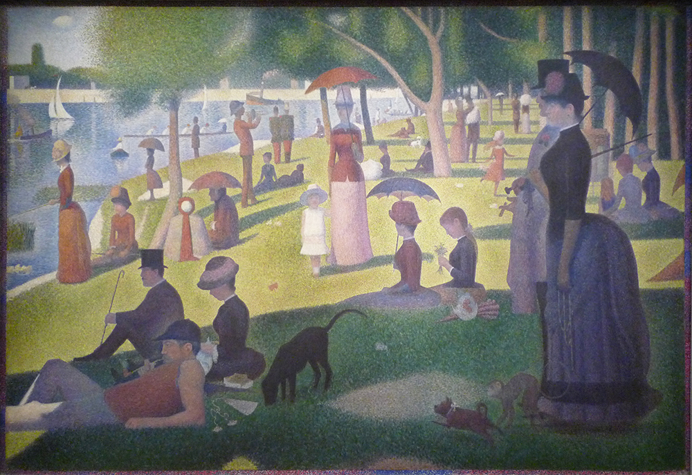
Just a dozen years after the debut of Impressionism, the art critic Félix Fénéon christened Georges Seurat as the leader of a new group of “Neo-Impressionists.” He did not mean to suggest the revival of a defunct style — Impressionism was still going strong in the mid-1880s — but rather a significant modification of Impressionist techniques that demanded a new label.
Fénéon identified greater scientific rigor as the key difference between Neo-Impressionism and its predecessor. Where the Impressionists were “arbitrary” in their techniques, the Neo-Impressionists had developed a “conscious and scientific” method through a careful study of contemporary color theorists such as Michel Chevreul and Ogden Rood. [1]
A scientific method
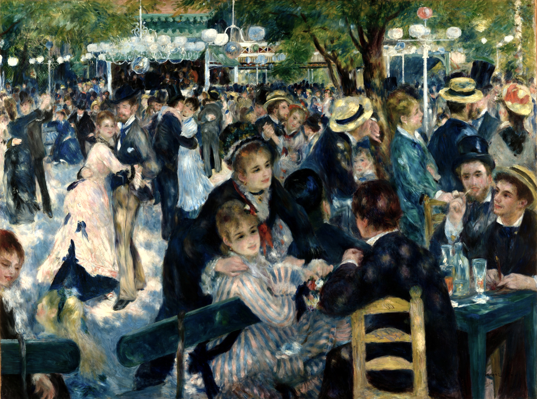
This greater scientific rigor is immediately visible if we compare Seurat’s Neo-Impressionist Grande Jatte with Renoir’s Impressionist Moulin de la Galette. The subject matter is similar: an outdoor scene of people at leisure, lounging in a park by a river or dancing and drinking on a café terrace. The overall goal is similar as well. Both artists are trying to capture the effect of dappled light on a sunny afternoon. However, Renoir’s scene appears to have been composed and painted spontaneously, with the figures captured in mid-gesture. Renoir’s loose, painterly technique reinforces this effect, giving the impression that the scene was painted quickly, before the light changed.
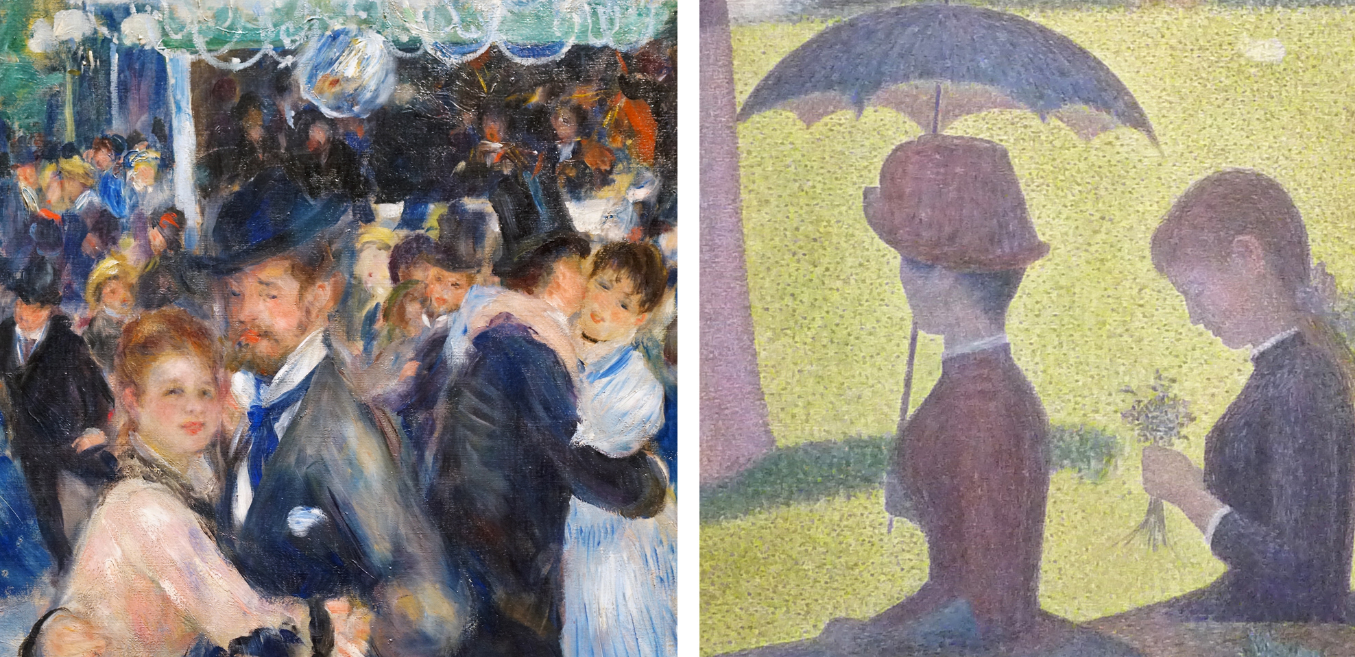
By contrast, the figures in La Grande Jatte are preternaturally still, and the brushwork has also been systematized into a painstaking mosaic of tiny dots and dashes, unlike Renoir’s haphazard strokes and smears. Neo-Impressionist painters employed rules and a method, unlike the Impressionists, who tended to rely on “instinct and the inspiration of the moment.” [2]
Pointillism, color, and optical mixture
One of these rules was to use only the “pure” colors of the spectrum: violet, blue, green, yellow, orange, and red. These colors could be mixed only with white or with a color adjacent on the color wheel (called “analogous colors”), for example to make lighter, yellower greens or darker, redder violets. Above all, the Neo-Impressionists would not mix colors opposite on the color wheel (“complementary colors”), because doing so results in muddy browns and dull grays.

More subtle color variations were produced by “optical mixture” rather than mixing paint on the palette. For example, examine the grass in the sun. Seurat intersperses the overall field of yellow greens with flecks of warm cream, olive greens, and yellow ochre (actually discolored chrome yellow). Viewed from a distance these flecks blend together to help lighten and warm the green, as we would expect when grass is struck by the yellow-orange light of the afternoon sun. Rather than mixing colors on the palette, the Neo-Impressionists would juxtapose them on the canvas in small dots. Seen from a suitable distance, these dots mix in the eye and achieve the intended effects without losing the chromatic intensity of the original pigments. It was this technique of painting in tiny dots (“points” in French) that gave Neo-Impressionism the popular nickname “Pointillism” although the artists generally avoided that term since it suggested a stylistic gimmick.
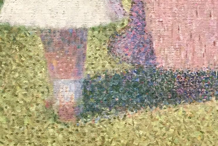
For the grass in the shadows, Seurat uses darker greens intermixed with flecks of pure blue and even some orange and maroon. These are very unexpected colors for grass, but when we stand back the colors blend optically, resulting in a cooler, darker, and duller green in the shadows. This green is, however, more vibrant than if Seurat had mixed those colors on the palette and applied them in a uniform swath.
Similarly, look at the number of colors that make up the little girl’s legs! They include not only the expected pinks and oranges of Caucasian flesh, but also creams, blues, maroons, and even greens. Stand back again, though, and “optical mixture” blends them into a convincing and luminous flesh color, modeled in warm light and shaded by her white dress.
The law of contrast
Paul Signac, the Neo-Impressionist, wrote about the artist’s need to take into account “the laws of contrast, of gradation, and of irradiation.” These “laws” refer to principles of color interaction discovered by nineteenth-century theorists such as Michel Chevreul, Ogden Rood, and Charles Henry, which seemed to promise that the entirety of art could be subsumed to rigorous scientific principles.
Chevreul’s most famous contribution to color theory is the “law of simultaneous contrast,” which takes account of how our perception of color changes relative to adjacent colors. Look at how different the same color swatch of blue appears against a field of bright green versus a field of dull orange, for example.

The general form of the law of simultaneous contrast is that two juxtaposed colors will appear maximally different from one another. Thus the blue appears both darker and duller when it is seen in a field of light, high-chroma yellow-green on the left, and it appears lighter and higher in chromatic intensity when seen against a field of dark, dull orange on the right.
Viewed against a white field, a swatch of color will actually gain a “halo” of its complementary color as a result of this effect. For example, if you gaze at the green swatch without focusing for several seconds, you will begin to see magenta edges emerge around it.
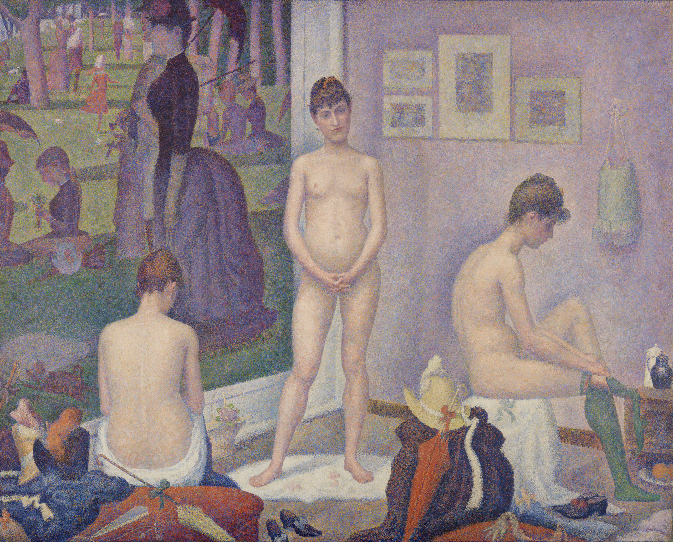
Seurat records this effect in his painting The Models. Notice how the seated model on the right has a dark, violet-blue halo around the light orange flesh of her back, and a light halo against the dark blue-violet shadowed side of her stomach and upper arm. This natural “irradiation” effect is exaggerated by Seurat in order to help intensify colors and values by juxtaposition with their opposites through simultaneous contrast.
Color perception, color harmony, color expression
Neo-Impressionists used color theory to help duplicate perceptual effects. Rather than the term “pointillism,” Signac’s preferred term “division” refers to the way the artist isolates all the component influences that contribute to a given perceived color. Neo-Impressionists employed divisionism to keep their paintings as luminous as possible while recording how perceived color is affected by factors such as the temperature of the light, reflected color, and simultaneous contrast with adjacent colors.
The aims of the Neo-Impressionists went beyond perceptual accuracy to also include the purely aesthetic effects of color: how they can be used to create pleasing color harmonies based on certain principles. Signac’s “laws of contrast and gradation” evokes two of these principles: “gradation” is the aesthetic harmony produced by gentle transitions between largely analogous colors, and “contrast” is produced by the sharper juxtaposition of opposites. Later works by Signac seem more concerned with such harmonies than with perceptual accuracy.
The Neo-Impressionists also recognized that color has expressive effects. Signac claimed that “joy” is evoked by paintings with dominant warm and light tones, while “sorrow” is evoked by dominant cool and dark colors. [3] Ideally, a Neo-Impressionist painting will take into account all three qualities: perceptual accuracy, formal harmony, and emotional expression. The artists believed that all of these were susceptible to rigorous scientific laws that were just being recognized and systematized in their period.
Compositional rigor
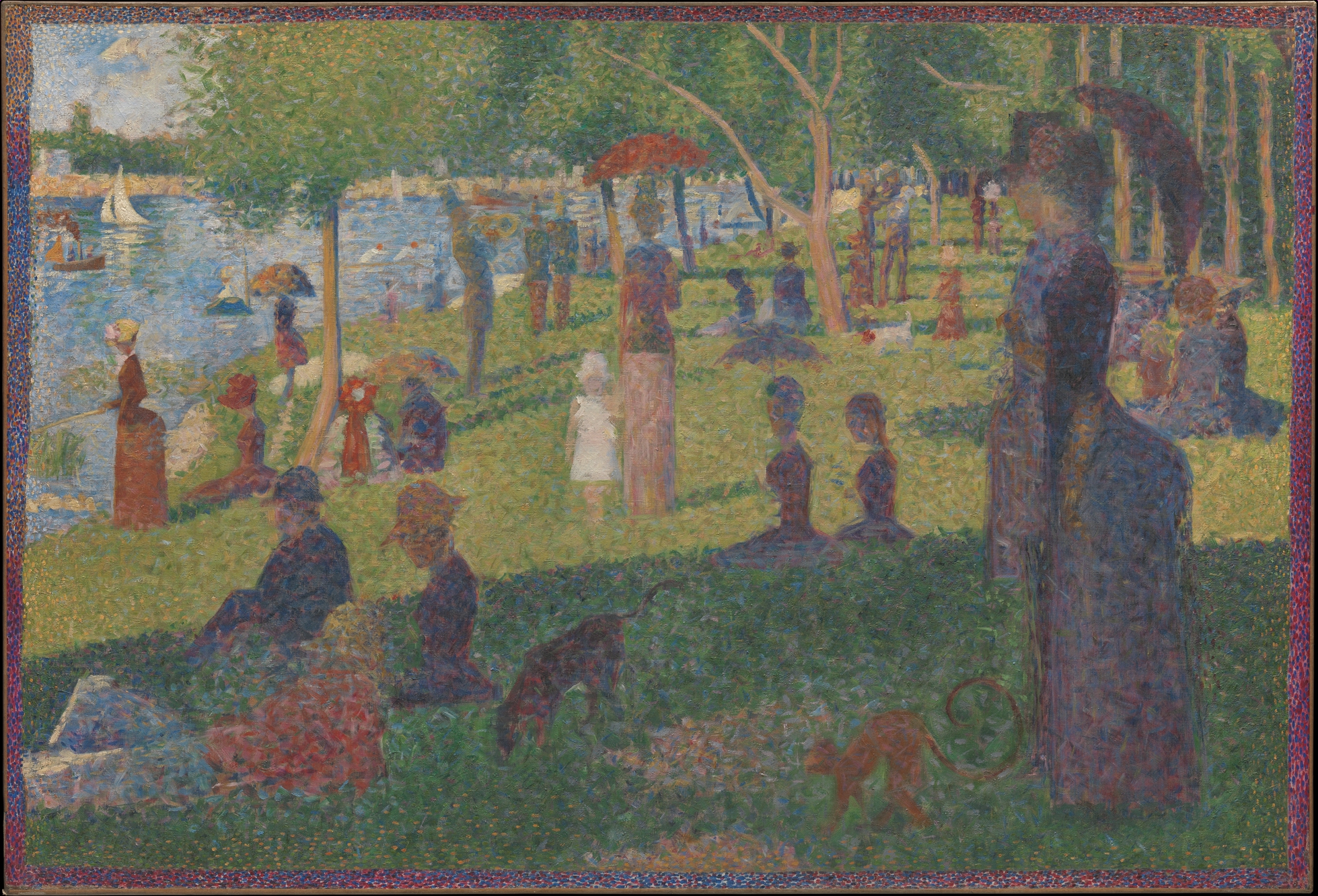
The Neo-Impressionists also applied scientific rigor to composition and design. Seurat’s friend and fellow painter Paul Signac asserted,
“The Neo-Impressionist … will not begin a canvas before he has determined the layout … Guided by tradition and science, he will … adopt the lines (directions and angles), the chiaroscuro (tones), [and] the colors (tints) to the expression he wishes to make dominant.” Paul Signac, Delacroix to Neo-Impressionism, in Nochlin, ed., p. 121.
Numerous studies for La Grande Jatte testify to how carefully Seurat decided on each figure’s pose and arranged them to create a rhythmic recession into the background. This practice is very different from the Impressionists, who emphasized momentary views (impressions) by creating intentionally haphazard-seeming compositions, such as Renoir’s Moulin de la Galette.
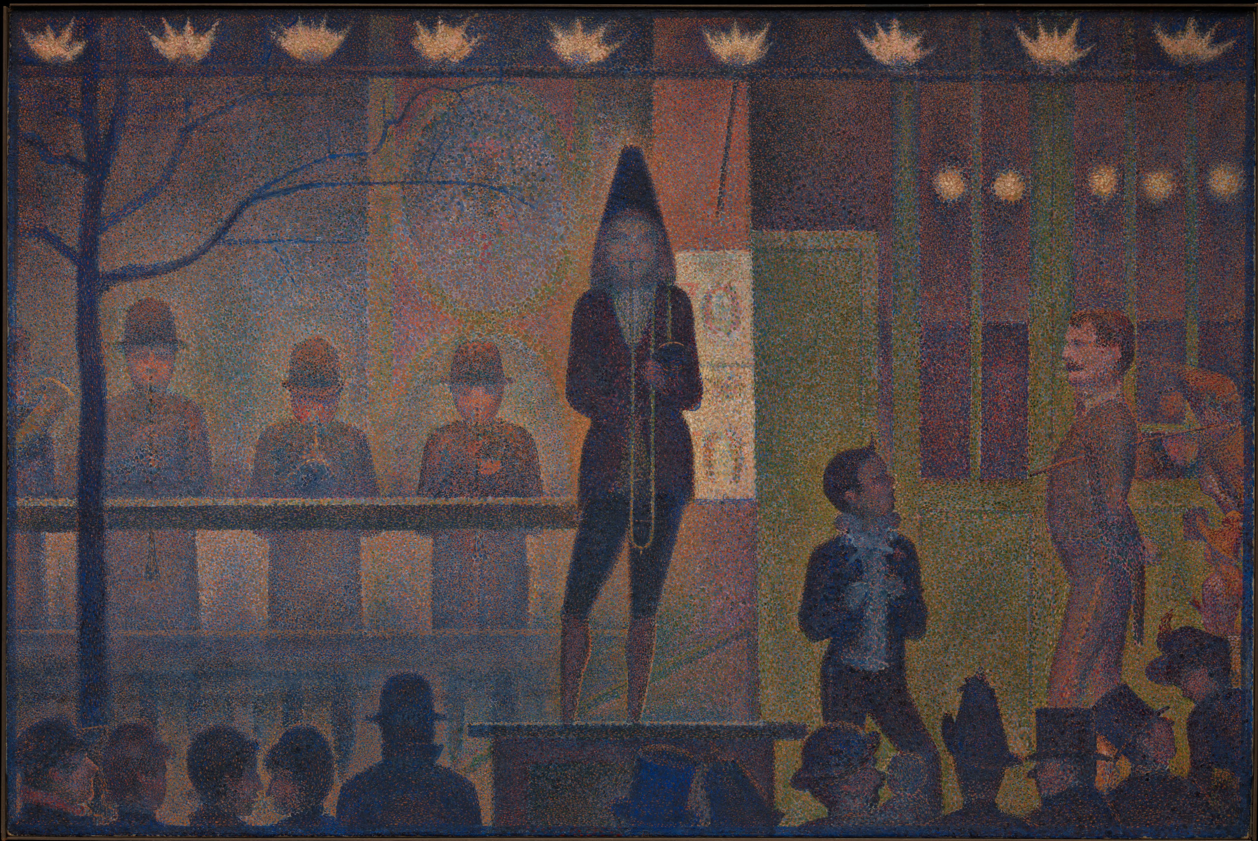
Seurat’s Parade de cirque is even more rigorously geometrical. It is dominated by horizontal and vertical lines, and the just slightly off-rhythmic spacing of the figures and architectural structure creates a syncopated grid. Scholars have debated whether the composition is based on the Golden Section, a geometric ratio that was identified by ancient Greek mathematicians as being inherently harmonious.
Systematized expression
The Neo-Impressionists also attempted to systematize the emotional qualities conveyed by their paintings. Seurat defined three main expressive tools at the painter’s disposal: color (the hues of the spectrum, from warm to cool), tone (the value of those colors, from light to dark), and line (horizontal, vertical, ascending, or descending). Each has a specific emotional effect:
“Gaiety of tone is given by the dominance of light; of color, by the dominance of warmth; of line, by lines above the horizontal. Calmness of tone is given by an equivalence of light and dark; of color by an equivalence of warm and cold; and of line, by horizontals. Sadness of tone is given by the dominance of dark; of color, by the dominance of cold colors; and of line, by downward directions.” Georges Seurat, Letter to Maurice Beaubourg, August 28, 1890, in Nochlin, ed., p. 114 (translation modified for clarity).
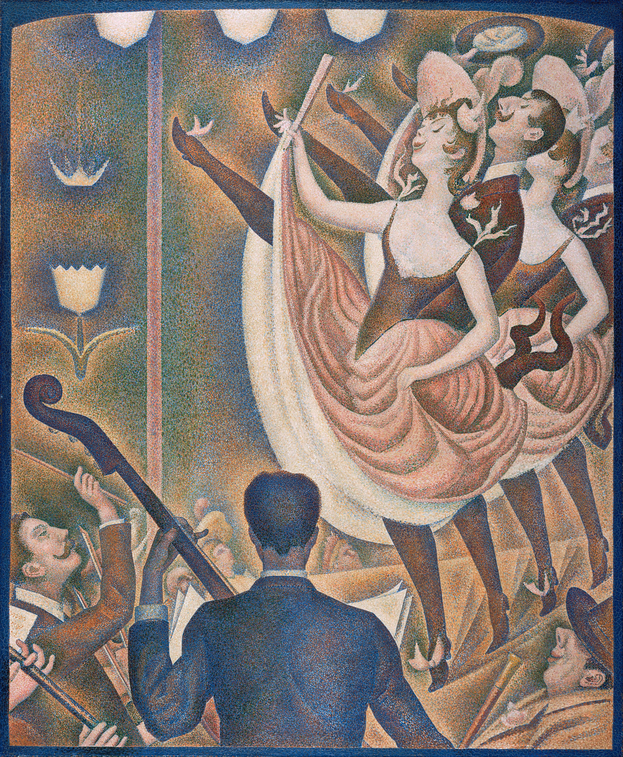
Seurat’s Chahut (Can-Can) seems designed to exemplify these rules, employing mostly warm, light colors and ascending lines to convey a mood of gaiety appropriate to the dance.
The Neo-Impressionist style had a relatively brief heyday; very few artists carried on the project into the 20th century. However, a great many artists experimented with it and took portions of its method into their own practice, from van Gogh to Henri Matisse. More broadly, the Neo-Impressionist desire to conform art-making to universal laws of perception, color, and expression echoes throughout Modernism, in movements as diverse as Symbolism, Purism, De Stijl, and the Bauhaus.
So far we have concentrated on the style of Neo-Impressionism. Next, we will examine the subject matter favored by the artists, and discuss its relation to the social and political context of the late-nineteenth century.
Neo-Impressionism: Subject Matter
First we examined the style of the movement, concentrating on the artists’ attempt to systematize a method for painting according to scientific laws of perception, color, composition, and expression. Here, we will turn to the kind of subject matter typically chosen by the Neo-Impressionists and discuss its relation to late-nineteenth century social and political history.
Scenes of leisure
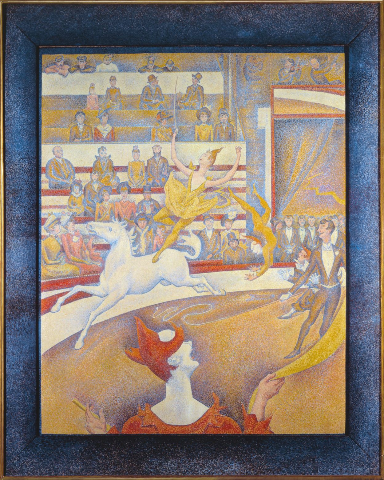
For the most part, the Neo-Impressionists continued to depict the kinds of subjects preferred by the Impressionists: landscapes and leisure scenes. In addition to his famous painting of people lounging in the park on the island of La Grande Jatte, many of Georges Seurat’s paintings portrayed entertainments such as the circuses and music halls that contributed to Paris’s reputation for mass spectacles in the late nineteenth century.
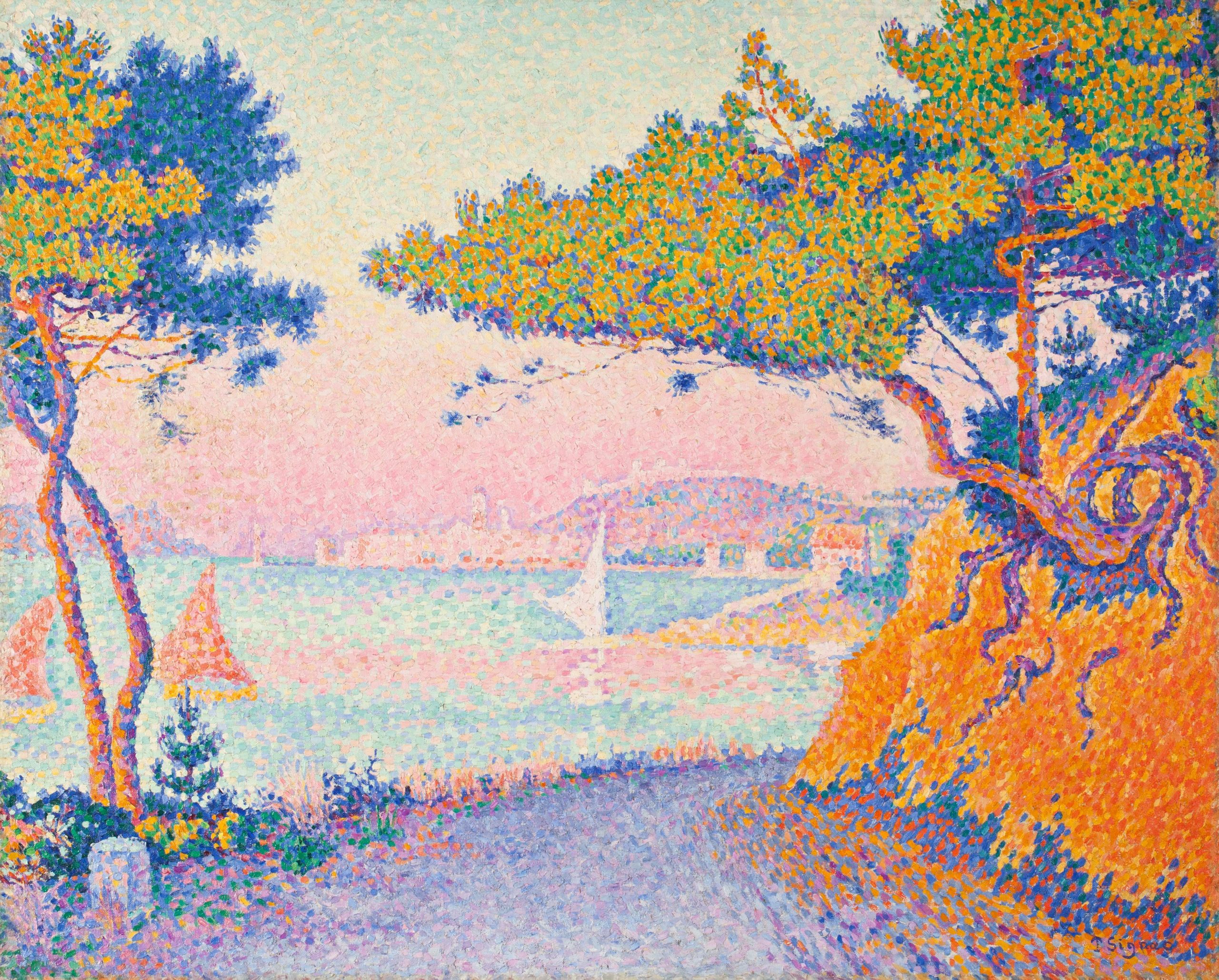
Paul Signac’s landscape paintings similarly reveal a concentration on leisure scenes. A sailor himself, Signac painted dozens of harbor scenes dominated by the sails and masts of small pleasure craft. The Mediterranean coast of France, where Signac spent his summers, had a reputation both for the quality of its light — a key interest of the Neo-Impressionists generally — and for a laid-back, sun-filled lifestyle. In Signac’s canvases, the bright colors favored by the Neo-Impressionists perfectly complement this reputation.
Social inequality
Although these subjects suggest carefree pleasure, there are undertones of social criticism in some Neo-Impressionist paintings. Seurat’s Circus shows the strict class distinctions in Paris both by location, with the wealthier patrons seated in the lower tiers, and by dress and posture, which gets markedly more casual the further the spectators are from ringside.
One contemporary critic also remarked that the rigidity of the poses in Seurat’s La Grande Jatte reminded him of “the stiffness of Parisian leisure, prim and exhausted, where even recreation is a matter of striking poses.” [4] As we examine the characters in La Grande Jatte in detail, there are some surprising inclusions and juxtapositions. In the left foreground, a working-class man in shirtsleeves overlaps a much more formally-dressed middle-class gentleman in a top hat holding a cane. A trumpet player in the middle-ground plays directly into the ears of two soldiers standing at attention in the background. A woman with an ostentatiously eccentric pet monkey on the right and another fishing on the left have been interpreted as prostitutes, one of whom is casting out lures for clients. Between them, a toy lap-dog with a pink ribbon leaps toward a rangy hound whose coat is as black as that of the bourgeois gentleman with the cane.
Despite these provocative juxtapositions and overlaps, very few of the figures actually seem to be interacting with each other; each is lost in their own world. Unlike the mood of convivial good-fellowship between the classes and sexes in Auguste Renoir’s Moulin de la Galette, Seurat’s Grande Jatte sets up a dynamic of alienation and tension.
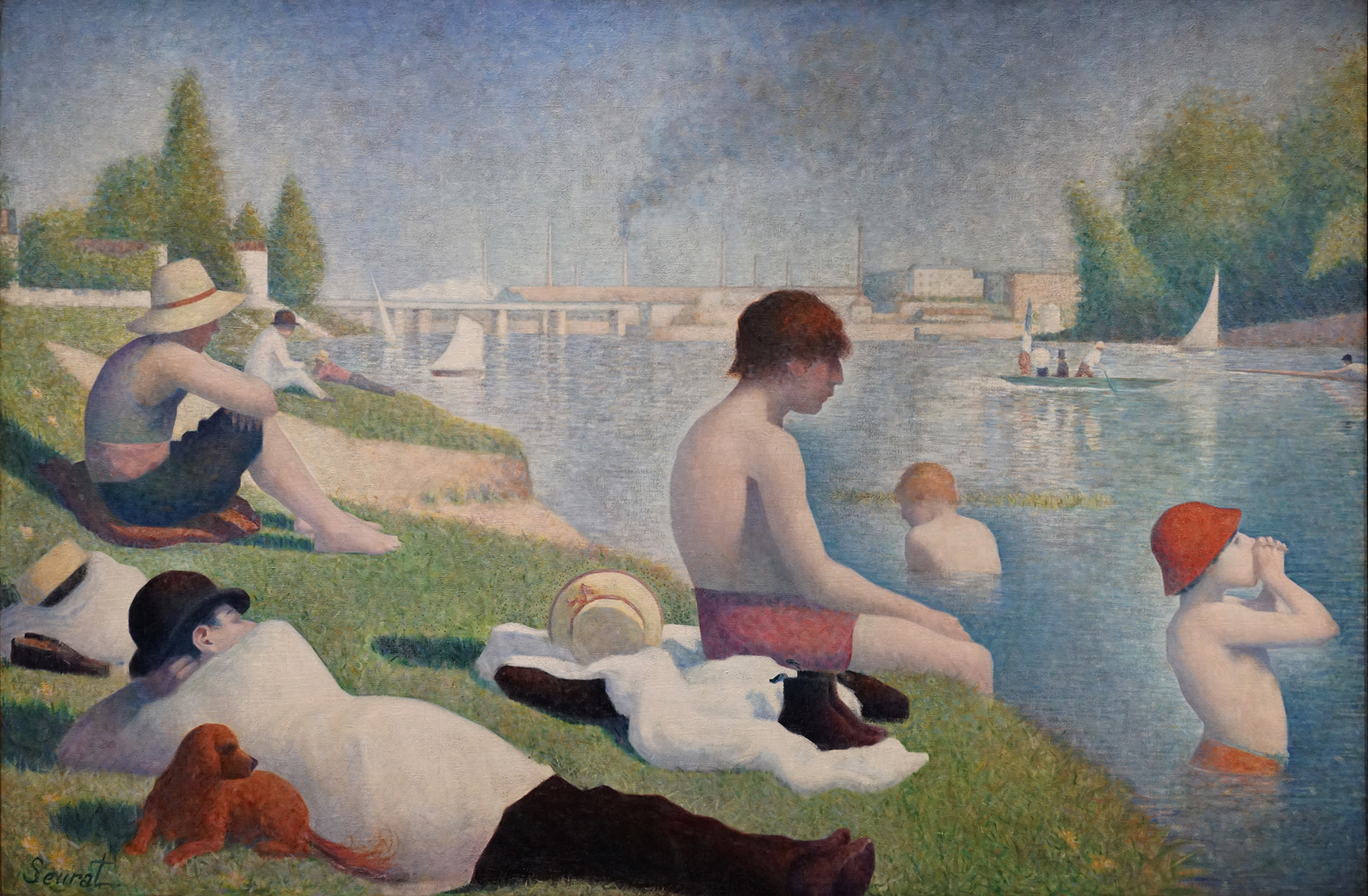
La Grande Jatte forms an implicit pair with an earlier painting of the same size by Seurat, Bathers at Asnières. Asnières was an industrial suburb of Paris, just across the river Seine from La Grande Jatte. Unlike that island’s largely middle-class patrons in their top hats and bustle skirts, here we see more working-class and lower-middle-class figures in shirtsleeves and straw hats or bowlers. In the background the smokestacks of the factories at Clichy serve as a reminder of labor, even during the men’s leisure time.
As in the painting of La Grande Jatte, all of the figures are isolated in their own world, but a sense of implicit tension is raised by their insistent gaze across the river at their wealthier compatriots. A middle-class couple being rowed by a hired oarsman in a boat with a prominent French flag further adds to the class tensions raised by the work.
Political revolutionaries?
Perhaps it was this odd sense of unresolved class tensions that caused Signac to suggest that even Seurat’s paintings of “the pleasures of decadence” are about exposing “the degradation of our era” and bearing witness to “the great social struggle that is now taking place between workers and capital.” [5] Seurat’s own politics were unclear, but Signac was a social anarchist, as were several other Neo-Impressionists, including Camille Pissarro and his son Lucien, as well as Maximilian Luce, Theodore van Rysselberghe, Henri Cross, and the critic Felix Fénéon. Social anarchists reject a strong centralized government in which the state owns the means of production and guides the economy; they believe that social ownership and cooperation will emerge naturally in a stateless society.
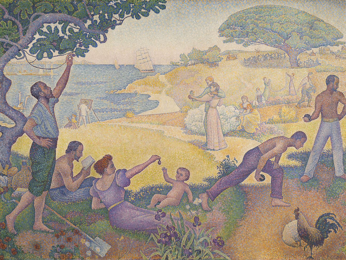
Signac’s In the Time of Harmony was originally titled In the Time of Anarchy, but political controversy forced a change. Between 1892 and 1894 there were eleven bombings in France by anarchists, and a very public trial of suspected anarchists that included Fénéon and Luce.
Signac’s painting was intended to show that, despite its current revolutionary tactics, the aim of anarchism was a peaceful utopia. In the foreground, workers lay down their tools for a picnic of figs and champagne while others play at boules. A couple in the center contemplates a posy, while behind them a man sows and women hang laundry. Although the mood is timeless — with different clothing, this painting could be a Classical pastoral scene — in the distance modern mechanical farm equipment reinforces the painting’s subtitle, “The Golden Age is Not in the Past, it is in the Future.”
Relatively few Neo-Impressionist paintings are so overtly allegorical and political. Signac argued that it was the Neo-Impressionists’ technique, not any directly socialist or anarchist subject matter, that was most in tune with the political revolutionaries. The Neo-Impressionists’ rigorous appeal to hard science, rather than dead conventions, along with their uncompromising will to “paint what they see, as they feel it,” will help “give a hard blow of the pick-axe to the old social structure” and promote a corresponding social revolution. [6]
Georges Seurat, A Sunday on La Grande Jatte – 1884
Georges Seurat developed the Neo-Impressionist style of Pointillism, which reflected his interest in scientific optics and the surface of the painting.
Paul Gauguin, Vision after the Sermon (or Jacob Wrestling with the Angel)
Gauguin’s famous Vision after the Sermon depicts the profound religious faith of the Breton people. A group of women in the foreground file out of church, having just heard a sermon on Jacob wrestling an angel (Genesis 32:24-32). So great is their faith that they literally “see” the Biblical scene in front of the church, right next to a prosaically grazing cow.
The drawing is crude, the anatomy of the women’s faces is almost childish, the flat planes of their clothing utterly fail to convey a sense of the bodies underneath, and the red ground stands up like a wall rather than receding into space. Far from incompetent, however, Gauguin’s simplified, even somewhat crude, technique was a conscious choice.
Gauguin advocated for both simplifying and intensifying what he saw. Gauguin advised artists to paint from memory rather than directly from nature, because memory automatically discards extraneous detail and distills perceptions down to their essence. This process of distilling multiple, complex elements into a simplified whole is what the group meant when they called themselves “Synthetists” at the Café des Arts exhibition. Insisting on the process of synthesis was a deliberate contrast to the highly scientific and analytic process of Neo-Impressionism. Whereas the Neo-Impressionists worked to analyze or carefully break down all the separate components that make up complex color sensations and then rendered them in innumerable tiny dots, the Synthetists distilled them into broad areas of pure color.
The Synthetist style was sometimes called “Cloisonnism,” after the cloisonné technique used to decorate objects by melting colored enamel between wire outlines. It also has similarities to Japanese prints, which were popular at the time, as well as Medieval colored woodcuts and stained glass. Synthetism was somewhat antithetically associated with both sensual/decorative qualities and religious/spiritual qualities, but whatever its genesis or purpose, it forms a sharp contrast to both the Academic naturalist style of artists like Pascal Dagnan-Bouveret and the Neo-Impressionist style of Signac.
The Nabis and Symbolism
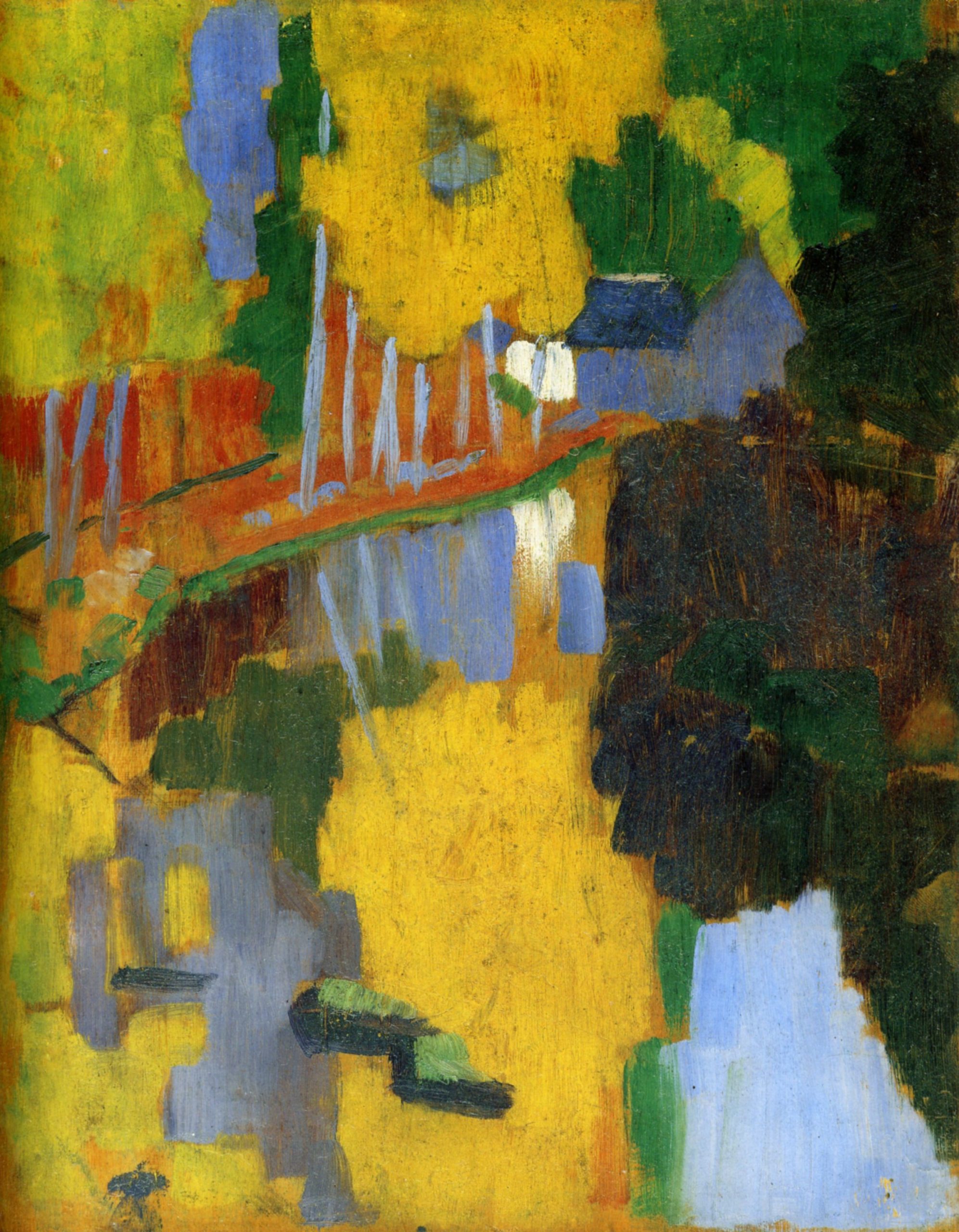
In the fall of 1888 Paul Sérusier spent an afternoon with Paul Gauguin in Brittany painting a small landscape on a cigar box lid. He followed Gauguin’s instructions to emphasize the colors he saw by using paint directly from the tube with little or no mixing. The result was a patchwork design of vivid colors only vaguely suggestive of its subject, trees on a riverbank.
Later in Paris Sérusier showed the landscape to fellow art students at the Académie Julian who saw it as an artistic revelation. They named the painting “The Talisman” and formed a group called the Nabis, after the Hebrew word for prophet. In addition to Sérusier the group included Pierre Bonnard, Édouard Vuillard, Maurice Denis, Paul Ranson, and Ker-Xavier Roussel, as well as others. In the 1890s the Nabis were one of the most innovative Post-Impressionist groups working in Paris.
Spiritual concerns
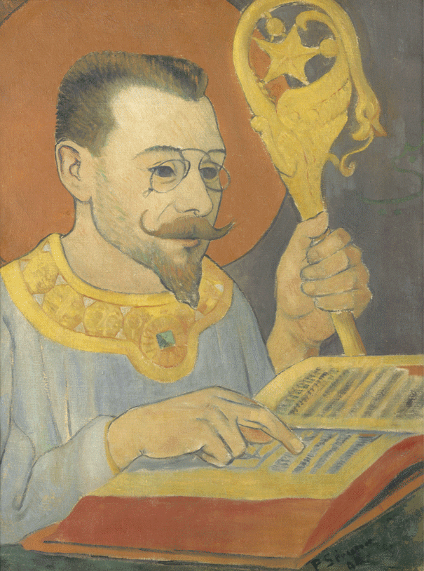
Like Gauguin and many other artists of the period, the Nabis were engaged with the spiritual and mystical concerns associated with fin-de-siècle Symbolism. Sérusier’s Portrait of Paul Ranson in Nabi Costume documents their early interest in esoterica and occult ceremonies. The simplified style Sérusier used derived from Gauguin’s Synthetism but was only one of the styles associated with Symbolism. It forms a marked contrast to the academic naturalism used by many fin-de-siècle Symbolist painters such as Jean Delville, who depicted the Symbolist writer Joséphin Péladan in robes and accompanied by ceremonial objects and symbols, much as Sérusier portrayed Paul Ranson.
A widespread attitude
Symbolism began as a literary movement with the 1886 publication of Jean Moréas’ Symbolist manifesto in the Paris newspaper Le Figaro. It quickly became a kind of catch-all term for a widespread fin-de-siècle aesthetic attitude that embraced the spiritual significance of art while rejecting science and objectivity. Symbolist artists favored idealism over realism, suggestion over specificity, and subjective expression over objective representation. They employed a variety of styles and approaches, including both traditional naturalism and modern techniques associated with Post-Impressionism. Many of the painters who exhibited at the popular Symbolist Salon of the Rose + Cross organized by Péladan in the 1890s favored a highly-detailed naturalism. These included Delville and Fernand Khnopff, whose dream-like images became prominent examples of Symbolist art.
Conveying meaning through color and design
Nabi painters used the modern Synthetist style of Gauguin, which emphasized abstract form, to convey spiritual meaning as well as a means of suggestion and personal expression. Maurice Denis was the most prominent art theorist associated with the Nabis, and one of his early statements became a famous touchstone of formalist modernism: “A painting — before being a battle horse, a nude woman, or some anecdote — is essentially a flat surface covered with colors arranged in a certain order.”[7] Emphasis on color and surface design is a primary characteristic of Nabi painting, which conveys emotion and meaning through abstract formal relations.
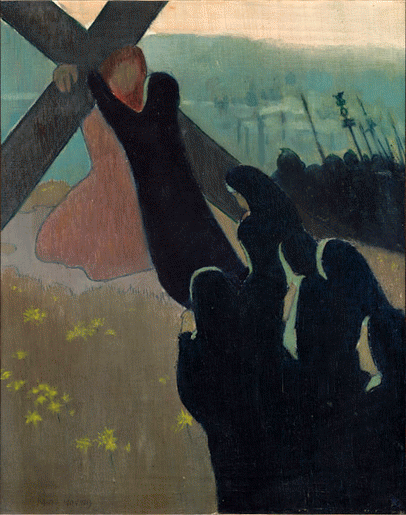
In Denis’ Climbing to Calvary the simple dark shapes of black-robed nuns rise diagonally towards a large cross carried by a barely-defined red Christ. One nun reaches out to embrace Christ at the top of the hill, and a strip of bright sky tops off the scene. The basic forms convey the combination of mourning and hope that Christians associate with Christ’s death and resurrection. The scene is timeless, containing elements of the present (the nuns) and the past (Mary embracing Christ on the way to the Crucifixion, the dark silhouette of a crowd of Roman soldiers over the hill). The figure of Christ suggests both the nuns’ spiritual vision of Christ carrying the cross, similar to Gauguin’s Vision after the Sermon, and a Good Friday procession re-enacting the Crucifixion.
Different approaches
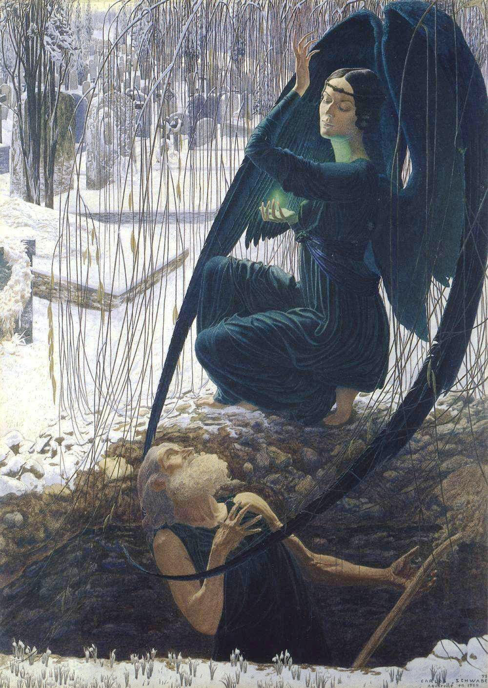
A comparison of Denis’ painting with Carlos Schwabe’s Death and the Gravedigger shows two very different approaches to Symbolist painting. In Denis’ work, the forms are reduced and simplified to mostly flat color areas. Basic symbols, shapes and their relationships convey meaning: the Christian cross, black for mourning, red for the blood of sacrifice, the upward movement towards light and resurrection.
Schwabe uses similar compositional devices to convey the theme of death and resurrection; both paintings show darkness and symbolic death at the bottom of the painting, light and resurrection rise above. Unlike Denis, however, Schwabe employs a traditional naturalistic technique that records many details based on careful observation. The figures and location are so specific that they suggest the illustration of a particular scene in a story. Denis by contrast depicts a more generalized, anonymous image of death and Christian resurrection.
Symbolism without symbols
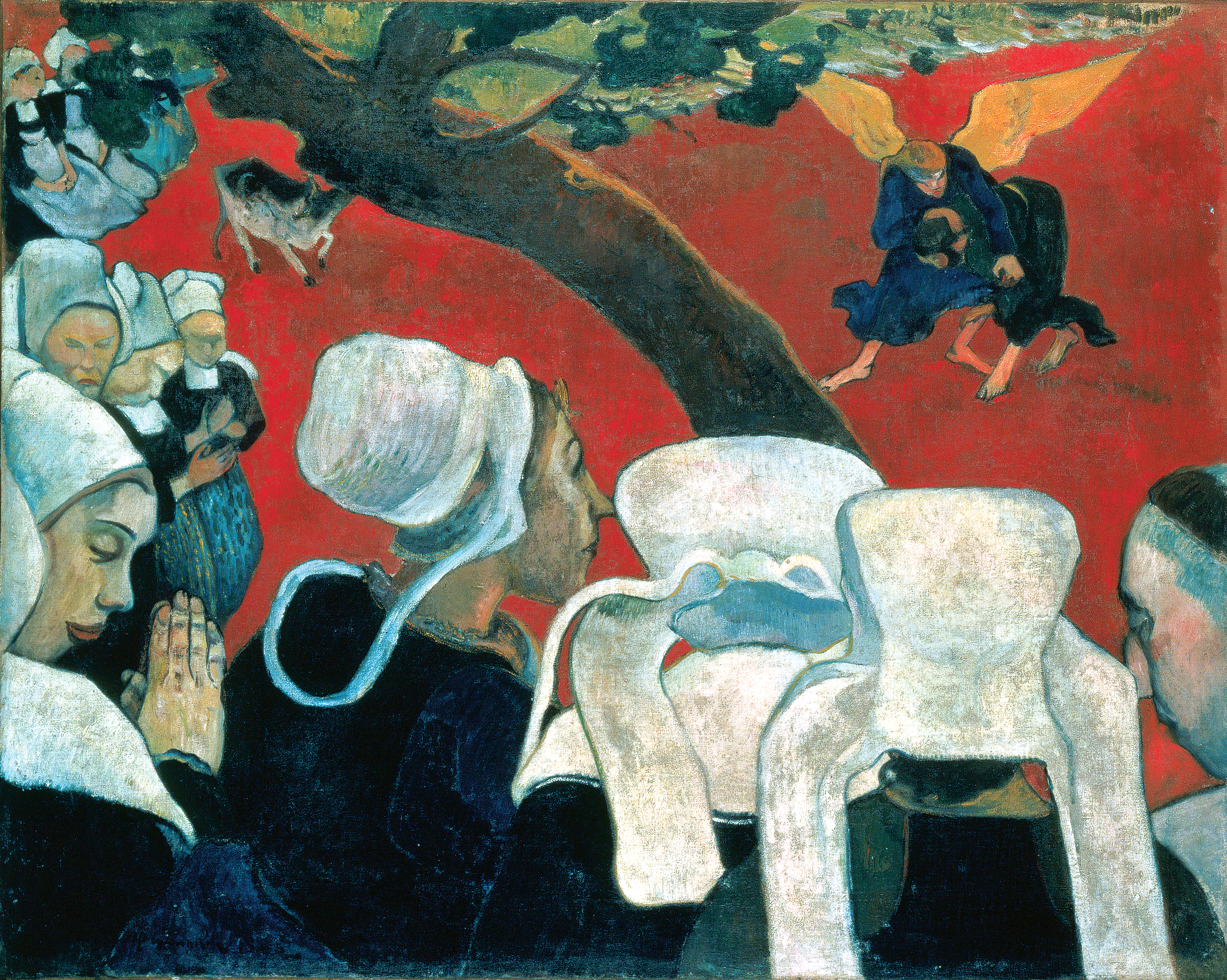
Symbolism is perhaps easiest to recognize in artworks that present known symbols, such as the Christian cross, or overtly symbolic meanings through recognizable themes such as youth, old age, love, death, etc. In addition to Denis’ Climbing to Calvary, many well-known Post-Impressionist works use conventional symbolism in this way, including Gauguin’s Vision after the Sermon. Symbolism was also, however, associated with both a conception of art as subjective expression and the capacity of art to suggest profound meanings indirectly. As a result, many artworks that lack obvious symbols or clear symbolic significance are also associated with Symbolism.
The subjects of Nabi paintings varied from the overt, often religious, symbolism of Maurice Denis to scenes of contemporary urban and suburban life depicted by Pierre Bonnard and Édouard Vuillard. Whatever their subject, though, the Nabis relied on the formal qualities of color, pattern, and surface design to enhance the dreamy moods and profound meanings of Symbolist art. Their emphasis on the capacity of formal elements to convey meaning and emotion was an early contribution to the developments that led to abstract art.
Vincent van Gogh, The Potato Eaters
Vincent Van Gogh was prominent among the Post-Impressionists for his modernist translation of the observed world through expressive use of form and color.
Vincent van Gogh, The Starry Night
A rare night landscape
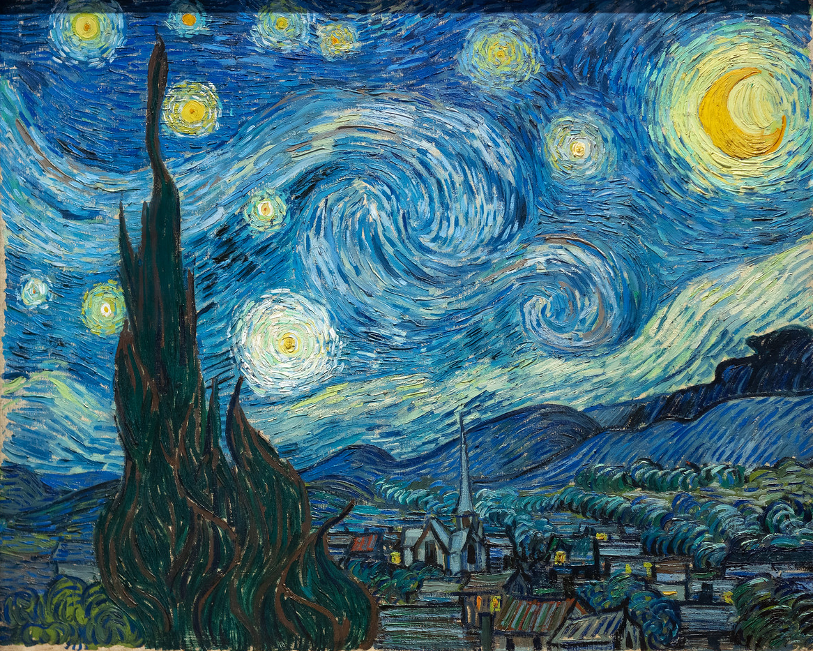
The curving, swirling lines of hills, mountains, and sky, the brilliantly contrasting blues and yellows, the large, flame-like cypress trees, and the thickly layered brushstrokes of Vincent van Gogh’s The Starry Night are ingrained in the minds of many as an expression of the artist’s turbulent state-of-mind. Van Gogh’s canvas is indeed an exceptional work of art, not only in terms of its quality but also within the artist’s oeuvre, since in comparison to favored subjects like irises, sunflowers, or wheat fields, night landscapes are rare. Nevertheless, it is surprising that The Starry Night has become so well known. Van Gogh mentioned it briefly in his letters as a simple “study of night” or “night effect.”
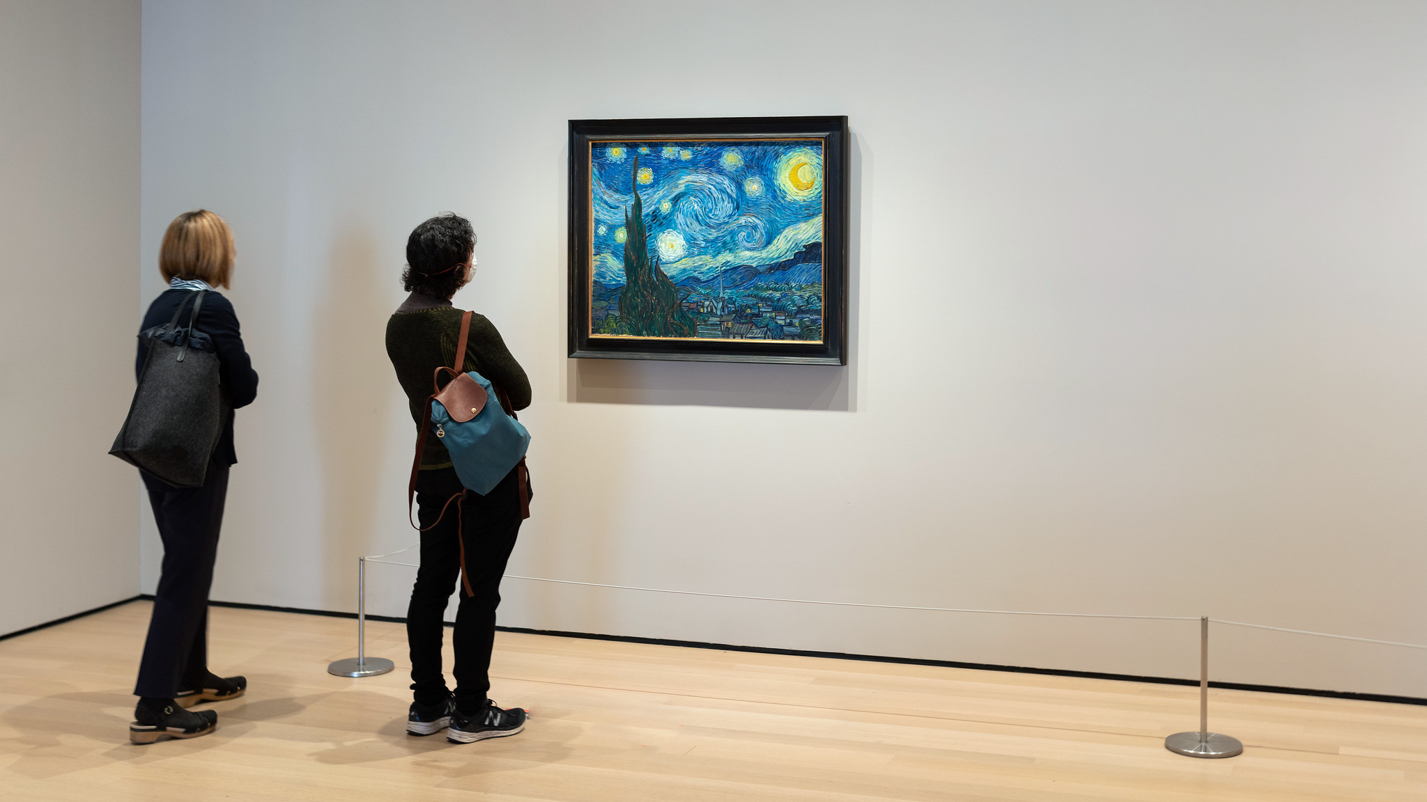
His brother Theo, manager of a Parisian art gallery and a gifted connoisseur of contemporary art, was unimpressed, telling Vincent, “I clearly sense what preoccupies you in the new canvases like the village in the moonlight… but I feel that the search for style takes away the real sentiment of things” (813, 22 October 1889). Although Theo van Gogh felt that the painting ultimately pushed style too far at the expense of true emotive substance, the work has become iconic of individualized expression in modern landscape painting.
Technical challenges
Van Gogh had had the subject of a blue night sky dotted with yellow stars in mind for many months before he painted The Starry Night in late June or early July of 1889. It presented a few technical challenges he wished to confront—namely the use of contrasting color and the complications of painting en plein air (outdoors) at night—and he referenced it repeatedly in letters to family and friends as a promising if problematic theme. “A starry sky, for example, well – it’s a thing that I’d like to try to do,” Van Gogh confessed to the painter Emile Bernard in the spring of 1888, “but how to arrive at that unless I decide to work at home and from the imagination?” (596, 12 April 1888).
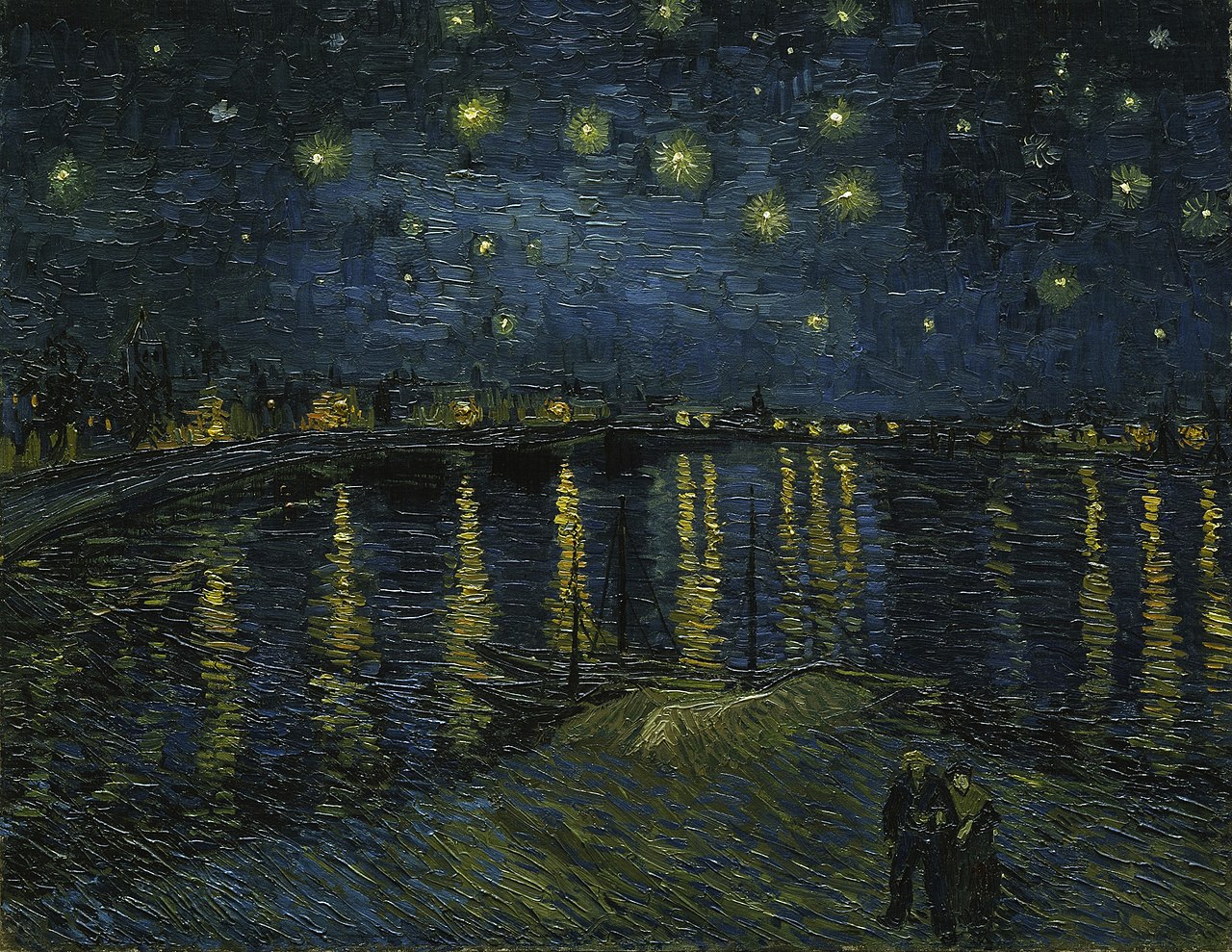
As an artist devoted to working whenever possible from prints and illustrations or outside in front of the landscape he was depicting, the idea of painting an invented scene from imagination troubled Van Gogh. When he did paint a first example of the full night sky in Starry Night over the Rhône (1888, oil on canvas, 72.5 x 92 cm, Musée d’Orsay, Paris), an image of the French city of Arles at night, the work was completed outdoors with the help of gas lamplight, but evidence suggests that his second Starry Night was created largely if not exclusively in the studio.
Location
Following the dramatic end to his short-lived collaboration with the painter Paul Gauguin in Arles in 1888 and the infamous breakdown during which he mutilated part of his own ear, Van Gogh was ultimately hospitalized at Saint-Paul-de-Mausole, an asylum and clinic for the mentally ill near the village of Saint-Rémy. During his convalescence there, Van Gogh was encouraged to paint, though he rarely ventured more than a few hundred yards from the asylum’s walls.
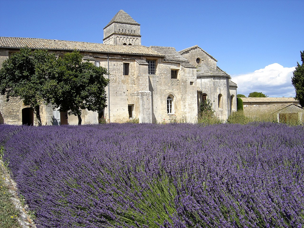
Besides his private room, from which he had a sweeping view of the mountain range of the Alpilles, he was also given a small studio for painting. Since this room did not look out upon the mountains but rather had a view of the asylum’s garden, it is assumed that Van Gogh composed The Starry Night using elements of a few previously completed works still stored in his studio, as well as aspects from imagination and memory. It has even been argued that the church’s spire in the village is somehow more Dutch in character and must have been painted as an amalgamation of several different church spires that van Gogh had depicted years earlier while living in the Netherlands.
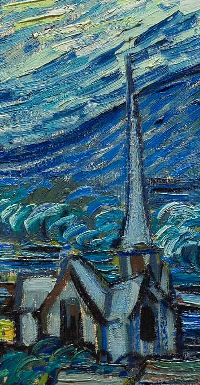
Van Gogh also understood the painting to be an exercise in deliberate stylization, telling his brother, “These are exaggerations from the point of view of arrangement, their lines are contorted like those of ancient woodcuts” (805, c. 20 September 1889). Similar to his friends Bernard and Gauguin, van Gogh was experimenting with a style inspired in part by medieval woodcuts, with their thick outlines and simplified forms.
The colors of the night sky
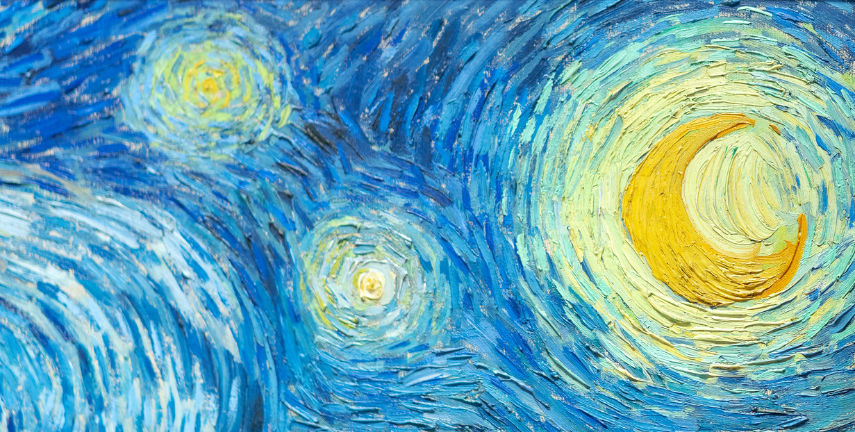
On the other hand, The Starry Night evidences Van Gogh’s extended observation of the night sky. After leaving Paris for more rural areas in southern France, Van Gogh was able to spend hours contemplating the stars without interference from gas or electric city street lights, which were increasingly in use by the late nineteenth century. “This morning I saw the countryside from my window a long time before sunrise, with nothing but the morning star, which looked very big” 777, c. 31 May – 6 June 1889). As he wrote to his sister Willemien van Gogh from Arles,
“It often seems to me that the night is even more richly colored than the day, colored with the most intense violets, blues and greens. If you look carefully, you’ll see that some stars are lemony, others have a pink, green, forget-me-not blue glow. And without laboring the point, it’s clear to paint a starry sky it’s not nearly enough to put white spots on blue-black.” (678, 14 September 1888)
Van Gogh followed his own advice, and his canvas demonstrates the wide variety of colors he perceived on clear nights.
Invention, remembrance and observation
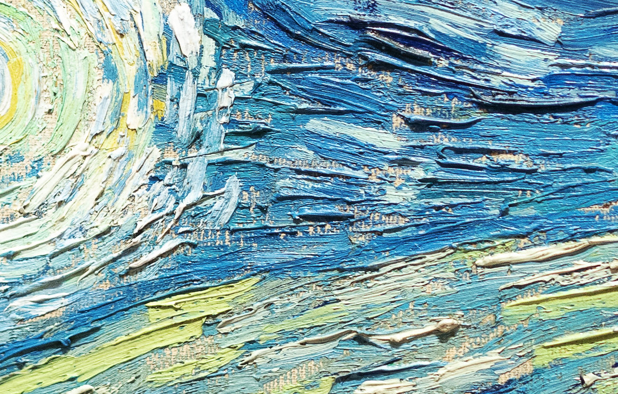
Arguably, it is this rich mixture of invention, remembrance, and observation combined with Van Gogh’s use of simplified forms, thick impasto, and boldly contrasting colors that has made the work so compelling to subsequent generations of viewers as well as to other artists. Inspiring and encouraging others is precisely what Van Gogh sought to achieve with his night scenes. When Starry Night over the Rhône was exhibited at the Salon des Indépendants, an important and influential venue for vanguard artists in Paris, in 1889, Vincent told Theo he hoped that it “might give others the idea of doing night effects better than I do.” The Starry Night, his own subsequent “night effect,” became a foundational image for Expressionism as well as perhaps the most famous painting in Van Gogh’s oeuvre.
Edvard Munch, The Scream
A Norwegian painter and printmaker, Edvard Munch’s Symbolist exploration of emotions and interpersonal relationships anticipated Expressionism.
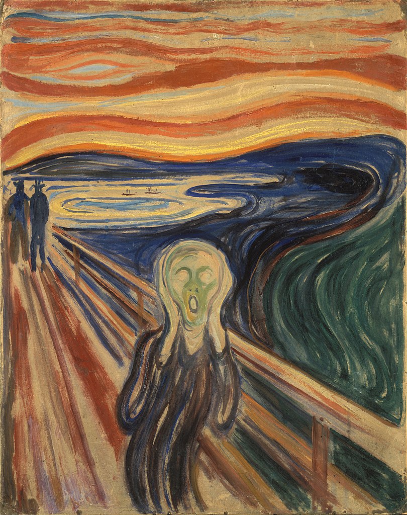
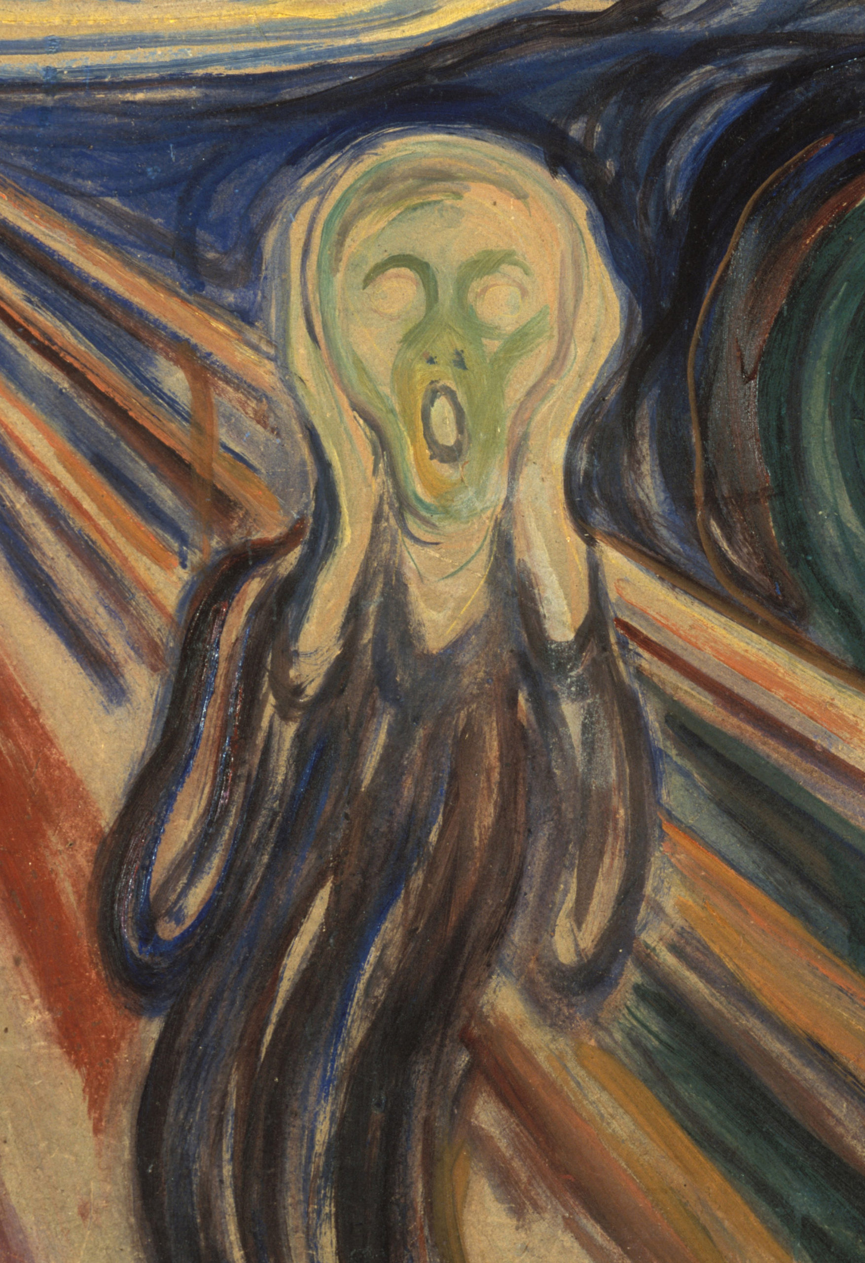
Second only to Leonardo da Vinci’s Mona Lisa, Edvard Munch’s The Scream may be the most iconic human figure in the history of Western art. Its androgynous, skull-shaped head, elongated hands, wide eyes, flaring nostrils and ovoid mouth have been engrained in our collective cultural consciousness; the swirling blue landscape and especially the fiery orange and yellow sky have engendered numerous theories regarding the scene that is depicted. Like the Mona Lisa, The Scream has been the target of dramatic thefts and recoveries, and in 2012 a version created with pastel on cardboard sold to a private collector for nearly $120,000,000 making it the second highest price achieved at that time by a painting at auction.
Semi-autobiographical
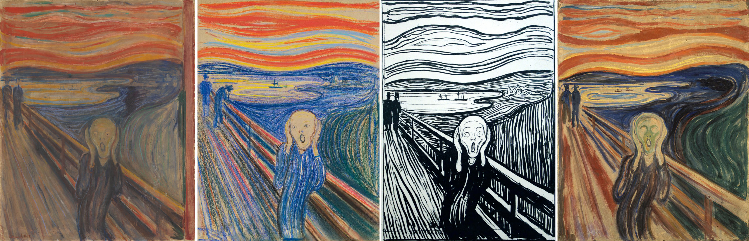
Conceived as part of Munch’s semi-autobiographical cycle “The Frieze of Life,” The Scream’s composition exists in four forms: the first painting, done in oil, tempera, and pastel on cardboard (1893, National Gallery of Art, Oslo), two pastel examples (1893, Munch Museum, Oslo and 1895, private collection), and a final tempera painting (1910, National Gallery of Art, Oslo). Munch also created a lithographic version in 1895. The various renditions show the artist’s creativity and his interest in experimenting with the possibilities to be obtained across an array of media, while the work’s subject matter fits with Munch’s interest at the time in themes of relationships, life, death, and dread.
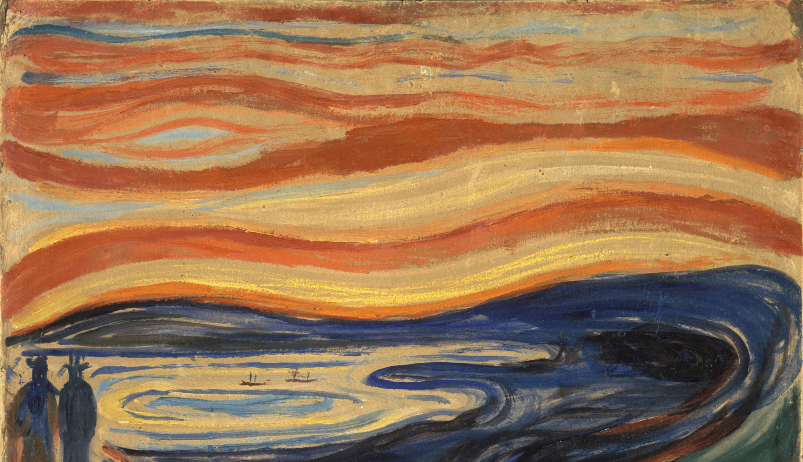
For all its notoriety, The Scream is in fact a surprisingly simple work, in which the artist utilized a minimum of forms to achieve maximum expressiveness. It consists of three main areas: the bridge, which extends at a steep angle from the middle distance at the left to fill the foreground; a landscape of shoreline, lake or fjord, and hills; and the sky, which is activated with curving lines in tones of orange, yellow, red, and blue-green. Foreground and background blend into one another, and the lyrical lines of the hills ripple through the sky as well. The human figures are starkly separated from this landscape by the bridge. Its strict linearity provides a contrast with the shapes of the landscape and the sky. The two faceless upright figures in the background belong to the geometric precision of the bridge, while the lines of the foreground figure’s body, hands, and head take up the same curving shapes that dominate the background landscape.
A scream through nature
The screaming figure is thus linked through these formal means to the natural realm, which was apparently Munch’s intention. A passage in Munch’s diary dated January 22, 1892, and written in Nice, contains the probable inspiration for this scene as the artist remembered it:
“I was walking along the road with two friends—the sun went down—I felt a gust of melancholy—suddenly the sky turned a bloody red. I stopped, leaned against the railing, tired to death—as the flaming skies hung like blood and sword over the blue-black fjord and the city—My friends went on—I stood there trembling with anxiety—and I felt a vast infinite scream [tear] through nature.”
The figure on the bridge—who may even be symbolic of Munch himself—feels the cry of nature, a sound that is sensed internally rather than heard with the ears. Yet, how can this sensation be conveyed in visual terms?
Munch’s approach to the experience of synesthesia, or the union of senses (for example the belief that one might taste a color or smell a musical note), results in the visual depiction of sound and emotion. As such, The Scream represents a key work for the Symbolist movement as well as an important inspiration for the Expressionist movement of the early twentieth century. Symbolist artists of diverse international backgrounds confronted questions regarding the nature of subjectivity and its visual depiction. As Munch himself put it succinctly in a notebook entry on subjective vision written in 1889, “It is not the chair which is to be painted but what the human being has felt in relation to it.”
A remembered sensation
Since The Scream’s first appearance, many critics and scholars have attempted to determine the exact scene depicted, as well as inspirations for the screaming figure. For example, it has been asserted that the unnaturally harsh colors of the sky may have been due to volcanic dust from the eruption of Krakatoa in Indonesia, which produced spectacular sunsets around the world for months afterwards. This event occurred in 1883, ten years before Munch painted the first version of The Scream. However, as Munch’s journal entry—written in the south of France but recalling an evening by Norway’s fjords also demonstrates—The Scream is a work of remembered sensation rather than perceived reality. Art historians have also noted the figure’s resemblance to a Peruvian mummy that had been exhibited at the World’s Fair in Paris in 1889 (an artifact that also inspired the Symbolist painter Paul Gauguin) or to another mummy displayed in Florence. While such events and objects are visually plausible, the work’s effect on the viewer does not depend on one’s familiarity with a precise list of historical, naturalistic, or formal sources. Rather, Munch sought to express internal emotions through external forms and thereby provide a visual image for a universal human experience.
Symbolism at the Vienna Secession: Gustav Klimt’s The Kiss
The Vienna Secession was a group of artists who rejected academic conservatism, embracing a more modern experimental approach and new aesthetic forms. A founder of the Vienna Secession, Gustav Klimt is known for his incorporation of Art Nouveau and Symbolist style in his works.
Art Nouveau
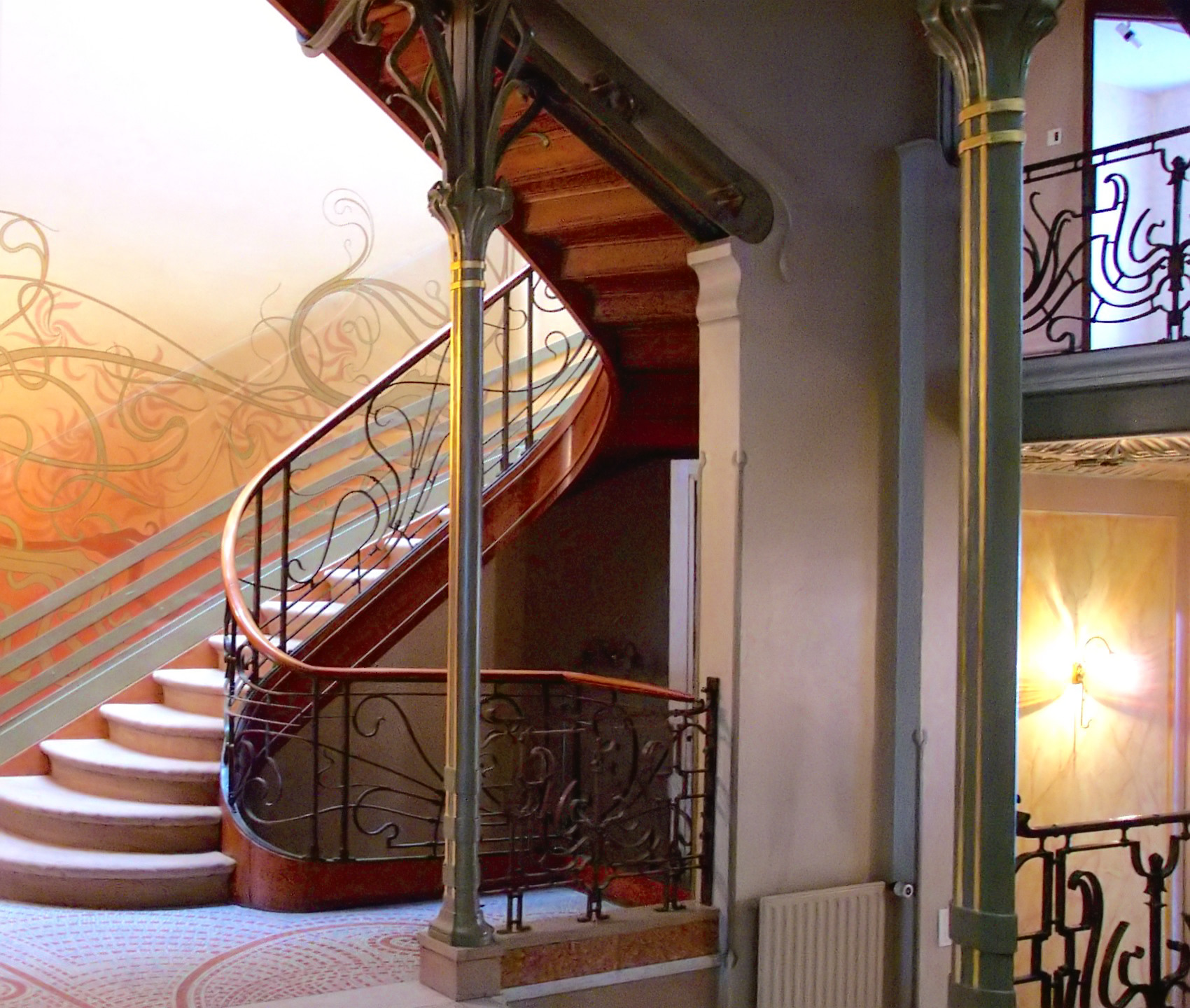
Victor Horta’s Tassel House in Brussels is one of the earliest examples of the Art Nouveau style. Horta designed the building’s architecture and every detail of the interior decoration and furnishings, making the house into a Gesamtkunstwerk, or total art work in multiple media. The repeated use of organically curved, undulating lines — often called whiplash lines — unifies the design, repeating in the floor tiles, wall painting, ironwork, and even in the structure of the spiraling staircase and surging entryways.
A modern style using modern materials
Art Nouveau artists and designers created a completely new style of decoration, rejecting the widespread nineteenth-century practice of copying historical, and especially Classical and Medieval, forms. While each designer invented their own decorative motifs, organic, often plant-based, forms and the whiplash line became hallmarks of Art Nouveau design, appearing in multiple media and contexts.
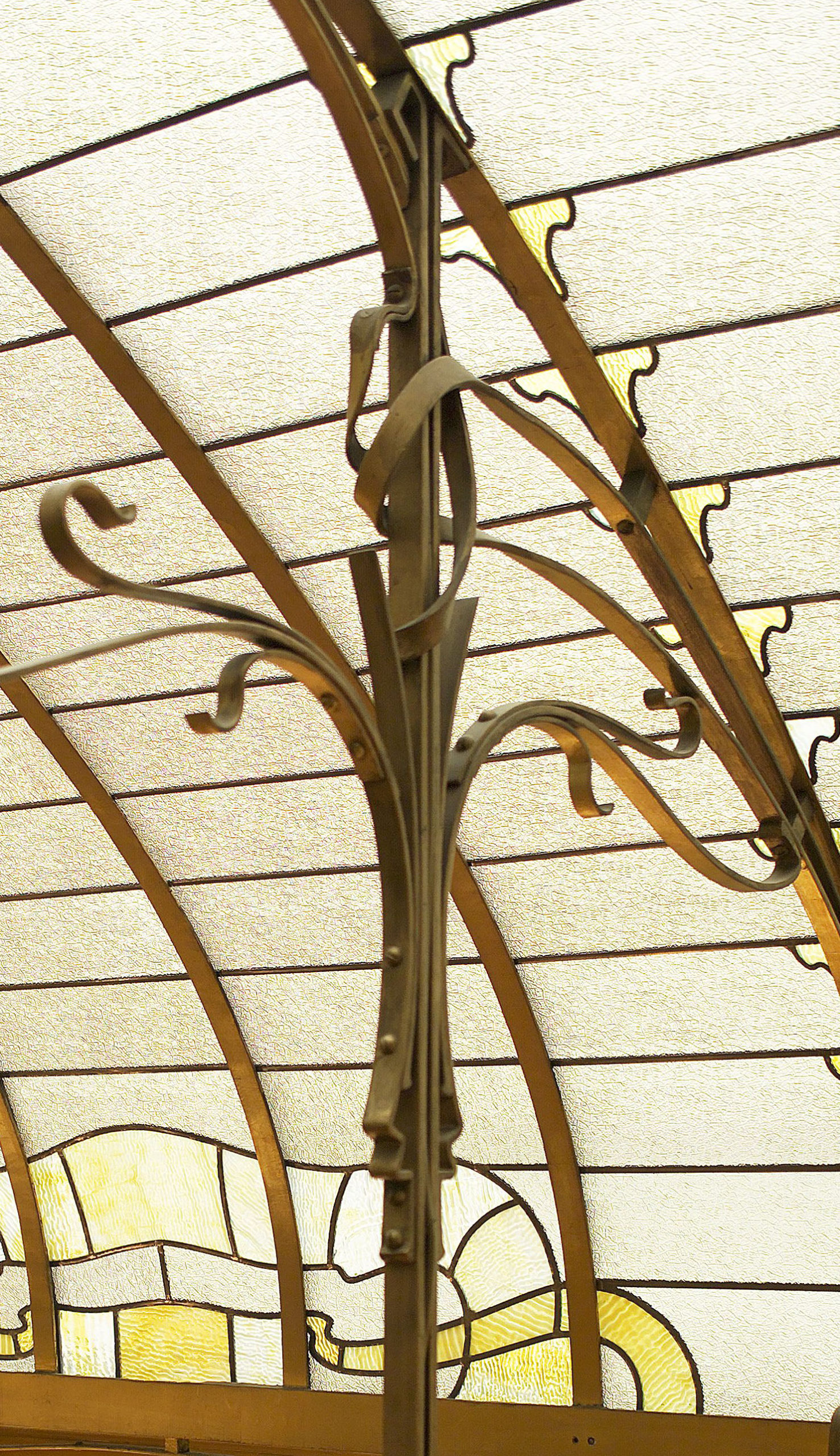
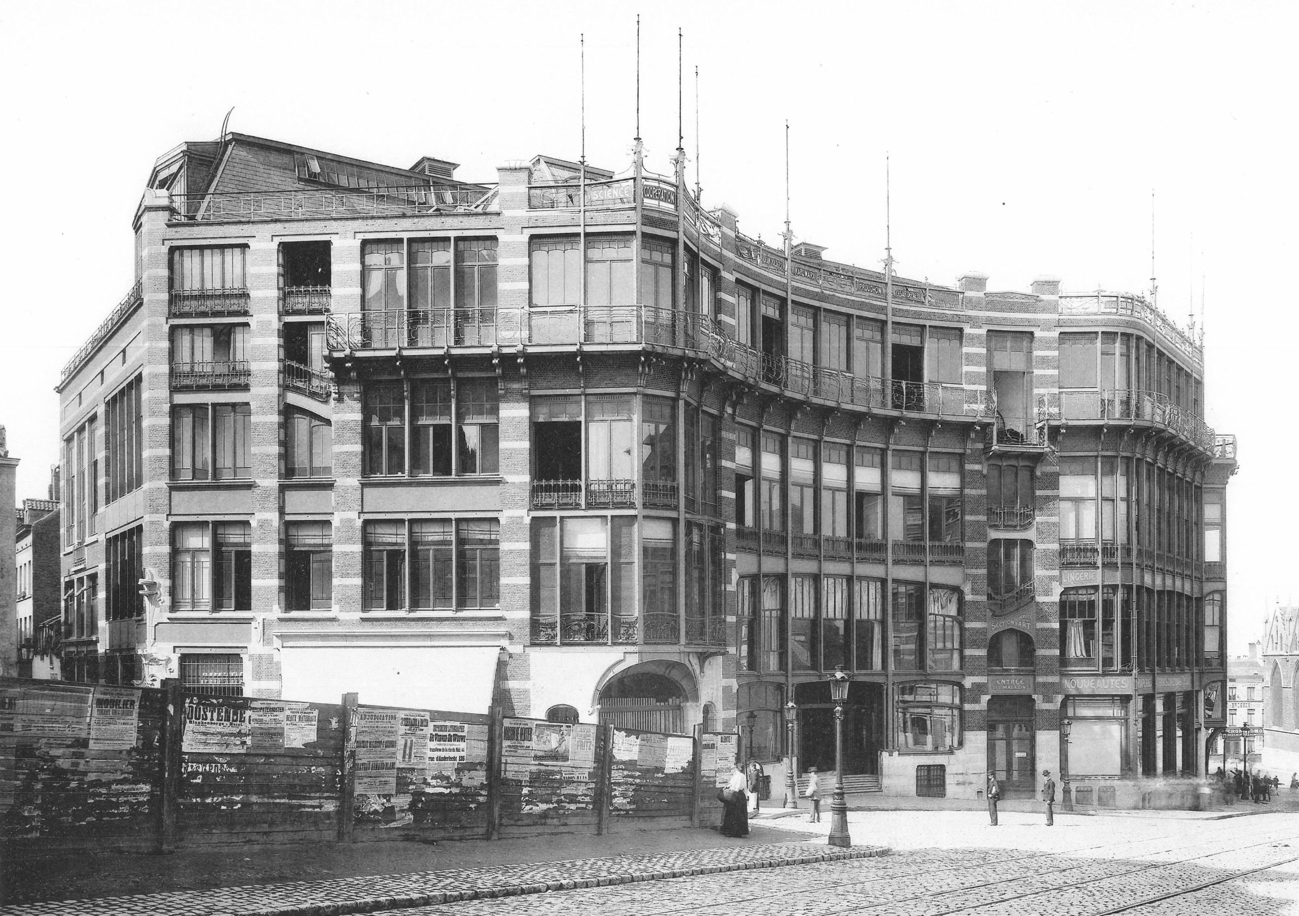
Art Nouveau architects and designers also embraced modern building materials, notably cast iron. Cast iron is both stronger and more flexible than traditional wood or stone and allows for much thinner supports, like the slender columns in Horta’s own house. Iron support structures also made it possible to create curved facades with large windows, which became prominent elements in many Art Nouveau buildings, including Horta’s Maison du Peuple.
An international style
Art Nouveau is only one of many names given to this international fin-de-siècle style, which had many regional variations. The term (French for “New Art”) derives from La Maison de L’Art Nouveau, the Paris art gallery run by Siegfried Bing, who was a major promoter of the new style, as well as of Japonisme and the Nabis. In addition to marketing individual objects, Bing commissioned artists and designers to create model rooms in his gallery to display Art Nouveau ensembles that included furniture, wallpaper, carpets, and paintings.
In addition to Paris, major centers of the modern fin-de-siècle style included Brussels, Glasgow, Munich (where it was known as Jugendstil or Youth Style), and Vienna (where it was called Secession Style). Barcelona’s Catalan Modernism, especially Antoní Gaudí‘s architecture and decorative designs, is also closely related to Art Nouveau.
Luxury design for the masses
French Art Nouveau was linked to government-supported efforts to expand the decorative arts and associated craft industries. Private residences and luxury objects were the focus for many Art Nouveau designers, including Emile Gallé, who made both decorative glass and furniture. Despite the close association of Art Nouveau with luxury items, the style is also apparent in urban design, public buildings, and art for the masses. Horta’s Maison du Peuple was the center for the socialist Belgian Workers’ Party, and among the most famous examples of Art Nouveau style are Hector Guimard’s entrances to the Paris Metro, the city’s new public transportation system.
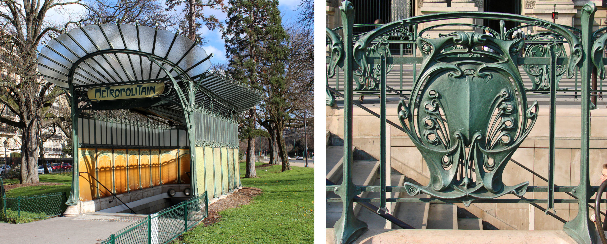
Like Horta’s designs for the Tassel House, Guimard used cast iron and invented stylized motifs based on plant forms. Industrially fabricated in modular units, the cast iron was relatively cheap, but it was painted green to resemble oxidized copper, a much more expensive material that adds a sense of luxury to the elaborate entrances. The use of modules made it possible to individualize each station while maintaining stylistic unity throughout the city.
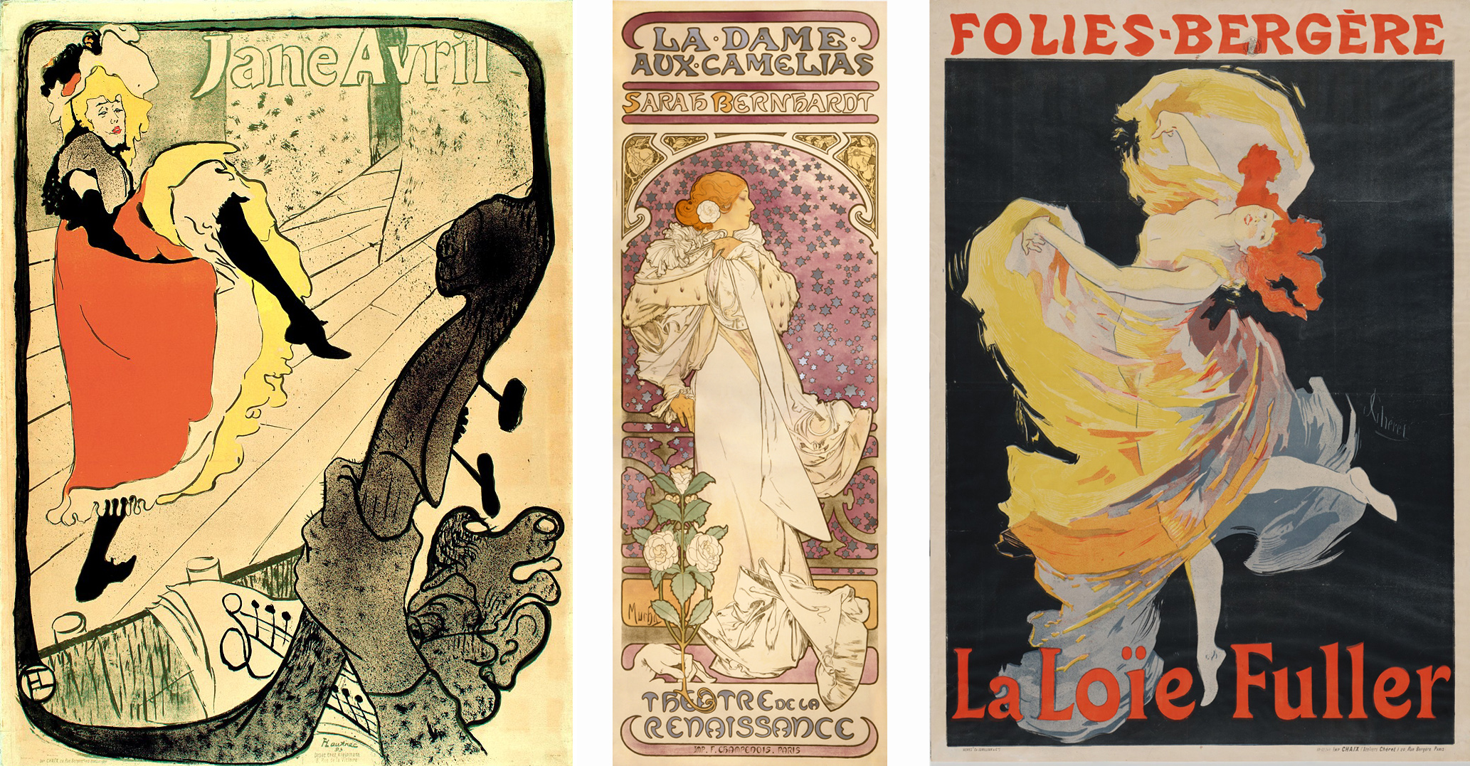
Art Nouveau designs were also widely visible in the advertising posters that decorated Paris. Henri de Toulouse-Lautrec, Alphonse Mucha, and Jules Chéret depicted famous fin-de-siècle performers such as Jane Avril, Sarah Bernhardt, and Loïe Fuller. Their posters stylized the female body and used sinuous whiplash lines, decorative plant forms, and flattened abstract shapes to create vivid decorative images.
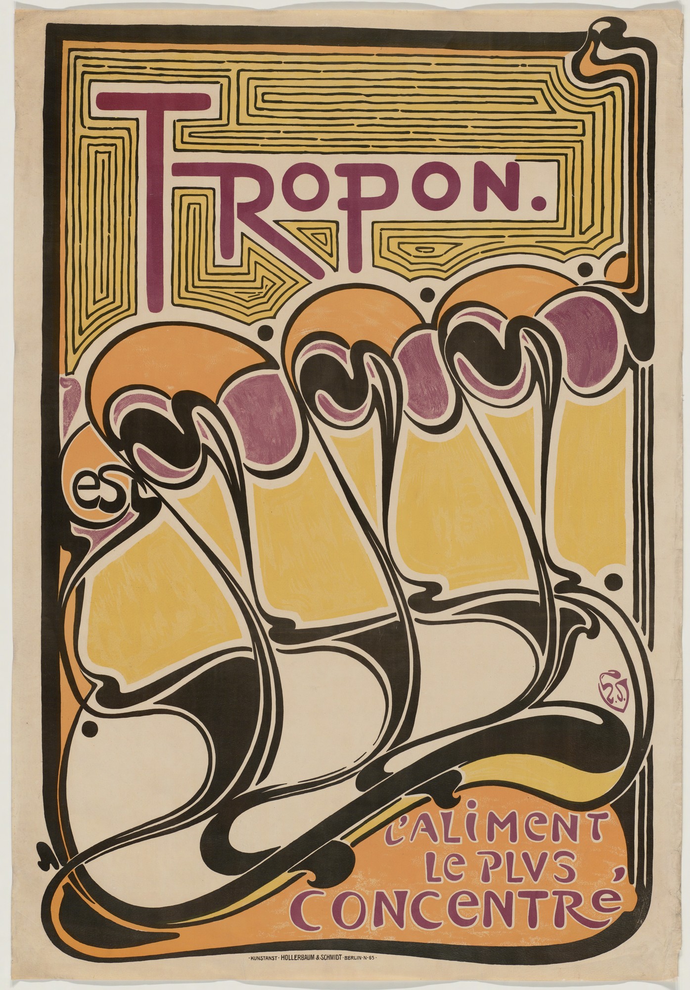
In a poster for the nutritional supplement Tropon, Henry van de Velde explored the decorative and suggestive potential of non-representational forms, using the whiplash line to create an abstract design of organic shapes that suggest both plant-like growth and dancing figures in the rising diagonal of repeated forms.
A holistic approach
Van de Velde worked in many different media, designing buildings, interiors, furniture, and decorative objects as well as posters. In the Continental Havana Company building in Berlin he used sinuous curves to integrate the shelving, doorways, alcoves, furniture, and walls into a unified organic whole.
The English designer William Morris and the English Arts and Crafts Movement that he initiated were a key influence on van de Velde and many other designers associated with Art Nouveau. Morris promoted a holistic approach to interior decoration as well as advocating for the social importance of design and high quality craftwork. In 1907 van de Velde founded the School of Arts and Crafts in Weimar, Germany, which promoted similar values. It later became the famous modern art and design school, the Bauhaus, which maintained the tradition of integrating art, craft, and design for the improvement of society.
Glasgow style
Curving whiplash lines are a common characteristic of French and Belgian Art Nouveau, but architects and artists working in Glasgow developed a more rectilinear style exemplified by the Willow Tea Room. Charles Rennie Mackintosh and Margaret Macdonald designed every component of the tea room, including the architecture, stained glass, decorative panels, furniture, cutlery, and staff uniforms. In keeping with Art Nouveau artists elsewhere they developed original stylized design motifs based on plant forms, but theirs were rigidly contained within elongated rectangles rather than expanding into supple curves.
Vienna Secession style
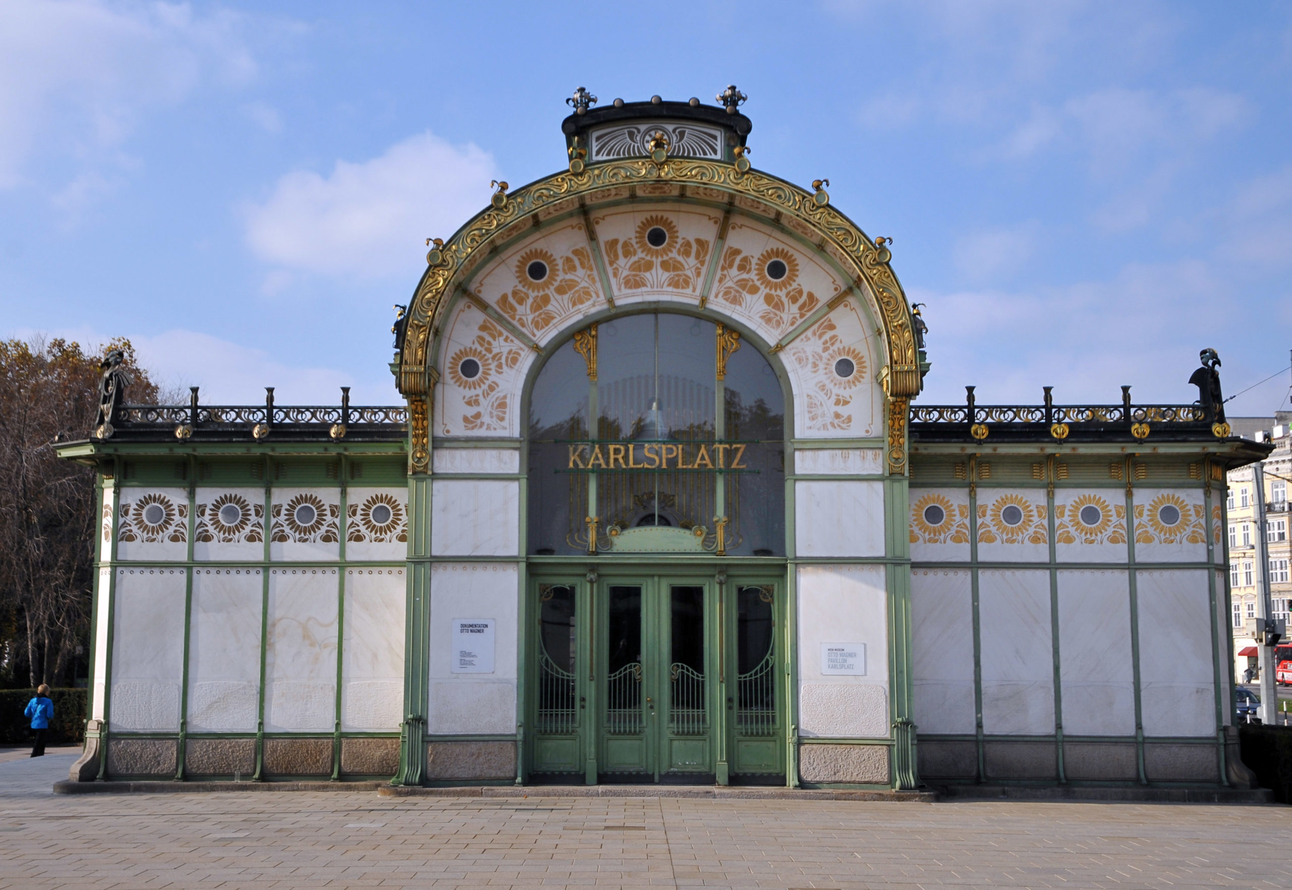
The Viennese Secession style also combined strict geometric forms with stylized organic decoration. Like Guimard’s entrances to the Paris Metro, Otto Wagner’s stations for Vienna’s public transportation system displayed the city’s modernity and wealth in their iron construction and their luxurious gold sunflower-motif decoration.
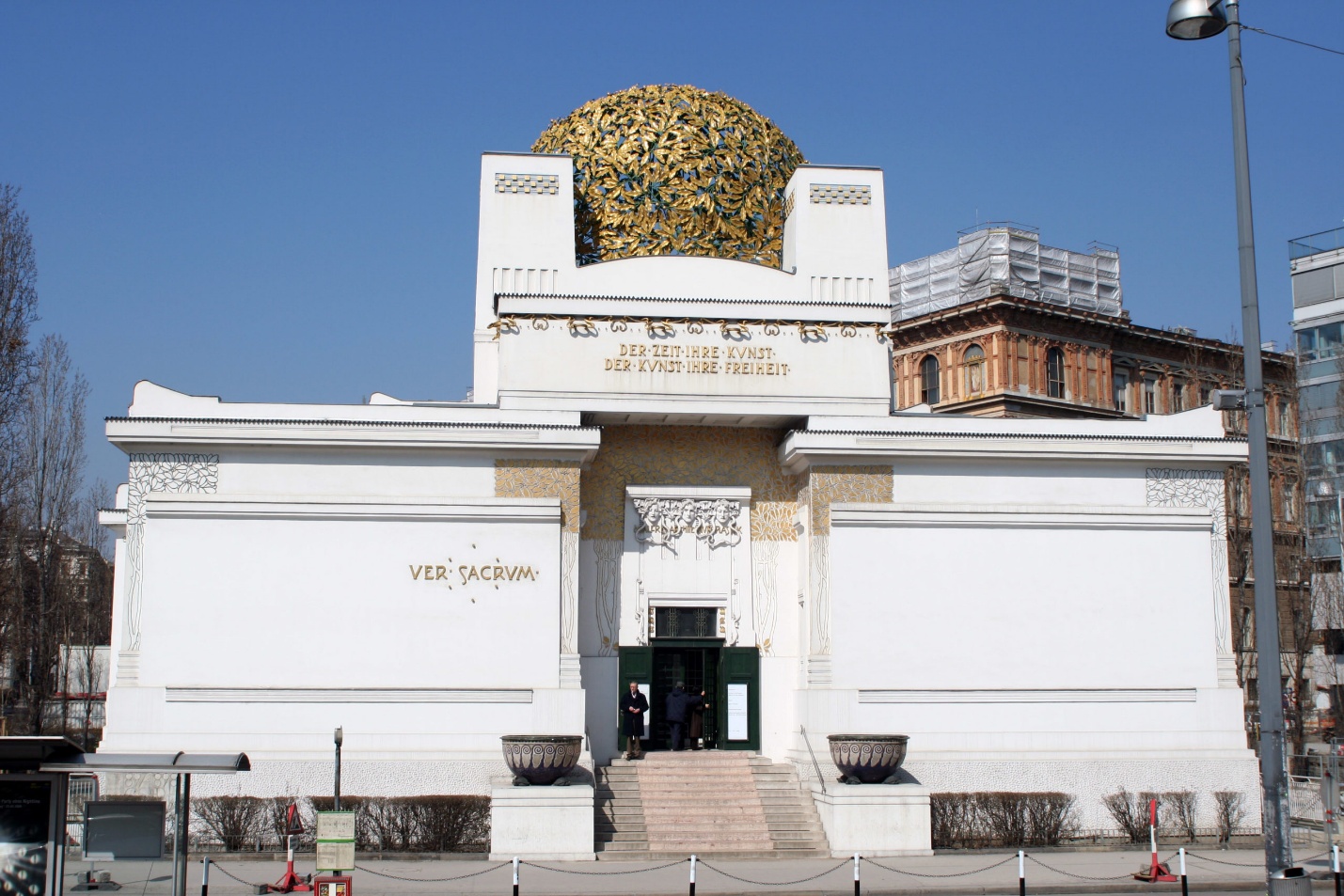
Joseph Maria Olbrich’s Secession Building proclaimed the goals of the rebellious group of artists who seceded from the Austrian art establishment in order to embrace avant-garde modern art. They displayed their work inside Olbrich’s building as well as hosting international exhibitions of modern art. The stylized decoration of the building is based on plant forms, while the structure emphasizes the harmonious balance of basic geometric shapes.
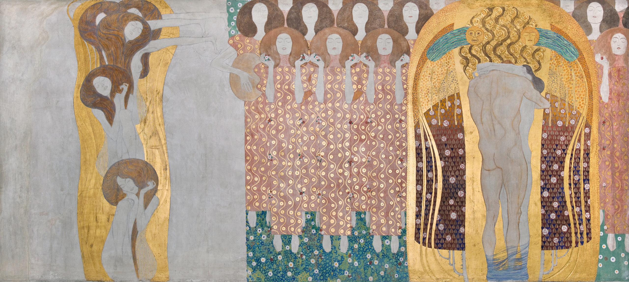
The leader of the Vienna Secession, Gustav Klimt, decorated the interior walls of the main exhibition hall with a long decorative mural dedicated to Ludwig von Beethoven. The Beethoven Frieze combines naturalistic representation of the human body, stylized figures, and complex abstract patterns in a variety of materials. Gold leaf and semi-precious stones enhance the decorative quality of the surface, making it a dramatic union of luxurious ornament and figurative painting.
Art Nouveau was fashionable for only a brief period around the year 1900, but the movement was part of a long-term modern trend that rejected historicism and Academicism and embraced new materials and original forms. In the modern period artists and designers increasingly recognized that the health and well-being of society and all its members were supported and enhanced by well-designed objects, buildings, and spaces. The unified designs of Art Nouveau presaged the innovations of the Bauhaus as well as architects such as Frank Lloyd Wright and Le Corbusier.
Architecture in the Post-Impressionist Period: Gustave Eiffel, The Eiffel Tower
An engineer whose early work was centered on bridge manufacture, Gustave Eiffel would tackle increasingly ambitious and demanding projects. An icon of Paris, the Eiffel Tower exhibits the achievements of engineering and science in late 19th-century France.
Sculpture in the Post-Impressionist Period: Auguste Rodin, The Gates of Hell
Who decides when a work of art is finished? An initial reaction may have you saying that the answer is the artist, but what happens when the artist’s painting or sculpture goes against preconceived notions of what constitutes a “completed” work of art? Auguste Rodin, a French artist who worked in the late 19th and early 20th centuries, was more interested in rough, blemished representations of the human body than idealized forms. He painstakingly immersed himself in his projects, sometimes spending years in order to develop a work of art, regardless of the public’s response. His sculpture was often judged harshly by the public and by critics (sculpture was in some ways a more conservative tradition than was painting).
When the building that stood on what is now the site of the Musée d’Orsay in Paris was destroyed by fire during the Commune in 1871, plans were drawn up to replace it with a museum of decorative arts. Rodin won the competition to design a great set of doors for its entryway. Although the museum was never built, Rodin continued to work on the doors. They became an ongoing project; a grand stage for his sculptural ideas. It’s fitting that the plaster of this great unfinished sculpture, The Gates of Hell, is now on display at the d’Orsay, the former railway terminal that was built on this site instead of the museum of decorative arts and that, by lovely coincidence, was converted into one of the world’s great art museums.
The painting of Paul Cézanne, an introduction
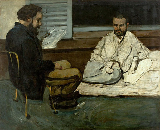
Categorizing the style of Paul Cézanne’s (Say-zahn) artwork is problematic. As a young man he left his home in Provence in the south of France in order to join with the avant-garde in Paris. He was successful, too. He fell in with the circle of young painters that surrounded Manet, he had been a childhood friend of the novelist, Emile Zola, who championed Manet, and he even showed at the first Impressionist exhibition, held at Nadar’s studio in 1874.
Out of place in Paris
However, Cézanne didn’t quite fit in with the group. Whereas many other painters in this circle were concerned primarily with the effects of light and reflected color, Cézanne remained deeply committed to form. Feeling out of place in Paris, he left after a relatively short period and returned to his home in Aix-en-Provence. He would remain in his native Provence for most of the rest of his life. He worked in the semi-isolation afforded by the country, but was never really out of touch with the breakthroughs of the avant-garde.
Working outdoors, but with a different purpose
Like the Impressionists, he often worked outdoors directly before his subjects. But unlike the Impressionists, Cézanne used color, not as an end in itself, but rather like line, as a tool with which to construct form and space. Ironically, it is the Parisian avant-garde that would eventually seek him out. In the first years of the 20th century, just at the end of Cézanne’s life, young artists would make a pilgrimage to Aix, to see the man who would change painting.

Influence
Paul Cézanne is often considered to be one of the most influential painter of the late 19th century. Pablo Picasso readily admitted his great debt to the elder master. Similarly, Henri Matisse once called Cézanne, “…the father of us all.” For many years The Museum of Modern Art in New York organized its permanent collection so as to begin with an entire room devoted to Cézanne’s painting. The Metropolitan Museum of Art also gives over an entire large room to him. Clearly, many artists and curators consider him enormously important.
Paul Cézanne, Mont Sainte-Victoire
Paul Cézanne, The Basket of Apples
In Jacques-Louis David’s Neoclassical era, still life was considered the least important subject type. Only minor artists bothered with what was then seen as the most purely decorative and trivial of painting subjects. The hierarchy of subjects went roughly from the most important—historical and religious themes (often very large in scale); to important—portraiture (usually of moderate scale); less important—landscape & genre (themes of common life, usually of modest scale); to least important—still life (generally small canvases).
A hopeless subject
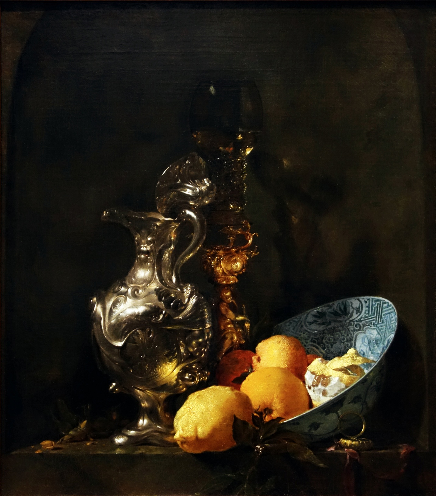
There had been one significant historical exception. In the 17th century in Northern Europe and particularly in the Netherlands, still life blossomed. But this period was brief and had little impact in France other than in the work of Jean Siméon Chardin. So why would Cézanne turn so often to this discredited subject?
It was the very fact that still life was so neglected that seems to have attracted Cézanne to it. So outmoded was the iconography (symbolic forms and references) in still life that this rather hopeless subject was freed of virtually all convention. Here was a subject that offered extraordinary freedom, a blank slate that gave Cézanne the opportunity to invent meaning unfettered by tradition. And Cézanne would almost single-handedly revive the subject of still life making it an important subject for Picasso, Matisse, and others in the 20th century.
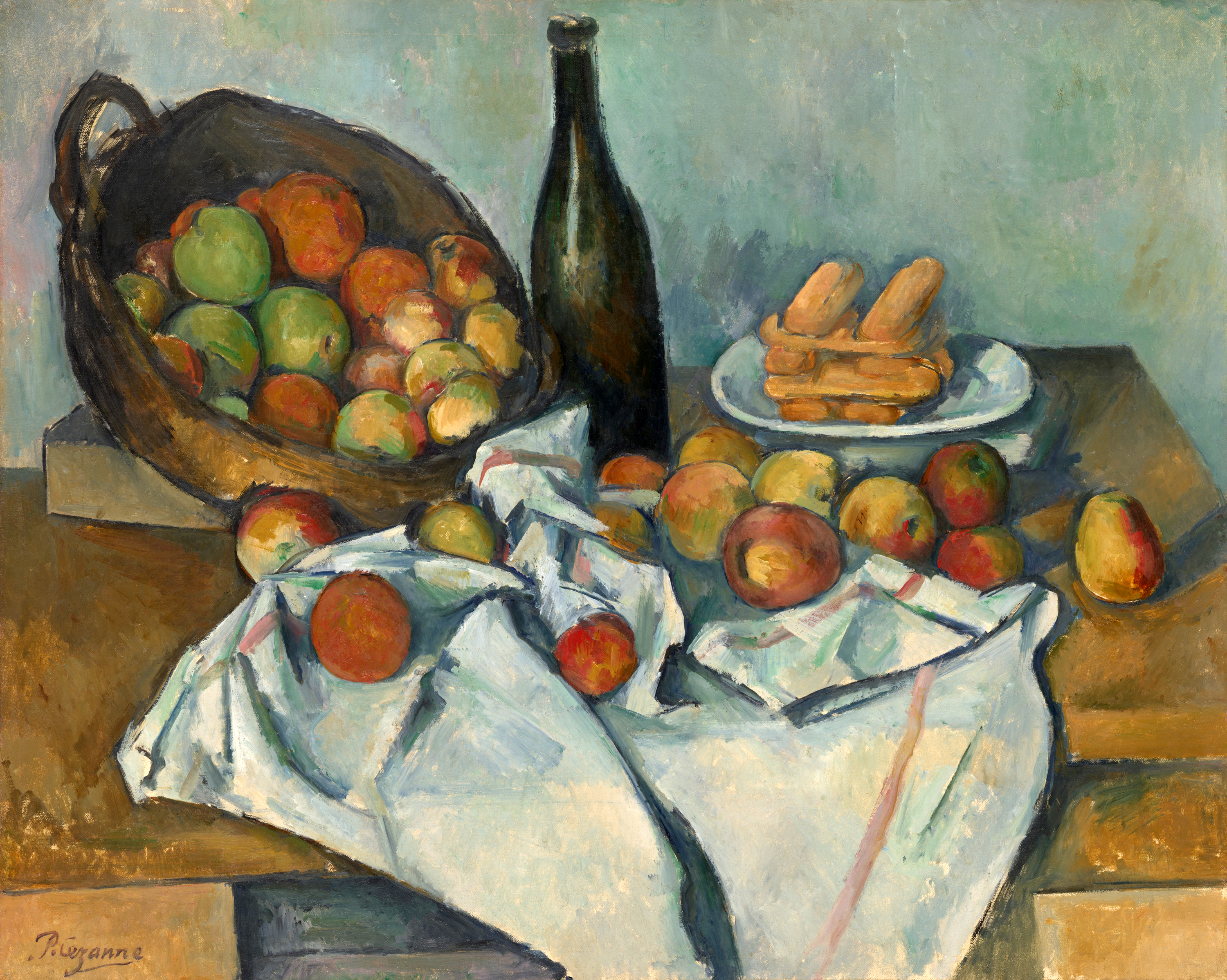
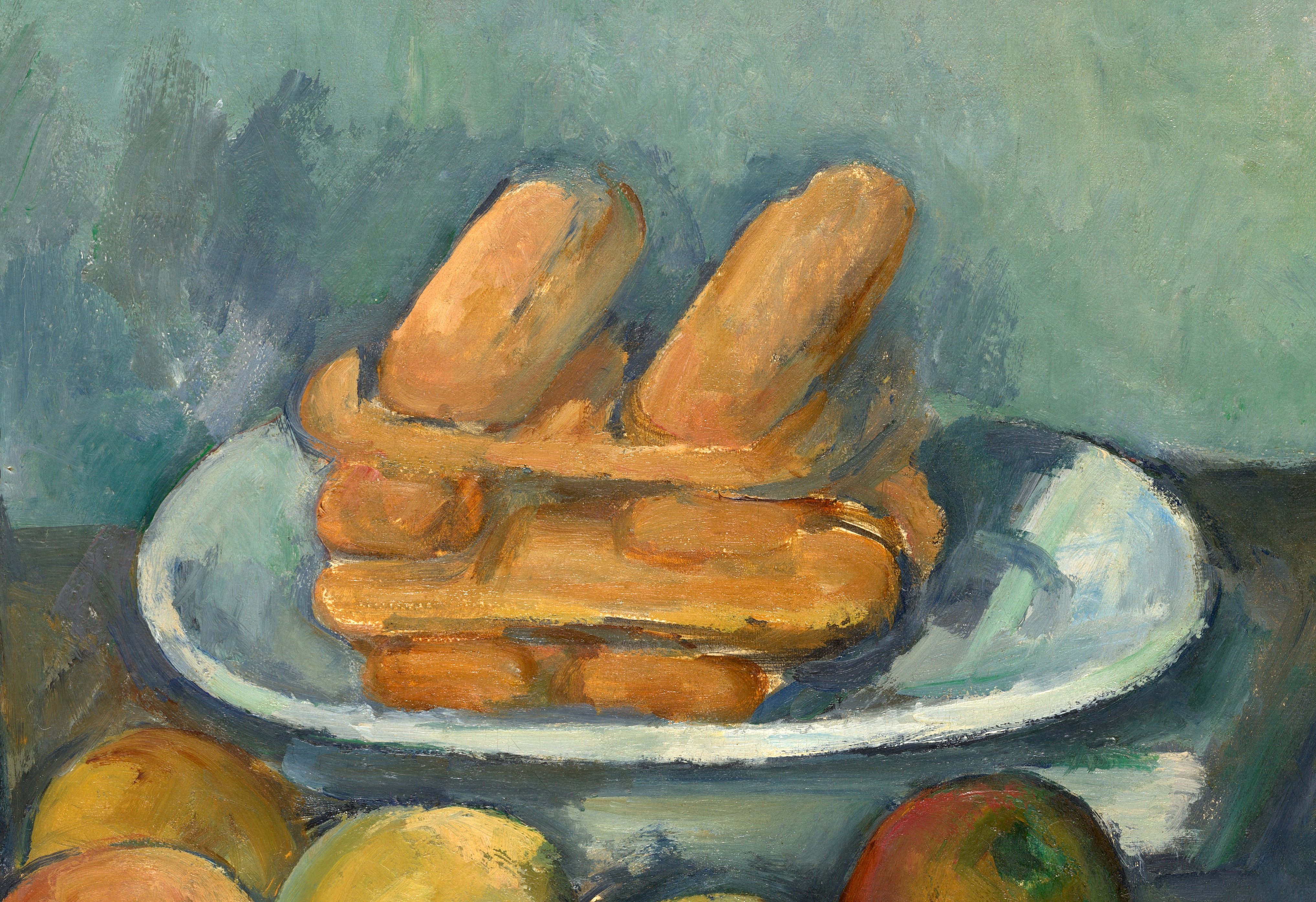
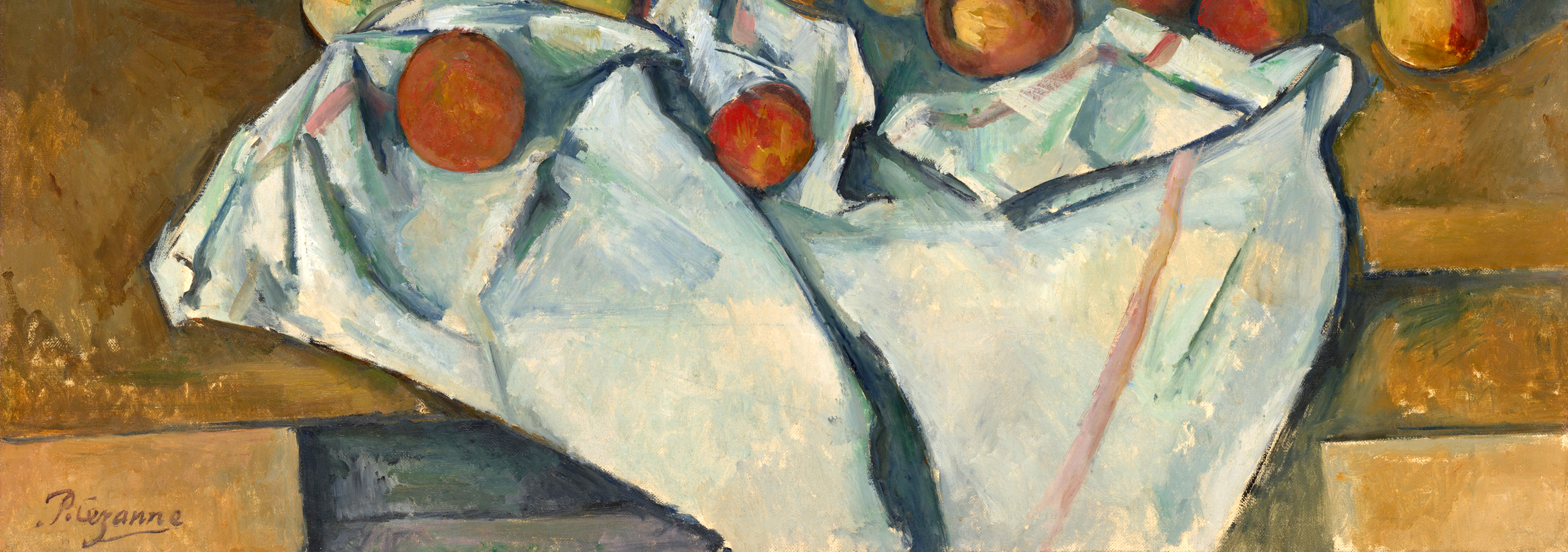
The image at the top of this page looks simple enough: a wine bottle, a basket tipped up to expose a bounty of fruit inside, a plate of what are perhaps stacked cookies or small rolls, and a tablecloth both gathered and draped. Nothing remarkable, at least not until one begins to notice the odd errors in drawing. Look, for instance, at the lines that represent the close and far edge of the table. I remember an old student of mine remarking to the class, “I would never hire him as a carpenter!” What she had noticed was the odd stepping of a line that we expect to be straight.
Purposeful errors
But that is not all that is wrong. The table seems to be too steeply tipped at the left, so much so that the fruit is in danger of rolling off it. The bottle looks tipsy and the cookies are very odd indeed. The cookies stacked below the top layer seem as if they are viewed from the side, but at the same moment, the two on top seem to pop upward as if we were looking down at them. This is an important key to understanding the questions that we’ve raised about Cézanne’s pictures so far.
Like Édouard Manet, from whom he borrowed so much, Cézanne was prompted to rethink the value of the various illusionistic techniques that he had inherited from the masters of the Renaissance and Baroque eras. This was due in part to the growing impact of photography and its transformation of modern representation. While Edgar Degas and Claude Monet borrowed from the camera the fragmenting of time, Cézanne saw this mechanized segmentation of time as artificial and at odds with the perception of the human eye. By Cézanne’s era, the camera did shatter time into fragments as do non-digital cameras that can be set so that the shutter is open to light for only 1/1000 of a second.
Sight and memory
Cézanne pushed this distinction between the vision of the camera and of human vision. He reasoned that the same issues applied to the illusionism of the old masters, of Raphael, Leonardo, Caravaggio, etc. For instance, think about how linear perspective works. Since the Early Renaissance, constructing the illusion of space required that the artist remain frozen in a single point in space in order to maintain consistent recession among all receding orthogonals. This frozen vantage point belongs to both the artist and then the viewer. But is it a full description of the experience of human sight? Cézanne’s still life suggests that it is not.
If a Renaissance painter set out to render Cézanne’s still life objects (not that they would, mind you), that artist would have placed himself in a specific point before the table and taken great pains to render the collection of tabletop objects only from that original perspective. Every orthogonal line would remain consistent (and straight). But this is clearly not what Cézanne had in mind. His perspective seems jumbled. When we first look carefully, it may appear as if he was simply unable to draw, but if you spend more time, it may occur to you that Cézanne is, in fact, drawing carefully, although according to a new set of rules.
Seemingly simple, Cézanne’s concern with representing the true experience of sight had enormous implications for 20th-century visual culture. Cézanne realized that unlike the fairly simple and static Renaissance vision of space, people actually see in a fashion that is more complex, we see through both time and space. In other words, we move as we see. In contemporary terms, one might say that human vision is less like the frozen vision of a still camera and more akin to the continuous vision of a video camera—except that Cézanne worked with oil on canvas which dries and becomes static.
Purposeful destruction
So very tentatively, Cézanne began the purposeful destruction of the unified image. Look again at the cookies, or whatever they are, stacked upon the plate in the upper right. Is it possible that the gentle disagreements that we noted result from the representation of two slightly different viewpoints? These are not large ruptures, but rather, they suggest careful and tentative discovery. It is as if Cézanne had simply depicted the bottom cookies as he looked across at them and then as he looked more slightly down at the top cookies after shifting his weight to his forward leg. Furthermore, I’m not sure that he was all that proud of these breaks that allow for more than a single perspective. Look, for instance, at the points where the table must break to express these multiple perspectives and you will notice that they are each hidden from view. Nevertheless, in doing this, Cézanne changed the direction of painting.
Conclusion
The late 19th century was a dynamic period. The use of modern materials in architecture (Eiffel Tower) and design (Art Nouveau) was introduced. Artists, like Seurat, experimented with the scientific capabilities of color while other artists, such as Gauguin and van Gogh, explored the spiritual and emotional possibilities of color. Cézanne questioned the traditional technique of linear perspective as truthful, experimented with multiple perspectives in rendering pictorial space, and began to collapse the picture plane. Post-Impressionism was a revolutionary era. The concepts and techniques introduced by Post-Impressionism became the foundation for all Modern Art.
Citation and Licensing
The following sections were written by Chelsea Wright and licensed CC BY-NC-SA 4.0:
- Chapter Overview and Introduction
- Focus artwork and term list compiled by Chelsea Wright
- Conclusion
The following articles from Smarthistory licensed CC BY-NC-SA 4.0 were remixed and adapted for the chapter:
- Dr. Charles Cramer and Dr. Kim Grant, “Neo-Impressionism part I, an introduction,” in Smarthistory, April 15, 2020.
- Dr. Charles Cramer and Dr. Kim Grant, “Neo-Impressionism part II, an introduction,” in Smarthistory, April 15, 2020.
- Dr. Steven Zucker and Dr. Beth Harris, “Georges Seurat, A Sunday on La Grande Jatte – 1884,” in Smarthistory, December 4, 2015.
- Dr. Charles Cramer and Dr. Kim Grant, “Neo-Impressionist Color Theory,” in Smarthistory, April 15, 2020.
- Dr. Steven Zucker and Dr. Beth Harris, “Paul Gauguin, Vision after the Sermon(or Jacob Wrestling with the Angel),” in Smarthistory, December 11, 2015.
- Dr. Charles Cramer and Dr. Kim Grant, “The Pont-Aven School and Synthetism,” in Smarthistory, June 29, 2020.
- Dr. Charles Cramer and Dr. Kim Grant, “The Nabis and Symbolism,” in Smarthistory, June 14, 2020.
- Smarthistory, “Vincent van Gogh,” in Smarthistory.
- Dr. Beth Harris and Dr. Steven Zucker, “Vincent van Gogh, The Potato Eaters,” in Smarthistory, January 8, 2020.
- Dr. Noelle Paulson, “Vincent van Gogh, The Starry Night,” in Smarthistory, August 9, 2015.
- Smarthistory, “Edvard Munch,” in Smarthistory.
- Dr. Noelle Paulson, “Edvard Munch, The Scream,” in Smarthistory, August 9, 2015.
- Smarthistory, “Vienna Secession,” in Smarthistory.
- Smarthistory, “Guxave Klimt,” in Smarthistory.
- Dr. Steven Zucker and Dr. Beth Harris, “Gustav Klimt,The Kiss,” in Smarthistory, December 5, 2015.
- Dr. Charles Cramer and Dr. Kim Grant, “Art Nouveau,” in Smarthistory, June 14, 2020.
- Elisabeth Rowney, “Auguste Rodin, The Walking Man,” in Smarthistory, September 10, 2016.
- Dr. Beth Harris and Dr. Steven Zucker, “Auguste Rodin, The Gates of Hell,” in Smarthistory, November 23, 2015.
- Smarthistory, “Gustave Eiffel,” in Smarthistory.
- Dr. Beth Harris and Dr. Steven Zucker, “Gustave Eiffel, The Eiffel Tower,” in Smarthistory, January 9, 2026.
- Dr. Beth Harris and Dr. Steven Zucker, “The painting of Paul Cézanne, an introduction,” in Smarthistory, August 9, 2015.
- Dr. Ben Harvey, “Paul Cézanne, Mont Sainte-Victoire,” in Smarthistory, August 9, 2015.
- Dr. Beth Harris and Dr. Steven Zucker, “Paul Cézanne, The Basket of Apples,” in Smarthistory, August 9, 2015.
- Félix Fénéon, “Les Impressionnistes en 1886,” as translated in Linda Nochlin, ed., Impressionism and Post-Impressionism, 1874-1904: Sources and Documents (Englewood Cliffs, N.J.: Prentice-Hall, 1966), p. 108. ↵
- Paul Signac, From Eugène Delacroix to Neo-Impressionism (1899), as translated in Nochlin, ed., p. 122. ↵
- Paul Signac, From Eugene Delacroix to Neo-Impressionism, as translated in Linda Nochlin, editor, Impressionism and Post-Impressionism, 1874–1904: Sources and Documents (Englewood Cliffs, N.J.: Prentice-Hall, 1966), 121. ↵
- Henri Fèvre, “L’Exposition des Impressionnistes,” in Étude sur le Salon de 1886 et sur l’exposition des impressionnistes (Paris, 1886), p. 43 (our translation). ↵
- Paul Signac, “Impressionists and Revolutionaries,” La Révolte, June 13-19, 1891, as translated in Nochlin, ed., p. 124. ↵
- ibid., p. 124. ↵
- Maurice Denis, “Definition of neo-traditionism” (1890), in Jean-Paul Bouillon, ed., Le Ciel et l’arcadie (Paris: Hermann, 1993), p. 5 (authors’ translation). ↵



,_oil_on_canvas,_185_x_152_cm,_Mus%C3%A9e_d%27Orsay.jpg)
_-_IMG_7171.JPG)


,_oil_on_canvas,_41_x_32.5_cm,_Mus%C3%A9e_d%27Orsay.jpg)


.jpg)
_(destroyed,_Brussels),_exterior_3_(cropped).jpg)
.jpg)
,_1898_(CH_18707967).jpg)


