
Northern European Baroque
Chapter Overview and Introduction
The Baroque style extended beyond Italy for a stylistic variation in Northern Europe, particularly in Flanders and the Netherlands. The historical context of the Reformation and Counter-Reformation continued to shape the artwork produced in these regions. As each region established its religious identity (Catholic or Protestant), such designation actively shaped the patronage, subject matter, and size/scale of artworks commissioned and created. Territories that sided with the new Protestant Reformation, such as the Netherlands in Northern Europe, developed a regional variation in the Baroque that emphasized a new range of subject matter. Territories that remained loyal to the Catholic Church in the Counter Reformation, such as Italy and Flanders, emphasized an entirely different purpose for art. The chapter explores the religious and corresponding artistic divisions that dominated the Baroque style.
Focus Artworks
- Peter Paul Rubens, Elevation of the Cross, 1610, oil on wood
- Rembrandt van Rijn, The Night Watch (Militia Company of District II under the Command of Captain Frans Banninck Cocq), 1642, oil on canvas
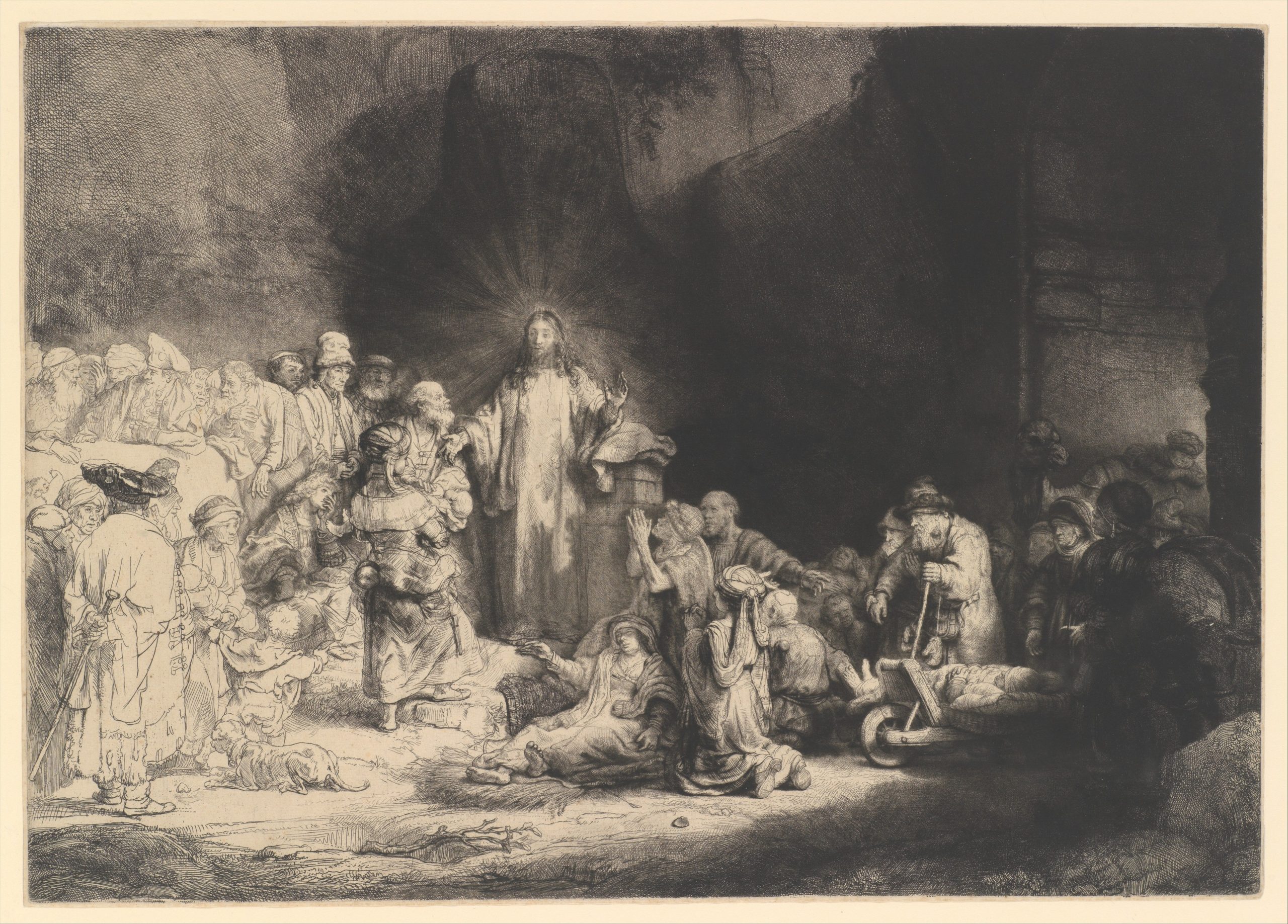
- Rembrandt van Rijn, The Hundred Guilder Print, c. 1649, etching, engraving, and drypoint; second state of two
- Rembrandt van Rijn, Self-Portrait, 1659, oil on canvas
- Johannes Vermeer, Young Woman with a Water Pitcher, c. 1662, oil on canvas
- Johannes Vermeer, Girl with a Pearl Earring, c. 1665, oil on canvas
- Rachel Ruysch, Flower Still Life, c. 1726, oil on canvas
Term List
- Counter-Reformation
- Reformation
- Protestant
- Protestant Iconoclasm
- Triptych
- Civic guard
- Etching
- Dry point
- States (as related to etching)
- Genre painting
- Tronie
- Still life
- Vanitas
The Catholic monarchs and their territories
The monarchs of Spain, Portugal, and France also embraced the more ornate elements of seventeenth-century art to celebrate Catholicism. In Spain and its colonies, rulers invested vast resources in elaborate church facades, stunning, gold-covered chapels and tabernacles, and strikingly realistic polychrome sculptures.
In the Spanish Netherlands, where sacred art had suffered terribly as a result of the Protestant iconoclasm (the destruction of art), civic and religious leaders prioritized the adornment of churches as the region reclaimed its Catholic identity. Refurnishing the altars of Antwerp’s churches kept Peter Paul Rubens’s workshop busy for many years. Europe’s monarchs also adopted this artistic vocabulary to proclaim their own power and status. Louis XIV, for example, commissioned the splendid buildings and gardens of Versailles as a visual expression of his divine right to rule.
Peter Paul Rubens, Elevation of the Cross
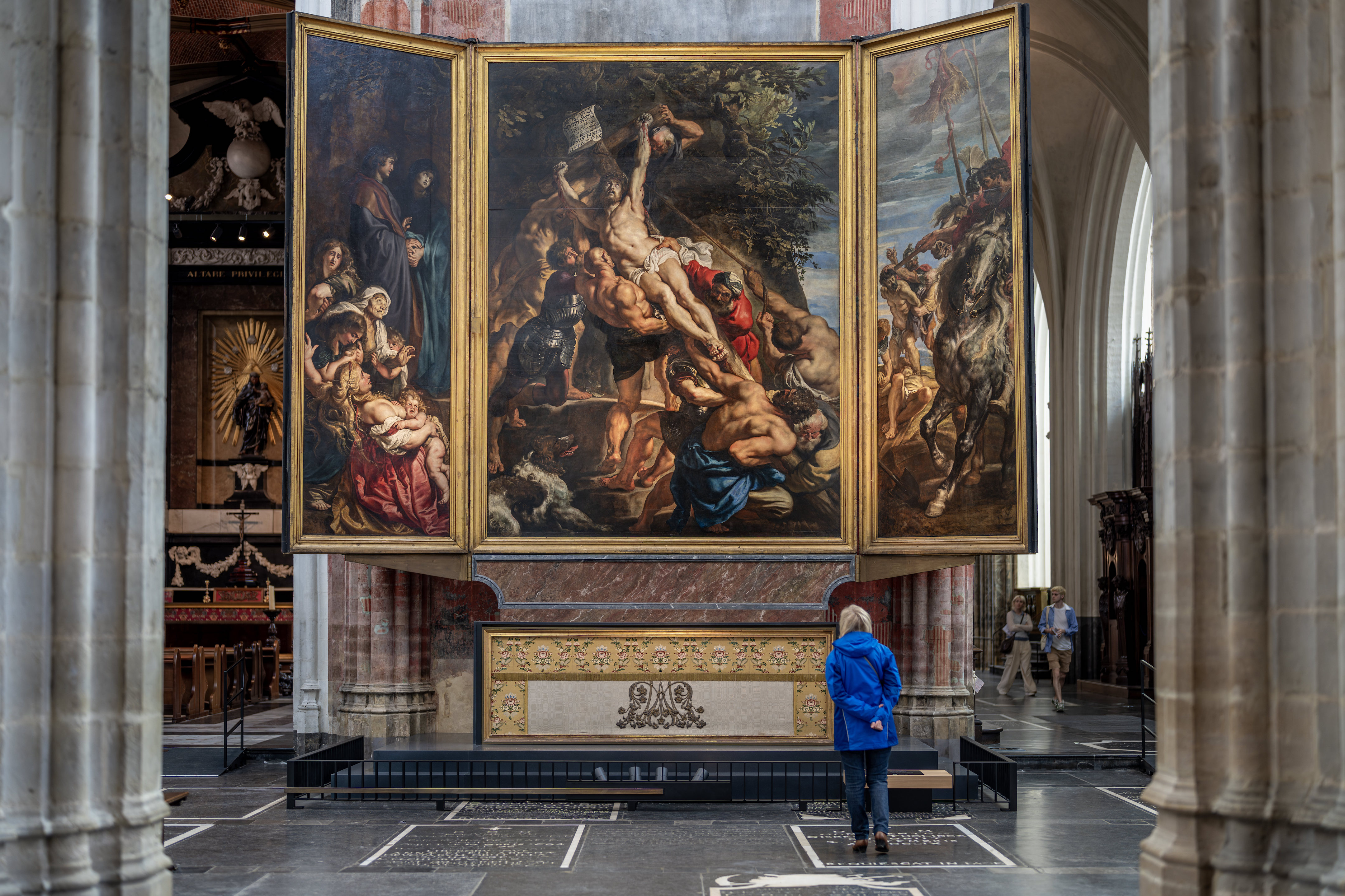
An enormous triptych
The Elevation of the Cross altarpiece is a masterpiece of Baroque painting by the Flemish painter Peter Paul Rubens. The work was originally installed on the high altar of the Church of St. Walburga in Antwerp (since destroyed), and is now located in the Cathedral of Our Lady in Antwerp.
This triptych (a painting—usually an altarpiece—comprised of two outer “wings” and a central panel) is impressive in its size, measuring 15 feet in height and 21 feet wide when open. The original frame, unfortunately lost, would have made the painting even more impressive in size! Due to its very size, Rubens actually painted it on-site behind a curtain. Four saints associated with the church of St. Walburga can be found on the exterior of the wings (visible when the altarpiece is closed): Saints Amandus and Walburga on the left and Saints Catherine of Alexandria and Eligius on the right.
Baroque dynamism
Rubens was one of the most prolific and sought after painters of the Baroque period, generally (although not always) defined in painting and sculpture by the representation of action and emotion in ways meant to inspire the Catholic faithful (this triptych was painted less than a century after Martin Luther’s challenge to the authority of the Catholic Church).
In the central panel, we see the dramatic moment when the cross of Christ’s crucifixion is being raised to its upright position. Rubens created a strong diagonal emphasis by placing the base of the cross at the far lower right of the composition and the top of the cross in the upper left—making Christ’s body the focal point. This strong diagonal reinforces the notion that this is an event unfolding before the viewer, as the men struggle to lift the weight of their burden.
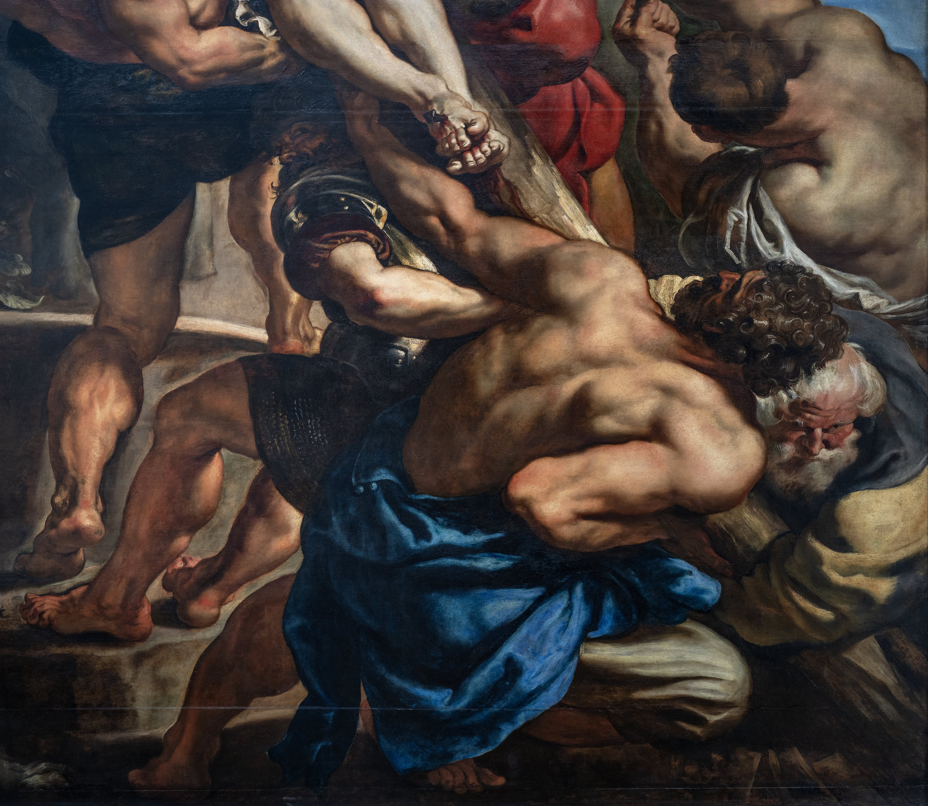
Adding to this dynamic tension is the visual sensation that the two men in the lower right are about to burst into the viewer’s space as they work to pull the cross upward (see image above). The viewer is caught in a moment of anxiety, waiting for the action to be complete.
In the left panel (below, left) are St. John the Evangelist and the Virgin Mary, who, standing in the shadow of the rocky outcrop above them, look to their left at what unfolds before their eyes. Shown in quiet resignation and grief over the fate of Christ, the group of women below is a stark contrast of overwrought emotion. Here too Rubens uses a diagonal along the line of the women from the lower right to the mid-left, setting John and Mary apart, allowing the viewer to focus on their reaction.
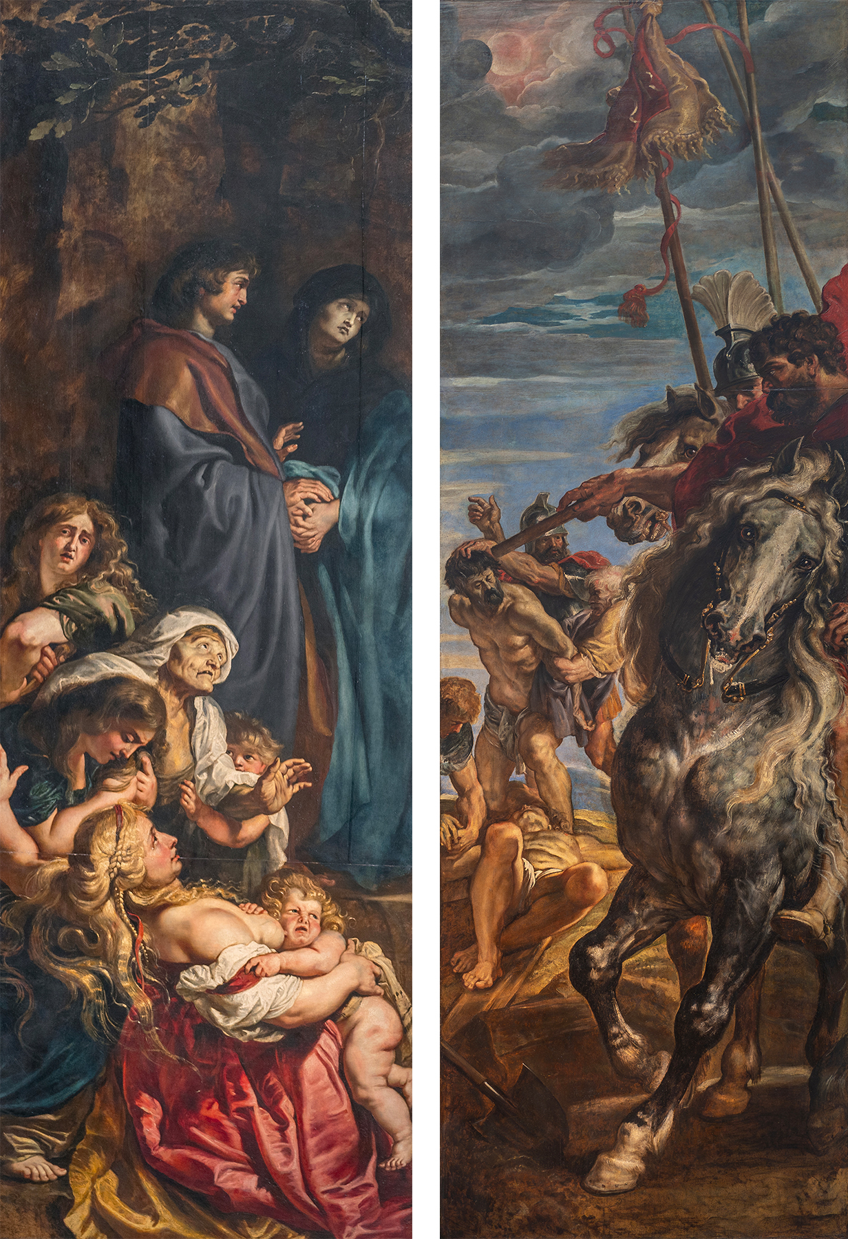
The right panel (above, right) continues the narrative event as Roman soldiers prepare the two thieves for their fate as they will be crucified alongside Christ. One thief—already being nailed to the cross on the ground—is foreshortened back into space, while the other—just behind him with his hands bound—is being forcefully led away by his hair. The diagonal Rubens created here runs the opposite direction as that in the left panel, moving from the lower left to the upper right along the line created by the leg and neck of the gray horse. These opposing diagonals further create tension across the composition, heightening the viewer’s sense of drama and chaotic action.
A unified narrative and biblical accuracy
In addition to the powerful figural composition, the three panels are visually unified through the landscape and sky. The left and central panels share a rocky outcropping covered with oak trees and vines (both of which have Christological significance). Notice that St. John, the Virgin Mary and the Roman soldiers just to the left of the cross are standing on the same ground-line.
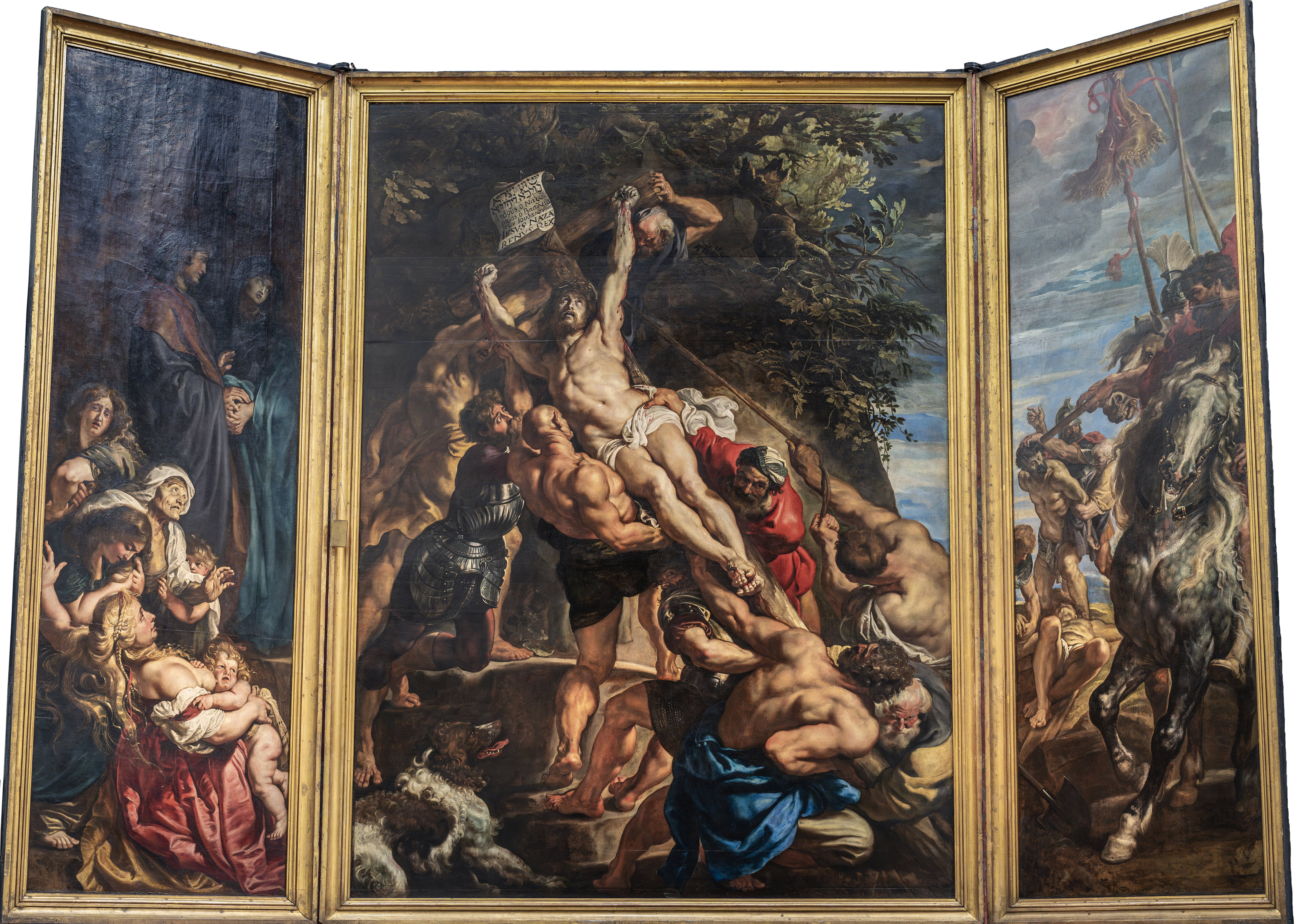
The unification of the central and right panels is accomplished through the sky, which begins to darken in the central panel, moving to the impending eclipse of the sun on the right, an event recounted in the Gospel of Matthew (27:45): “From noon on, darkness came over the whole land….” This attention to biblical accuracy is also seen in the text on the scroll at the top of the cross, which reads: “Jesus of Nazareth, King of the Jews,” written in Greek, Latin, and Aramaic, as told in the Gospel of John (19:19–21). In both cases, Rubens was adhering to one of the primary mandates of the Council of Trent (1545–63), which called for historical accuracy in the representation of sacred events (at the Council of Trent, church authorities essentially decided theological questions raised by Martin Luther and the Protestants, the period following the Council is known as the Counter-Reformation—the Catholic Church’s response to Martin Luther’s Protestant Reformation).
Rubens and a reflection of Italy
The Elevation of the Cross altarpiece was the first commission Rubens received after returning to Antwerp from his Italian sojourn from 1600 to 1608/9 where he worked in the cities of Mantua, Genoa, and Rome.
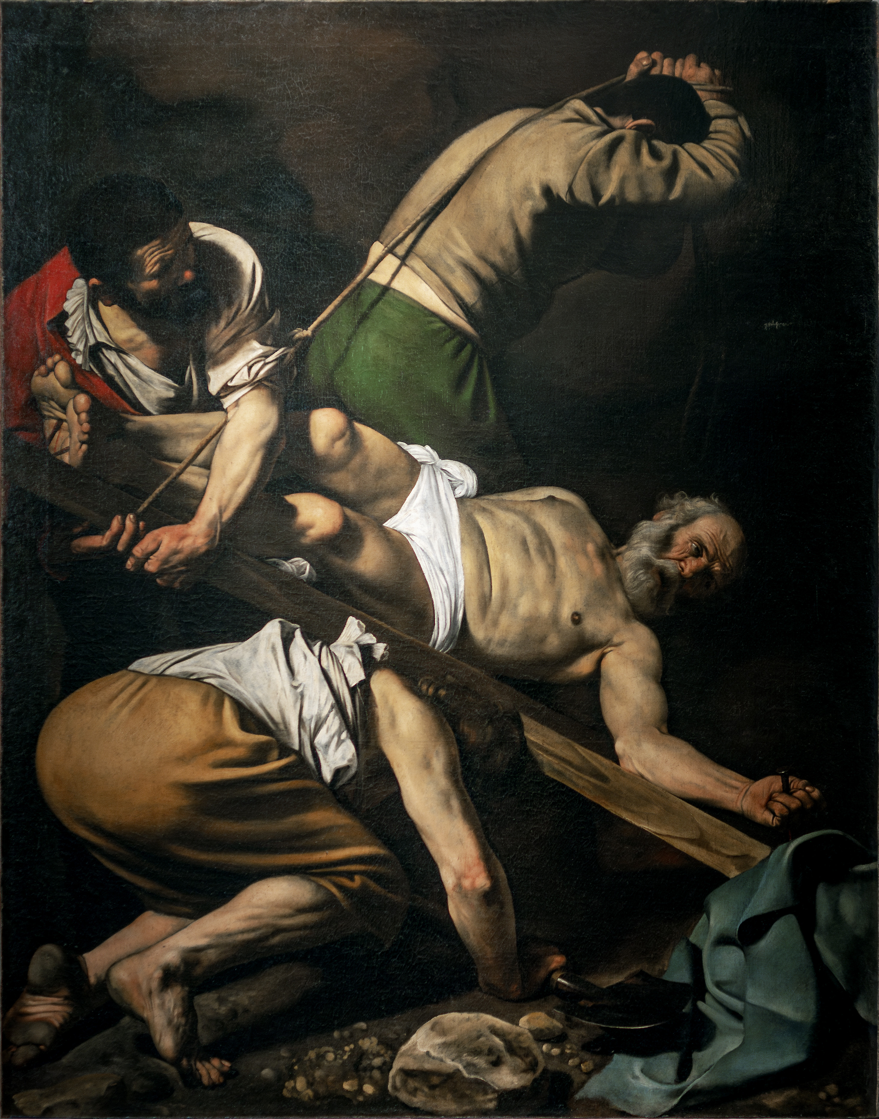
Given his extended time in Italy, it is not surprising that we see a number of Italian influences in this work. The richness of the coloration (notice the blues and reds throughout the composition) and Rubens’ painterly technique recalls that of the Venetian master Titian, while the dramatic contrasts of light and dark bring to mind Caravaggio’s tenebrism (darkness) in his Roman compositions, such as the Crucifixion of St. Peter. And indeed, we can clearly see Rubens’ interest in his Italian counterpart in the sense of physical exertion, the use of foreshortening—where figures push past the boundaries of the picture plane into the space of the viewer, and in the use of the diagonal.
In terms of the muscularity and physicality of Ruben’s male figures, a clear connection can be drawn to Michelangelo’s nude males (the ignudi) on the Sistine Chapel ceiling. In addition to looking at the works of past and contemporary masters, we know Rubens was also interested in the study of classical antiquity (ancient Greece and Rome). In fact, the figure of Christ seems to have been based on one of the most famous works of antiquity, the Laocoön, which Rubens made drawings of during his time in Rome.
Elevation: altarpiece and high altar
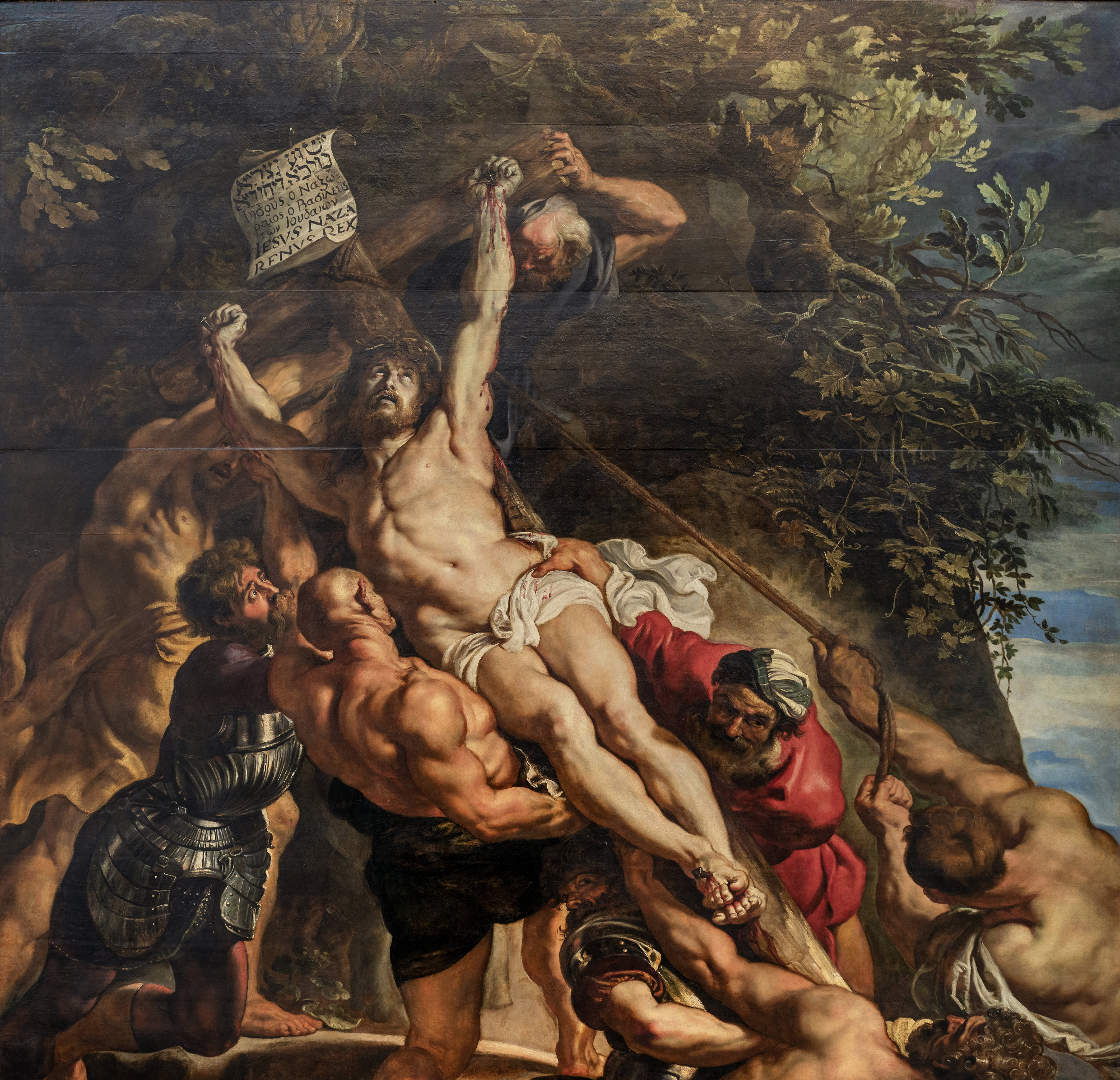
When the Elevation of the Cross altarpiece was placed on the high altar, there was a specific connection being forged between the subject of the painting and the function of the altar. The act of raising an object up is known in Latin as elevatio. During the Mass performed by the priest at the high altar, there is a moment when the Eucharistic wafer (miraculously transformed into the body of Christ) is elevated. Thus, when the congregation faced the high altar, they not only saw the elevatio of Christ’s cross but the elevation of the wafer, and thus the altarpiece and the ritual of the mass performed in front of it visually reinforced the message of Christ’s sacrifice on behalf of mankind.
The Protestant North
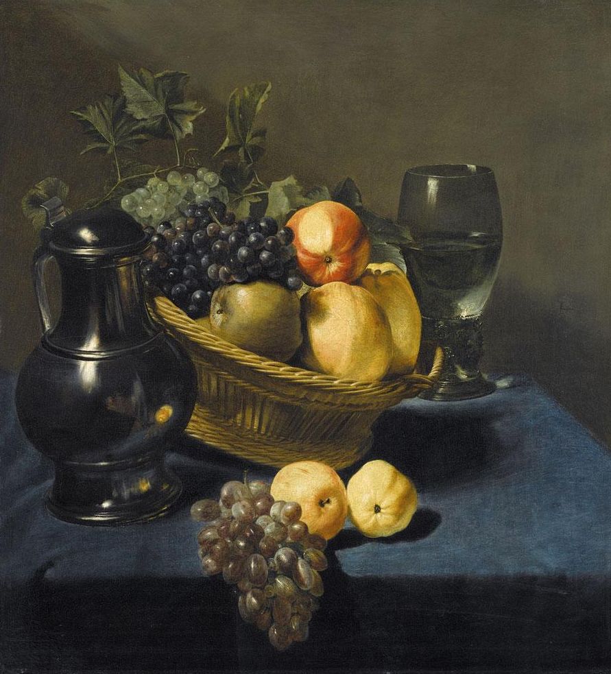
In the Protestant countries, and especially in the newly independent Dutch Republic (modern-day Holland), the artistic climate changed radically in the aftermath of the Reformation. Two of the wealthiest sources of patronage—the monarchy and the Church—were now gone. In their stead arose an increasingly prosperous middle class eager to express its status, and its new sense of national pride, through the purchase of art.
By the middle of the 17th century, a new market had emerged to meet the artistic tastes of this class. The demand was now for smaller-scale paintings suitable for display in private homes. These paintings included religious subjects for private contemplation, as seen in Rembrandt’s poignant paintings or even his prints of biblical narratives, as well as portraits documenting individual likenesses.
But, the greatest change in the market was the dramatic increase in the popularity of landscapes, still-lifes, and scenes of everyday life (known as genre painting). Indeed, the proliferation of these subjects as independent artistic genres was one of the 17th century’s most significant contributions to the history of Western art.
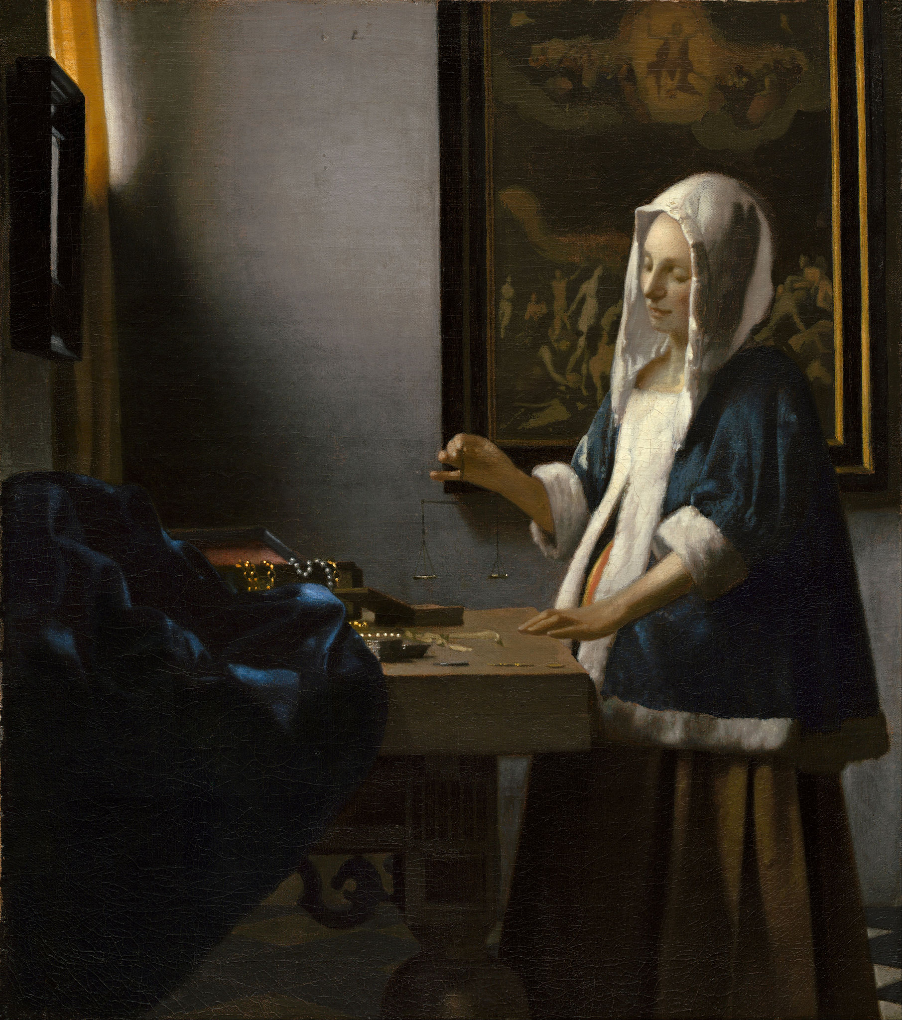
In all of these genres, artists revealed a keen interest in replicating observed reality—whether it be the light on the Dutch landscape, the momentary expression on a face or the varied textures and materials of the objects the Dutch collected as they reaped the benefits of their expanding mercantile empire. These works demonstrated as much artistic virtuosity and physical immediacy as the grand decorations of the palaces and churches of Catholic Europe.
The Dutch art market in the 17th century
Rembrandt, The Night Watch
A Dutch painter and printmaker, Rembrandt van Rijn is a key figure of the Baroque, known for his portraits and historical subjects in virtuoso brushwork.
A night watch?
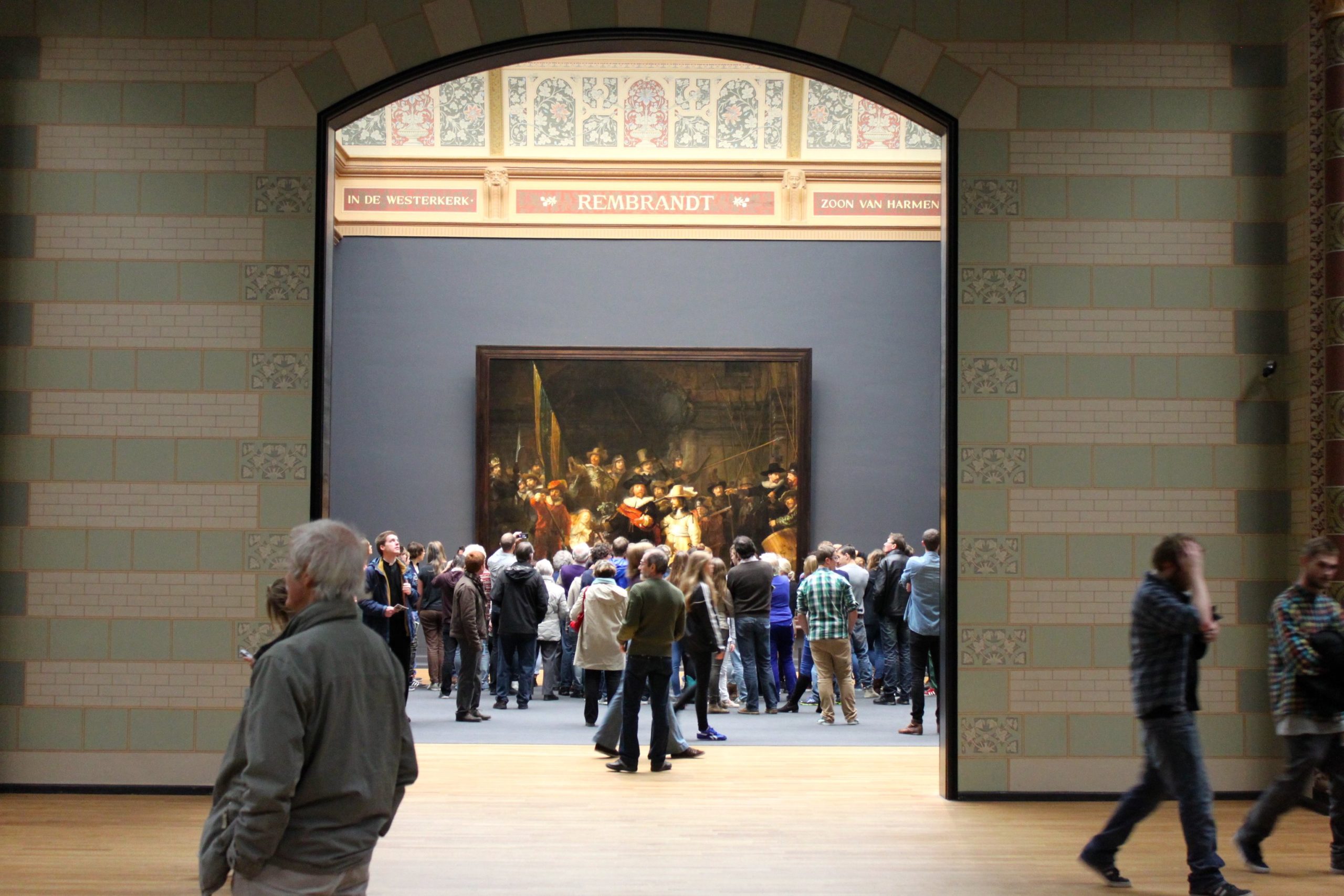
Would it surprise you to find that the title that Rembrandt’s most famous painting is known by is actually incorrect? The so-called Night Watch is not a night scene at all; it actually takes place during the day. This title, which was not given by the artist, was first applied at the end of the eighteenth century. By that time the painting had darkened considerably through the accumulation of many layers of dirt and varnish, giving the appearance that the event takes place at night.
The Dutch civic guard
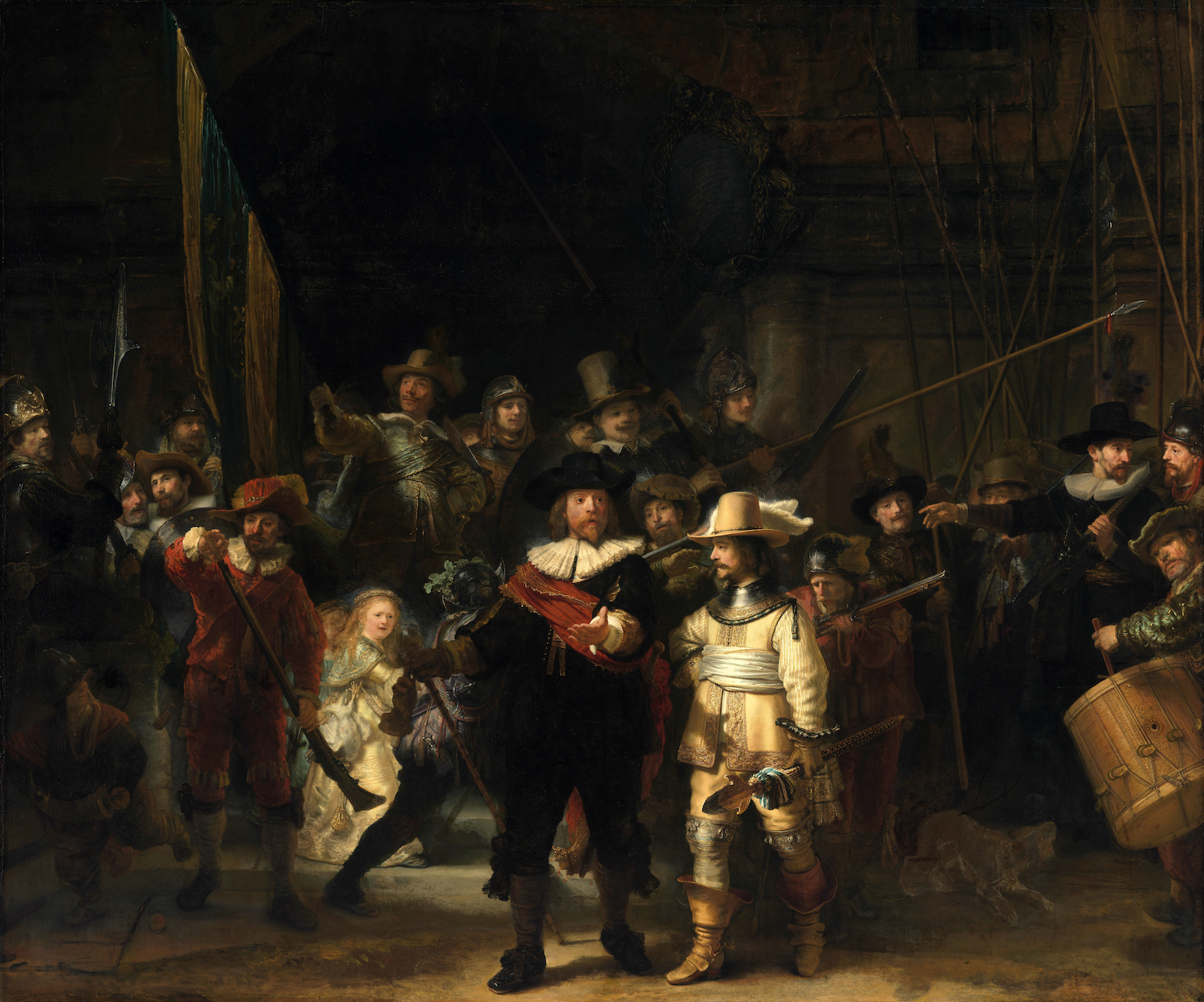
Rembrandt’s The Night Watch is an example of a very specific type of painting that was exclusive to the Northern Netherlands, with the majority being commissioned in the city of Amsterdam. It is a group portrait of a company of civic guardsmen. The primary purpose of these guardsmen was to serve as defenders of their cities. As such, they were tasked with guarding gates, policing streets, putting out fires, and generally maintaining order throughout the city. Additionally, they were an important presence at parades held for visiting royalty as well and other festive occasions.
Each company had its own guild hall as well as a shooting range where they could practice with the specific weapon associated with their group, either a longbow, a crossbow, or a firearm. According to tradition, these assembly halls were decorated with group portraits of its most distinguished members, which served not only to record the likenesses of these citizens, but more importantly to assert the power and individuality of the city that they defended. In short, these images helped promote a sense of pride and civic duty.
Rembrandt was at the height of his career when he received the commission to paint The Night Watch for the Kloveniersdoelen, the guild hall that housed the Amsterdam civic guard company of arquebusiers, or musketeers.
This company was under the command of Captain Frans Banning Cocq, who holds a prominent position in the center foreground of the image. He wears the formal black attire and white lace collar of the upper class, accented by a bold red sash across his chest. At his waist is a rapier and in his hand a baton, the latter of which identifies his military rank. Striding forward, he turns his head to the left and emphatically extends his free hand as he addresses his lieutenant, Willem van Ruytenburgh, who turns to acknowledge his orders. He is also fancifully dressed, but in bright yellow, his military role referenced by the steel gorget he wears around his neck and the strongly foreshortened ceremonial partisan that he carries.
Sixteen additional portraits of members of this company are also included, with the names of all inscribed on a framed shield in the archway. As was common practice at the time, sitters paid a fee that was based on their prominence within the painting.
A unique approach
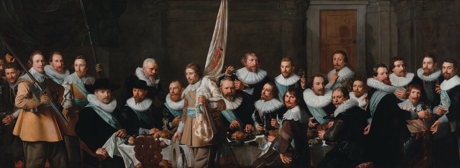
Compared to other civic guard portraits, Rembrandt’s The Night Watch stands out significantly in terms of its originality. Rather than replicating the typical arrangement of rows of figures, Rembrandt animates his portrait. Sitters perform specific actions that define their roles as militiamen.
A great deal of energy is generated as these citizens spring to action in response to their captain’s command. Indeed, the scene has the appearance of an actual historical event taking place although what we are truly witnessing is the creative genius of Rembrandt at work.
Men wearing bits of armor and varied helmets, arm themselves with an array of weapons before a massive, but imaginary archway that acts as a symbol of the city gate to be defended. On the left, the standard bearer raises the troop banner while on the far right a group of men hold their pikes high.
In the left foreground, a young boy carrying a powder horn dashes off to collect more powder for the musketeers. Opposite him, a drummer taps out a cadence while a dog barks enthusiastically at his feet.
In addition to the eighteen paid portraits, Rembrandt introduced a number of extras to further animate the scene and allude to the much larger makeup of the company as a whole. Most of these figures are relegated to the background with their faces obscured or only partly visible. One, wearing a beret and peering up from behind the helmeted figure standing next to the standard bearer has even been identified as Rembrandt himself.
Three musketeers
While a number of different weapons are included in the painting, the most prominent weapon is the musket, the official weapon of the Kloveniers. Three of the five musketeers are given a place of significance just behind the captain and lieutenant where they carry out in sequential order the basic steps involved in properly handling a musket. First, on the left, a musketeer dressed all in red, charges his weapon by pouring powder into the muzzle. Next, a rather small figure wearing a helmet adorned with oak leaves fires his weapon to the right. Finally, the man behind the lieutenant clears the pan by blowing off the residual powder.
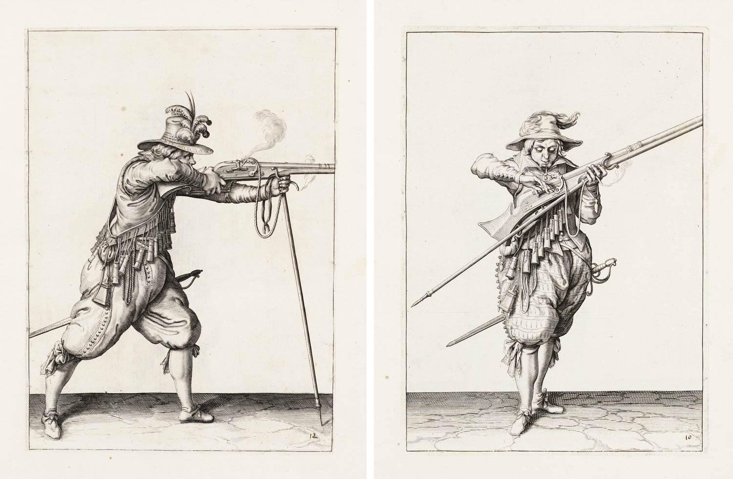
In his rendering of these steps, it seems that Rembrandt was influenced by weapons manuals of the period.
A golden girl
Probably the most unusual feature is the mysterious girl who emerges from the darkness just behind the musketeer in red. With flowing blond hair and a fanciful gold dress, the young girl in all her brilliance draws considerable attention. Her most curious attribute, however, is the large white chicken that hangs upside down from her waistband.
The significance of this bird, particularly its claws, lies in its direct reference to the Kloveniers. Each guild had its own emblem and for the Kloveniers it was a golden claw on a blue field. The girl then is not a real person, but acts as a personification of the company.
Rembrandt, Christ Preaching (Hundred Guilder Print)
It cost how much?!
What is art worth? A painting depicting the Salvator Mundi (Christ as savior of the world), often attributed to Leonardo da Vinci, sold for 450.3 million dollars in 2017. Damien Hirst’s For the Love of God had an asking price of 50 million British pounds in 2007. Things may not have been that different in the seventeenth century. One of Rembrandt’s most technically ambitious prints has been primarily known more for its price tag than for its subject: The Hundred Guilder Print. In her 2021 monograph on the print, art historian Amy Golahny revealed that it was already referred to by this nickname in 1648/49 and singled out by contemporaries for its excellence. A guilder was a unit of currency, and 100 guilders was an enormous amount of money to pay for a print. Most prints were under one guilder, with only very fancy and desirable images getting into double digits. As soon as the print was made, it shot into the stratosphere of value with Rembrandt himself insisting on his own high value.
The Hundred Guilder Print represents a series of moments in the life and ministry of Jesus, drawn from the Bible. More than that, however, it presents a perfect opportunity to examine a range of topics within the visual culture of the seventeenth-century Dutch Republic. Not only does it help us understand the economics surrounding printmaking, but it also allows for insight into how the artist manipulated the medium, selected and combined scenes from the Bible within the composition, responded to artistic precedent set by earlier generations of printmakers, and benefitted from the global trade networks that shaped daily life at the time. We can also connect the print to discussions in current museum practice about which stories about the past get told and the role of the museum in creating conversations about diverse populations in both the past and present. The value of the print is not only monetary, but also intellectual, spiritual, and artistic.
Printmaking: use and value in the seventeenth century
Although you may be more familiar with Rembrandt as a painter, he was also one of the most skilled and ambitious printmakers of the seventeenth century. He probably began making prints in the 1620s. Scholars don’t know exactly what prompted him to adopt the medium, but it was a useful skill set for any aspiring artist. Earlier Northern Renaissance artists such as Albrecht Dürer, who had worked in both painted and printed media, had helped elevate the prestige attached to printmaking.
By Rembrandt’s time, prints were more than merely illustrations of biblical or popular texts and functioned as an independent art form of their own. They were avidly collected and Rembrandt himself amassed a sizable print collection that included many works by artists from across Europe. Prints advertised the compositions of an artist and could spread farther, faster, and more economically than painted images. In addition, Rembrandt, like other artists, used prints as inspiration, working and reworking motifs to emulate previous generations of printmakers thereby demonstrating his own ingenuity. Numerous scholars of Dutch art have written detailed discussions of how Rembrandt has borrowed motifs from Leonardo, Raphael, and Martin Schongauer in the Hundred Guilder Print. However, rather than merely copying a pose, Rembrandt creatively reinvented his sources.
As an artist who could perhaps be understood as a brand-conscious influencer, Rembrandt usually filled his painted and printed works with his face and his signature. But he did not sign the Hundred Guilder Print. It is its own signature: at the time, no one else could possibly have created a printed image like this because of the technical complexity and manual skill required. Rembrandt innovatively combined multiple different techniques on the copper plate as well as making unusual decisions about the paper and ink used.
Two techniques: etching and drypoint
The image combines two different techniques: etching and drypoint. Etching is a chemical process. A printmaker would treat the surface of a copper plate with a resist—a waxy substance used to cover and protect the plate. Marks are then made in the resist, revealing the copper beneath and exposing it so that when the metal is placed in a chemical solution, acids will eat away at the revealed copper. This creates grooves and depressions in the surface that can then be inked and printed.
By contrast, in drypoint a printmaker cuts directly into the plate itself, creating the reservoir for ink. The copper is not cut away with the drypoint process, but rather pushed to the side, creating a burr of copper above the surface of the sheet that “grabs onto” more ink and creates a deep, rich, often fuzzy line. By combining techniques, Rembrandt makes use of the widest possible range of marks to create highly detailed, heavily worked sections that dissolve into inky darkness as well as more cursorily worked areas that might draw our eye less.
The print exists in two states, or versions. Every time a printmaker reworks a plate and reprints the same image with some changes, a new “state” is created. To really understand a print by Rembrandt and to follow his design process it is often necessary to examine many different impressions of the same print. In addition to changes to the copper plate itself, he also experimented with ink application and paper type.
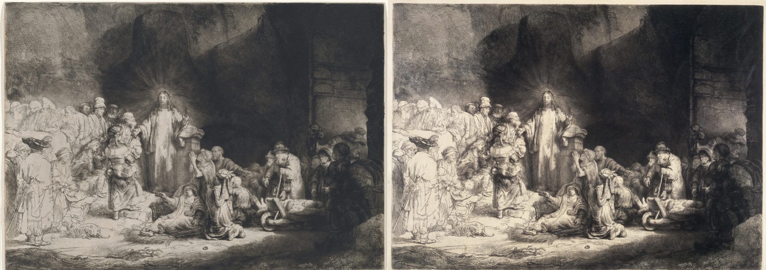
Some impressions were printed on a paper imported from Japan. Because it is made from different materials, the paper absorbs and supports the ink differently than local European paper. Although the changes between the states of the Hundred Guilder Print are quite small, the ink and paper choice makes a significant difference in appearance, as the lush plate tone created on the Japanese paper gives a warmth and softness that the European paper lacks. The differences are even more pronounced when viewed in person.
The subject and composition
Jesus stands just to the left of the center with his right hand gesturing slightly downwards and his left held up as if in a gesture of blessing. He stands out against the inky darkness behind him due to the modulation of light and dark. Rembrandt’s handling of the plate here creates the sense that Jesus is emanating a holy light. Even his hands are outlined so that they stand out against the background.
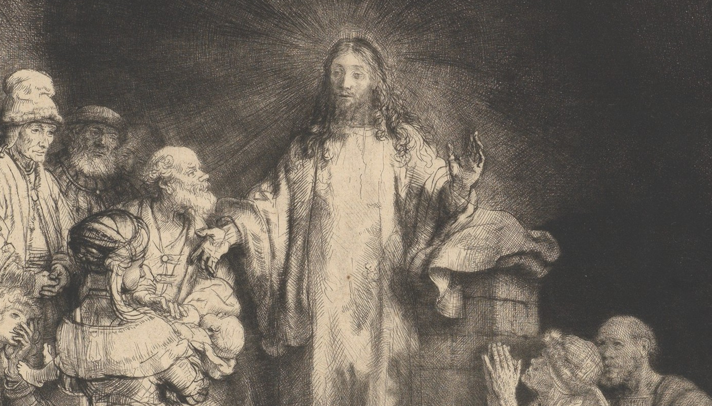
Jesus angles his head to face the woman with the infant while his torso and other arm gesture to the masses in search of healing and instruction. He is surrounded by a throng of figures. Those in closer proximity and off to our right are observed in great detail: figures in complicated headgear, a sick woman at Jesus’s feet, figures kneeling in supplication or being brought in on wheelbarrows fill the right half.
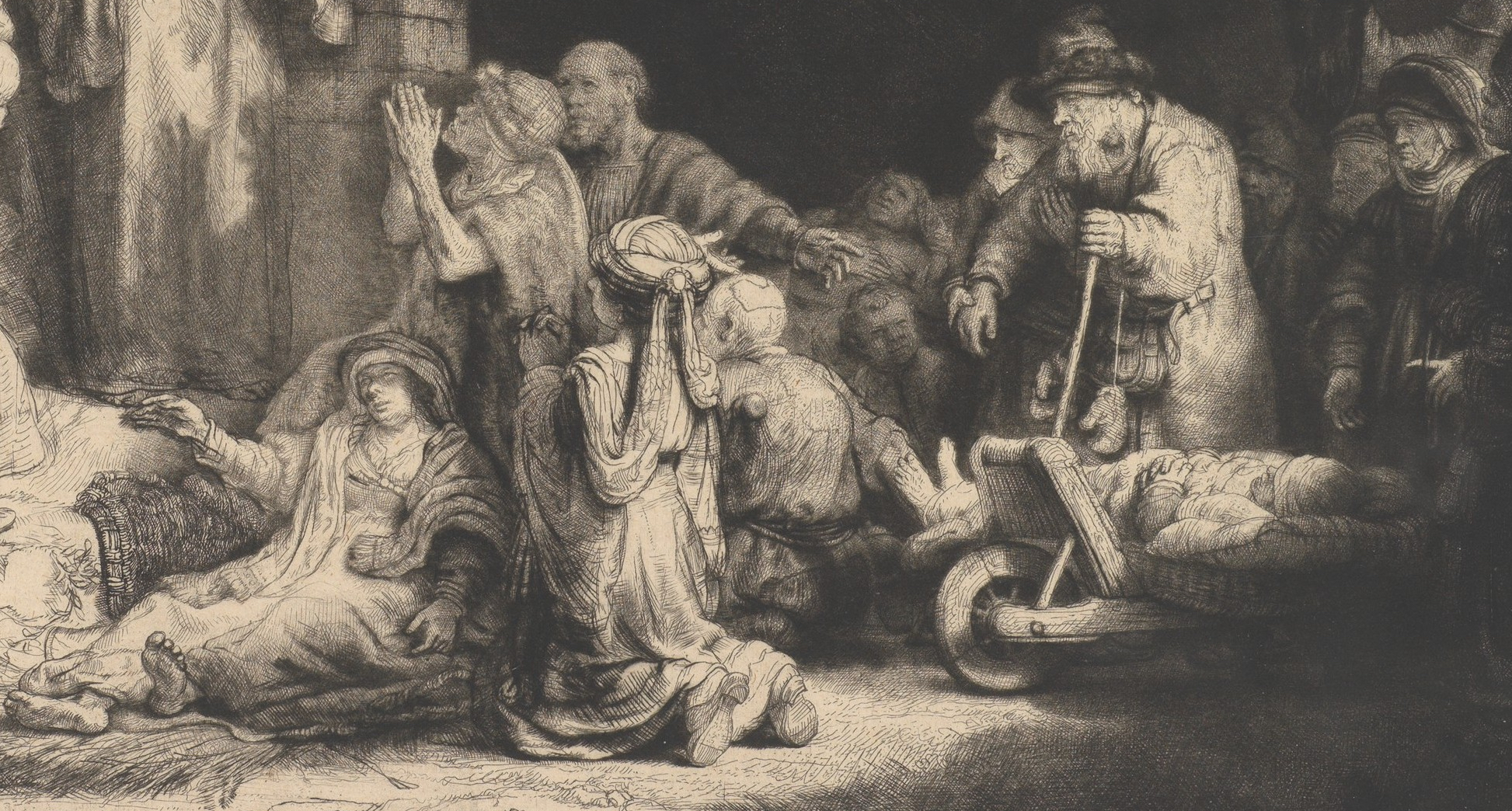
The figures on the left side of the print are shown in much less detail; Rembrandt has merely sketched in outlines and general forms of men both standing and seated. The complex grouping of bodies seems to occupy a single plane within the composition, like a frieze. Jesus stands on a slight rise and in front of a wall of some sort, while the figures to the right seem to be coming through an arch. The space behind the figures is ambiguous: it is unclear where this group has assembled, and whether we are seeing a stony outcrop, a manmade structure, or some sort of ruin behind them. This focuses our attention on the events unfolding and prevents us from wandering off into a distant landscape.
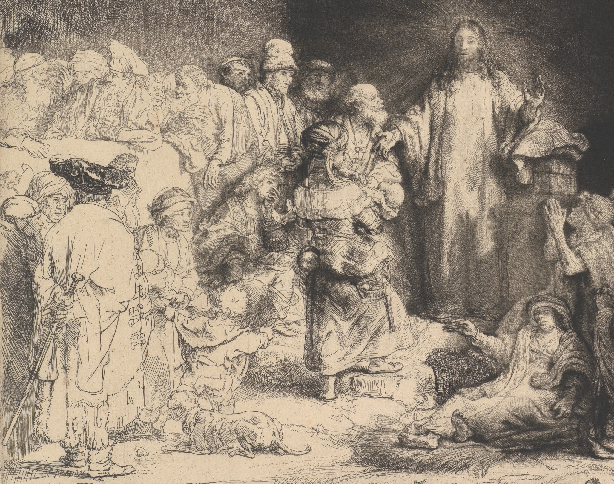
Rather than depicting one specific moment from the Bible, such as the Crucifixion or Last Supper, Rembrandt created a composite of several different vignettes. Scholars tend to agree that Rembrandt depicted many different verses from chapter 19 in the Book of Matthew. These include Jesus healing the sick, disagreeing with the Pharisees, telling a rich man to sell his possessions to achieve salvation, and admonishing his disciples to “suffer the children” to come to him. Unlike the most common scenes in art of the life of Jesus, this is not about his birth or death, but about his ministry as teacher and healer. The figure with whom Jesus most directly engages is a mother carrying a baby, presumably a child she is presenting for his care. Selecting multiple verses from the Bible to be simultaneously represented both underscores the richness of Christian ministry while also contrasting the disciples and the doubters.
The divide between the faithful and the skeptical is underscored by the visual choices made by the artist. In contrast to the darker, carefully worked right half of the print containing the faithful and their supplication, the left third of the print is occupied by a group of more sketchily worked figures, including the Pharisees with whom Jesus argues, a man with a staff and fancy hat who anchors the left foreground, and a young well-dressed man with his face in his hands—perhaps the rich man who will be unable to enter the kingdom of heaven because of his earthly goods. Notice how carefully Rembrandt depicted the fancy hat to help balance out the visual weight of the right half of the print.
Rembrandt, the Christian message, and the Globe
It is important to remember that the material and financial wealth of the Dutch Republic was largely derived from global trade. Amsterdam was a trade hub, with people, objects, and ideas coming and going all the time. Though it’s tempting to zoom in on Rembrandt’s masterful line work and his creative narrative and artistic choices, or to theorize about how this image might connect to the artist’s personal religious beliefs, the Hundred Guilder Print also reflects the global context of its creation. It is evidence of how images, ideas, and materials circulated in both artistic and economic markets. Even the Japanese paper speaks to the globally oriented milieu in which Rembrandt lived and worked.

Rembrandt included a dark-skinned, perhaps African man in the front right section of the throng surrounding Jesus. He wears an elaborate earring, a common motif for Black figures in art at the time. One way of interpreting his presence—as well as that of the camel—is to see him as evidence that the Christian message was applicable to the whole world. It was common in Renaissance art to depict one of the three wise men (Balthazar) who visited the infant Jesus as African, for example.
The inclusion of a Black figure in Rembrandt’s print is also a technical flex: modeling the light fall on a range of skin tones is a challenge for a printmaker. Rembrandt’s mastery of the medium is evident here. Like many of his contemporaries, Rembrandt often incorporated Black figures into his work, but this has only recently become a topic of discussion for art historians. The economic prosperity that fueled the so-called “Golden Age” of Dutch art was built on global trade networks, many of which depended on either enslaved or exploited populations in Dutch colonies in western and southern Africa, the Caribbean, Brazil, and across the Indian Ocean. While slavery was illegal in The Netherlands at the time, it was quite common in Dutch territorial holdings.
The 2020 exhibition at the Rembrandthuis Museum Black in Rembrandt’s Time added an important layer to our understanding of what life in 17th-century Amsterdam was like for people of color. Some people had been brought to Amsterdam as part of the households of those relocating from places where enslavement was more common or were purchased to serve at court. Other people of color came to the city or passed through it via global networks, perhaps as sailors in navies or merchant ships, in the entourage of diplomats, or as merchants and diplomats themselves. Many of the free Black and African people living in Amsterdam were clustered in Rembrandt’s neighborhood. In his recent research in the Amsterdam archives, historian Mark Ponte has not only discovered evidence of a thriving Black community of at least several dozen individuals during the seventeenth century, but has been able to establish names, occupations, and marriage and baptism dates for them.
The Black man in the Hundred Guilder Print may stand as evidence of Rembrandt’s artistic practice: he worked “naer het leven”—or from life, using live models of all different types. He is even rumored to have pulled his neighbors off the street to model for him! While we cannot link the Black figure in the Hundred Guilder Print to any specific individual, his presence in the print amidst the other faithful followers of Jesus can be a reminder of the complexity of life in Amsterdam at the time. Together with the use of Japanese paper and the pan-European artistic sources, the print speaks to the wider world in both material and spiritual ways.
Rembrandt, Self-Portrait (1659)
Practicing Visual Analysis
Rembrandt’s Self-Portrait from 1659 contrasts to Albrecht Dürer’s Self-Portrait of 1500. Unlike Dürer’s Renaissance idealized vision of himself, Rembrandt’s self-portrait contains veracity, or truthfulness. Rembrandt applied a mottling of multiple colors and thick paint to suggest curvilinear age lines and uneven skin tone. The texture here is literal. In traditional oil painting, smooth layers of oil paint are layered to create the illusion of texture. Working with impasto (thick application of paint), Rembrandt used the actual texture of paint to render his image. When looking closely, the viewer can observe the gesture or the movement of the artist’s hand across the canvas. Borrowing from the Caravaggisti in Utrecht, Rembrandt applied a softer version of tenebrism with subtle light illuminating his face. His figurative form turns in a three-quarter viewer toward the picture plane. Rembrandt’s gaze looks towards us with an honesty and vulnerability not often seen in self-portraiture.
Johannes Vermeer, Young Woman with a Water Pitcher
A Dutch painter known for his mastery of light, lyrical color, and atmosphere in depicting interior genre scenes, Vermeer was also an art dealer.
Johannes Vermeer, Girl with a Pearl Earring
Rachel Ruysch, Flower Still-Life
What would you consider today’s most coveted status symbols? A Mercedes or a Ferrari, a diamond Rolex or a designer handbag? A European villa? In Rachel Ruysch’s day it was a simple tulip. Looking at her floral still life paintings can reveal an entire hidden world—of wealth, status, even the economics of the world’s first financial crises.
Growing up: art and science
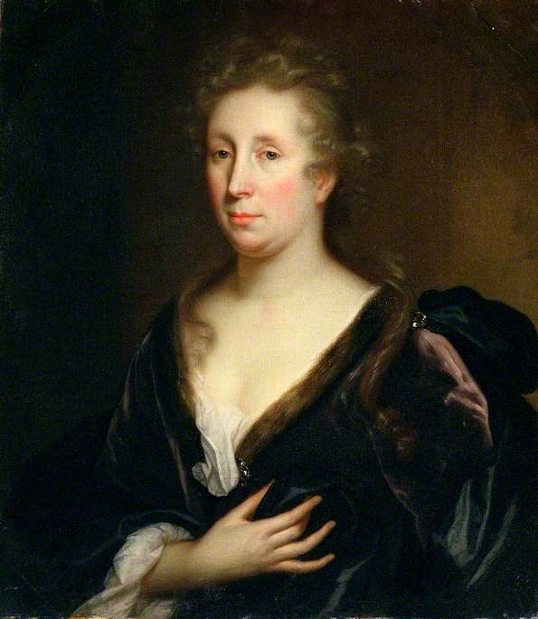
Rachel Ruysch grew up in Amsterdam, into a wealthy and prominent family of Dutch artists, architects and scientists. Her father, Frederik Ruysch, was an eminent scientist and professor of anatomy and botany. He possessed a well-known collection of rare natural history specimens, which Rachel helped catalogue and record. He encouraged her artistic talents, careful observation of the natural world and scientifically accurate renderings of plants and flowers. At age fifteen, Ruysch began an apprenticeship with famous still life painter Willem van Aelst. By eighteen, she was already producing her first still life paintings and starting to establish her long and successful career.
A working mother
At twenty-nine, Ruysch married portrait painter Juriaen Pool, with whom she had ten children. Despite her enormous domestic responsibilities, she was remarkably prolific, producing more than 250 paintings over seven decades. Her works were in great demand, and she achieved widespread fame and international recognition. Considered one of the most successful artists of her day, contemporary Dutch writers called her “Holland’s art prodigy” and “our subtle art heroine.”
Consumer society
In 1648, the Netherlands became independent from Spain, ushering in a period of great economic prosperity. Flourishing international trade and a thriving capitalistic economy resulted in a newly affluent middle class. Wealthy merchants created a new kind of patronage and art market. Without a powerful monarchy or the Catholic Church to commission artworks (the Dutch were Protestants), artists produced directly for buyers. Like today, buyers purchased art either from professional dealers or from the artist in their studios. Subjects like big historical, mythological or religious paintings were no longer desired; buyers wanted portraits, still lifes, landscapes, and genre paintings (scenes of everyday life) to decorate their homes. Proud of their newly independent country and trade wealth, they desired artworks that would reflect their success. In a competitive open market, artists began to specialize. Rachel Ruysch became known as one of the greatest flower painters of her time.
Flowers: A national passion
Ruysch’s career paralleled the growth of the Dutch horticultural industry and the science of botany. The Netherlands became the largest importers of new and exotic plants and flowers from around the world. Once valued primarily for their use as herbs or medicine, flowers became newly appreciated simply for their beauty and fragrance. They became prized luxuries and desirable status symbols for the wealthy. Botanists and gardeners sought the rarest specimens imported from overseas trade. The tulip, like the one featured prominently in Ruysch’s painting below, was the most exotic.
“Tulip mania”
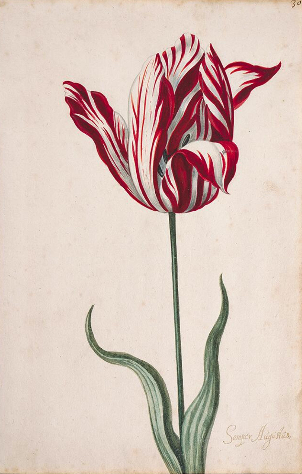
Coveted for their intense and unusually varied colors, tulips were introduced into the Netherlands from Turkey in the late sixteenth century. The Dutch fell madly in love with them. Because it takes so long for a tulip to be grown from seed, demand far outpaced supply. The rarest and most valuable tulips were the variegated or “flamed” tulips, those with feathers of contrasting color on their petals. This exotic coloration was actually caused by a virus that infected the tulip, shortening its life span and making it even more sought after and valuable. The stage was set for a buying craze.
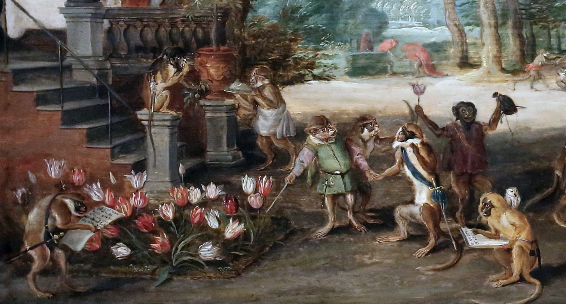
Buyer beware: a cautionary tale?
The word tulip mania is often used today to refer to certain types of economic crises. It describes a financial bubble caused by large numbers of people speculating on unproved commodities or companies. Tulip bulbs were so avidly desired in the seventeenth-century Netherlands that a “futures market” was born. Buyers bought bulbs still in the ground, speculating that they would be worth more in the future and could then be sold for a large profit. Prices rose steadily and irrationally. At the peak of tulip speculation in 1636, some bulbs sold for more than a skilled craftsman earned in ten years. A nursery catalog of the time notes that at the height of the madness, a rare “Semper Augustus” tulip sold for 5,200 guiders, more than the price of a fine house, a ship or twelve acres of land.
In February, 1637, investors suddenly decided that tulip bulbs were grossly overpriced, and began to sell. Within days, panic ensued. With more sellers than buyers, demand for tulips evaporated. Prices plummeted, tulip bulbs lost 90% of their earlier value, and the market crashed. The world had just experienced its first financial bubble.
Look closely: microscopic detail
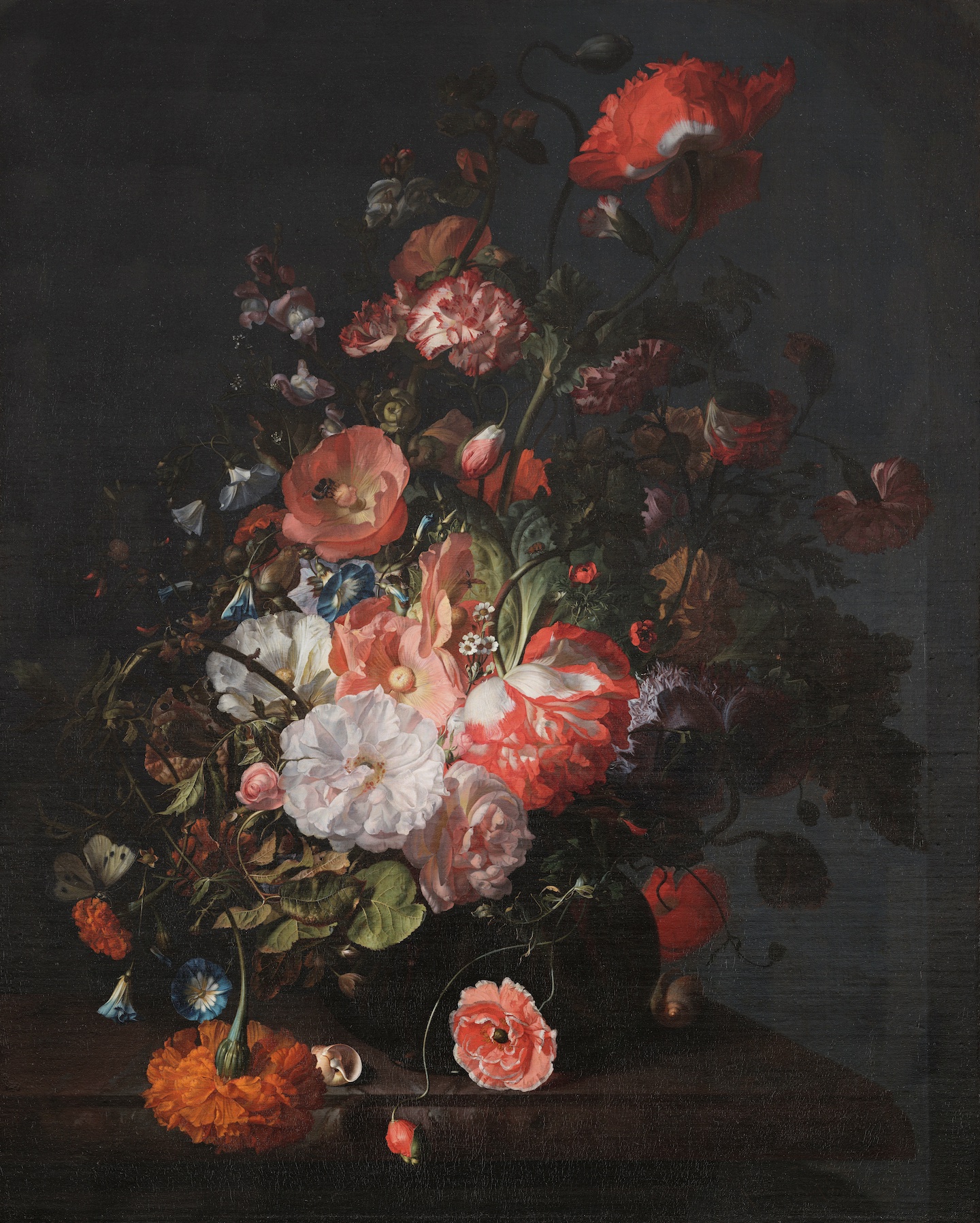
A successful Dutch still life painting was highly valued for its degree of skillful realism. Flower Still Life depicts a profusion of scientifically accurate floral details. Each petal, stem, and leaf is minutely and precisely rendered. Textures are remarkably realistic, from the delicate paper thin poppy petals to the crinkly, brittle leaves. Looking closer still, we see that Ruysch has also meticulously depicted tiny insects: a caterpillar crawls on a stem, a bee gathers pollen from the center of a poppy, a white butterfly alights on a marigold.
Mixed bouquet
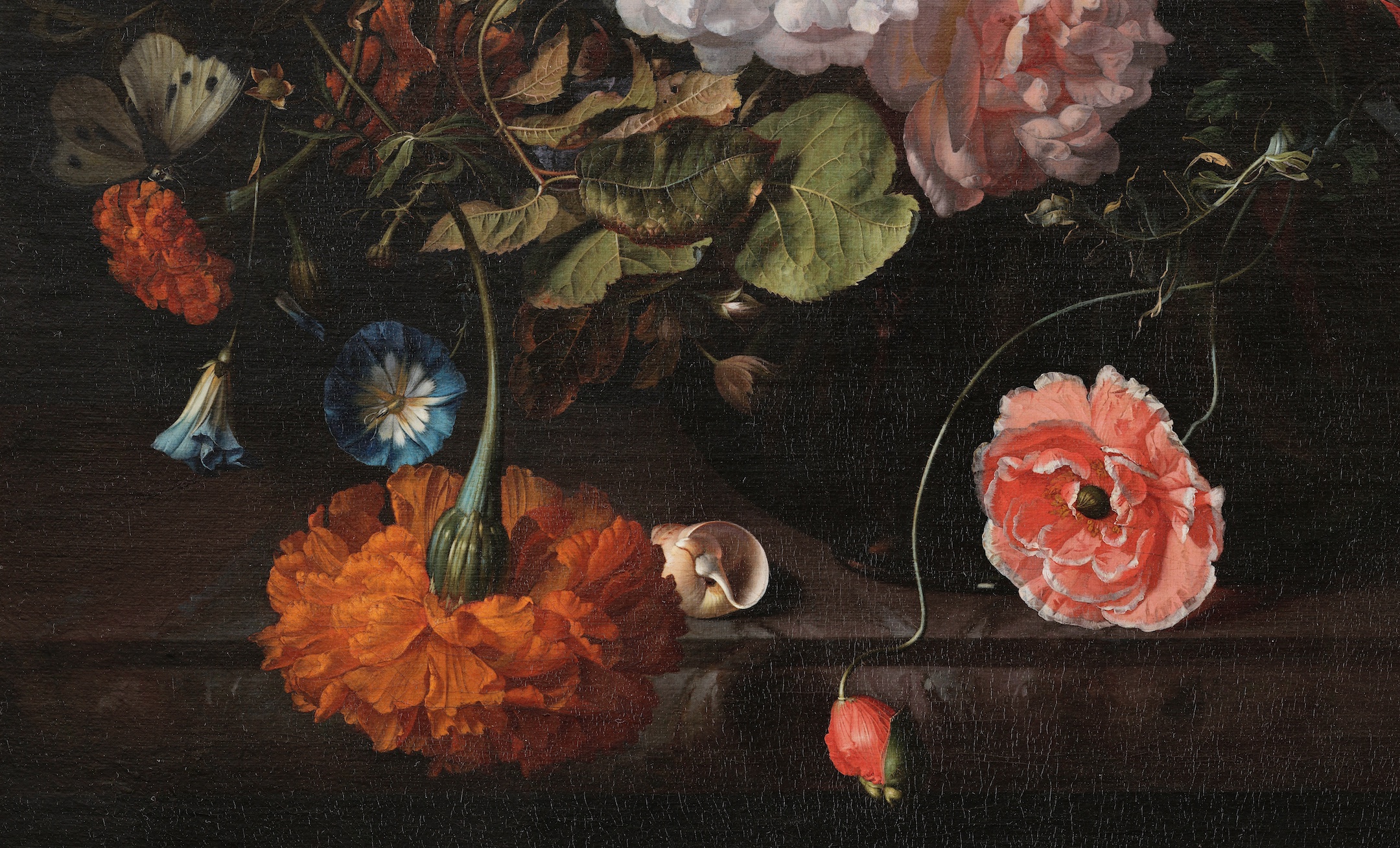
Flower Still Life depicts a lush variety of different flowers, from popular common European blooms to rare overseas species. Ruysch combines a complex and intricate arrangement of poppies, snapdragons, roses, carnations, hollyhocks, marigolds, morning glories, and a single red and white flamed tulip. Flowers lavishly spill out of the vase, filling the entire picture space. Some are in full bloom, others droop and wilt, as leaves and curving stems entwine throughout. While many of her contemporary flower painters used more symmetrical and formal compositions, Ruysch was known for these lively and informal looking arrangements. The flowers are asymmetrically arranged, leading the eye diagonally from the lower left drooping marigold to the upper right red poppy. Our eye is first attracted to the lightest flowers in the center, then to the brightly colored surrounding flowers, and finally out to the small darker flowers at the edges of the bouquet. Complementary colors create harmony, as warm yellows and rose balance cool blues and greens. Light alternates with shadow, enlivening the flowers as they stand out dramatically against the darker background.
“Vanitas”: hidden meanings?
Some scholars believe there is another way to view Ruysch’s flower paintings. One common interpretation is to understand them in light of vanitas, a moral message common at the time. Taken from a passage in the Christian bible, it was a reminder that beauty fades and all living things must die. While still life paintings celebrated the beauty and luxury of fine food or voluptuous flowers, vanitas was a warning about the fleeting nature of these material things and the shortness of life. In Flower Still Life, some flowers wilt and die while insects have eaten holes in the leaves. Wealthy Dutch consumers were being reminded to not become too attached to their material possessions and worldly pleasures; eternal salvation came only through devotion to God.
Conclusion
Patrons in the Protestant Dutch Republic commissioned artworks in a variety of subject matters from still lifes and genre paintings to militia portraits. Such artworks were usually designed for private viewing in the homes of the new wealthy merchant middle class. In stark contrast to the large-scale public religious pieces of Flanders and Italy in the time of the Baroque, artworks in the 17th century Dutch Republic nevertheless showcased the Baroque style. They were dramatic often with heightened contrasts in light and shadow and featured strong diagonal lines. The Baroque style flourished in other regions, such as France and Spain where they became increasingly aligned with royal rule.
Citation and Licensing
The following sections were written by Chelsea Wright and licensed CC BY-NC-SA 4.0:
- Chapter Overview and Introduction
- Focus artwork and term list compiled by Chelsea Wright
- Practicing Visual Analysis
- Conclusion
The following articles from Smarthistory licensed CC BY-NC-SA 4.0 were remixed and adapted for the chapter:
- Dr. Esperança Camara, “Baroque art, an introduction,” in Smarthistory, June 9, 2015.
- Dr. Shannon Pritchard, “Peter Paul Rubens, Elevation of the Cross,” in Smarthistory, September 11, 2024.
- Dr. Christopher D.M. Atkins, Van Otterloo-Weatherbie Director, Center for Netherlandish Art, Museum of Fine Arts, Boston and Dr. Beth Harris, “The Dutch art market in the 17th century,” in Smarthistory, January 20, 2023.
- Smarthistory, “Rembrandt,” in Smarthistory.
- Dr. Wendy Schaller, “Rembrandt, The Night Watch,” in Smarthistory, August 8, 2015.
- Dr. Saskia Beranek, “Rembrandt, Christ Preaching (Hundred Guilder Print),” in Smarthistory, April 26, 2022.
- Dr. Steven Zucker and Dr. Beth Harris, “Rembrandt, Self-Portrait (1659),” in Smarthistory, December 14, 2015.
- Smarthistory, “Johannes Vermeer,” in Smarthistory.
- Dr. Steven Zucker and Dr. Beth Harris, “Johannes Vermeer, Young Woman with a Water Pitcher,” in Smarthistory, November 25, 2015.
- Dr. Steven Zucker and Dr. Beth Harris, “Johannes Vermeer, Girl with a Pearl Earring,” in Smarthistory, August 9, 2015.
- Lynn Robinson, “Rachel Ruysch, Flower Still-Life,” in Smarthistory, August 8, 2015.



_and_lieutenant_Jacob_Rogh_(1586-1670),_by_Nicolaes_Eliasz_Pickenoy.jpg)


