
Early 20th Century Modern Art
Chapter Overview and Introduction
The period of Modern art occurred between 1900-1945. There are many different styles that fall under the term Modern art: Fauvism, German Expressionism, Cubism, Futurism, Abstract art, etc. Each style has distinct characteristics; yet they share common features related to their larger historical context of the early 20th century. Modern art was built upon the foundations of Post-Impressionism. The color experimentations of Gauguin and van Gogh transformed into the arbitrary use of color by Matisse in Fauvism. The deconstruction of pictorial space begun by Cézanne was pushed further by Braque and Picasso in Cubism. While Post-Impressionism served as the foundation, Modern art was dramatically shaped by the cultural context of the early 20th century. The 20th century introduced new ways of thinking about science, spirituality, and how to represent the truth. In addition, in the early 20th century, World War I profoundly affected the way artists thought about the modern world in which they lived.
Focus Artworks
- Henri Matisse, Bonheur de Vivre (Joy of Life), 1906, oil on canvas
- Ernst Ludwig Kirchner, Street, Dresden, 1908, oil on canvas
- Vasily Kandinsky, Improvisation 28 (second version), 1912, oil on canvas
- Pablo Picasso, Les Demoiselles d’Avignon, 1907, oil on canvas
- Pablo Picasso, The Guitarist, 1910, oil on canvas,
- Georges Braque, Violin and Palette, 1909, oil on canvas
- Pablo Picasso, Still Life with Chair Caning, 1912, oil and oilcloth on canvas framed with rope
- Piet Mondrian, Composition with Red, Blue, and Yellow, 1930, oil on canvas
Term List
- Modern Art
- Avant-garde
- Fauvism
- Fauve
- Salon d’Automne
- Primitivism
- Expressionism
- Die Brücke
- Der Blaue Reiter
- Synesthesia
- Naturalism
- Linear perspective
- Foreshortening
- Multiple perspectives
- X-ray
- Spiritualism
- Cubism
- Curiosity cabinet
- Social Darwinism
- Cultural relativism
- Analytic Cubism
- Synthetic Cubism
- Collage
- Abstract
- Non-representational
- Non-objective
- De Stijl
- Neo-Plasticism
- Theosophy
Fauvism, an introduction
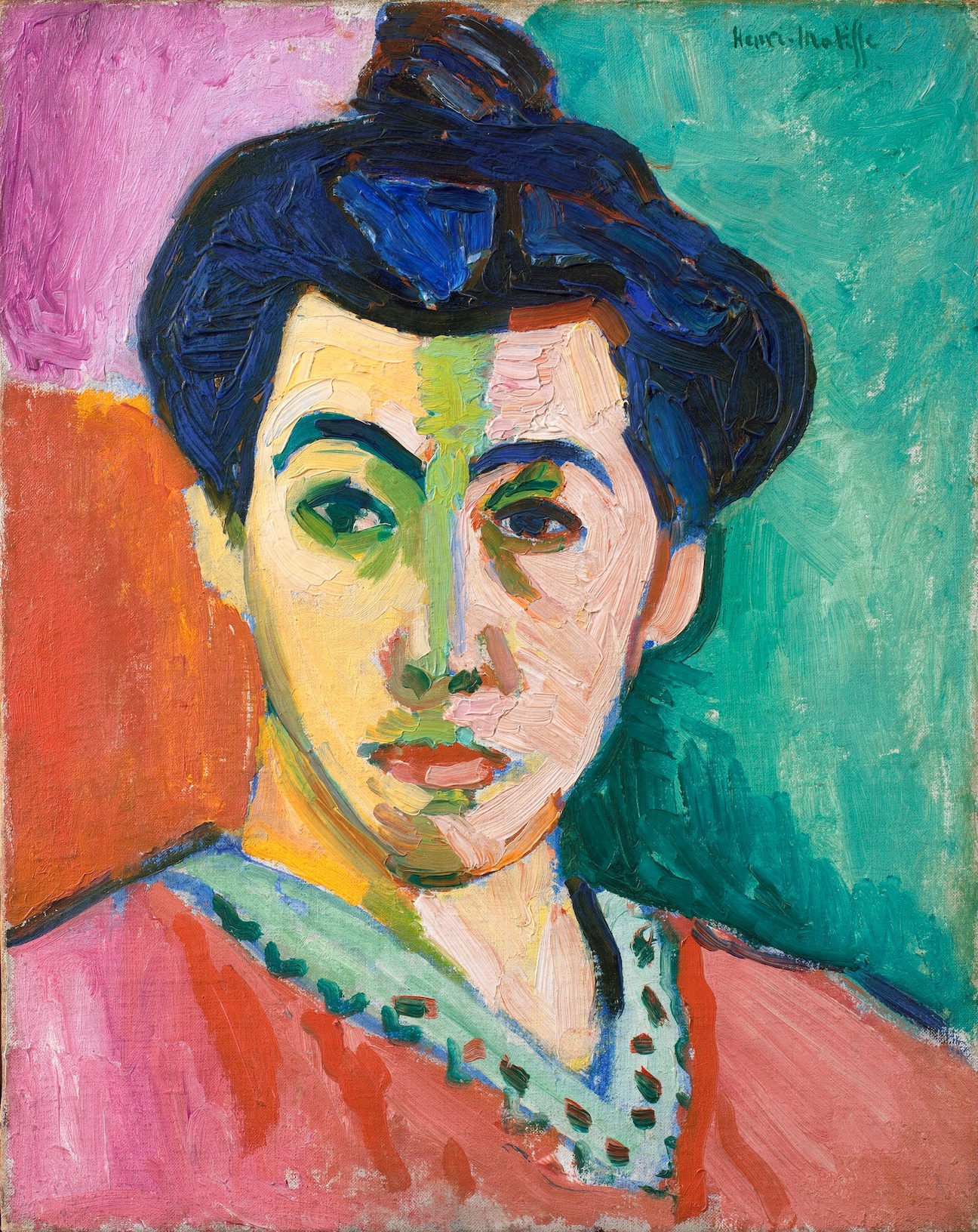
Distinctive brushwork
Fauvism developed in France to become one of the first new artistic styles of the 20th century. In contrast to the dark, vaguely disturbing nature of much fin-de-siècle, or turn-of-the-century, Symbolist art, the Fauves produced bright cheery landscapes and figure paintings, characterized by pure vivid color and bold distinctive brushwork.
“Wild beasts”
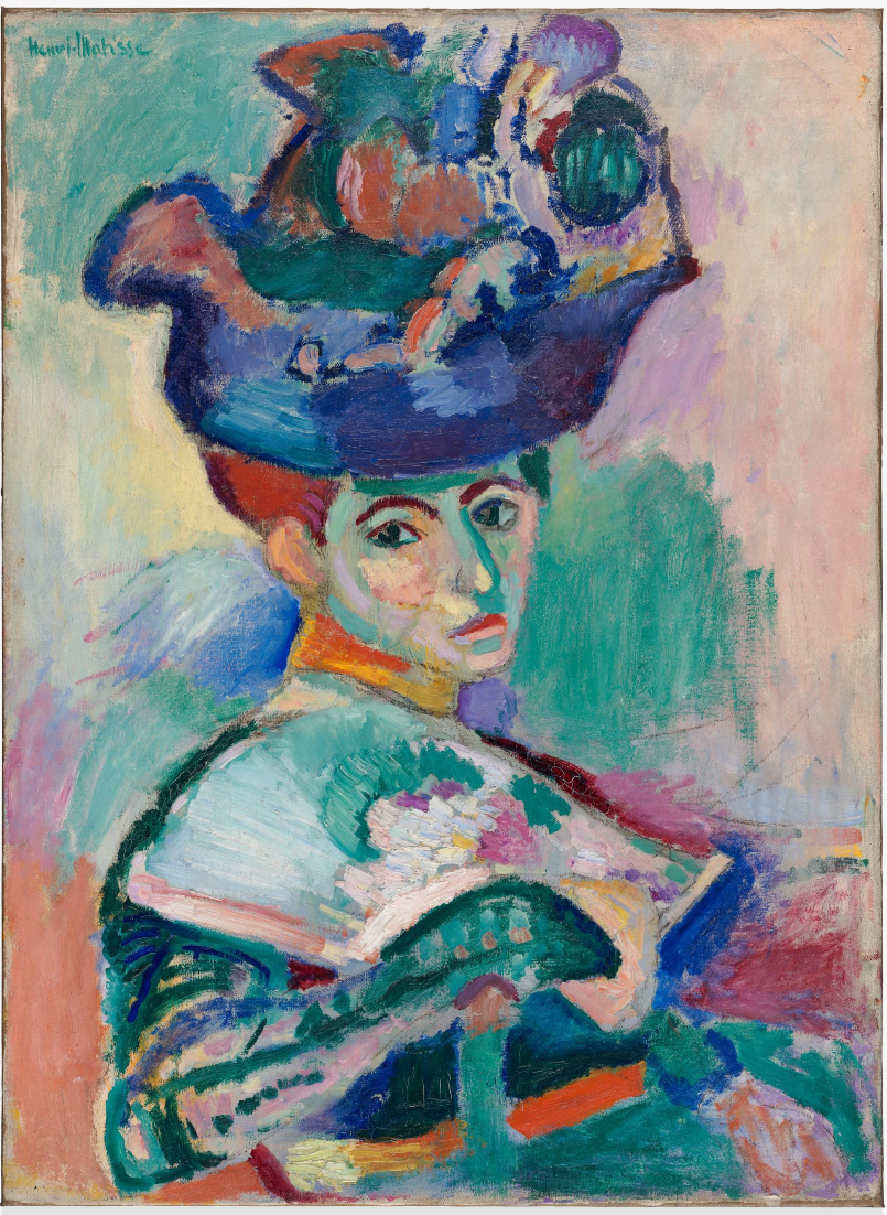
When shown at the 1905 Salon d’Automne in Paris, the contrast to traditional art was so striking it led critic Louis Vauxcelles to describe the artists as “Les Fauves” or “wild beasts,” and thus the name was born.
One of several Expressionist movements to emerge in the early 20th century, Fauvism was short lived, and by 1910, artists in the group had diverged toward more individual interests. Nevertheless, Fauvism remains significant for it demonstrated modern art’s ability to evoke intensely emotional reactions through radical visual form.
The expressive potential of color
The best known Fauve artists include Henri Matisse, André Derain, and Maurice Vlaminck who pioneered its distinctive style. Their early works reveal the influence of Post-Impressionist artists, especially Neo-Impressionists like Paul Signac, whose interest in color’s optical effects had led to a divisionist method of juxtaposing pure hues on canvas. The Fauves, however, lacked such scientific intent. They emphasized the expressive potential of color, employing it arbitrarily, not based on an object’s natural appearance.
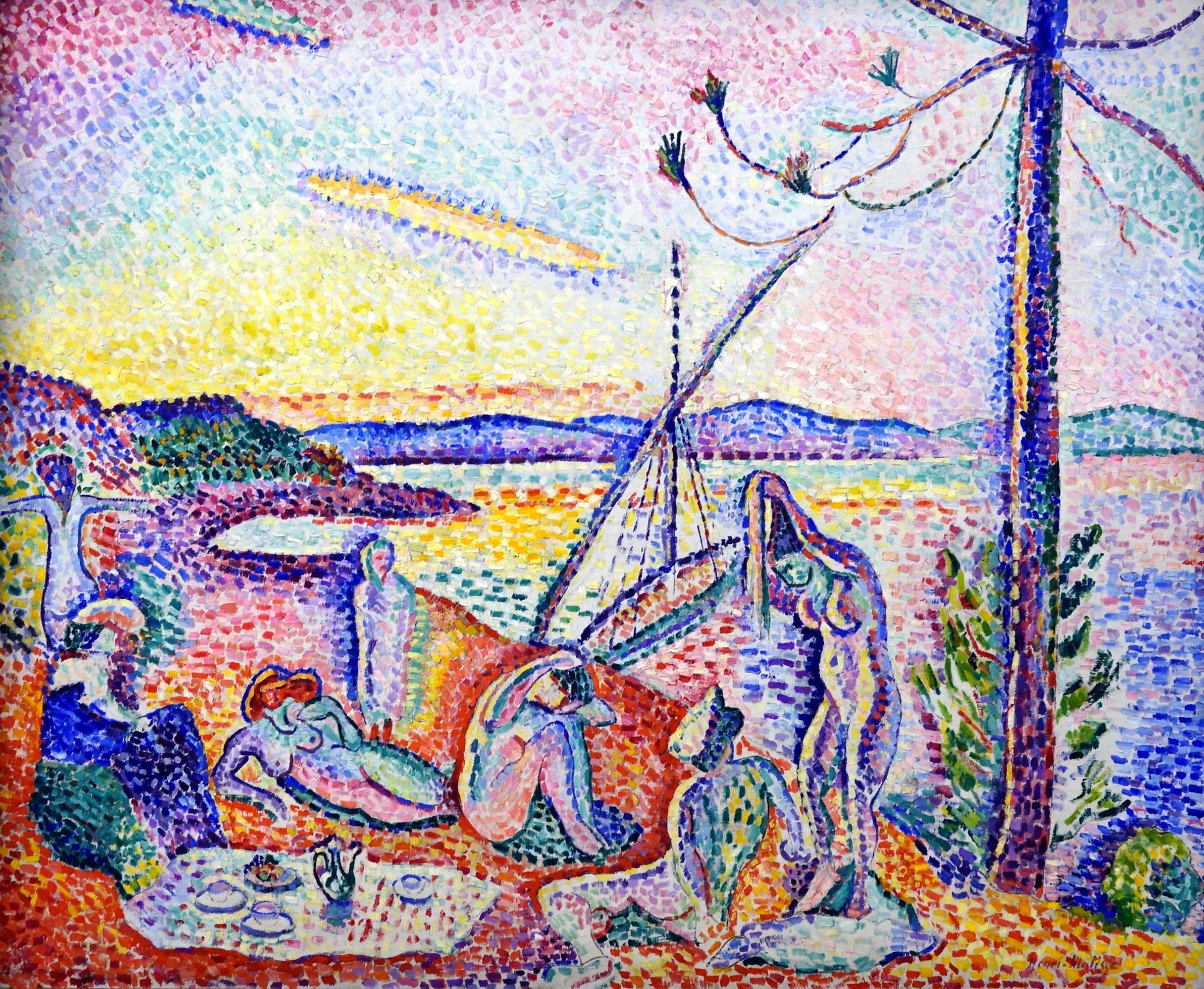
In Luxe, calm et volupté (1904), for example, Matisse employed a Pointillist style by applying paint in small dabs and dashes. Instead of the subtle blending of complementary colors typical of the Neo-Impressionist painter Georges Seurat, for example, the combination of fiery oranges, yellows, greens and purple is almost overpowering in its vibrant impact.
Similarly, while paintings such as Vlaminck’s The River Seine at Chatou (1906) appear to mimic the spontaneous, active brushwork of Impressionism, the Fauves adopted a painterly approach to enhance their work’s emotional power, not to capture fleeting effects of color, light or atmosphere on their subjects. Their preference for landscapes, carefree figures and lighthearted subject matter reflects their desire to create an art that would appeal primarily to the viewers’ senses.
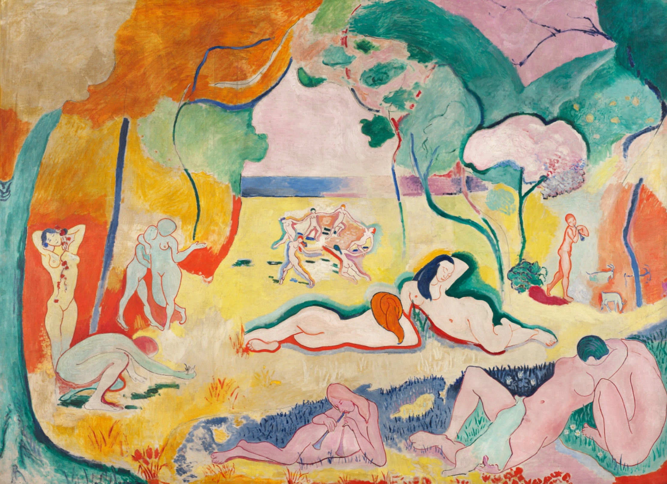
Paintings such as Matisse’s Bonheur de Vivre (1905–06) epitomize this goal. Bright colors and undulating lines pull our eye gently through the idyllic scene, encouraging us to imagine feeling the warmth of the sun, the cool of the grass, the soft touch of a caress, and the passion of a kiss.
Like many modern artists, the Fauves also found inspiration in objects from Africa and other non-western cultures. Seen through a colonialist lens, the formal distinctions of African art reflected current notions of Primitivism—the belief that, lacking the corrupting influence of European civilization, non-western peoples were more in tune with the primal elements of nature.
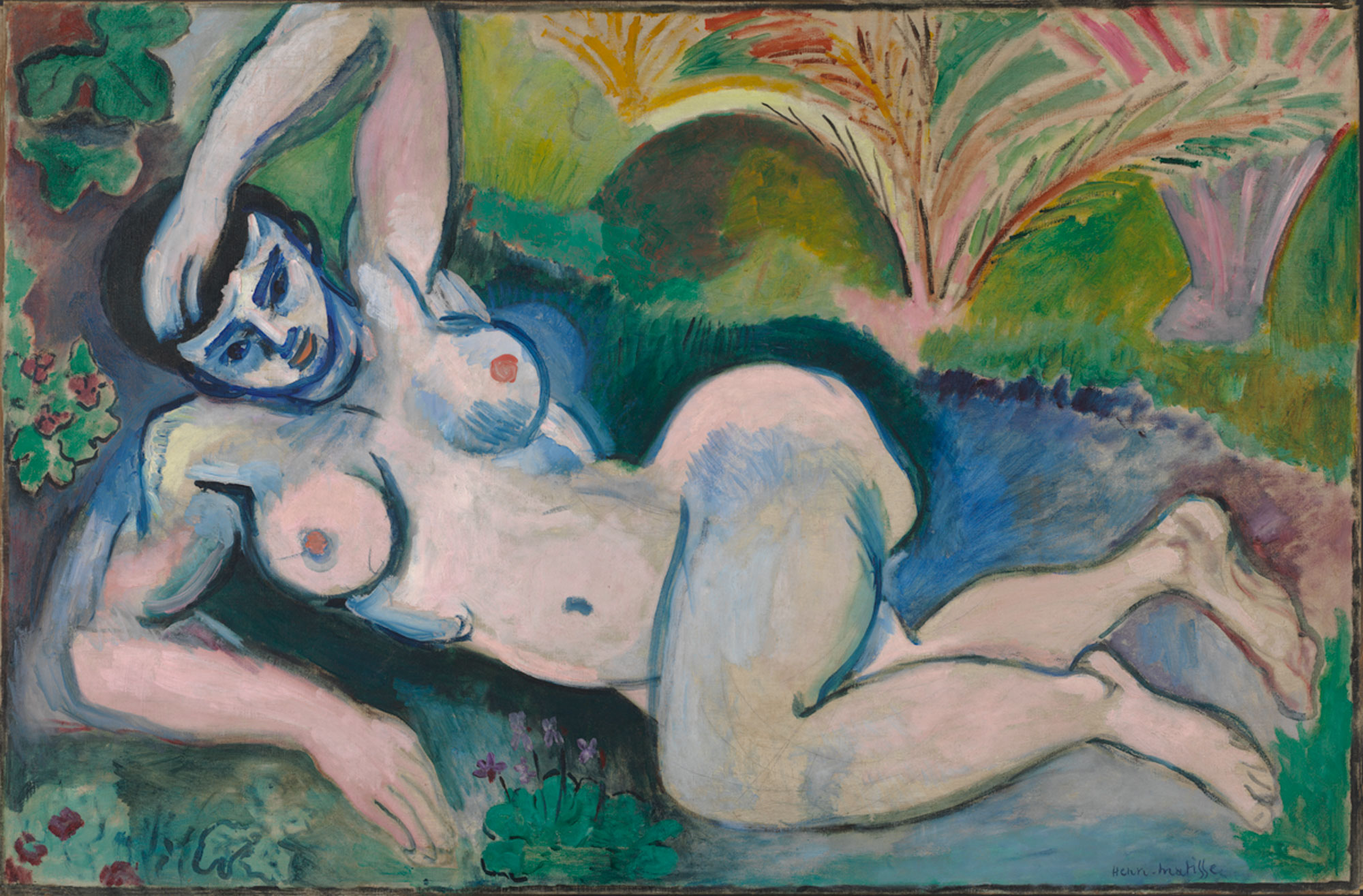
Blue Nude (Souvenir of Biskra) of 1907 shows how Matisse combined his traditional subject of the female nude with the influence of primitive sources. The woman’s face appears mask-like in the use of strong outlines and harsh contrasts of light and dark, and the hard lines of her body recall the angled planar surfaces common to African sculpture. This distorted effect, further heightened by her contorted pose, clearly distinguishes the figure from the idealized odalisques of Jean-Auguste-Dominique Ingres and painters of the past.
The Fauves’ interest in Primitivism reinforced their reputation as “wild beasts” who sought new possibilities for art through their exploration of direct expression, impactful visual forms and instinctual appeal.
Fauvism: Henri Matisse, Bonheur de Vivre (Joy of Life)
The Joy of Life
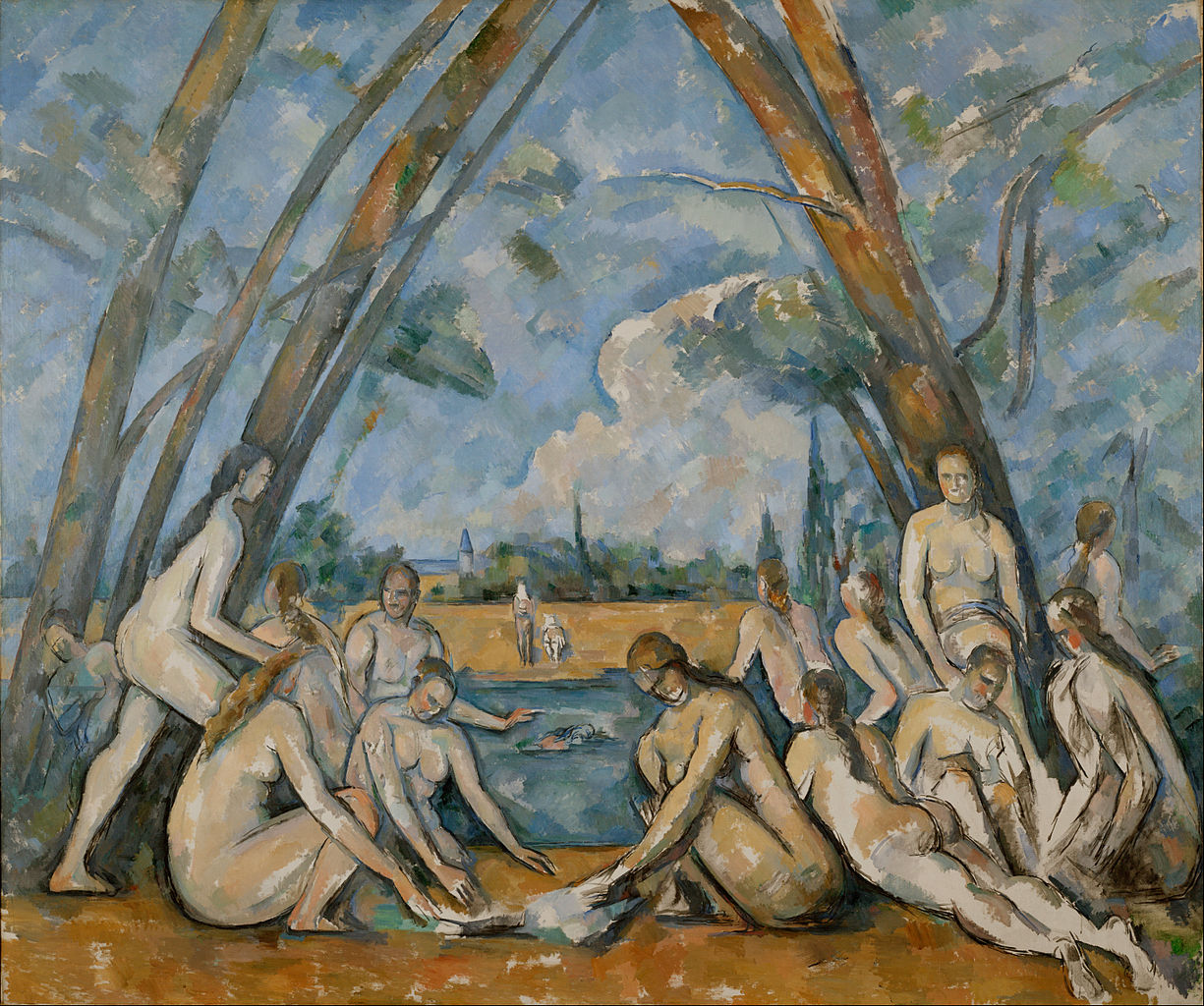
In 1906, Henri Matisse finished what is often considered his greatest Fauve painting, the Bonheur de Vivre, or the “Joy of Life.” It is a large-scale painting depicting an Arcadian landscape filled with brilliantly colored forest, meadow, sea, and sky and populated by nude figures both at rest and in motion. As with the earlier Fauve canvases, color is responsive only to emotional expression and the formal needs of the canvas, not the realities of nature. The references are many, but in form and date, Bonheur de Vivre is closest to Paul Cézanne’s last great image of bathers.
Matisse and his sources
Like Cézanne, Matisse constructs the landscape so that it functions as a stage. In both works trees are planted at the sides and in the far distance, and their upper boughs are spread apart like curtains, highlighting the figures lounging beneath. And like Cézanne, Matisse unifies the figures and the landscape. Cézanne does this by stiffening and tilting his trunk-like figures. In Matisse’s work, the serpentine arabesques that define the contours of the women are heavily emphasized, and then reiterated in the curvilinear lines of the trees.
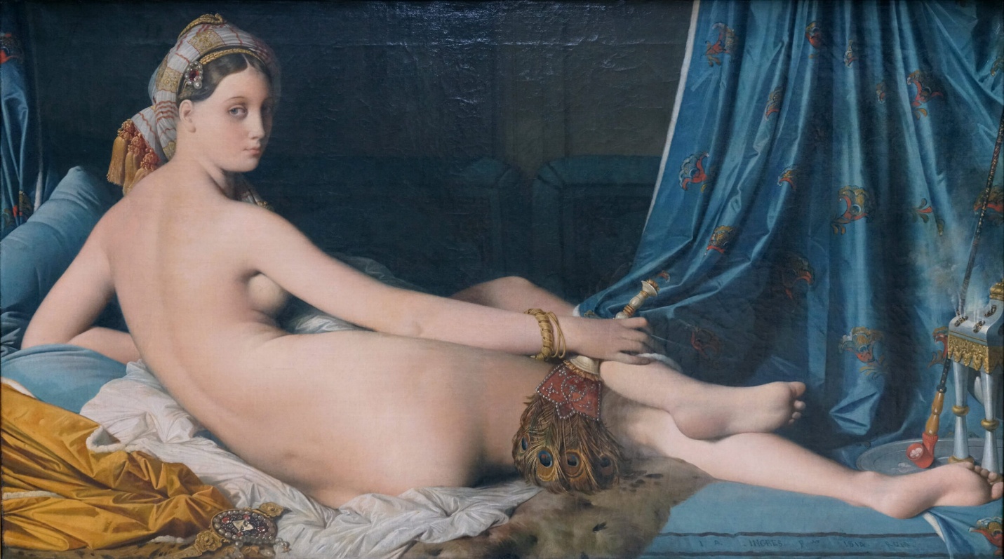
Matisse creates wildly sensual figures in Bonheur de Vivre, which show how he was clearly informed by Jean-Auguste-Dominique Ingres’s odalisques and harem fantasies. Additionally, Matisse references Titian. For like Titian’s Bacchanal of the Andrians, the scene depicted in Bonheur de Vivre is an expression of pure pleasure. Here is a place full of life and love and free from want or fear. Instead of a contemporary scene in a park, on the banks of the Seine, or other recognizable places in nature, Matisse has returned to mythic paradise.
Radicalism, or how to color outside the lines
But do not be misled by his interest in myth—Matisse is not joining in with William-Adolphe Bouguereau or any other Salon artist. This is the epitome of Fauvism, a radical new approach that incorporate purely expressive, bright, clear colors and wildly sensual forms. Matisse’s paintings are perhaps the first canvas to clearly understand Cézanne’s great formal challenge, and to actually further the elder master’s ideas. In fact, despite its languid poses, Bonheur de Vivre was regarded as the most radical painting of its day. Because of this, Matisse became known, briefly, as the most daring painter in Paris.
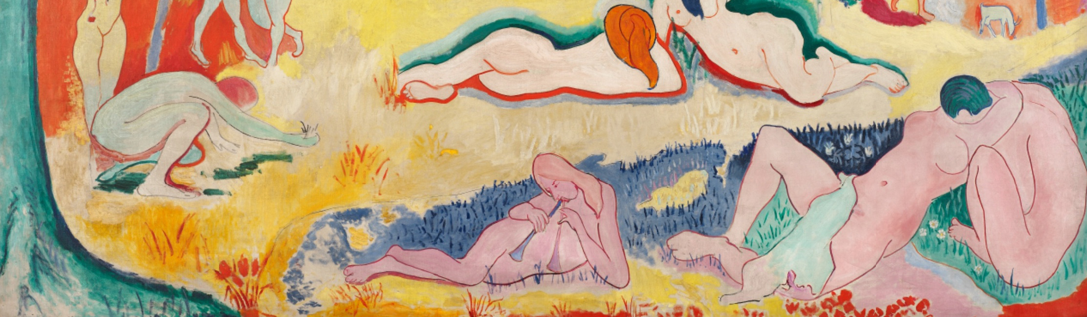
So what was daring about this canvas? Here is one key issue: unlike the paintings by Cézanne, Ingres, or Titian, Matisse’s work does not depict forms that recede in the background and diminish in scale. If you study the figures in the foreground and the middle ground of Bonheur de Vivre, you will notice that their scale is badly skewed. The shift of scale between the player of the double flute (bottom center) and the smooching couple (bottom right) is plausible, if we take the musician to be a child, but what of the giants just behind them? Compared to the figures standing in the wings, who are obviously mature women (middle ground left), these center women are of enormous proportion. They are simply too big to make sense of within the traditional conventions of Western painting.
Perspective, patronage and Picasso
So why has Matisse done this? How could these shifts of scale make sense? Have we seen anything like this before? Well, in a sense we have. Cézanne’s painting ruptured forms in order to accurately explore vision as experienced through time and space—in other words, forms look different depending on where we are in relation to them.
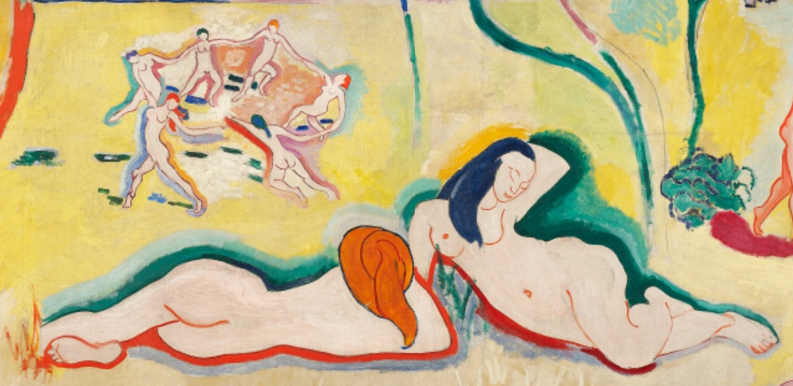
In fact, this exploration of vision through space is the key to understanding Matisse’s work. By incorporating shifting perspectives, he brought this idea to a grand scale. Put simply, Matisse’s shifting scale is actually the result of our changing position vis-à-vis the figures. As a result of his experimentation with perspective, the viewer relates differently to the painting and is required to “enter” the scene. It is only from the varied perspectives within this landscape that the abrupt ruptures of scale make sense.
The painting was purchased by a wealthy expatriate American writer-poet named Gertrude Stein and her brother, Leo Stein, who shared a home filled with modern art at 27 Rue de Fleurus, in Paris. This was also the location for Gertrude Stein’s weekly salon. Here, Matisse, Guillaume Apollinaire, the young and largely unknown Pablo Picasso and other members of the avant-garde came together to exchange ideas.
Stein was able to attract such a crowd not only because of her literary skills but because she often provided financial support to these nearly destitute artists. In fact, the Steins bought Matisse’s Bonheur de Vivre soon after its completion and hung it in their dining room for all to see. One person who saw it there was Picasso. By all accounts the painting’s fame was too much for the terribly competitive young Spaniard. He determined to out do Matisse, and he did with his 1907 canvas, Les Demoiselles d’Avignon.
Picasso turned Matisse’s sensuality into violent pornography. Matisse in turn responds to the challenge of what was then called “primitivism” with his own brand of aggression in his Blue Nude.
Expressionism, an introduction

Imagine a painting where the magentas scream, the greens glare, and coarse brushstrokes become more ominous the longer you look at them. Paintings like this, where the artist uses color, line, and visible techniques to evoke powerful responses from the viewer date from the early twentieth century but continue expressive traditions that can be found throughout art’s history (see, for example, work by Francisco Goya). When capitalized as “Expressionism,” however, the term refers more specifically to an artistic tendency that became popular throughout Europe in the early twentieth century. Like many categories in art history, Expressionism was not a name coined by artists themselves. It first emerged around 1910 as a way to classify art that shared common stylistic traits and seemed to emphasize emotional impact over descriptive accuracy. For this reason, artists like Edvard Munch straddle the line between Post-Impressionist developments in late 19th century painting and early 20th century Expressionism. Likewise, the Fauves in France exhibited similar characteristics in their work and are often linked to Expressionism.
Expressionism in Germany
Though many artists of the early twentieth century can accurately be called Expressionists, two groups that developed in Germany, Die Brücke (The Bridge) and Der Blaue Reiter (The Blue Rider), are among the best known and help to define the style. Influenced in part by the spiritual interests of Romanticism and Symbolism, these artists moved further from the idealized figures and smooth surface of 19th century academic painting that can be seen in paintings by Lawrence Alma-Tadema, for example. Instead of depicting the visible exterior of their subjects, they sought to express profound emotional experience through their art. German Expressionists, like other European artists of the time, found inspiration in so-called “primitive” sources that included African art, as well as European medieval and folk art and others untrained in Western artistic traditions. For the Expressionists, these sources offered alternatives to established conventions of European art and suggested a more authentic creative impulse.
Die Brücke
In 1905, four young artists working in Dresden and Berlin, joined together, calling themselves Die Brücke (The Bridge). Led by Ernst Ludwig Kirchner, the group wanted to create a radical art that could speak to modern audiences, which they characterized as young, vital, and urban. Drawn from the writings of Friedrich Nietzsche, the nineteenth-century German philosopher, the name “Die Brücke” describes their desire to serve as a bridge from the present to the future. While each artist had his own personal style, Die Brücke art is characterized by bright, often arbitrary colors and a “primitive” aesthetic, inspired by both African and European medieval art. Their work often addressed modern urban themes of alienation and anxiety, and sexually charged themes in their depictions of the female nude.
Their first exhibition was held in the showroom of a lamp factory in Dresden in 1906 for which they published a program of woodcut prints reflecting their interest in earlier traditions of German art. In the introductory broadsheet (above left), Kirchner made clear the group’s revolutionary intentions. He proclaimed,
“With faith in progress and in a new generation of creators and spectators we call together all youth. As youth, we carry the future and want to create for ourselves freedom of life and of movement against the long established older forces.”1
This optimism was not long-lived. Internal squabbling caused the group to dissolve in 1913 just prior to the start of the First World War.
Der Blaue Reiter

Based in the German city of Munich, the group known as Der Blaue Reiter lasted only from their first exhibition at the Galerie Thannhausen in 1911 to the outbreak of World War I in 1914. Created as an alternative to Kandinsky’s previous group, the more conservative Neuen Künstlervereinigung München (New Artists Association of Munich or NKVM), Die Blaue Reiter took its name from the motif of a horse and rider, often used by founding member Vasily Kandinsky.
This motif appeared on the cover of the Blue Rider Almanac (left), published in May 1912, and reflects Kandinsky’s interest in medieval traditions and the folk art of his Russian homeland. In contrast to Die Brücke, whose subjects were physical and direct, Kandinsky and other Die Blaue Reiter artists explored the spiritual in their art, which often included symbolism and allusions to ethereal concerns. They thought these ideas could be communicated directly through formal elements of color and line, that, like music, could evoke an emotional response in the viewer. Conceived by Kandinsky and Franz Marc, the almanac included essays by themselves and other German and Russian artists, musical compositions by Expressionist composers, such as Arnold Schönberg, and Kandinsky’s experimental theater piece, “Der gelbe Klang” (The Yellow Sound). This range of content shows Der Blaue Reiter’s efforts to provide a philosophical approach not just for the visual arts, but for culture more broadly. These ideas would become more fully developed at the Bauhaus where Kandinsky taught after the war (Marc died during the Battle of Verdun in 1916).
Austrian Expressionism
While the Die Brücke and Der Blaue Reiter groups had relatively defined memberships, Expressionist artists also worked independently. In Vienna, Oskar Kokoschka and Egon Schiele stand out for paintings that show intense, often violent feeling and for their efforts to represent deeper psychological meaning.
In the aftermath of the First World War, many artists in Germany felt that the forceful emotional style of Expressionism that had been so progressive before the war but had become less appropriate. Neue Sachlichkeit (New Objectivity) arose as a direct response to pre-war stylistic excess.
Die Brücke Expressionism: Ernst Ludwig Kirchner, Street, Dresden
Best known as a painter and printmaker, Kirchner was a founder of Die Brücke whose work focused on the expression of urban anxiety and confusion.
Der Blaue Reiter Expressionism and Abstract Art: Vasily Kandinsky, Improvisation 28
A Russian-born artist active in Germany, Kandinsky was a member of The Blue Rider and a Bauhaus instructor whose color theory was highly influential. What would this painting sound like? Yes, you read that right—this canvas blurs the lines between senses.
Modern art and reality
If asked, most people would probably say that modern art is not true to reality. Indeed, modern art is practically defined by its bizarre distortions of reality; this is one reason why Norman Rockwell, whose work is more recent than Umberto Boccioni’s, is not considered a modern artist. But looking like reality — what art historians call “naturalism” — is only one way of being true to reality. As we shall see, the attempt to create art that was more true to reality than traditional naturalism was the motivation for some of the most radical modern art, even including Boccioni’s States of Mind: The Farewells.
Impressionism and optical realism
When the Impressionist style first appeared on the art scene of the 1870s, many hostile viewers dismissed it as art by “lunatics” whose color perception was questionable and who did not have the technical skills to properly finish their paintings. Some critics claimed, however, that Impressionist paintings were more accurate than traditional naturalistic representations. Their argument was that the Impressionists represented their perception of objects rather than the objects themselves, and that the colors we perceive are often not identical to an object’s actual or “local” color.
In the 1890s, Monet created dozens of paintings of Rouen Cathedral at different times of day and in different weather. At dawn, the cathedral was tinged with blue light; in the late-afternoon, it was radiant with oranges and yellows; while on cloudy days it was a duller grayish tan. By recording how the appearances of objects are affected by different lighting conditions, the Impressionists argued that their paintings were more accurate representations of the way we see the world. What appears at first sight to be a radically unrealistic style is in fact more true to the way things actually look.
Discarding artificial conventions
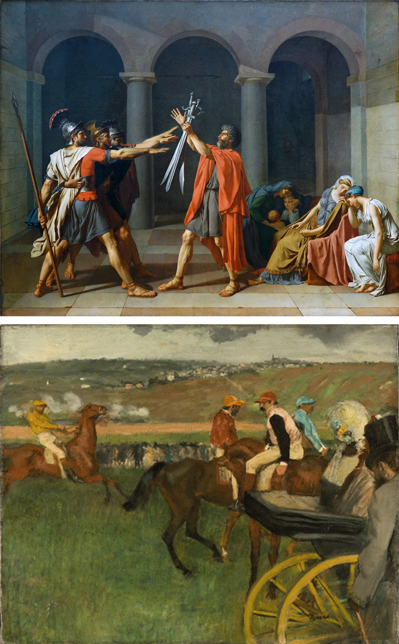
The Impressionists recognized that much traditional art was accepted as true to reality only because it was familiar, not because it was accurate. For example, methods of composition taught in Academies tended to emphasize a central focus, equal balance on both sides, and a clear depiction of spatial recession, as in David’s Oath of the Horatii. Such compositions are, in fact, very artificially staged. When we move through the world, we are more likely to encounter scenes like the one represented in Degas’s The Race Track: awkwardly unbalanced, abruptly cropped, and spatially ambiguous. Critics who supported the Impressionists argued that artists like Degas were correcting artificial conventions and making art more true to reality.
Although the Impressionist style was new, this form of argument was not. In the sixteenth century artists and critics tried to draw a distinction between a true naturalism and a false naturalism (often derogatorily called “Mannerism“). False naturalism involved copying the work of other artists, and thus understanding nature only at second hand. The solution, some felt, was to discard the conventions of art and return to a more careful study of the original source, nature itself, just as the Impressionists did.
Is naturalism true to nature?
Impressionist artists sought greater truth to nature through more careful observation, but there is a sense in which our eyes inevitably distort the objects they perceive. Three ways they do so are embodied in the artistic techniques of linear perspective, diminution, and foreshortening.
In linear perspective, what are actually parallel lines in real life (such as railroad tracks or the edges of floor tiles) converge in the representation. This effect, seen above in the Saenredam painting of a church interior, is integral to what is popularly considered a realistic style, but it is obviously not true to reality. Each of the tiles on the floor is in fact square. Similarly, with diminution, objects appear to get smaller the farther away they are, but this is just an optical trick; each of those windows is in reality the same size.
Foreshortening occurs when we view an object from an angle at which it recedes away from us, so that the object appears to be contracted, shorter than its actual length. In the Academic figure study above on the right, the two thighs appear to be of different lengths and shapes simply because one is viewed parallel to the picture plane while the other is receding sharply away from it. In actual reality, of course, both thighs are very similar (mirror images) in length and shape.
Correcting for perceptual distortion
The style we colloquially call “realistic” is not literally true to reality, then. It is only a record of our perception of reality, from one angle, at one distance, at one moment in time, and in one kind of light, and all of these factors can distort the object. Some Modern art movements sought a representational system that would be more accurate to the true shapes of objects, rather than representing them deformed by perception.
Cubist paintings seem at first sight to be even more bizarrely distorted and unrealistic than Impressionist paintings. In the Salon Cubist Jean Metzinger’s Le Goûter, objects appear to be twisted and broken up, but this is done in order to correct the distortions of perspective and foreshortening. Metzinger shows things from multiple perspectives so we can better understand their true shapes. The left side of the tea cup on the table is seen from the side at eye level, but from that angle you wouldn’t be able to tell that the cup has a round opening, so the right side is seen from above to complete our understanding of the round lip and concave shape of the cup. Similarly, one of the woman’s eyes is viewed in profile, while the other is seen facing us, and her left shoulder is seen from above, while the right is more straight on. Cubism doesn’t “distort” objects; it shows them from multiple angles in order to give us more information about their true shapes than would be visible in traditional naturalistic representation.
Modernism and science
Another way of justifying the apparent distortions of modern art came in the form of appeals to science. Modern science provided a stream of new images that sparked artists’ imaginations, as well as new theories that radically altered people’s understanding of reality.
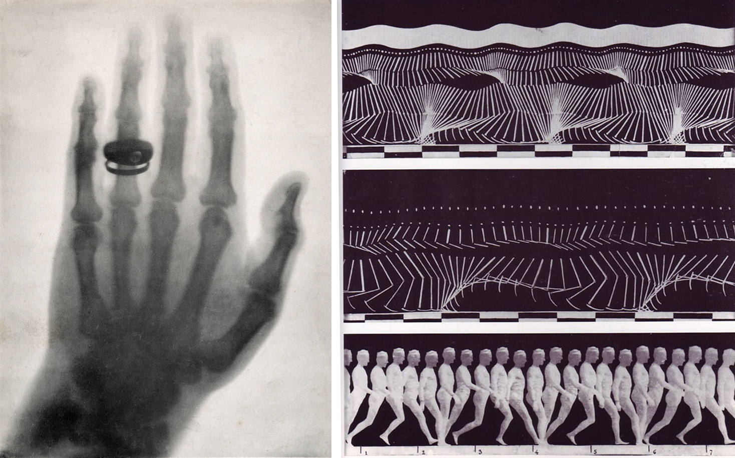
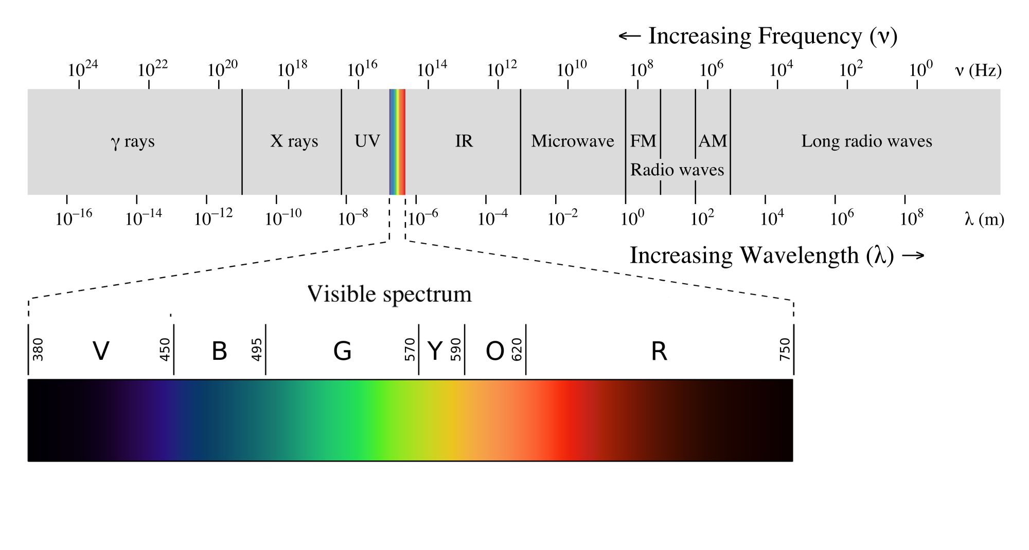
Beginning in the seventeenth century, new technologies based on the use of optical lenses provided evidence of microscopic and macroscopic worlds hitherto unsuspected. The discovery of wavelengths beyond the visible spectrum, including infrared and ultraviolet light as well as x-rays, gamma rays, and radio waves, made it clear that the human senses are very limited instruments for understanding the objective world. The visual culture of modern science provided new ways of representing and understanding reality. Stop-motion photography made rapid actions visible for study, and x-ray photography allowed peeks into the interior of solid forms, resulting in visions of reality beyond traditional naturalism.
One work that attempted to represent this new super-sensory reality was Italian Futurist Umberto Boccioni’s States of Mind: The Farewells (1911). The only clearly legible feature in the painting is the number 6943 stenciled on what we gradually discern is the engine of a dark-gray train engine spewing steam in a station. The train is represented, Cubist-fashion, from multiple perspectives. The nose cone is in profile, while the body of the train recedes in a zig-zag toward the upper right then upper center of the canvas. In front of the train in green are a series of a couples saying goodbye (their two heads and embracing arms are clearest in the lower left) — or perhaps they are one couple, viewed multiple times in the manner of stop-action photography in order to show motion through time.
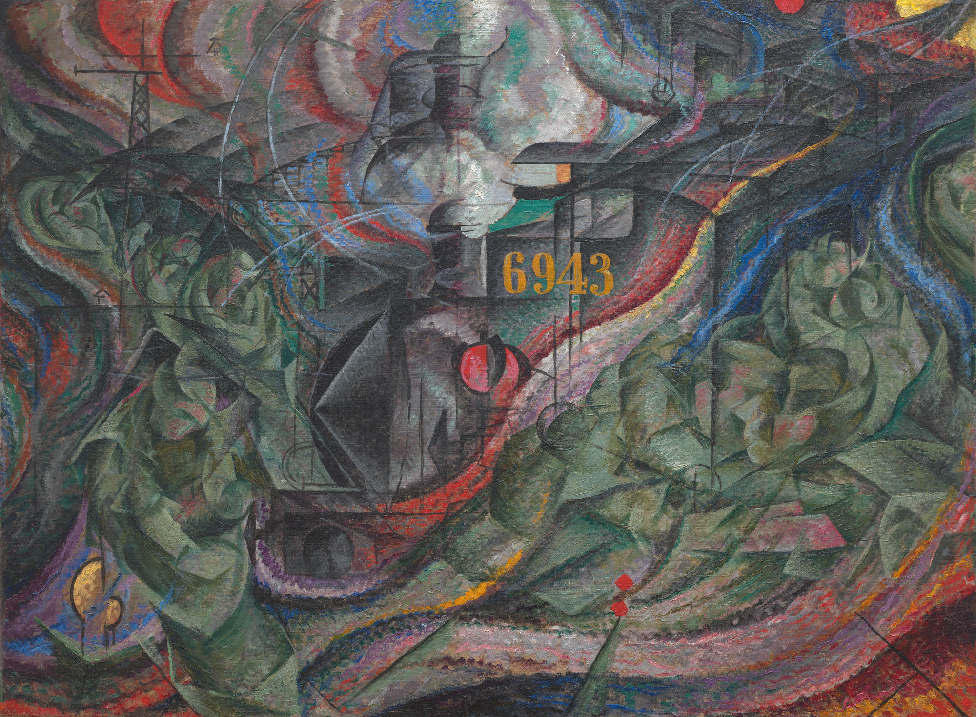
Two truss structures on the left suggest the radio towers that were constructed across Europe in the first decades of the twentieth century after the Italian Guglielmo Marconi harnessed radio waves for wireless communication. Correspondingly, the remainder of the composition is permeated with wave-forms in bright colors to suggest their high energy. Many forms of electromagnetic energy such as radio waves are invisible to the eye, but nonetheless permeate the world. Altogether, the work makes visible the new understanding of nature achieved by modern physics and presents a glimpse of reality beyond the limitations of the human senses.
Italian Futurism, an introduction
Can you imagine being so enthusiastic about technology that you name your daughter Propeller? Today we take most technological advances for granted, but at the turn of the last century, innovations like electricity, x-rays, radio waves, automobiles and airplanes were extremely exciting. Italy lagged Britain, France, Germany, and the United States in the pace of its industrial development. Culturally speaking, the country’s artistic reputation was grounded in Ancient, Renaissance and Baroque art and culture. Simply put, Italy represented the past.
In the early 1900s, a group of young and rebellious Italian writers and artists emerged determined to celebrate industrialization. They were frustrated by Italy’s declining status and believed that the “Machine Age” would result in an entirely new world order and even a renewed consciousness.
Filippo Tommaso Marinetti, the ringleader of this group, called the movement Futurism. Its members sought to capture the idea of modernity, the sensations and aesthetics of speed, movement, and industrial development.
A manifesto
Marinetti launched Futurism in 1909 with the publication his “Futurist manifesto” on the front page of the French newspaper Le Figaro. The manifesto set a fiery tone. In it Marinetti lashed out against cultural tradition (passatismo, in Italian) and called for the destruction of museums, libraries, and feminism. Futurism quickly grew into an international movement and its participants issued additional manifestos for nearly every type of art: painting, sculpture, architecture, music, photography, cinema—even clothing.
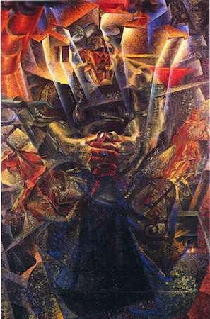
The Futurist painters—Umberto Boccioni, Carlo Carrà, Luigi Russolo, Gino Severini, and Giacomo Balla—signed their first manifesto in 1910 (the last named his daughter Elica—Propeller!). Futurist painting had first looked to the color and the optical experiments of the late 19th century, but in the fall of 1911, Marinetti and the Futurist painters visited the Salon d’Automne in Paris and saw Cubism in person for the first time. Cubism had an immediate impact that can be seen in Boccioni’s Materia of 1912 for example. Nevertheless, the Futurists declared their work to be completely original.
Dynamism of Bodies in Motion
The Futurists were particularly excited by the works of late 19th-century scientist and photographer Étienne-Jules Marey, whose chronophotographic (time-based) studies depicted the mechanics of animal and human movement.
A precursor to cinema, Marey’s innovative experiments with time-lapse photography were especially influential for Balla. In his painting Dynamism of a Dog on a Leash, the artist playfully renders the dog’s (and dog walker’s) feet as continuous movements through space over time.
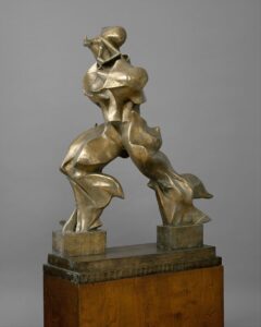
Entranced by the idea of the “dynamic,” the Futurists sought to represent an object’s sensations, rhythms and movements in their images, poems and manifestos. Such characteristics are beautifully expressed in Boccioni’s most iconic masterpiece, Unique Forms of Continuity in Space (see above).
The choice of shiny bronze lends a mechanized quality to Boccioni’s sculpture, so here is the Futurists’ ideal combination of human and machine. The figure’s pose is at once graceful and forceful, and despite their adamant rejection of classical arts, it is also very similar to the Nike of Samothrace.
Politics & War
Futurism was one of the most politicized art movements of the twentieth century. It merged artistic and political agendas in order to propel change in Italy and across Europe. The Futurists would hold what they called serate futuriste, or Futurist evenings, where they would recite poems and display art, while also shouting politically charged rhetoric at the audience in the hope of inciting riot. They believed that agitation and destruction would end the status quo and allow for the regeneration of a stronger, energized Italy.
These positions led the Futurists to support the coming war, and like most of the group’s members, leading painter Boccioni enlisted in the army during World War I. He was trampled to death after falling from a horse during training. After the war, the members’ intense nationalism led to an alliance with Benito Mussolini and his National Fascist Party. Although Futurism continued to develop new areas of focus (aeropittura, for example) and attracted new members—the so-called “second generation” of Futurist artists—the movement’s strong ties to Fascism has complicated the study of this historically significant art.
Modernism and spiritualism
Modern artists’ quest for truth to realities beyond human perception was also influenced by the explicitly non-scientific approaches of spiritualism. Although spiritual visions and discoveries are often seen as subjective, many modern artists saw them as revealing objective truths. They claimed their depictions of these discoveries were glimpses of a higher reality than that available to the human senses.

The Swedish artist Hilma af Klint painted a series of works called The Paintings for the Temple between 1905 and 1915 based in part on mystical visions she received from a spiritual guide. Around the same time, the Dutch artist Piet Mondrian undertook a close study of nature to eventually discover what he felt were the basic “building blocks” of all natural and artistic form: the primary colors red, yellow, and blue; the primary values black and white, and horizontal and vertical lines. Although both of these artists produced some artworks that are entirely non-representational in the sense that they do not look like nature, both argued that their spiritual quest revealed a higher reality than that available to the senses.
These artists all remind us that what is popularly considered ”realistic” in art is in fact only based on sense perceptions, which are inevitably partial, and which in many cases distort reality. By observing nature more closely, discarding artificial conventions, correcting for perceptual distortions, absorbing new scientific theories, and engaging in spiritual investigations, many modern artists rejected traditional naturalism in order to seek higher truths.
Proto-Cubism: Pablo Picasso, Les Demoiselles d’Avignon
Spanish artist Pablo Picasso dominated 20th-century European art. He developed Cubism with Georges Braque and would embody the image of the modern artist. Picasso loved the magic of illusionism—but here, he shatters it.
The reception of African art in the West
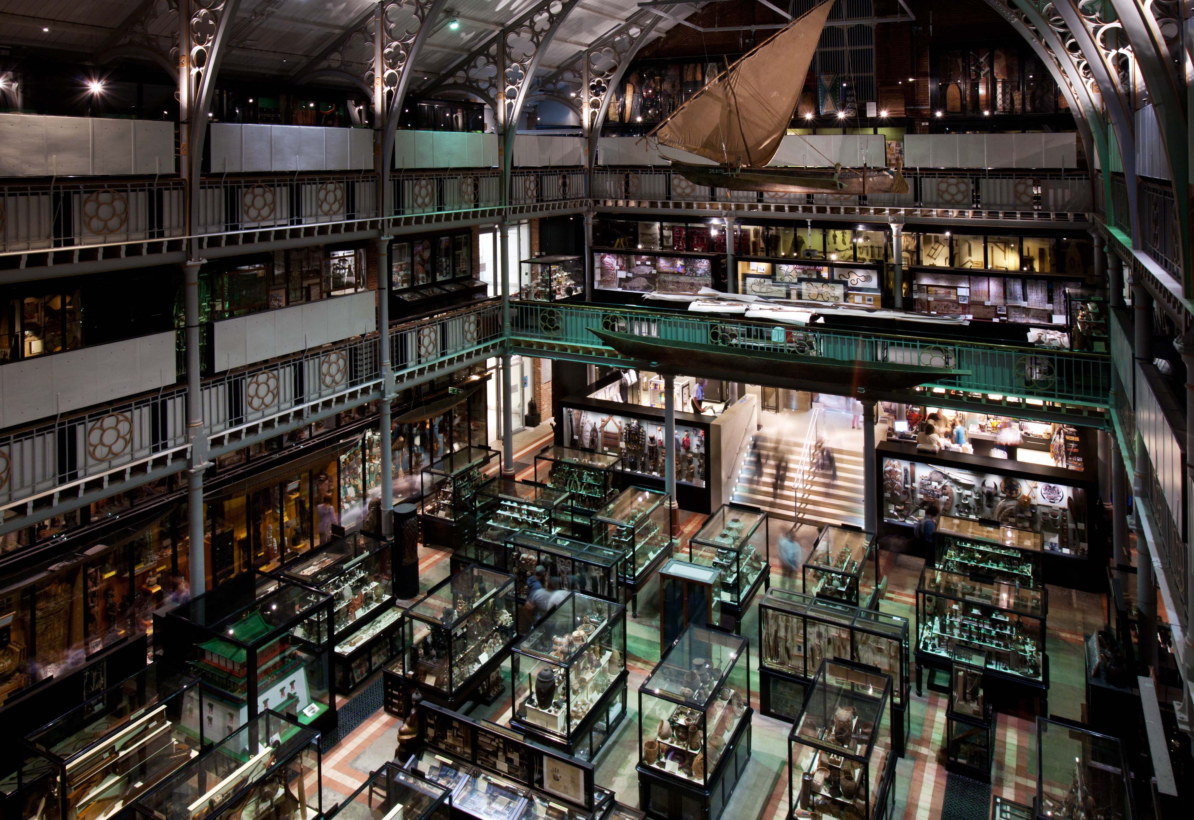
When early European explorers brought back souvenirs from their trips to the African continent they were regarded as curiosities and they didn’t find a home in art museums for centuries. Instead, these objects became part of natural history museums—along with fossilized remains, flora and fauna, and purely utilitarian objects. They were considered the man-made material remains of a culture. Clouded by the framework of Social Darwinism in the 19th century and other beliefs that justified racial hierarchies, peoples of African, Pacific, and Native American descent were regarded as less civilized, even less human. Attitudes about their art were also determined by pre-conceived ideas about race and therefore, their creations were not categorized as “Art” in Euro-American sense.
By the early 1900s however, these same objects that were initially regarded as artifacts of material culture, began to be exhibited in Western art museums and galleries as “art.” The objects themselves had not changed, but there was a shift in the attitudes and assumptions about what constituted a work of art.
To historicize this issue more, we can divide the history of the display and reception of African art into four periods. In the 18th century, objects like the ones illustrated here would likely be housed in a “curiosity cabinet”—in a private family parlor where trinkets and novelties acquired over generations, often while traveling, were displayed. The artist, culture, and function of these objects was not usually recorded or regarded as significant. By the 19th century, many of these curiosity cabinet collections were donated first to natural history museums where they were categorized and classified in the name of science along with flora, fauna, and skeletal remains. By the twentieth century, some of these same works were exhibited in fine art galleries and museums. Over time, African art has become widely collected and ever more popular.
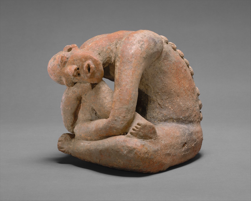
Some of the assumptions about what constitutes art is still very much a part of the Western aesthetic system. For example, “high art” is still thought of as painting and sculpture. Because many African artworks served a specific function, Westerners have sometimes not regarded these as art. It is worth remembering, however, that the concept of “art” divorced from ritual and political function, is a relatively recent development in the West. Prior to the 18th century, most artistic traditions around the world were functional as well as aesthetic, and arguments can be made that all art serves social and economic functions. The objects that African artists create—while useful—embody aesthetic preferences and may be admired for their form, composition and invention.
18th-century theories
In 18th-century Europe, philosophers and critics constructed a definition of “art” in which the object was unique, complex, irreplaceable, inspired by the natural world, and with the exception of architecture, non-functional. In contrast, non-Western art was viewed as not unique, simply produced, replaceable, abstract, and utilitarian. Therefore, Non-Western art was not considered to be art.
19th-century theories
19th century notions of art were redefined by theories of cultural evolution. Social Darwinism was used to support the claim that all cultures progress along an evolutionary ladder. Western culture was seen as the most advanced and inherently superior. Societies in Africa were viewed as more primitive, a state of being from which modern Western society evolved. Franz Boas in 1927 in his book Primitive Art shows that cultural evolutionism is seriously flawed. He argued that contemporary societies cannot be arranged on a ladder of “least evolved” or “most advanced.” Nor can their art.
20th-century cultural relativism and Pablo Picasso
Anthropologists and art historians came to support the idea of cultural relativism, meaning that they realized that non-Western cultures should not be judged according to the values of the West, but instead should be understood in their own cultural context. This led anthropologists and art historians to a reevaluation of the nature of “art.” However, it was modern Western artists who brought non-Western objects into the popular imagination as works of art worthy of aesthetic consideration. Looking for a new way to represent modernity, artists such as Andre Derain, Amedeo Modigliani, and Pablo Picasso turned to non-Western art for stylistic inspiration. We see this in Picasso’s Les Demoiselles d’Avignon (above). The women’s faces on the right of the canvas have been painted as masks inspired by African artworks Picasso observed on his trip to the Trocadero Museum in Paris in 1907:
“All alone in that awful museum with masks, dolls made by the redskins, dusty manikins. Les Demoiselles d’Avignon must have come to me that very day, but not at all because of the forms; because it was my first exorcism painting — yes absolutely!…The masks weren’t just like any other pieces of sculpture. Not at all. They were magic things. But why weren’t the Egyptian pieces or the Chaldean? We hadn’t realized it. ‘Those were primitive, not magic things. The Negro pieces were mediators. They were against everything — against unknown, threatening spirits. I always looked at fetishes. I understood; I too am against everything. I understood what the Negroes used their sculpture for. Why sculpt like that and not some other way? After all, they weren’t Cubists! Since Cubism didn’t exist.”
In the quote above, Picasso recognized that the African and Amerindian artists whose work he saw at the museum in Paris were deliberately using abstraction. He doesn’t focus on why they chose this style but he adopts it, none-the-less, to pursue his own expressive interests. For contemporary avant-garde artists, African art offered abstraction as a strategy for the representation of modernity. The quote also tells us that Picasso, like many Western collectors, didn’t know much about the function, culture, or history of African objects and he seems to have focused on their purely formal properties. Picasso, Piet Mondrian, Constantin Brancusi, Georges Braque and other modernists helped Western viewers to see these objects as “art” but the cultural meanings of these works remained opaque. However, over the course of the nineteenth and twentieth centuries, scholars began to question social Darwinism and seek out indigenous interpretations of the form and function of objects.
Today, many contemporary African artists are influenced by tradition-based African art (see for example, El Anatsui and Magdalene Odundo). African arts played a central role in their communities, whether to communicate royalty, sacrality, inner virtues, aesthetic interests, genealogy, or other concerns. As the art historian Robert Farris Thompson has argued for the Yoruba, African art is used to make things happen, it is efficacious and necessary for events like rituals, masquerades, and life cycle transitions to successfully occur.
Inventing Cubism
During the summer of 1908, Georges Braque returned to Paul Cézanne‘s old haunt for a second summer in a row. Previously he had painted this small port just south of Aix-en-Provence with the brilliant irreverent colors of a Fauve. But now, after Cézanne’s death and after having met Pablo Picasso, Braque set out on a very different tack, the invention of Cubism.
Cubism is a terrible name. Except for a very brief moment, the style has nothing to do with cubes. Instead, it is an extension of the formal ideas developed by Cézanne and broader perceptual ideas that became increasingly important in the late 19th and early 20th centuries. These were the ideas that inspired Matisse as early as 1904 and Picasso perhaps a year or two later. We certainly saw such issues asserted in Les Demoiselles d’Avignon. But Picasso’s great 1907 canvas is not yet Cubism. It is more accurate to say that it is the foundation upon which Cubism is constructed. If we want to really see the origin of the style, we need to look beyond Picasso to his new friend Georges Braque.
A new perspective
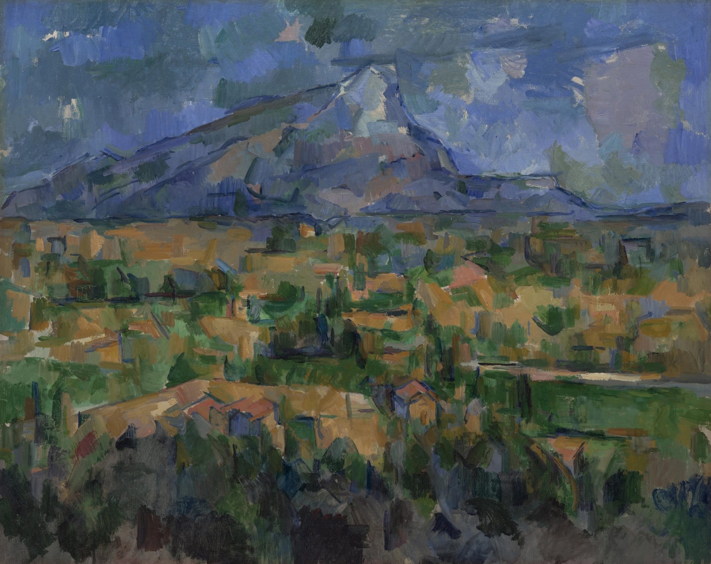
The young French Fauvist, Georges Braque that had been struck by both the posthumous Cézanne retrospective exhibition held in Paris in 1907 and his first sight of Picasso’s radical new canvas, Les Demoiselles d’Avignon. Like so many people that saw it, Braque is reported to have hated it—Matisse, for example, predicted that Picasso would be found hanged behind the work, so great was his mistake. Nevertheless, Braque stated that it haunted him through the winter of 1908. Like every good Parisian, Braque fled Paris in the summer and decided to return to the part of Provence in which Cézanne had lived and worked. Braque spent the summer of 1908 shedding the colors of Fauvism and exploring the structural issues that had consumed Cézanne and now Picasso. He wrote:
“It [Cézanne’s impact] was more than an influence, it was an invitation. Cézanne was the first to have broken away from erudite, mechanized perspective…”[1]
Like Cézanne, Braque sought to undermine the illusion of depth by forcing the viewer to recognize the canvas not as a window but as it truly is, a vertical curtain that hangs before us. In canvases such as Houses at L’Estaque, Braque simplifies the form of the houses (here are the so called cubes), but he nullifies the obvious recessionary overlapping with the trees that force forward even the most distant building.
Brothers of invention
When Braque returned to Paris in late August, he found Picasso an eager audience. Almost immediately, Picasso began to exploit Braque’s investigations. But far from being the end of their working relationship, this exchange becomes the first in a series of collaborations that lasts six years and creates an intimate creative bound between these two artists that is unique in the history of art.
Between the years 1908 and the beginning of the First World War in 1914, Braque and Picasso work together so closely that even experts can have difficulty telling the work of one artist from the other. For months on end they would visit each other’s studio on an almost daily basis sharing ideas and challenging each other as they went. Still, a pattern did emerge and it tended to be to Picasso’s benefit. When a radical new idea was introduced, more than likely, it was Braque that recognized its value. But it was inevitably Picasso who realized its potential and was able to fully exploit it.
Tough art
By 1910, Cubism had matured into a complex system that is seemingly so esoteric that it appears to have rejected all esthetic concerns. The average museum visitor, when confronted by a 1910 or 1911 canvas by Braque or Picasso, the period known as Analytic Cubism, often looks somewhat put upon even while they may acknowledge the importance of such work. I suspect that the difficulty, is, well…, the difficulty of the work. Cubism is an analysis of vision and of its representation and it is challenging. As a society we seem to believe that all art ought to be easily understandable or at least beautiful. That’s the part I find confusing.
Pablo Picasso and the new language of Cubism
Picasso was a technically skilled draftsman—so why did he choose to take his forms apart?
Georges Braque, Violin and Palette
George Braque is best known for his collaboration with Pablo Picasso and their development of Cubism, especially its collage aspect.
Although much of the painting is not naturalistic, we can identify the still-life objects in Georges Braque’s Violin and Palette fairly easily. The form of the violin at the bottom of the painting is fractured; the body of the instrument has been broken up into geometric shapes, and on the right side they grow like crystals into the surrounding space.
While the lower portion of the instrument is painted naturalistically and visibly recedes, the upper left side does not, and part of it is missing altogether. The bridge that supports the strings has been tilted and flattened into a light gray pentagon between the S-shaped sound holes. The strings are broken into two differently angled sections, the neck is shortened, and the scroll at the top is displaced and twisted in relation to the body.
Tradition and innovation
This painting is an early example of Analytic Cubism, the name given to the first phase of Picasso’s and Braque’s joint endeavor to create a new approach to the pictorial representation of objects in space. Despite its often baffling innovations, one of the defining features of Cubism is its engagement with the European painting tradition.
This engagement with tradition is particularly evident in Picasso’s and Braque’s use of traditional subjects: landscapes, figure studies, portraits, and still life paintings of dishes, fruit, glassware, and musical instruments. Landscapes largely disappeared after the earliest stages. Picasso made more figure studies and portraits during the Analytic Cubist phase, while Braque favored still life subjects.
The relative familiarity of these subjects helps to set Cubism’s radical formal innovations in high relief. Why are objects and even apparently space itself fractured and faceted? Many different explanations have been put forward by art critics and historians, but they all revolve around Braque and Picasso’s engagement in a radical new analysis of three-dimensional form and its relation to both literal and pictorial space.
New strategies of representation
Some of the distortions in Violin and Palette, most notably the relationship of the violin’s scroll to its body, may be explained as the result of combining several different angles of view into a single depiction. This explanation was frequently advanced by contemporaneous critics, and it does explain many of the Salon Cubists’ paintings. However, it fails to account for all of the distortions in Braque’s Violin and Palette, such as the way parts of the violin are abstracted into geometric forms, and the elimination of entire parts of the instrument.
It also does not address the way in which the surrounding space is represented as if it too were fractured geometric abstractions of solid forms. These are all important characteristics of Braque’s Cubist exploration of new strategies of pictorial representation.
The upper half of Violin and Palette displays additional approaches to representation. We see several pages of sheet music, perhaps propped up on a music stand behind the violin depicted below. Paper is flat, but Braque has used shading to indicate creases and the bowing of the page.This gives the paper tangible form while also connecting it to the abstract geometric pattern that dominates the painting. Notice that Braque paints the musical staff lines projecting to the left beyond the page on which they are printed. This is an echo of the way he painted cubic sections of the violin growing into space below.
A trompe l’oeil illusion
Above and behind the sheet music, Braque painted a green curtain and a palette hanging from a nail. Both of these objects refer to traditional naturalistic representation. The curtain is a conventional framing device used in European painting to suggest spatial depth. In Braque’s painting the curtain frames the palette. Although the curtain, nail, and palette are painted in a sketchy manner that is not very realistic, cast shadows make a direct visual reference to the kind of trompe l’oeil illusionism employed in William Harnett’s Violin and Music.
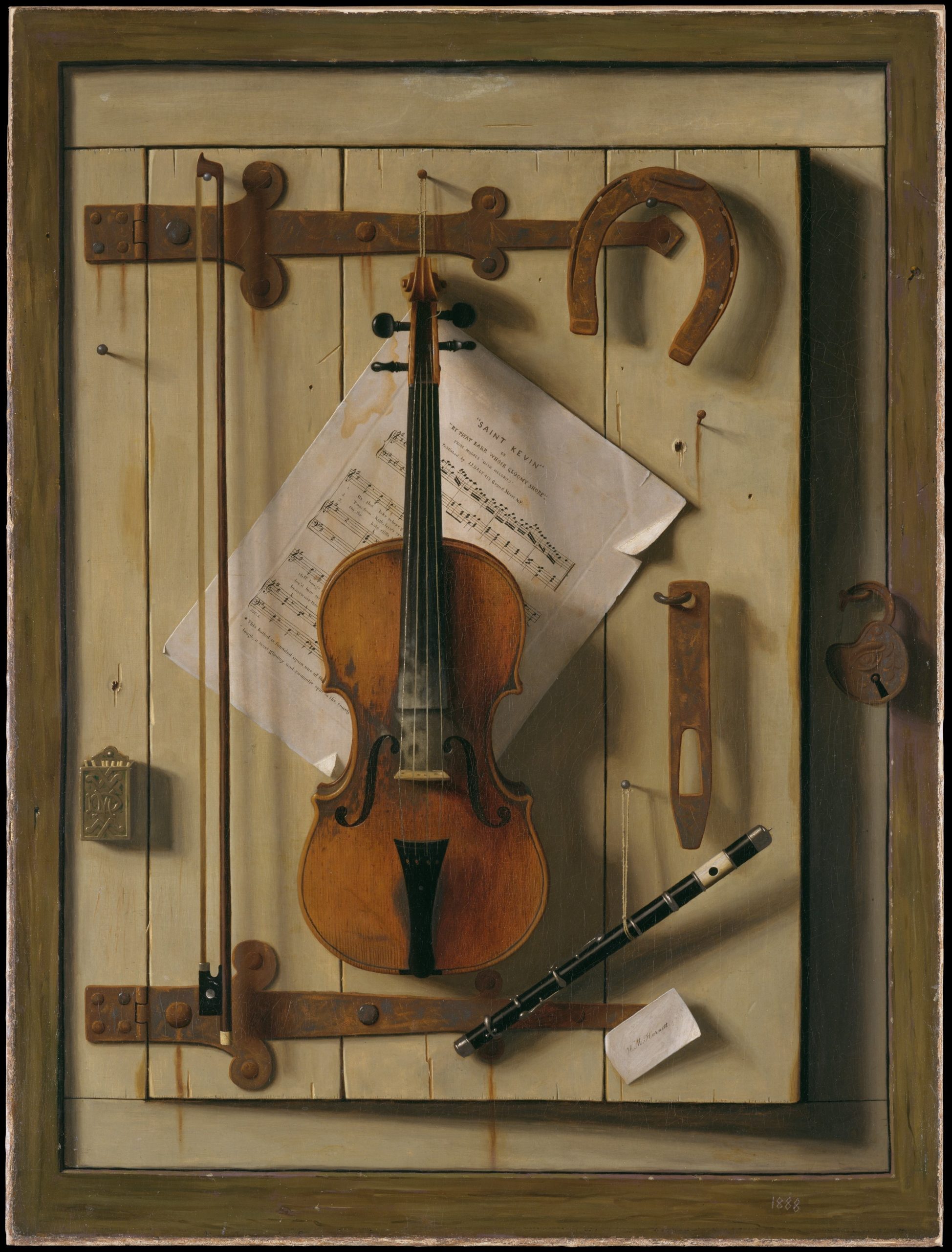
Because the palette is itself flat, and Braque painted shadows behind its curved edges, his illusion is somewhat successful and contrasts with the distorted representation of the violin below. The placement of the nail in the top center of the painting adds another layer to the paintings’ illusion. It looks like it could be literally nailing the canvas to the wall. As a whole, Violin and Palette presents naturalistic representation in juxtaposition to Cubist representational techniques to indicate that these new techniques are alternative, and equally viable, modes of depiction.
A developmental process
Picasso’s and Braque’s Cubism is generally understood to have been a developmental process rather than a style that followed a predetermined theoretical approach. The two artists worked in a close and competitive relationship between 1908 and 1914, meeting regularly to see each other’s latest works, and pushing each other to increasingly daring pictorial innovations. Braque’s Violin and Palette was painted during the early stages of their Cubist explorations. Over the course of the next few years, both artists’ approach to representation became increasingly abstract.
In Braque’s Mandora, the surface of the painting is divided into a shifting lattice of diamond shapes in which we can dimly perceive the suggestion of several objects. The mandora (a type of lute) is the only object we can see with certainty, but it is a much less substantial presence than the violin in Violin and Palette. Dark geometric shapes create a shadow framing the lighter central facets, suggesting the outline of the mandora and other objects arranged on a table. Vertical rectangles in the upper portion of the canvas may indicate more objects resting on the table top, but there is not enough information to be certain. The still life objects have become a shifting chiaroscuro pattern of abstract shapes that sparkle across the canvas with little regard for legibility or representational accuracy.
A new kind of pictorial space
Candlestick and Playing Cards on a Table is even more difficult to decipher. The title tells us what to look for, and hints of the objects’ forms emerge from the shifting grid of rectangles presented in an oval format. In the center of the composition we can find the circular base of a candlestick. It is placed above the corner of a table, which juts out towards the viewer. The most legible objects are the two playing cards on the right. Below them Braque painted a schematic open drawer, another reference to traditional trompe l’oeil painting effects like the curtain and nail in Violin and Palette.
The jutting corner of the table and the open drawer in Braque’s painting are counterpoints to the depiction of an indeterminate space. Black lines that demarcate the edges of objects also create abstract floating planes that hover throughout the painting. This adds another level of complexity to the composition and its suggestion of multiple interlocking layers of planes that fill and define a new kind of shallow pictorial space.
A limited palette
One of the characteristics of Braque’s and Picasso’s Analytic Cubist paintings is their increasingly limited color range. In his earliest Cubist landscapes, Braque used the ochres, greens, and blues favored by Cézanne. Violin and Palette is restricted to browns, grays, and a little green, while the later still life paintings are limited to browns and grays.
From 1909 to 1912 both Picasso and Braque painted almost exclusively in a range of neutral tones before re-introducing color, largely through the use of collage elements. Other Cubist painters often used bright colors, making the use of a limited palette one of the distinctive characteristics of Braque’s and Picasso’s Analytic Cubist paintings. This elimination of color is generally linked to their intense focus on the structural analysis of representing objects in space.
Sythentic Cubism: Pablo Picasso, Still Life with Chair Caning
The Evolution of Cubism
Beginning in 1908, and continuing through the first few months of 1912, Braque and Picasso co-invent the first phase of Cubism. Since it is dominated by the analysis of form, this first stage is usually referred to as Analytic Cubism. But then during the summer of 1912, Braque leaves Paris to take a holiday in Provence. During his time there, he wanders into a hardware store, and there he finds a roll of oil cloth. Oil cloth is an early version of contact paper, the vinyl adhesive used to line the shelves or drawers in a cupboard. Then, as now, these materials come in a variety of pre-printed patterns.
Braque purchased some oil cloth printed with a fake wood grain. That particular pattern drew his attention because he was at work on a Cubist drawing of a guitar, and he was about to render the grain of the wood in pencil. Instead, he cut the oil cloth and pasted a piece of the factory-printed grain pattern right into his drawing. With this collage, Braque changed the direction of art for the next ninety years.
Collage
As you might expect, Picasso was not far behind Braque. Picasso immediately begins to create collage with oil cloth as well—and adds other elements to the mix (but remember, it was really Braque who introduced collage—he never gets enough credit). So what is the big deal? Oil cloth, collage, wood grain patterns—what does this have to do with art and Cubism? One of the keys to understanding the importance of Cubism, of Picasso and Braque, is to consider their actions and how unusual they were for the time. When Braque, and then Picasso placed industrially-produced objects (“low” commercial culture) into the realm of fine art (“high” culture) they acted as artistic iconoclasts (“icon”=image/”clast”=destroyer).
Moreover, they questioned the elitism of the art world, which had always dictated the separation of common, everyday experience from the rarefied, contemplative realm of artistic creation. Of equal importance, their work highlighted—and separated—the role of technical skill from art-making. Braque and Picasso introduced a “fake” element on purpose, not to mislead or fool their audience, but rather to force a discussion of art and craft, of high and low, of unique and mass-produced objects. They ask: “Can this object still be art if I don’t actually render its forms myself, if the quality of the art is no longer directly tied to my technical skills or level of craftsmanship?”
Still-Life with Chair Caning
Virtually all avant-garde art of the second half of the twentieth century is indebted to this brave renunciation. But that doesn’t make this kind of Cubism, often called Synthetic Cubism (piecing together, or synthesis of form), any easier to interpret. At first glance, Picasso’s Still-Life with Chair Caning of 1912 might seem a mish-mash of forms instead of clear picture. But we can understand the image—and other like it—by breaking down Cubist pictorial language into parts. Let’s start at the upper right: almost at the edge of the canvas (at two o’clock) there is the handle of a knife. Follow it to the left to find the blade. The knife cuts a piece of citrus fruit. You can make out the rind and the segments of the slice at the bottom right corner of the blade.
Below the fruit, which is probably a lemon, is the white, scalloped edge of a napkin. To the left of these things and standing vertically in the top center of the canvas (twelve o’clock) is a wine glass. It’s hard to see at first, so look carefully. Just at the top edge of the chair caning is the glass’s base, above it is the stem (thicker than you might expect), and then the bowl of the glass. It is difficult to find the forms you would expect because Picasso depicts the glass from more than one angle. At eleven o’clock is the famous “JOU,” which means “game” in French, but also the first three letters of the French word for newspaper (or more literally, “daily”; journal=daily). In fact, you can make out the bulk of the folded paper quite clearly. Don’t be confused by the pipe that lays across the newspaper. Do you see its stem and bowl?
Looking Down and Looking Through
But there are still big questions: why the chair caning, what is the gray diagonal at the bottom of the glass, and why the rope frame? (Think of a ship’s port hole. The port hole reference is an important clue.) Also, why don’t the letters sit better on the newspaper? Finally, why is the canvas oval? It has already been determined that this still life is composed of a sliced lemon, a glass, newspaper, and a pipe. Perhaps this is a breakfast setting, with a citron pressé (French lemonade). In any case, these items are arranged upon a glass tabletop. You can see the reflection of the glass. In fact, the glass allows us to see below the table’s surface, which is how we see the chair caning—which represents the seat tucked in below the table.
Okay, so far so good. But why is the table elliptical in shape? This appears to be a café table, which are round or square but never oval. Yet, when we look at a circular table, we never see it from directly above. Instead, we see it at an angle, and it appears elliptical in shape as we approach the table to sit down. But what about the rope, which was not mass-produced, nor made by Picasso, but rather something made especially for this painting? We can view it as the bumper of a table, as it was used in some cafés, or as the frame of a ship’s port hole, which we can look “through,” to see the objects represented. The rope’s simultaneous horizontal and vertical orientation creates a way for the viewer (us) to read the image in two ways—looking down and looking through/across. Put simply, Picasso wants us to remember that the painting is something different from that which it represents. Or as Gertrude Stein said, “A rose is a rose is a rose.”
Who created the first abstract artwork?
Abstract art — also called “non-representational” or “non-objective” — has long been considered a central achievement of modernism. Several early-twentieth century artists claimed to be the first to make a completely abstract artwork, and although it turns out to be surprisingly difficult to fully settle the question, we will consider some of the main contenders below.
Defining the terms
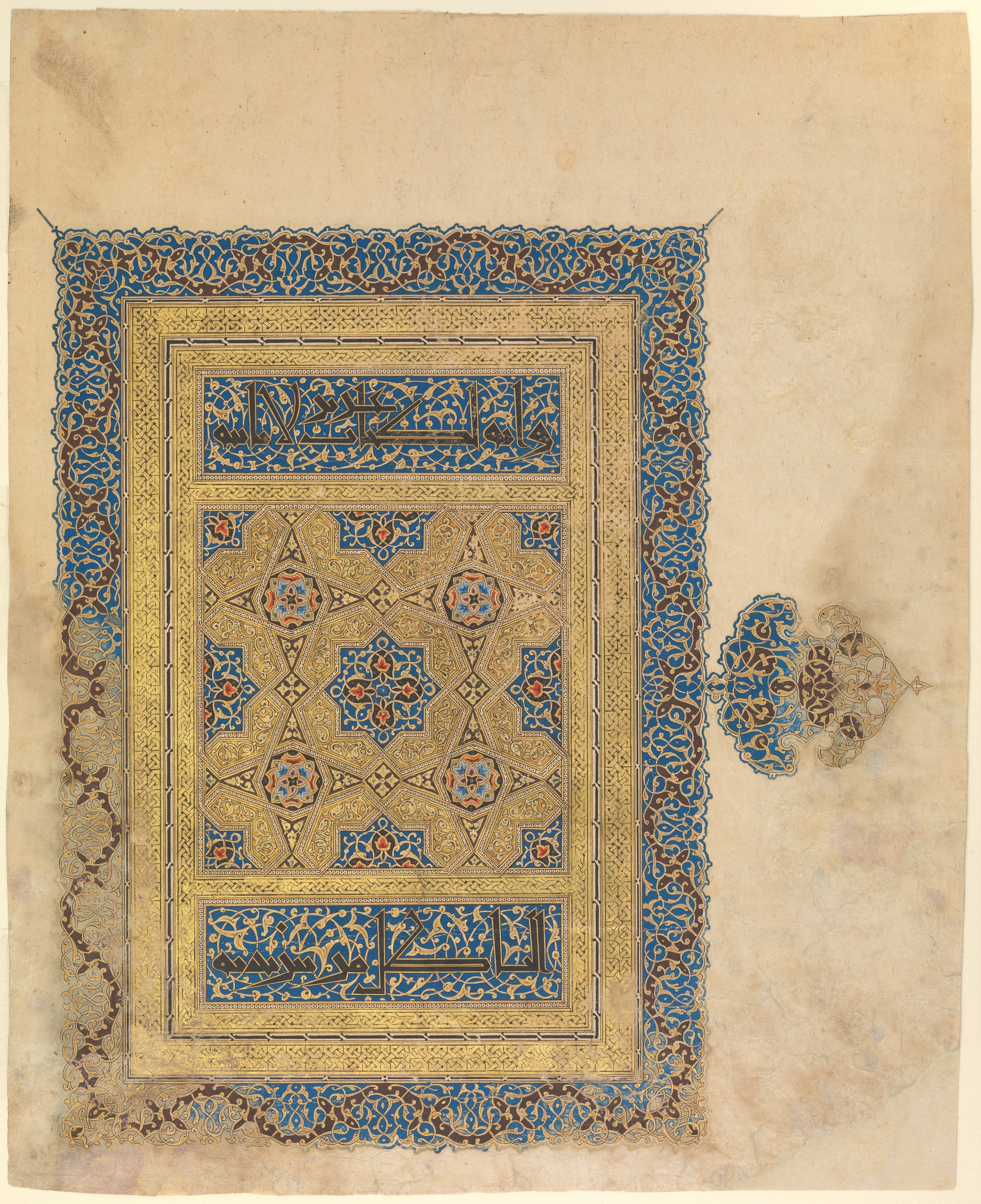
This 14th-century manuscript painting pre-dates the modern contenders for the first abstract work by over six hundred years. It is one example from a long Islamic tradition of non-representational art. Works like this are generally ignored in discussions about who made the first abstract painting, which reveals that the debate is, in fact, quite limited in its focus. We really mean, “Who in Western culture created the first abstract work?” Like Columbus “discovering” America, it turns out that there were actually a lot of people already there.
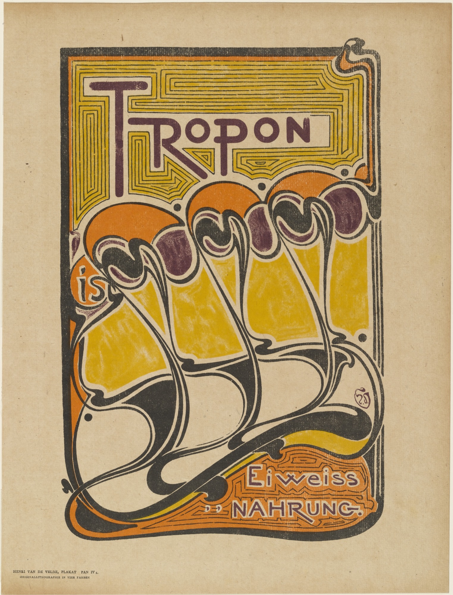
Van de Velde’s poster advertising the protein extract Tropon displays an abstract design of stylized, vaguely organic shapes. Why is this also not generally considered a viable contender for the first abstract work? We find that we need to limit the question again: the first abstract work must have been made as “fine art.” Decorative art and commercial design don’t count. This distinction can seem very arbitrary, since many modern artists worked as commercial designers at times, and modern design is also often collected by art museums.
What we are really looking for, then, is not truly “the first” abstract artwork. Instead, we are seeking the first abstract artwork that was intentionally created in the context of the post-Renaissance Western art world, when fine art was expected to be representational.
A De Stijl contender
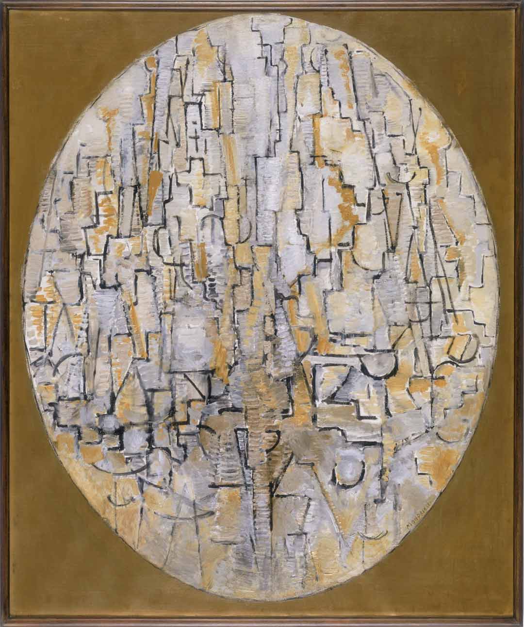
Piet Mondrian wrote extensive justifications of abstract art, demonstrating a clear awareness of how radical he felt the move to abstraction was for fine art. Over the course of the 1910s he produced several series of works through a process that he explicitly called “abstraction,” etymologically defined as “pulling away” elements of natural appearances from observed objects until eventually they bore no resemblance to those objects.
The work above is part of his series of abstracted trees: perhaps the two parallel vertical lines in the lower center are a trunk, and the oval frame defines the crown of the tree. However, if we approached the work in a museum without that information, it would be easy to see it as abstract in the sense of entirely non-representational. The gradual nature of Mondrian’s evolution makes it very difficult to state when he first created a fully abstract work.
The titling of works can further complicate the issue: this work was titled “Tableau” or “Composition” by Mondrian, asking us to see it as just a composition of lines, shapes, and colors. An equally abstract-seeming work from the same year is called “The Tree A,” which asks us to see a tree where otherwise we might not. Should determining whether a work is abstract depend on its title or other extrinsic information?
Kandinsky’s spiritual vision
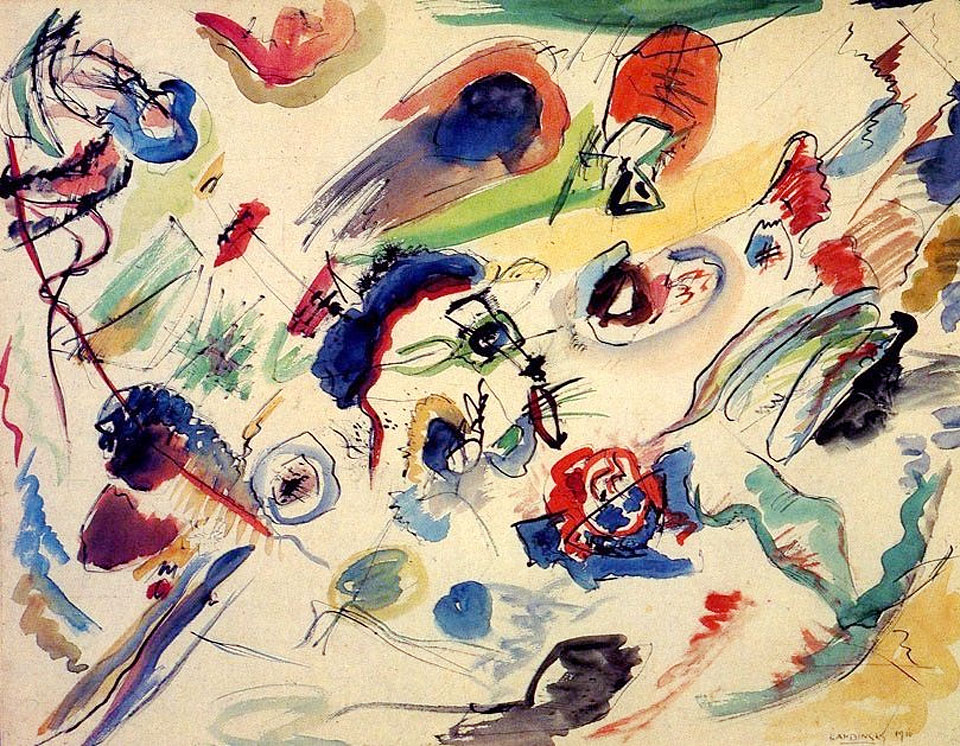
Vasily Kandinsky backdated this work to 1910 (in the signature at the lower right), probably in order to claim that he was the first abstract artist — most art historians believe it dates to 1913. His 1909 text On the Spiritual in Art justifies abstraction in art as more spiritual than representation. However he, like Mondrian, approached abstraction very gradually. Even this painting is ambiguously abstract. It is part of a group of works based on imagery of the apocalypse, and, like Mondrian, Kandinsky “abstracted” that imagery to reduce material references.
In many paintings the imagery is very difficult to recognize, but it is still there. Kandinsky famously described seeing one of his own paintings as “only form and colors . . . . whose content was incomprehensible,” but this was only because the work was on its side. Viewing it from the proper angle he saw the painting’s apocalyptic imagery.[2]
Both Mondrian and Kandinsky eventually went on to create unequivocally non-representational artwork, but where is the line between representation and abstraction when the abstracted forms are derived from representational images that only a few people, if any, can recognize? Is abstraction in the eye of the beholder?
Appreciating color and music
In the early twentieth century many people (including Kandinsky) justified abstract painting by comparing it to music. When we listen to instrumental music we do not generally compare it to real world sounds; we just enjoy being moved by the melody, harmony, rhythm, etc., in themselves. Why should visual art be different? Why not just appreciate how we are moved by colors, shapes, and textures?
A group of artists called the Orphists, including Robert and Sonia Delaunay and František Kupka, took this route. The title of Kupka’s Fugue in Two Colors declares the painting to be the visual equivalent of a type of musical composition in which a short melody is repeated and developed in multi-part counterpoint. The looping, swelling, intertwining curves of red and blue in Kupka’s painting are understandable as visualizations of the flowing aural interweaving of the musical voices in a fugue. Again, however, there was a naturalistic source for the painting: a drawing of a girl dancing with a ball in her hand that Kupka progressively abstracted.
Malevich’s Suprematism
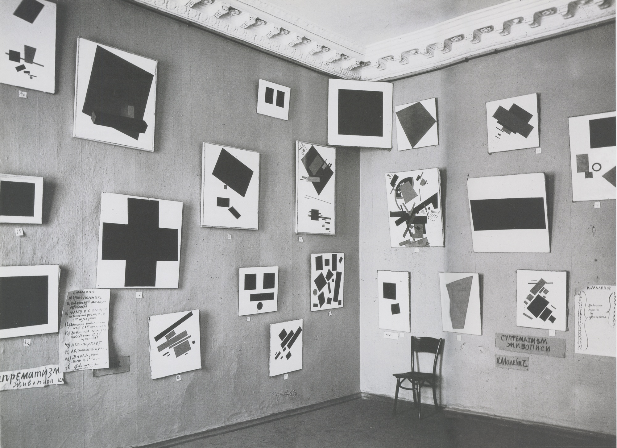
Kasimir Malevich is unusual in making the leap to pure abstraction very rapidly, rather than through a long process of abstracting natural objects. Malevich’s works in The Last Futurist Exhibition are geometric abstractions, although some of them have titles that suggest real-world references, such as Airplane Flying. Malevich claimed that he first painted a pure abstract work, Black Square, in 1913. However, there is no evidence to support this other than some loosely-related theater designs, and as we have noted, abstraction in design occurred earlier than that. This photograph of the exhibition dates to 1915, and Malevich wrote a theoretical justification of non-representational Suprematist painting the same year, making 1915 a solid terminus ante quem for the first abstract painting.
A new contender
Another artist who has recently been brought forward as a candidate for painting the first abstract artwork is Hilma af Klint. Between 1906 and 1915 Klint made a series of works called Paintings for the Temple that were generated from visions she had as a spiritual medium (in fact, all of the artists considered here apart from van de Velde were motivated to create abstract art for spiritual reasons). Some of Klint’s works have recognizable natural imagery, but many others are pure geometric or biomorphic abstractions.
In terms of chronology Klint is a serious contender to be the first abstract painter, and it may be gratifying to think that it is a woman who has that distinction, despite the jockeying of her male contemporaries. Unfortunately, however, Klint’s abstract works were created completely outside the context of the modern art world. In fact, she stipulated that they not be exhibited until twenty years after her death, and as a consequence they were unknown outside of her circle of friends, and had no influence on the debates concerning the viability of abstraction in art until the question was already settled.
An unanswerable question?
In the end, it may not be possible to answer the question of who created the first abstract artwork, but even this brief survey of the main contenders raises an arguably more interesting question. Although there were common themes and some direct contacts between the artists considered here, they were largely independent, working in different countries (Sweden, Russia, Germany, France, and The Netherlands), ending up with very different-looking works, and developing substantially different rationales for practicing abstraction. For whatever reason, in the years around 1910–15 all across Europe, the time was right for abstract art to (re-)enter the Western art world.
De Stijl: Piet Mondrian, Composition with Red, Blue, and Yellow
A Dutch painter, Piet Mondrian’s Neo-Plasticism used the most fundamental aspects of line and color in an attempt to create a universal expression.
“Pure abstract art becomes completely emancipated, free of naturalistic appearances.”—Piet Mondrian, 1929 [3]
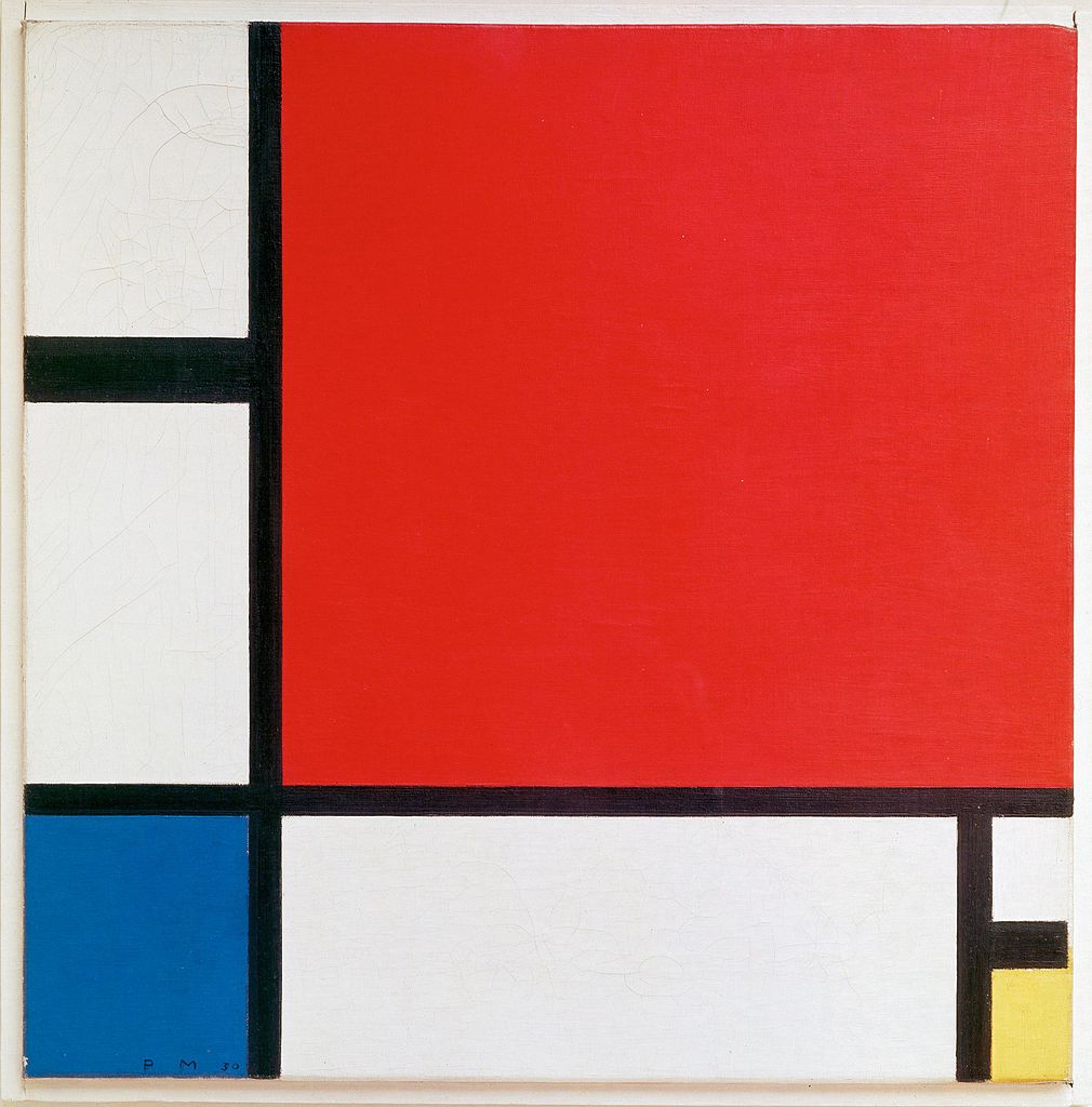
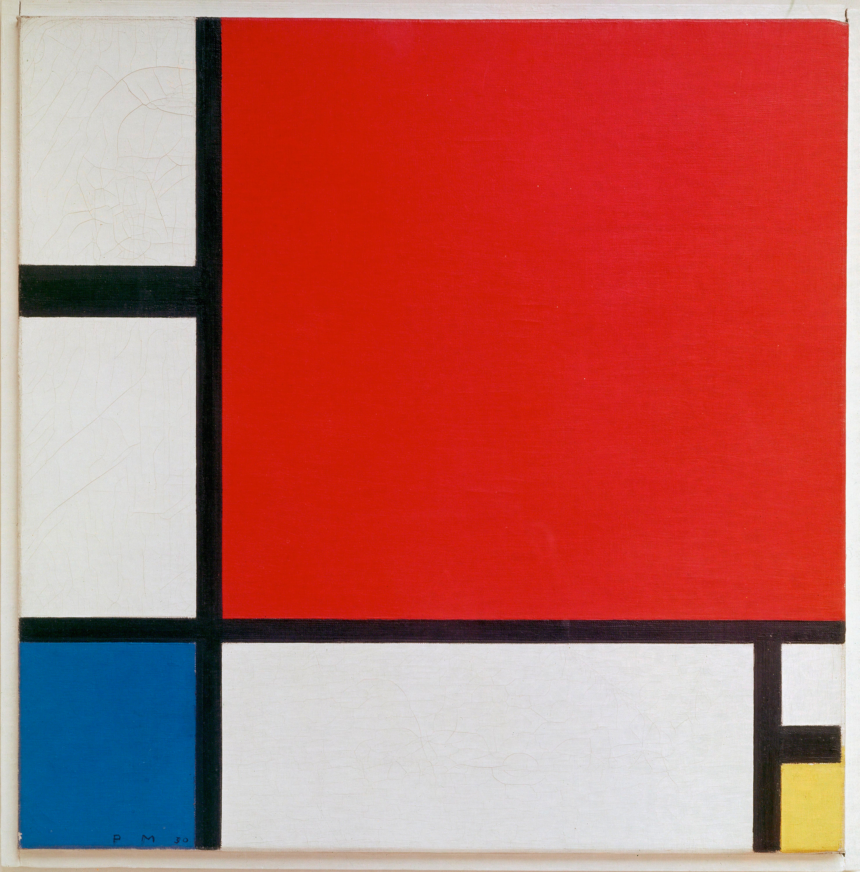
Walking up to Piet Mondrian’s painting, Composition with Red, Blue, and Yellow can be a baffling experience. The canvas is small and uses only the simplest of colors: red, blue, yellow, white and black. The composition is similarly reduced to the simplest of rectilinear forms, squares and rectangles defined by vertical and horizontal lines. One would hardly suspect that we are seeing the artist’s determination to depict the underlying structure of reality.
Neo-Plasticism
Mondrian called his style Neo-Plasticism or “The New Plastic Painting,” the title of his famous 1917 essay promoting abstraction for the expression of modern life. Don’t be confused by Mondrian’s use of the term “plastic.” He uses it to refer to the plastic arts—media such as sculpture, that molds three-dimensional form, or, in Mondrian’s case, painting on canvas. For centuries, European painters had attempted to render three-dimensional forms in believable spaces—creating convincing illusions of reality (click here for an example—Vermeer’s Young Woman with a Water Pitcher). In contrast, Mondrian and other modernists wanted to move painting beyond naturalistic depiction to focus instead on the material properties of paint and its unique ability to express ideas abstractly using formal elements such as line and color.
Mondrian believed his abstraction could serve as a universal pictorial language representing the dynamic, evolutionary forces that govern nature and human experience. In fact, he believed that abstraction provides a truer picture of reality than illusionistic depictions of objects in the visible world. Perhaps this is why Mondrian characterized his style as “abstract real” painting.
Abstraction and human progress
Mondrian’s earliest paintings were quite traditional in both subject and style. He studied at the art academies in the Hague and in Amsterdam in his home country of the Netherlands. Then, as with many artists during the early twentieth century, he began to emulate a variety of contemporary styles, including Impressionism, Neo-Impressionism, and Symbolism in an effort to find his own artistic voice. The impact of these modern movements can be seen in the development of Mondrian’s painting which, over time, shows the dissolution of recognizable objects into increasingly pared-down structures (see the three depictions of trees below). His emphasis on line, color, and geometric shape sought to highlight formal characteristics.

Mondrian was inspired by Cubism, a movement led by Pablo Picasso and Georges Braque that explored the use of multiple perspectives. Mondrian began experimenting with abstracted forms around the time he moved to Paris in 1912.
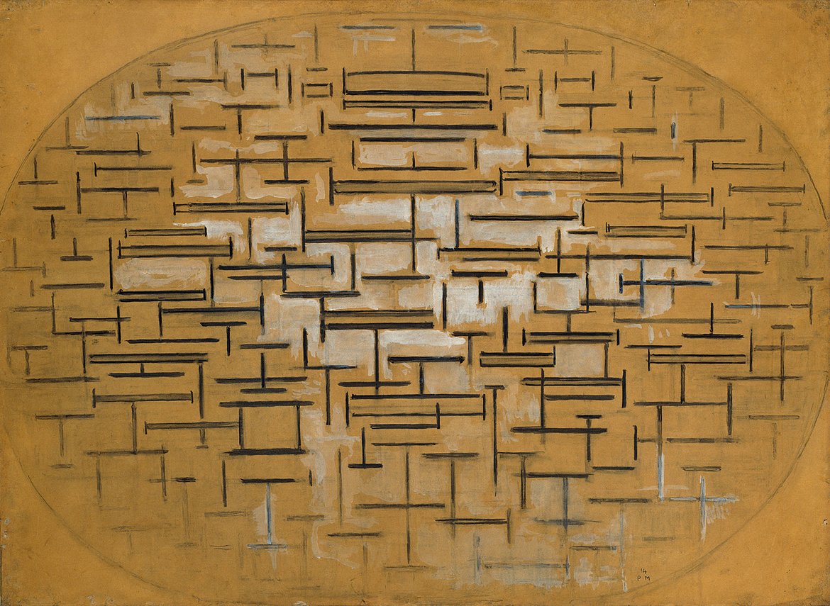
His famous “Pier and Ocean” series (see above), which reduces the landscape to arrangements of vertical and horizontal lines, exemplifies this period in Mondrian’s career. He wanted to push beyond Cubism’s strategy of fragmenting forms (café tables were a favorite subject), and move toward pure abstraction. However, this change in Mondrian’s process did not take place overnight and he continued to work in a studied, methodical way. In fact, his production of paintings within a series of canvases was part of Mondrian’s method, and how he worked through thematic and compositional issues. Because Mondrian continued to rely on the series throughout his career, we can see the progression of his pictorial language even in his later, purely abstract work.
His use of the term “composition” (the organization of forms on the canvas) signals his experimentation with abstract arrangements. Mondrian had returned home to the Netherlands just prior to the outbreak of the First World War and would remain there until the war ended. While in the Netherlands he further developed his style, ruling out compositions that were either too static or too dynamic, concluding that asymmetrical arrangements of geometric (rather than organic) shapes in primary (rather than secondary) colors best represent universal forces. Moreover, he combined his development of an abstract style with his interest in philosophy, spirituality, and his belief that the evolution of abstraction was a sign of humanity’s progress.
Philosophy & Theosophy
Some art historians have viewed Mondrian’s painting as an expression of his interest in dialectical relationships, ideas advanced by the early nineteenth-century German philosopher Hegel that art and civilization progress by successive moments of tension and reconciliation between oppositional forces. For Mondrian then, composing with opposites such as black and white pigments or vertical and horizontal lines suggest an evolutionary development.
Mondrian’s painting may also reflect his association with the Theosophical Society, an esoteric group that had a strong presence in Europe. Theosophists were interested in opposites as an expression of hidden unity. During WWI, Mondrian stayed in Laren, a village with a thriving art community near Amsterdam. He lived near M.H.J. Schoenmaeker, a prominent Theosophist who used terms such as “New Plastic” to promote his ideas on spiritual evolution and the unification of the real and the ideal, the physical and immaterial. In Theosophy, lines, shapes, and colors symbolized the unity of spiritual and natural forces.
De Stijl
De Stijl is one of the most recognizable styles in all of modern art. Consisting only of horizontal and vertical lines and the colors red, yellow, blue, black, and white, De Stijl was applied not only to easel painting but also to architecture and a broad range of designed objects from furniture to clothing. This is not inappropriate. Despite its close association with Piet Mondrian, the artist thought of it not as his personal style, but as De Stijl – The Style; it was objective and universal, applicable to all people and all things.
While in Holland, Mondrian founded the movement called De Stijl (The Style) with the artist Theo van Doesburg. The two shared many ideas about art as an expression of relationships, particularly the relationships between art and life. Because these artists believed that the evolution of art coincided with the modern progression of humankind, they thought that New Plasticism could, and should, encompass all of human experience. Van Doesburg founded the journal De Stijl to promote these ideas and demonstrate that their geometric abstraction, based on their theory of spiritual and pictorial progress, could form a total environment, and impact modern life. Although Mondrian and van Doesburg eventually parted ways, their movement to combine modern art and living was so influential that the abstract, geometric principles and use of primary colors they applied in painting, sculpture, design, and architecture still resonate today.
Dynamic contrasts
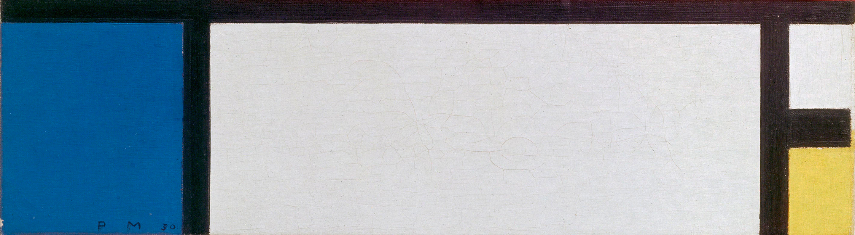
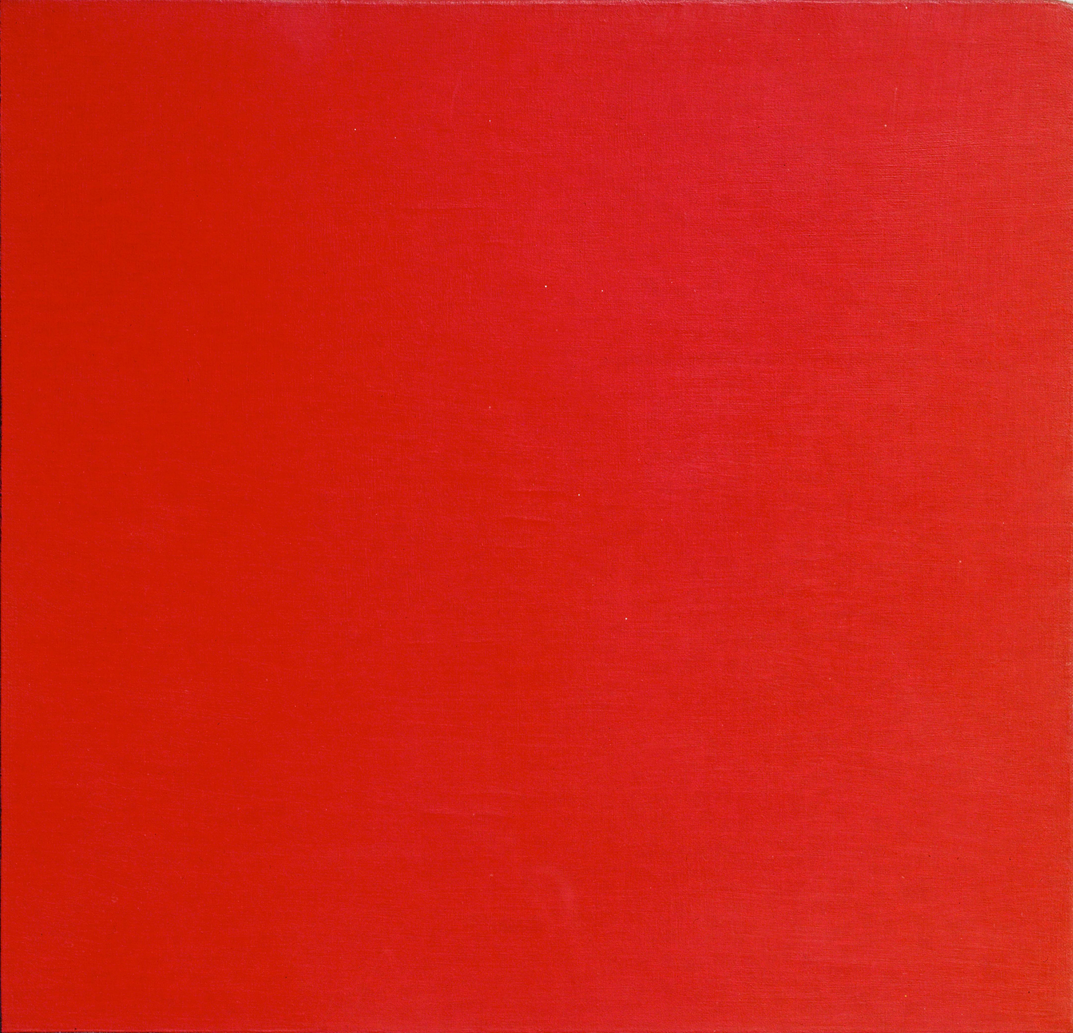
Mondrian’s Composition with Red, Blue, and Yellow demonstrates his commitment to relational opposites, asymmetry, and pure planes of color. Mondrian composed this painting as a harmony of contrasts that signify both balance and the tension of dynamic forces. Mondrian viewed his black lines not as outlines but as planes of pigment in their own right; an idea seen in the horizontal black plane on the lower right of the painting that stops just short of the canvas edge (see image above). Mondrian eradicates the entire notion of illusionistic depth predicated on a figure in front of a background. He achieves a harmonious tension by his asymmetrical placement of primary colors that balance the blocks of white paint. Notice how the large red square at the upper right, which might otherwise dominate the composition, is balanced by the small blue square at the bottom left. What’s more, when you see this painting in a person you can discern just how much variation is possible using this color scheme—and that Mondrian used varying shades of blacks and whites, some of which are subtly lighter or darker. Seen up close, this variety of values and textures create a surprising harmony of contrasts. Even the visible traces of the artist’s brushwork counter what might otherwise be a rigid geometric composition and balance the artist’s desire for a universal truth with the intimately personal experience of the artist.
Conclusion
Early 20th century avant-garde artists produced a range of styles. Leading up to World War I, artists experimented with the expressive power of color and the destruction of the picture plane. The Fauves and the German Expressionists pushed color to allow for both its arbitrary application and psychological or spiritual expression. Cubism and Abstract art further challenged the 500-year-old Western art traditions of naturalism and pictorial space that had been dominant since the early Renaissance. Instead, artists like Picasso and Mondrian emphasized the flatness of the canvas. The artists of the early 20th century expanded avenues for artistic creation. They also continued the avant-garde tradition of breaking boundaries and introducing new ways of communicating about the complex modern world. With World War I, the styles of Dada and Surrealism would simultaneously expand the discourse on defining fine art and attempt to process the destruction caused by the First World War.
Citation and Licensing
The following sections were written by Chelsea Wright and licensed CC BY-NC-SA 4.0:
- Chapter Overview and Introduction
- Focus artwork and term list compiled by Chelsea Wright
- Conclusion
The following articles from Smarthistory licensed CC BY-NC-SA 4.0 were remixed and adapted for the chapter:
- Dr. Virginia B. Spivey, “Fauvism, an introduction,” in Smarthistory, August 9, 2015.
- Dr. Beth Harris and Dr. Steven Zucker, “Henri Matisse, Bonheur de Vivre (Joy of Life),” in Smarthistory, August 9, 2015.
- Shawn Roggenkamp, “Expressionism, an introduction,” in Smarthistory, October 2, 2016.
- Smarthistory, “Ernst Ludwig Kirchner,” in Smarthistory.
- Dr. Juliana Kreinik, Dr. Steven Zucker and Dr. Beth Harris, “Ernst Ludwig Kirchner, Street, Dresden,” in Smarthistory, November 13, 2015.
- Smarthistory, “Vasily Kandisnky,” in Smarthistory.
- Dr. Beth Harris and Dr. Steven Zucker, “Vasily Kandinsky, Improvisation 28 (second version),” in Smarthistory, August 9, 2015.
- Dr. Charles Cramer and Dr. Kim Grant, “Modern art and reality,” in Smarthistory, June 16, 2020.
- Emily Casden, “Italian Futurism, an introduction,” in Smarthistory, August 9, 2015.
- Smarthistory, “Pablo Picasso,” in Smarthistory.
- Dr. Beth Harris and Dr. Steven Zucker, “Pablo Picasso, Les Demoiselles d’Avignon,” in Smarthistory, August 9, 2015.
- Dr. Peri Klemm, “The reception of African art in the West,” in Smarthistory, December 20, 2016.
- Dr. Beth Harris and Dr. Steven Zucker, “Inventing Cubism,” in Smarthistory, August 9, 2015.
- Dr. Beth Harris and Dr. Steven Zucker, “Pablo Picasso and the new language of Cubism,” in Smarthistory, May 12, 2018.
- Smarthistory, “George Braque,” in Smarthistory.
- Dr. Charles Cramer and Dr. Kim Grant, “Georges Braque, Violin and Palette,” in Smarthistory, March 23, 2020.
- Dr. Beth Harris and Dr. Steven Zucker, “Pablo Picasso, Still Life with Chair Caning,” in Smarthistory, August 9, 2015.
- Dr. Charles Cramer and Dr. Kim Grant, “Who created the first abstract artwork?,” in Smarthistory, September 28, 2019.
- Dr. Charles Cramer and Dr. Kim Grant, “De Stijl, Part I: Total Purity,” in Smarthistory, September 28, 2019.
- Smarthistory, “Piet Mondrian,” in Smarthistory.
- Dr. Stephanie Chadwick, “Piet Mondrian, Composition with Red, Blue, and Yellow,” in Smarthistory, April 27, 2016.
- As quoted in William Rubin, Picasso and Braque: Pioneering Cubism (New York: The Museum of Modern Art, 1989), p. 353. ↵
- Vasily Kandinsky, “Reminiscences” (1913), as translated in Robert L. Herbert, ed., Modern Artists on Art (Mineola, New York: Dover Publications, 2000), p. 29. ↵
- Piet Mondrian, “Pure Abstract Art, 1929” in The New Art—The New Life: The Collected Writings of Piet Mondrian, edited and translated by Harry Holtzman and Martin S. James (Boston: G.K. Hall& Co.), p. 224. ↵



,_1898_(CH_18707967).jpg)

.jpg)
,_210_x_200_cm,_Narodni_Galerie,_Prague.jpg)


