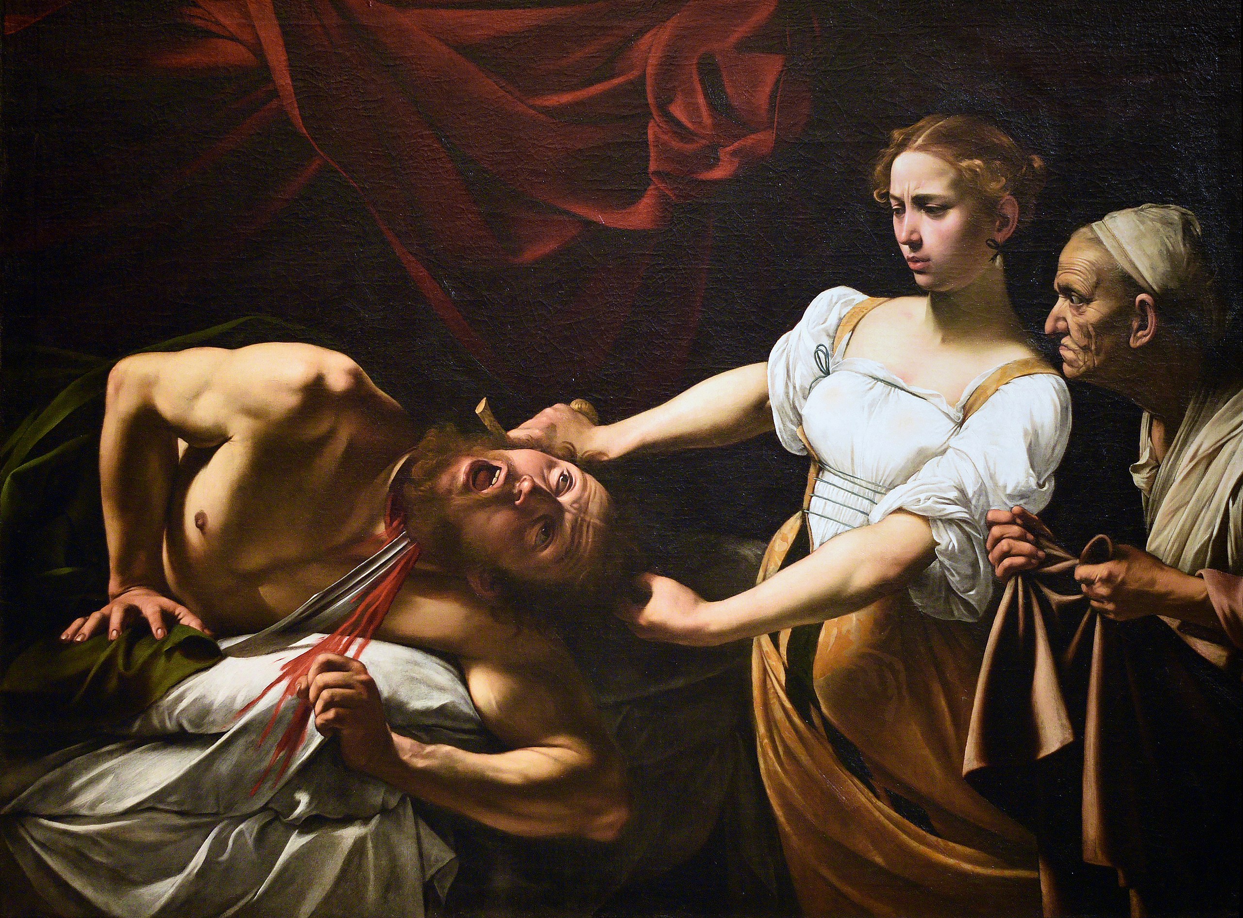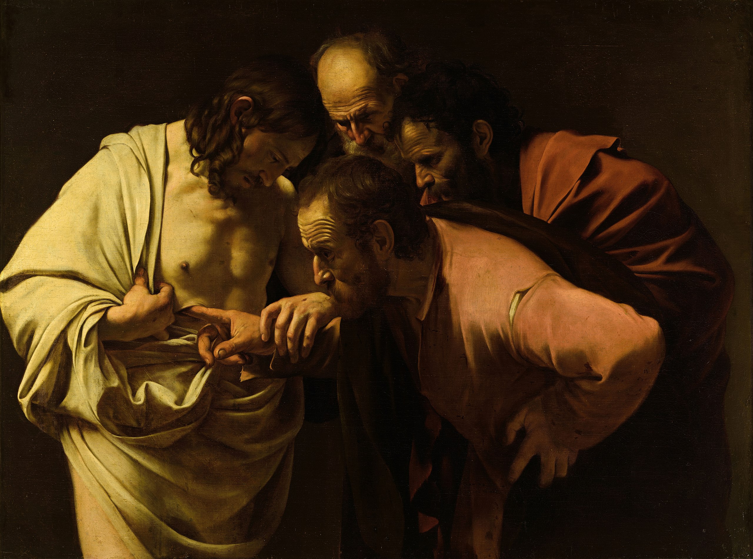
Mannerism and the Italian Baroque
Chapter Overview and Introduction
In the late 16th century, Mannerism was a transitional style between the Renaissance and the Baroque. The historical context of the Baroque period, from c. 1600-1700, is anchored by the Reformation and the Counter-Reformation. Both the Protestant Reformation and the Catholic Church’s Counter-Reformation serve as the backdrop for understanding the dramatic style of the Baroque. Across Europe, regional variations of the Baroque style developed, often dependent upon religious affiliation. In Italy, artists like Bernini, Borromini, Caravaggio, and Gentileschi worked for the Catholic Church’s Counter-Reformation. As such, their works were designed to teach the faithful and inspire a deep connection to the faith.
Focus Artworks
- Parmigianino, Madonna of the Long Neck, 1530–33, oil on panel
- El Greco (Domenikos Theotokopoulos), Adoration of the Shepherds, ca. 1612 – 1614, oil on canvas
- Gian Lorenzo Bernini, David, 1623, marble
- Francesco Borromini, San Carlo alle Quattro Fontane (“Carlino”), Rome, Italy, 1638-1646.
- Gian Lorenzo Bernini, Saint Peter’s Square (Piazza San Pietro), Vatican City, Rome, 1656–67
- Michelangelo Buonarotti, Last Judgment, altar wall of the Sistine Chapel, Vatican City, Rome, Italy, 1534-1541, fresco
- Michelangelo Merisi da Caravaggio, Calling of Saint Matthew, c. 1597-1601, oil on canvas
- Artemisia Gentileschi, Judith Slaying Holofernes, 1620-21, oil on canvas
Term List
- Mannerism
- Figura serpentinata
- Baroque
- Reformation
- Martin Luther
- 95 Theses
- Counter-Reformation
- Catholic
- Council of Trent
- Baldacchino (In St. Peter’s Basilica)
- (new) St. Peter’s Basilica, Rome
- Relic
- Piazza
- Tenebroso (tenebrism)
- Caravaggisti
- Momento mori
Mannerism, an introduction
Parasitic. Original. Derogatory. Refined. Hyper-decorative. Courtly. Anti-classical. Classicizing. All of these words (and many more!) have been used to describe mannerist art, which begins in the 16th century. But what is it, and how could it possibly prompt so many contradictory descriptors?
What is mannerism?
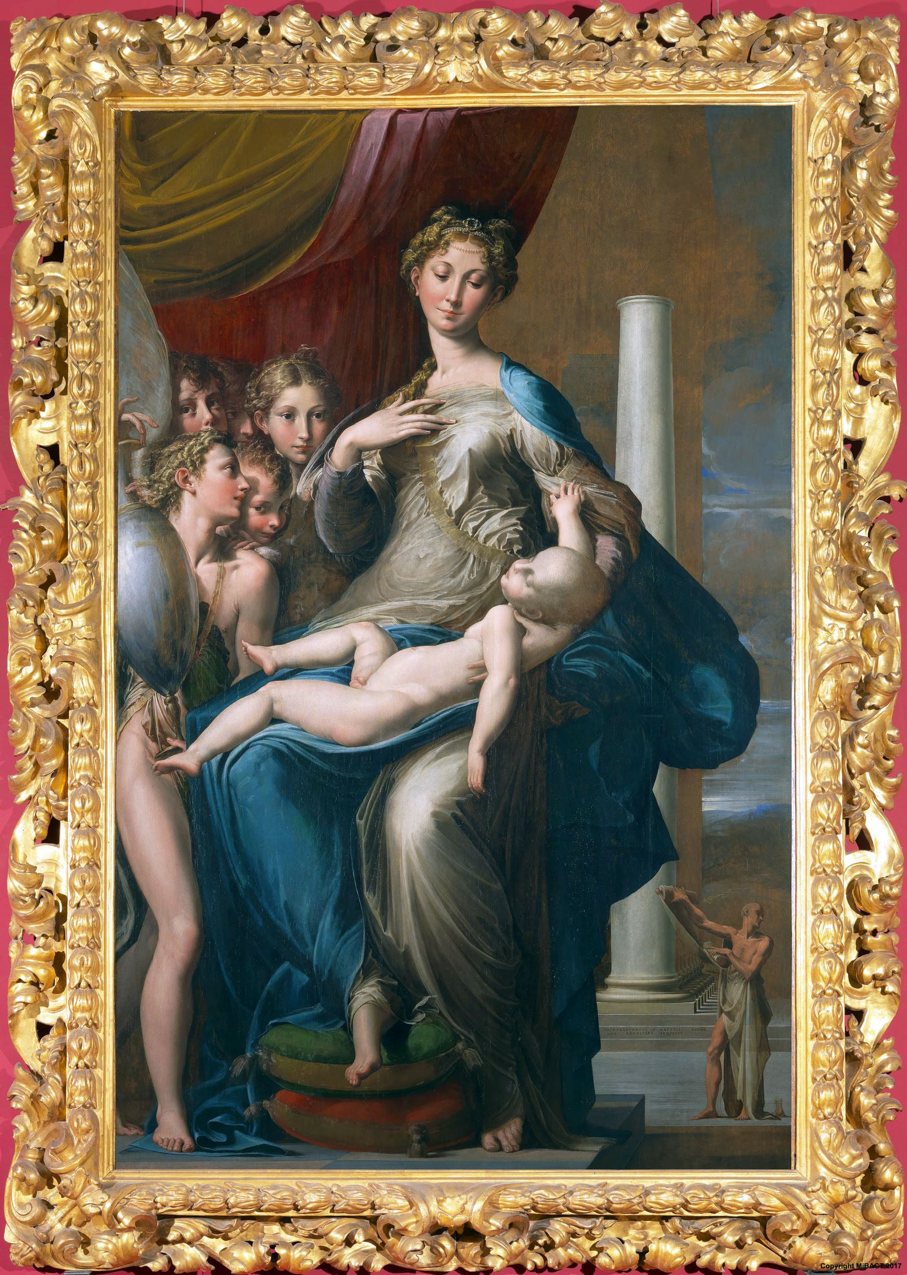
Parmigianino’s Madonna of the Long Neck is a famous example of mannerist art. It was painted for the funerary chapel of an Italian noblewoman. In the center, the Virgin’s lower body seems to swell, her impossibly long legs swathed in billowing fabric that then clings sensuously to her rapidly tapering torso, revealing her navel and a protruding nipple. Her head, seeming too small for her body, is precariously balanced upon an elongated neck rising from narrow, sloping shoulders. Christ’s spindly, bare body stretches across her lap. Pressed closely to her right are sensuous yet bizarrely proportioned angels, compressed into the foreground. One angelic figure, showing a long bare leg, holds an elegant antique vase with the tips of his impossibly long fingers. On the right side, a diminutive figure in the lower corner mysteriously holds up a scroll, while the background recedes dramatically into a deep, unfinished space. The architectural space is designed to appear illogical (though it can be reconciled) and the within it figures are mis-proportioned, yet the overall impression is one of elegance and carefully contrived artifice. This effect is enhanced by the use of rich jewel tones and the absence of visible brush marks.
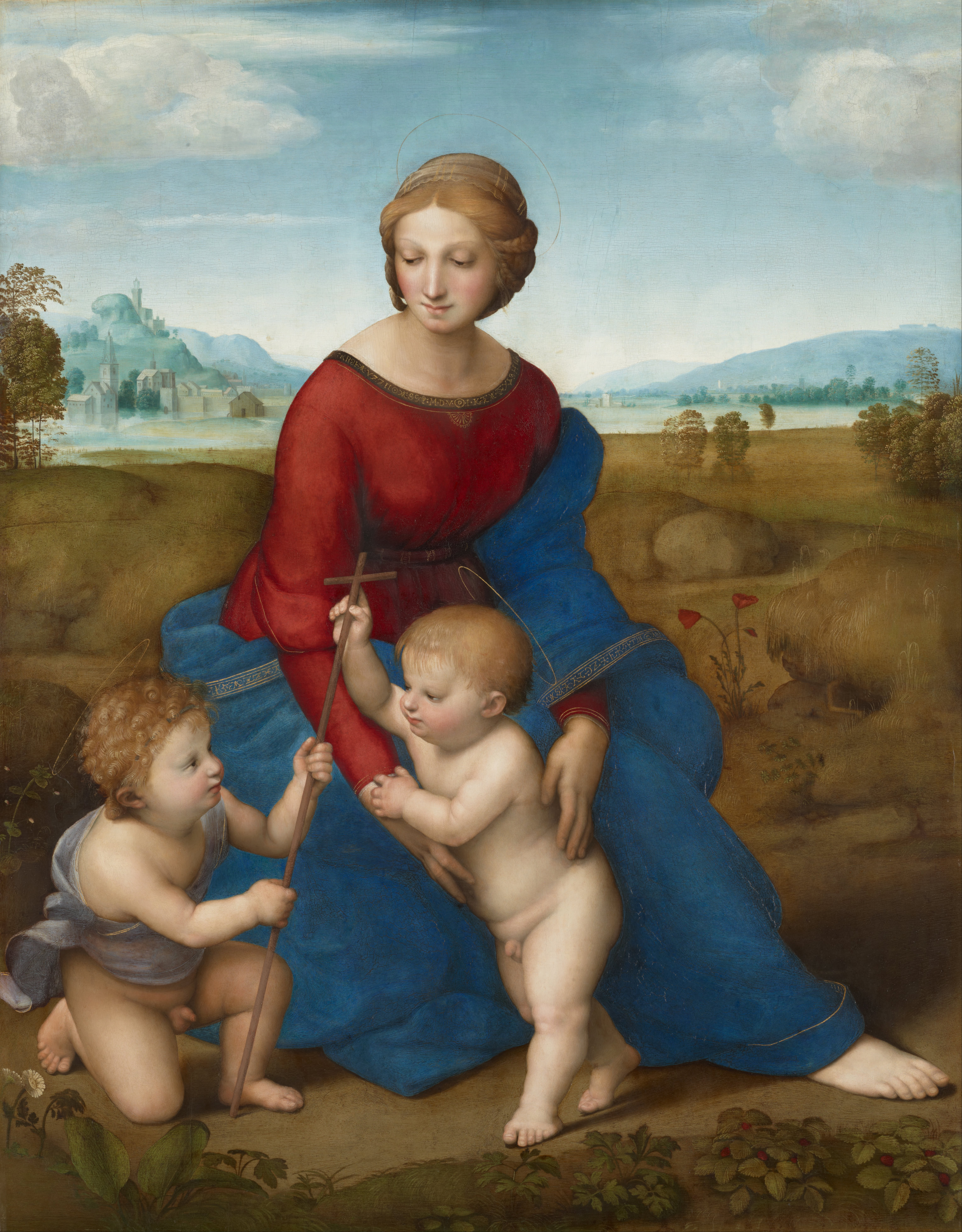
Parmigianino takes us to an otherworldly realm in which the laws of proportion, naturalism, and mathematics do not apply. It is a far cry from the rational classicism of earlier works like Raphael’s Madonna of the Meadow (from what is traditionally called the “high renaissance“). Here, the Virgin and Christ child, accompanied by the infant John the Baptist, are rendered in classical proportions and occupy an idealized though believable space. The Virgin’s body is demurely clothed and the children’s plump forms suggest playful vitality. Nowhere do we find the sensuous ambiguity or the irrational geometry of Parmigianino’s creation. Something new is happening in the mannerist image.
Towards a definition of mannerism
The term “mannerism” is not easily defined. It has been used to designate art that is overtly artificial, often ambiguous, and conspicuously sophisticated. However, these are by no means the only stylistic traits associated with this designation. Mannerist imagery frequently pushes the boundaries of fantasy and imagination with artists looking to art, rather than nature, as a model, as Parmigianino was clearly doing in his painting. Mannerism is therefore a confusing term, subject to radically different interpretations. When the term was first widely used in the 17th century, it was intended as a pejorative label. It was used to negatively characterize Italian renaissance art created between 1520 and 1600 that was seen by these later audiences as overly stylized and tasteless, a debased departure from the classicism of Raphael and the high renaissance. With the rise of expressionism and abstraction in the 20th century, such negative views of this generation of artists subsided. Today, the English term “mannerism” is used to broadly designate 16th-century art throughout Europe (and even in places like the Americas in the 16th and 17th centuries) that is conspicuously artificial, often emotionally provocative, and designed to impress.
In sixteenth-century Italy, where what we now call mannerism is first evident, the term “mannerism” did not exist. What we do find is “maniera,” a term rooted in the word mano (hand). It was used in a straight forward way by contemporaries to simply designate style. The styles that the word maniera was used to describe were as varied as way the word style might be used today. Audrey Hepburn had style. So did David Bowie.
Maniera was also used in the 16th century to suggest “stylishness” itself, a self-conscious, artificial artistry that at times privileged fantasy over reality. Artists displaying maniera may consciously exploit their technical skill but ideally did so with seeming effortlessness, like we see in Parmigianino’s Madonna of the Long Neck. Artistic departures from visual reality were intended to demonstrate invention and refinement, learning and grace. One way to understand mannerism, popularized by late 20th-century scholars, is to think of it as the “stylish-style.”

Rather than seeing such images as breaking with renaissance visual developments, scholars now recognize mannerist imagery as continuing those explorations in new ways. While the artworks might seem to diverge from classical forms, these artists did actually invent new ways of engaging with the ancient past. One of the most influential artworks for mannerist artists was the Hellenistic sculpture of Laocoön and his sons, whose twisting, contorted bodies appealed to a variety of artists of this time, including the Burgundian artist Juan de Juni (who worked in Spain), Domenicos Theotokopoulos (known as El Greco), Alonso Berruguete, and Francesco Primaticcio. Berruguete frequently adapted aspects of the Laocoön in his sculpture to heighten the emotional expressiveness of his saintly figures, such as we find in his Abraham and Isaac.
Why mannerism?
Why do these elegant explorations take place after 1520? While there is no easy answer for the style’s emergence at this time, historical and religious developments, the tastes of powerful patrons, and the rising social status of the artist may all be key factors. Mannerism first developed in central Italy in the cities of Rome and Florence and it quickly spread. The reasons are many. The early and mid-16th century was a period of enormous social, economic, and political change witnessing the spread of Protestantism and the wars of religion that followed. The rise of capitalism and absolutism, colonization and exploitation of new lands and peoples, and new developments in the science of anatomy and optics also add to the era’s complexity. Some have attributed the new stylistic explorations of the period to a general neurosis resulting from this shifting context. The new contorted and exaggerated forms are deliberately unbalanced like the 16th century itself.
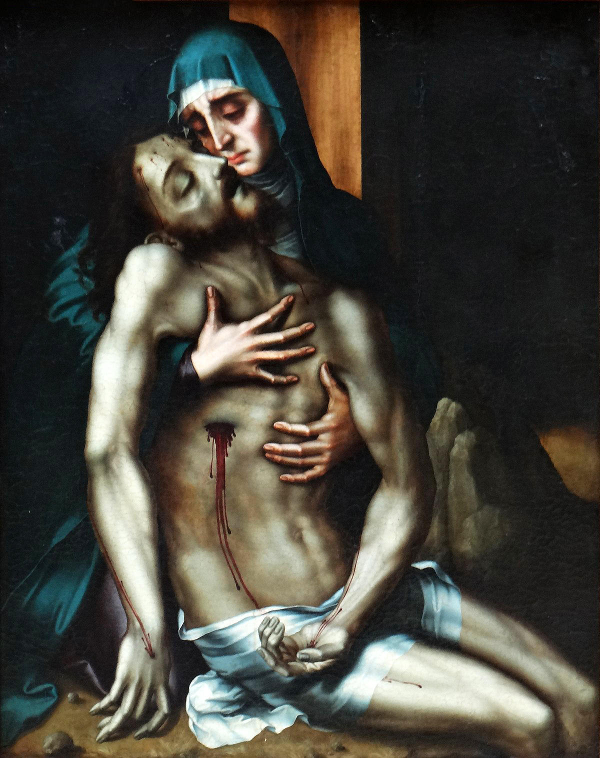
While mannerist qualities are found in secular works, like Bronzino’s Allegory with Venus and Cupid, this otherworldly, fantastical stylishness may have served a particular function for sacred subjects. The distortion, ambiguity, and supernatural beauty of many mannerist works may have heightened their emotional appeal to Christian audiences, inspiring a deeply personal devotional experience appropriate to this era of religious upheaval. On the Iberian Peninsula, mannerist artists like Berruguete or the painter Luis de Morales forged an expressive visual language that encouraged profoundly emotional and ecstatic religious devotion.
Mannerist art has been associated with the tastes of aristocratic patrons, particularly those within court circles where displays of wealth and appreciation for beautiful things helped cultivate an elite persona. The self-conscious artifice and deliberate complexity of these works would have appealed to patrons who were familiar with recent artistic developments and eager to show off their knowledge and good taste. The general rise in the status of the artist—particularly in central Italy where mannerism first developed over the course of the renaissance, may also have contributed to a rising taste in art that reflected an artist’s individual style. Previously, artists were regarded as humble craftsmen, practitioners of the “mechanical arts.” By the 1520s—thanks in part to high renaissance artists like Michelangelo, Raphael, Albrecht Dürer and others—visual artists could claim status as practitioners of a “liberal art,” placing them alongside scholars, poets, and other humanists. The stylistically specific creations of individual visual artists were increasingly valued as precious records of their individual ingenuity and intellect, it meant something to own a “Dürer” or a “Titian.” The pronounced stylishness of mannerist imagery unmistakably marked these works as creations of a unique maker.
The first mannerist artists
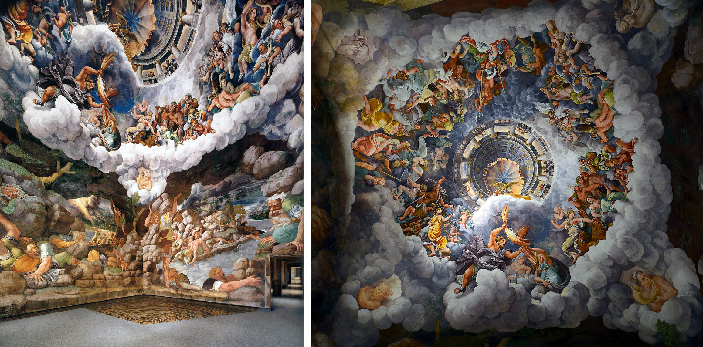
Mannerist visual strategies have local beginnings (from what we can tell) in Central Italy, although they begin to spread rapidly after their introduction. We find elements of the maniera among Raphael’s followers, such as in the work of Giulio Romano, who, along with Gian Francesco Penni, took over Raphael’s workshop in Rome upon the master’s untimely death. His work at Palazzo Tè (the pleasure villa of Federico II Gonzaga of Mantua), like the frescoes in the Sala dei Giganti (Hall of the Giants), is a creative interpretation of and playful riff upon the classical tradition, continuing renaissance fascination with the ancient past. Powerful, elongated figures writhe across painted walls and ceiling that are reminiscent of ancient sarcophagi. At the Palazzo, Romano even developed architectural spaces that appear to dissolve in place like ancient ruins.
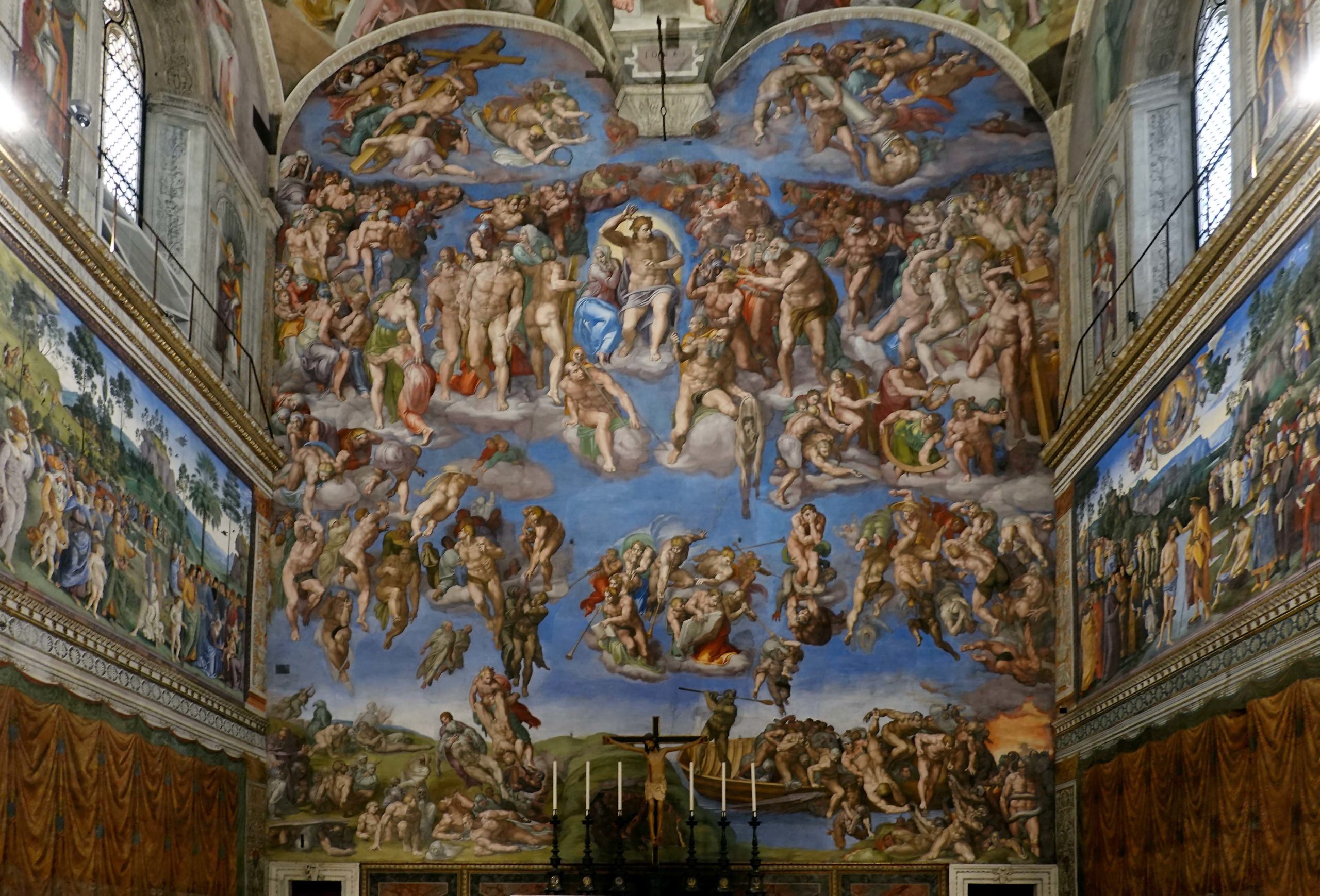
While Michelangelo is typically associated with what is called high renaissance art, he also helped to shape the powerful visual language of what we now call the maniera. Michelangelo’s Last Judgement, painted upon the altar wall of the Sistine Chapel, is a complicated and intentionally terrifying vision of the end of time. With disconcerting jumps in scale, nude figures in contorted poses are spread across a blue sky, their souls and bodies bared before God as they either rise in glory or are crushed in despair. Michelangelo’s figures are heavy, their musculature overemphasized—these are the bodies of the afterlife, rooted in the artist’s imagination and the brawny nudes of antiquity rather than reality. His maniera is unmistakable.
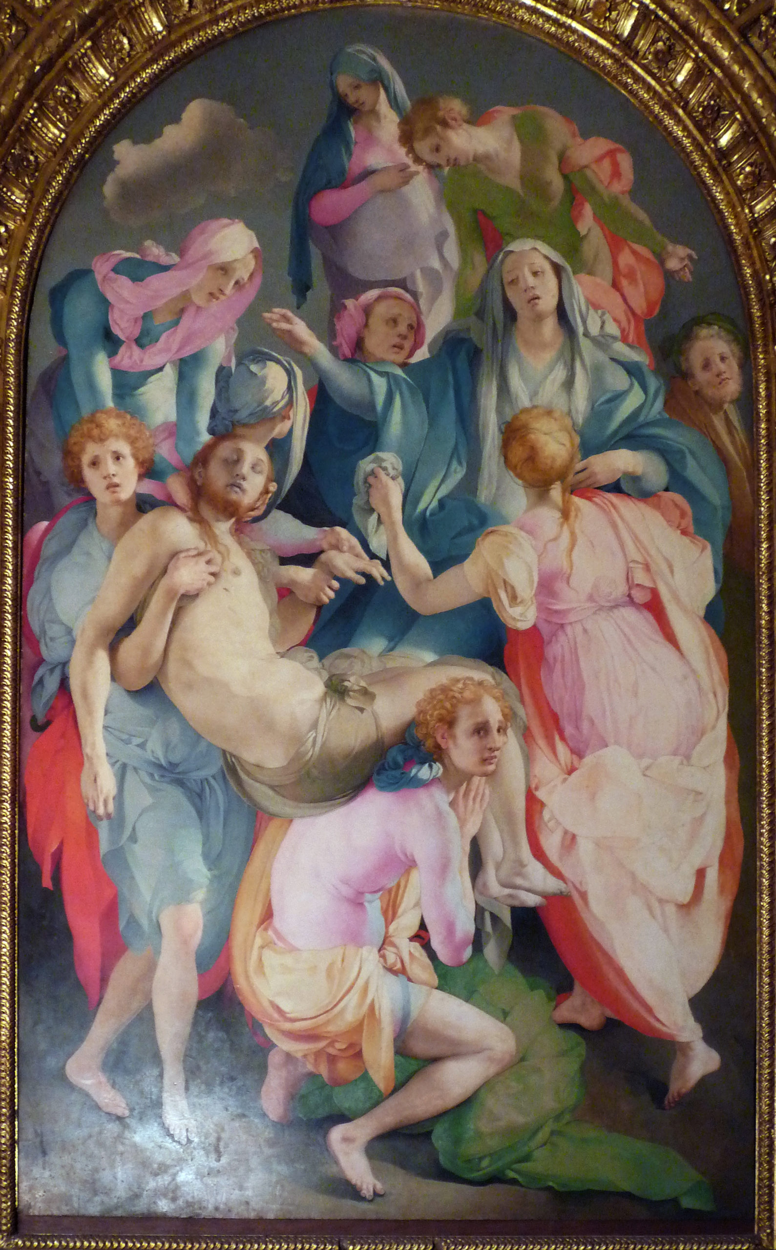
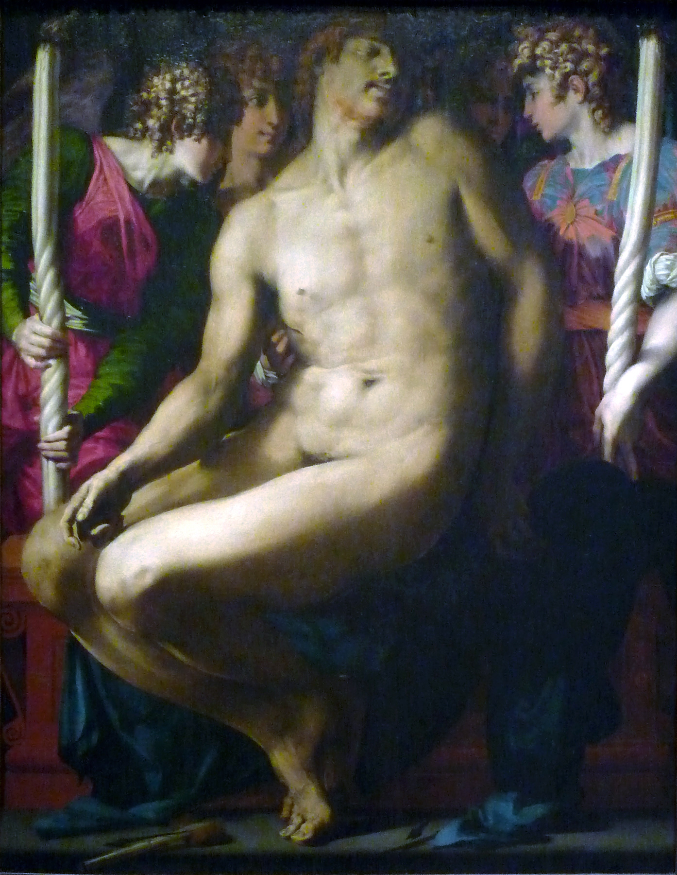
Early mannerist qualities are found in the work of Florentine painter Andrea del Sarto, and his followers Jacopo Pontormo and Rosso Fiorentino. Pontormo’s Deposition (or Entombment), created for the Capponi Chapel, has figures swirling across the picture plane, dislocated in time and space. No narrative elements, like the cross and concrete environment of Fra Angelico’s 1432 Deposition, serve to ground and clarify the image. The contorted figures and bizarre use of color recall more the work of Michelangelo than they do visual reality.
Ambiguous compositions, like Pontormo’s Deposition, seem to require sophisticated audiences already familiar with both visual and spiritual traditions. At the same time, a case may be made for the broader public appeal of such imagery. While the references to and departures from artistic tradition may not have been readily appreciated by non-elites, the disorienting effect of the image may have indeed spoken to any viewer familiar with the unsettling effects of grief.
Mannerism on the move
The forms explored by mannerist artists spread rapidly to other parts of Italy and to parts of northern Europe, the Iberian Peninsula, the Americas, and even Asia. In each area, mannerism developed differently, reflecting regional visual traditions, as well as cultural, political, and religious formations.
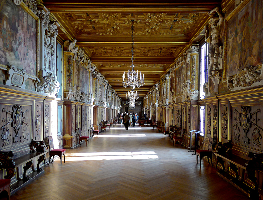
After the sack of Rome in 1527, the French King, Francis I, brought mannerist art to France by importing the Florentine artists Rosso Fiorentino and Benvenuto Cellini, as well as Francesco Primaticcio (who had trained with Giulio Romano). Under Francis’s patronage, these artists helped transform a rugged hunting lodge into the spectacular palace of Fontainebleau, and where a new form of mannerism would influence generations of French artists. The Italian Jesuit artist Bernardo Bitti would emigrate to Lima in the Spanish Viceroyalty of Peru, and paint large-scale paintings with the classicizing visual language of the maniera.
Artists from other European regions also trained in Italy, absorbing mannerist tendencies. Spanish artist Luis de Vargas spent time in Italy with artists like Sebastiano del Piombo and Giorgio Vasari (among others), bringing back what he learned and adapted to the Iberian Peninsula. Vargas would create elaborate retablos (altarpieces) filled with painting and sculpture, for the Cathedral and the Church of Santa Cruz in Seville.
Likewise, the Flemish painter Maarten de Vos, who is thought to have spent time in the workshop of Tintoretto (a Venetian mannerist artist), created images infused with rich color, elegant elongated figures, and an overtly decorative style. Engravings of De Vos’s works circulated across Europe, and eventually found their way across the Atlantic Ocean to the Spanish viceroyalties.
In Prague, under the patronage of Holy Roman Emperor Rudolph II, the Dutch printmaker Hendrik Goltzius produced numerous engravings, such as Apollo, 1588, notable for their dramatic gestures, flamboyant figure treatment, and conspicuous display of artistic virtuosity. Goltzius would become one of the most influential mannerist printmakers of his day. Goltzius borrowed mannerist strategies from Bartholomaeus Spranger, a Flemish artist who studied and traveled in Italy, and brought drawings and ideas back to Rudolph II’s court.
Simply put, the spread of mannerism was global.
Why mannerism matters
The ambiguity of mannerism and often sensuous treatment of figures proved problematic for some. The Reformation brought with it a new scrutiny of religious images. The Augustinian monk Martin Luther and other Protestant leaders were concerned that images could mislead or be treated as idols. While the Catholic Church never wavered in its commitment to the validity of images as tools for religious practice, the style of religious art did become an issue. At the Council of Trent (1545–1563), a series of meetings intended to solidify Catholic doctrine and strengthen the threatened church, it was declared that religious images must be clear, unambiguous, and lead viewers to faithful contemplation. Art should be for celebrating and instructing in the faith, not for showcasing artistic skill. The sensuosity, ambiguity, and conspicuous artistry of mannerism was not to be tolerated in sacred art.
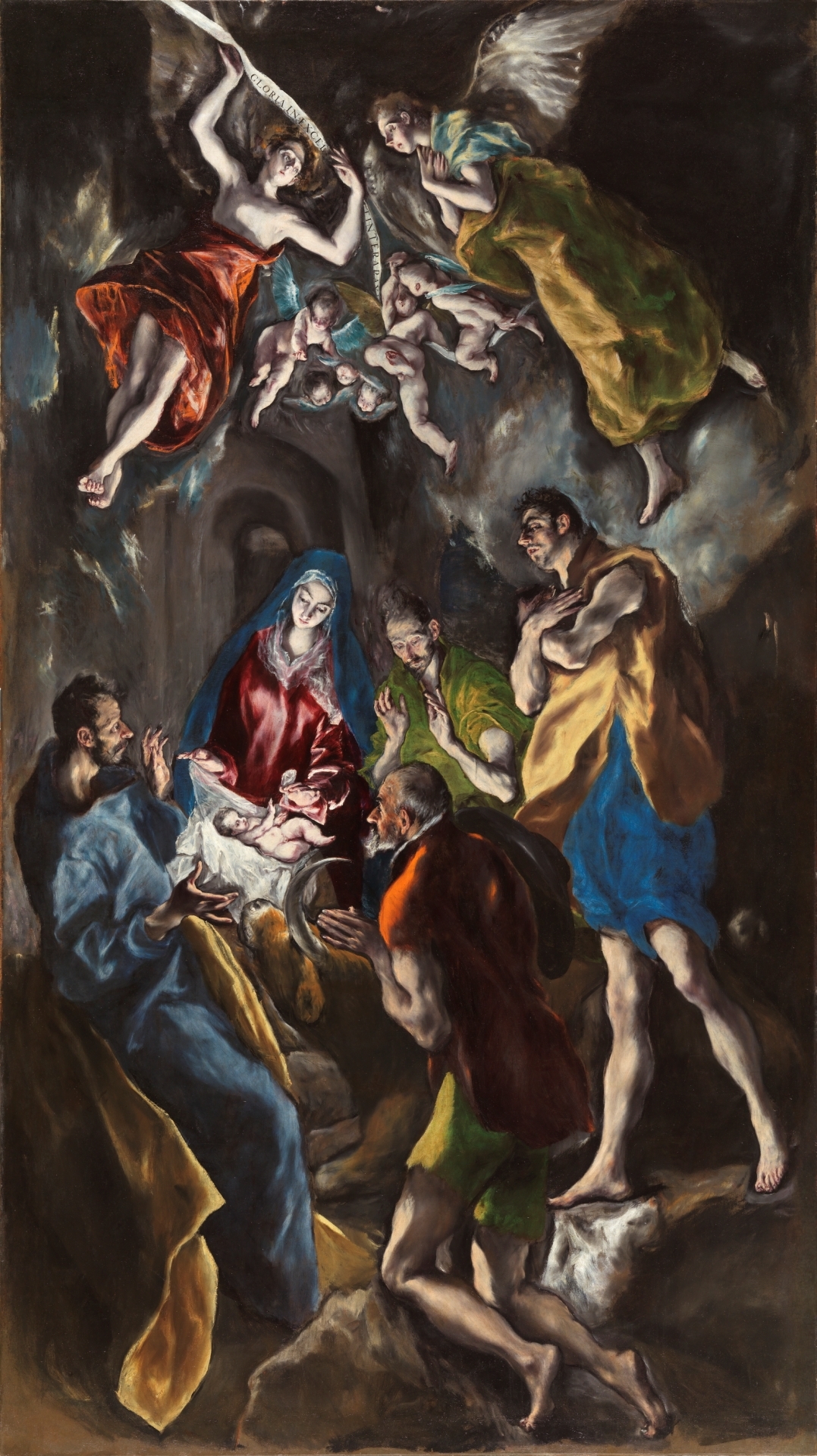
This call for conservatism in art on the part of the Catholic Counter Reformation, the movement behind the Council of Trent, did not bring an end to mannerist explorations. The style continued in new ways and across the global Catholic landscape. Devout Catholics, such as the Duke of Florence, Cosimo I de’Medici (who was eager to garner the Pope’s approval in his quest to become Grand Duke of Tuscany), continued to patronize mannerist forms in paint and stone—and even tapestries. El Greco, an artist who is thought to almost perfectly embody the Counter-Reformation Church’s desire to produce emotionally affective religious works, borrowed a great deal from mannerism. In fact, El Greco’s work demonstrates that mannerism extends beyond the sixteenth century, attesting once again to the ways in which visual strategies ebbed and flowed differently in various parts of the world.
Later artists are indebted to the mannerists. The dynamic compositions, rich color choices, and dramatic brushwork of later Baroque traditions all owe a debt to mannerist experimentation.
El Greco, Adoration of the Shepherds
A Greek painter who settled in Spain, El Greco is known for his elongated figures, idiosyncratic color, and emotive spirituality.
Baroque art, an introduction
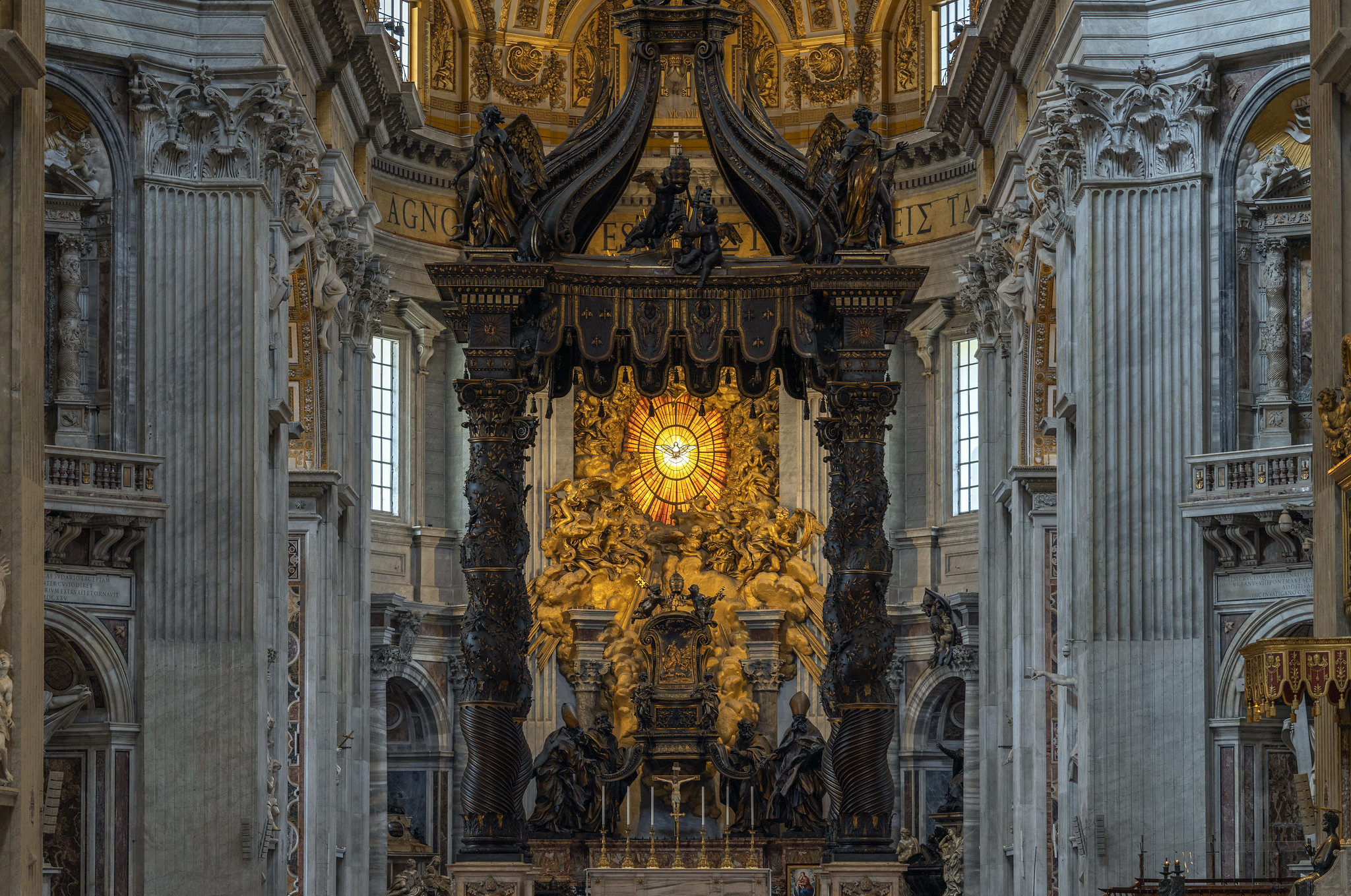
Rome: From the “Whore of Babylon” to the resplendent bride of Christ
When Martin Luther tacked his 95 theses to the doors of Wittenberg Cathedral in 1517, protesting the Catholic Church’s corruption, he initiated a movement that would transform the religious, political, and artistic landscape of Europe. For the next century, Europe would be in turmoil as new political and religious boundaries were determined, often through bloody military conflicts. Only in 1648, with the signing of the Treaty of Westphalia, did the conflicts between Protestants and Catholics subside in continental Europe.
Martin Luther focused his critique on what he saw as the Church’s greed and abuse of power. He called Rome, the seat of papal power, “the whore of Babylon,” decked out in the finery of expensive art, grand architecture, and sumptuous banquets. The Church responded to the crisis in two ways: by internally addressing issues of corruption and by defending the doctrines rejected by the Protestants. Thus, while the first two decades of the 16th century were a period of lavish spending for the Papacy, the middle decades were a period of austerity. As one visitor to Rome noted in the 1560s, the entire city had become a convent. Piety and asceticism ruled the day.
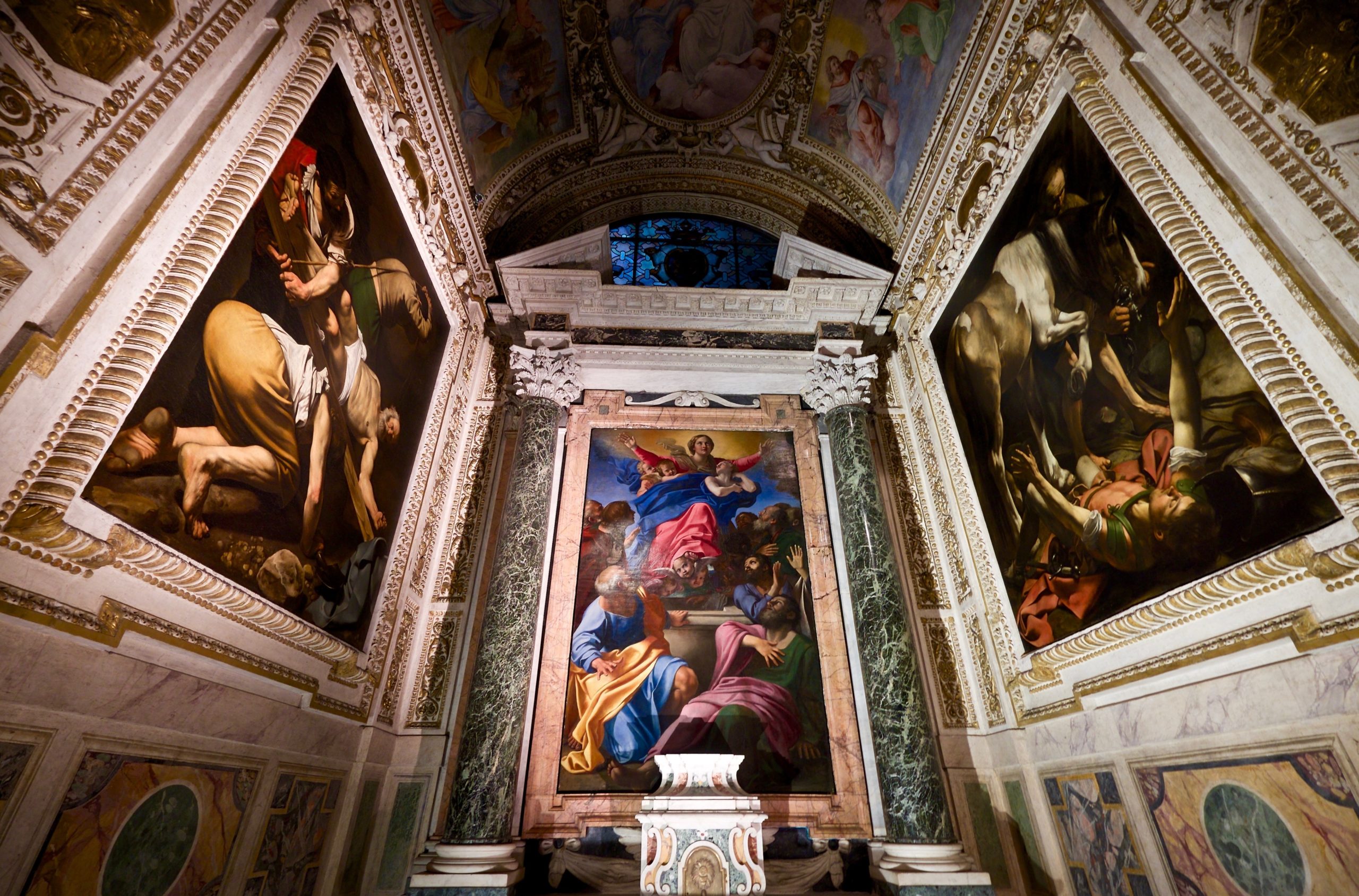
By the end of the 16th century, the Catholic Church was once again feeling optimistic, even triumphant. It had emerged from the crisis with renewed vigor and clarity of purpose. Shepherding the faithful—instructing them on Catholic doctrines and inspiring virtuous behavior—took center stage. Keen to rebuild Rome’s reputation as a holy city, the Papacy embarked on extensive building and decoration campaigns aimed at highlighting its ancient origins, its beliefs, and its divinely sanctioned authority. In the eyes of faithful Catholics, Rome was not an unfaithful whore, but a pure bride, beautifully adorned for her union with her divine spouse.
The art of persuasion: To instruct, to delight, to move
While the Protestants harshly criticized the cult of images, the Catholic Church ardently embraced the religious power of art. The visual arts, the Church argued, played a key role in guiding the faithful. They were certainly as important as the written and spoken word, and perhaps even more important since they were accessible to the learned and the unlearned alike. In order to be effective in its pastoral role, religious art had to be clear, persuasive, and powerful. Not only did it have to instruct, but it also had to inspire. It had to move the faithful to feel the reality of Christ’s sacrifice, the suffering of the martyrs, and the visions of the saints.
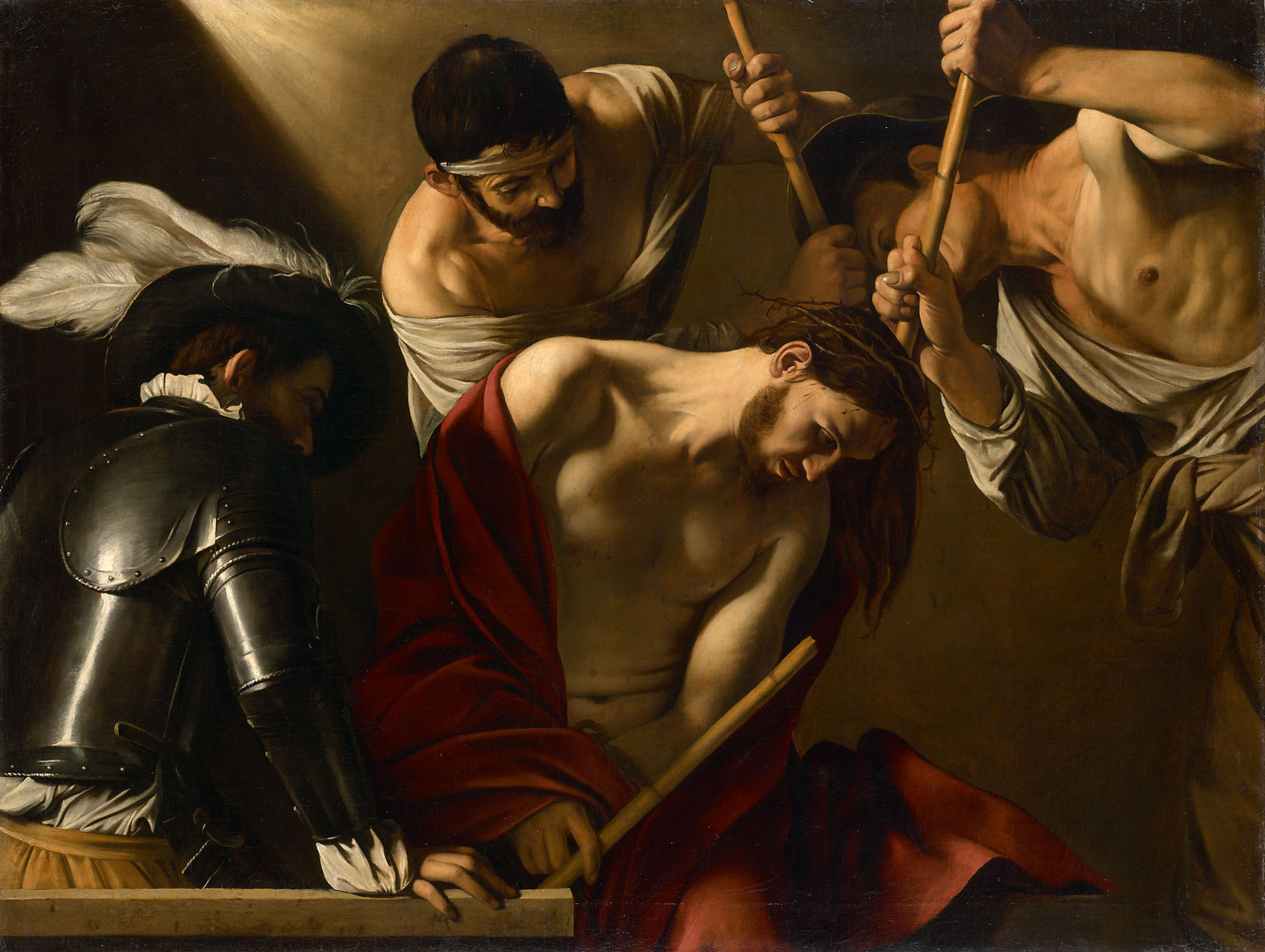
The Church’s emphasis on art’s pastoral role prompted artists to experiment with new and more direct means of engaging the viewer. Artists like Caravaggio turned to a powerful and dramatic realism, accentuated by bold contrasts of light and dark, and tightly cropped compositions that enhance the physical and emotional immediacy of the depicted narrative.
Other artists, like Annibale Carracci (who also experimented with realism), ultimately settled on a more classical visual language, inspired by the vibrant palette, idealized forms, and balanced compositions of the High Renaissance. Still others, like Giovanni Battista Gaulli, turned to daring feats of illusionism that blurred not only the boundaries between painting, sculpture, and architecture, but also those between the real and depicted worlds. In so doing, the divine was made physically present and palpable.
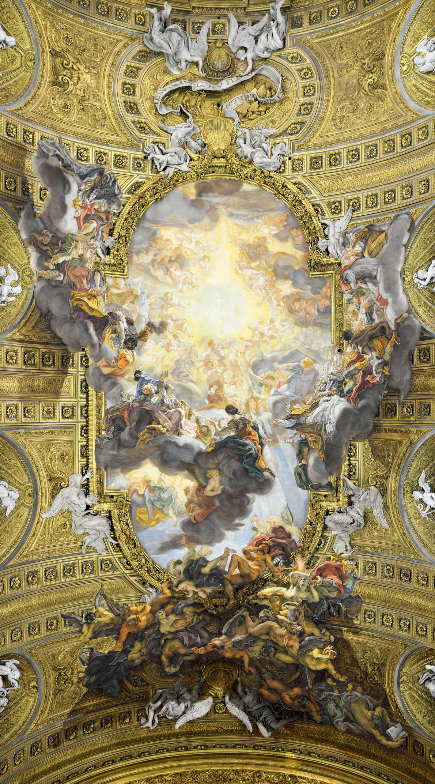
Whether through shocking realism, dynamic movement, or exuberant ornamentation, seventeenth-century art is meant to impress. It aims to convince the viewer of the truth of its message by impacting the senses, awakening the emotions, and activating—even sharing—the viewer’s space.
“Baroque”—the word, the style, the period
In the context of European history, the period from c. 1585 to c. 1700/1730 is often called the Baroque era. The word “baroque” derives from the Portuguese and Spanish words for a large, irregularly shaped pearl (“barroco” and “barrueco,” respectively). Eighteenth-century critics were the first to apply the term to the art of the 17th century. It was not a term of praise. To the eyes of these critics, who favored the restraint and order of Neoclassicism, the works of Bernini, Borromini, and Pietro da Cortona appeared bizarre, absurd, even diseased—in other words, misshapen, like an imperfect pearl.
By the middle of the 19th century, the word had lost its pejorative implications and was used to describe the ornate and complex qualities present in many examples of 17th-century art, music, and literature. Eventually, the term came to designate the historical period as a whole.
In the context of the painting, for example, the stark realism of Zurbarán’s altarpieces, the quiet intimacy of Vermeer’s domestic interiors, and the restrained classicism of Poussin’s landscapes are all “Baroque” (now with a capital “B” to indicate the historical period), regardless of the absence of the stylistic traits originally associated with the term.
Scholars continue to debate the validity of this label, admitting the usefulness of having a label for this distinct historical period, while also acknowledging its limitations in characterizing the variety of artistic styles present in the 17th century.
How to recognize Baroque art with Bernini’s David
Painted and sculpted bodies move into our space. Everything feels like it’s in motion, including the light.
Introduction to Baroque Architecture
Like its sculpture and painting counterparts, Baroque architecture focused on the dramatic. Renaissance architecture emphasized symmetry and balance often relying on the regular forms of circles and squares, such as with Bramante’s Tempietto. In contrast, Baroque architecture utilized the trapezoid, the oval, diagonal lines, and theatrical spaces. Often working on a large-scale, architects like Bernini and Borromini were working for the Counter-Reformation Catholic Church. Architectural spaces designed in the context of the Counter-Reformation reaffirmed the power and authority of the Catholic Church while appearing dynamic and visually engaging for the viewer.
Francesco Borromini, San Carlo alle Quattro Fontane, Rome
A Baroque architect whose idiosyncratic use of curves was nonetheless based on geometry, Borromini built complex and sometimes controversial designs.
Gian Lorenzo Bernini, Saint Peter’s Square
A sculptor, architect, and painter, Gian Lorenzo Bernini’s stone carving and innovation in dynamic architectural spaces was in service of the Counter-Reformation. Central to the Counter Reformation, Bernini’s double colonnades activate Saint Peter’s and reach out into the city.
Gian Lorenzo Bernini, Baldacchino, Saint Peter’s
Michelangelo, Last Judgment, Sistine Chapel
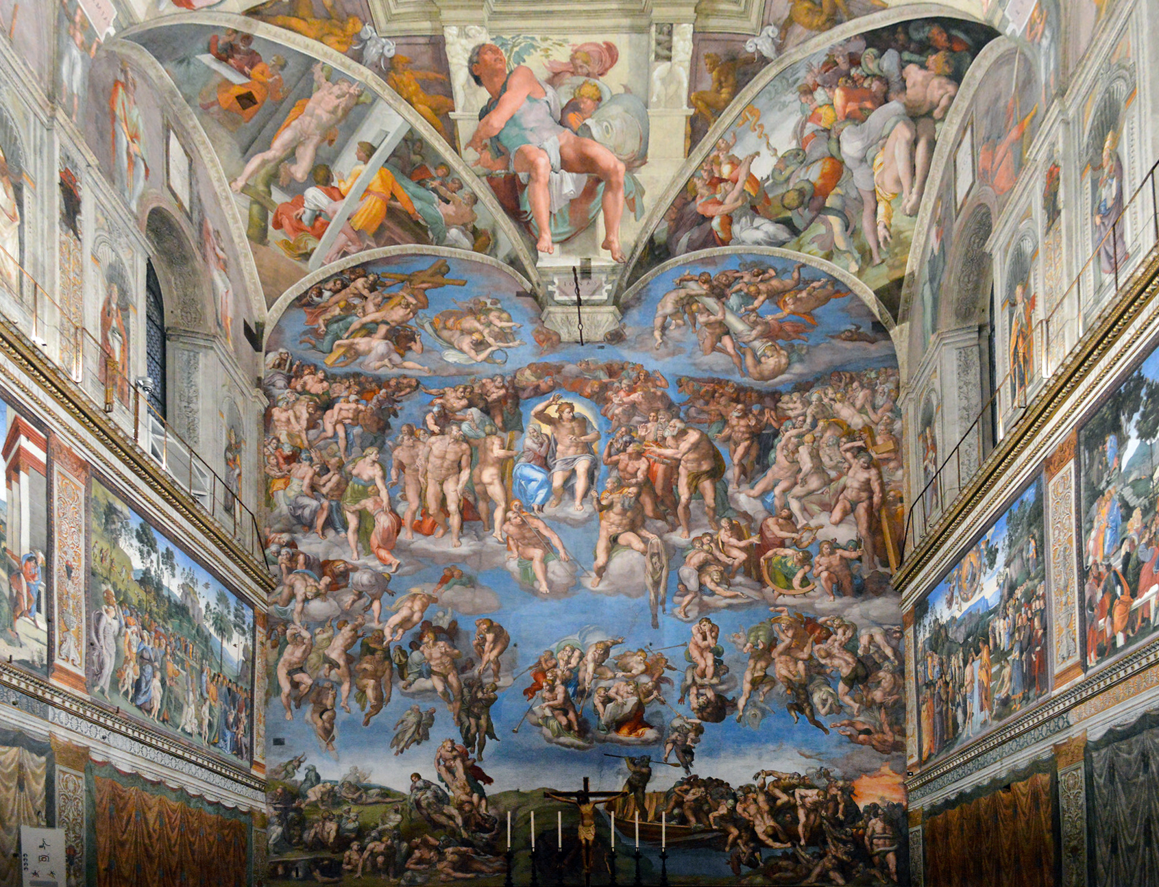
“He will come to judge the living and the dead.” from the Apostle’s Creed, an early statement of Christian belief
This is it. The moment all Christians await with both hope and dread. This is the end of time, the beginning of eternity when the mortal becomes immortal, when the elect join Christ in his heavenly kingdom and the damned are cast into the unending torments of hell. What a daunting task: to visualize the endgame of earthly existence—and furthermore, to do so in the Sistine Chapel, the private chapel of the papal court, where the leaders of the Church gathered to celebrate feast day liturgies, where the pope’s body was laid in state before his funeral, and where—to this day—the College of Cardinals meets to elect the next pope.
No artist in sixteenth-century Italy was better positioned for this task than Michelangelo, whose completion of the chapel’s ceiling in 1512 had sealed his reputation as the greatest master of the human figure—especially the male nude. Pope Paul III was well aware of this when he charged Michelangelo with repainting the chapel’s altar wall with the Last Judgment. With its focus on the resurrection of the body, this was the perfect subject for Michelangelo.
Historical & pictorial contexts
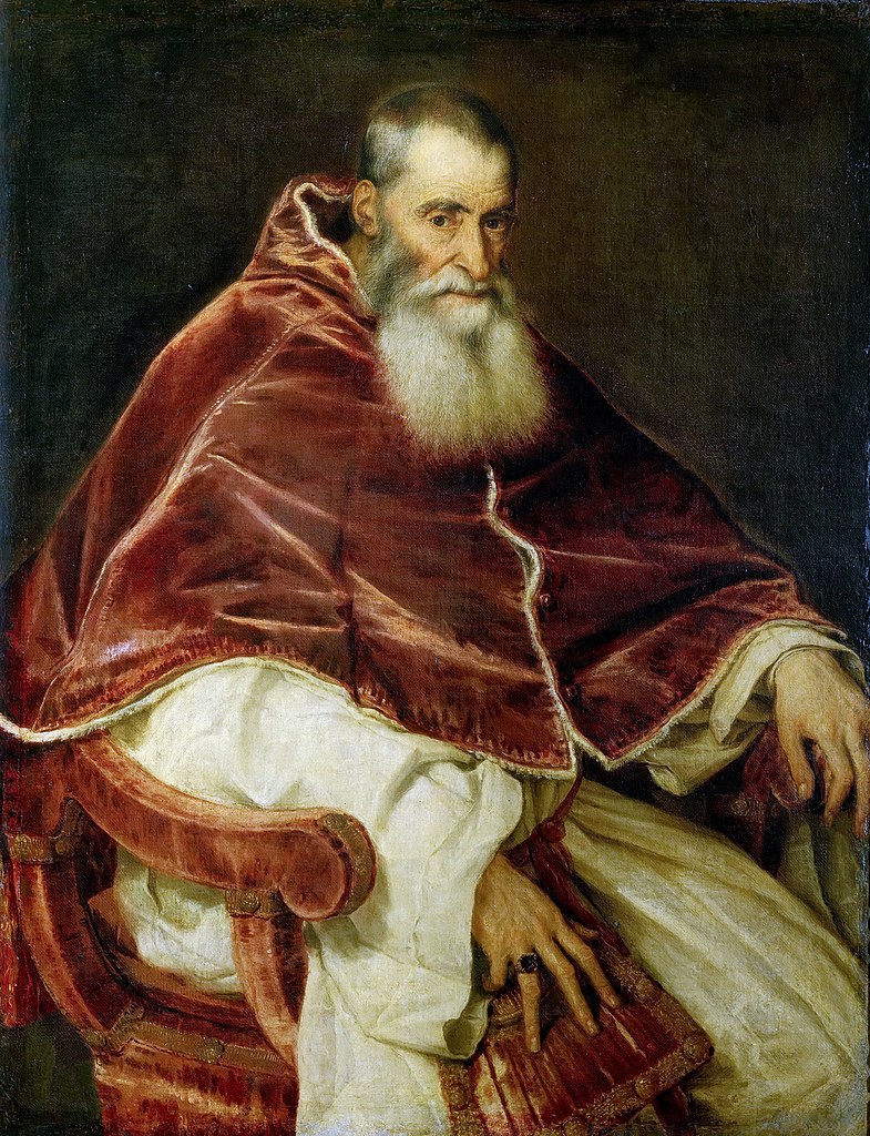
The Last Judgment was one of the first art works Paul III commissioned upon his election to the papacy in 1534. The church he inherited was in crisis; the Sack of Rome (1527) was still a recent memory. Paul sought to address not only the many abuses that had sparked the Protestant Reformation, but also to affirm the legitimacy of the Catholic Church and the orthodoxy of its doctrines (including the institution of the papacy). The visual arts would play a key role in his agenda, beginning with the message he directed to his inner circle by commissioning the Last Judgment.
The decorative program of the Sistine Chapel encapsulates the history of salvation. It begins with God’s creation of the world and his covenant with the people of Israel (represented in the Old Testament scenes on the ceiling and south wall), and continues with the earthly life of Christ (on the north wall). The addition of the Last Judgment completed the narrative. The papal court, representatives of the earthly church, participated in this narrative; it filled the gap between Christ’s life and his Second Coming.
The composition
Michelangelo’s Last Judgment is among the most powerful renditions of this moment in the history of Christian art. Over 300 muscular figures, in an infinite variety of dynamic poses, fill the wall to its edges. Unlike the scenes on the walls and the ceiling, the Last Judgment is not bound by a painted border. It is all encompassing and expands beyond the viewer’s field of vision. Unlike other sacred narratives, which portray events of the past, this one implicates the viewer. It has yet to happen and when it does, the viewer will be among those whose fate is determined.
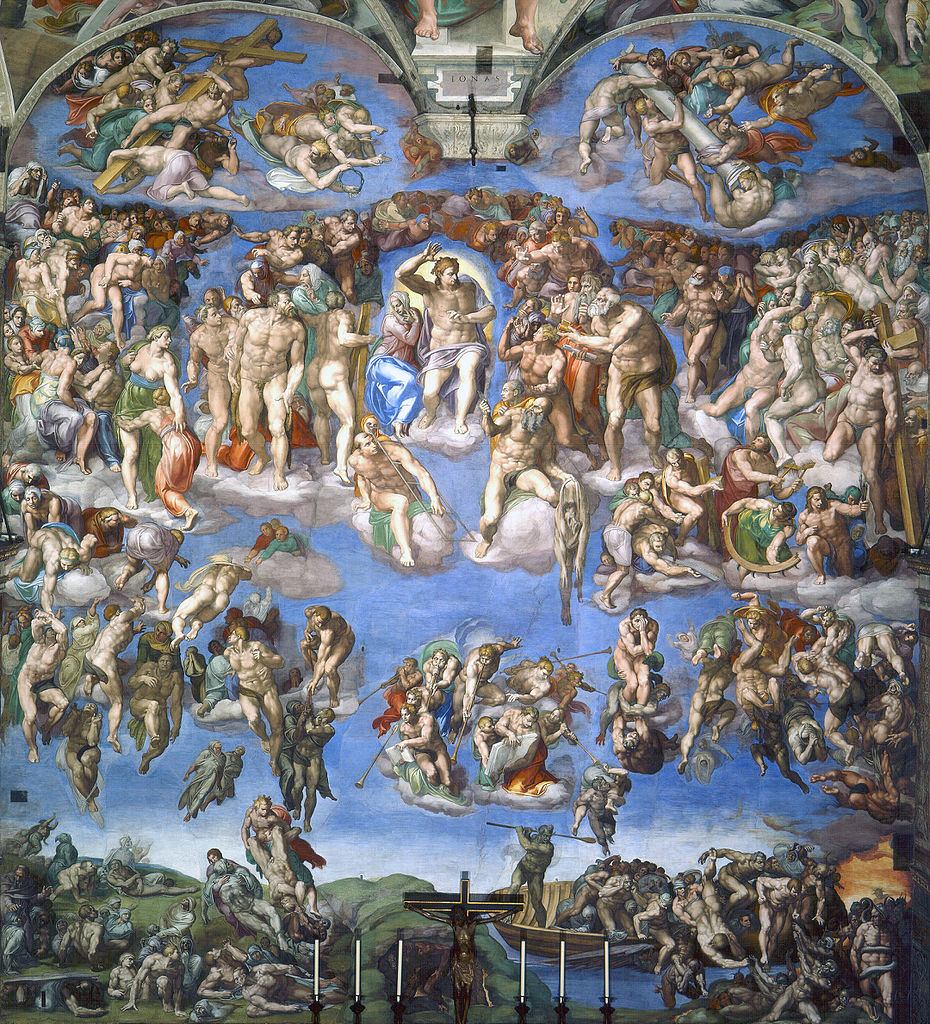
Despite the density of figures, the composition is clearly organized into tiers and quadrants, with subgroups and meaningful pairings that facilitate the fresco’s legibility. As a whole, it rises on the left and descends on the right, recalling the scales used for the weighing of souls in many depictions of the Last Judgment.
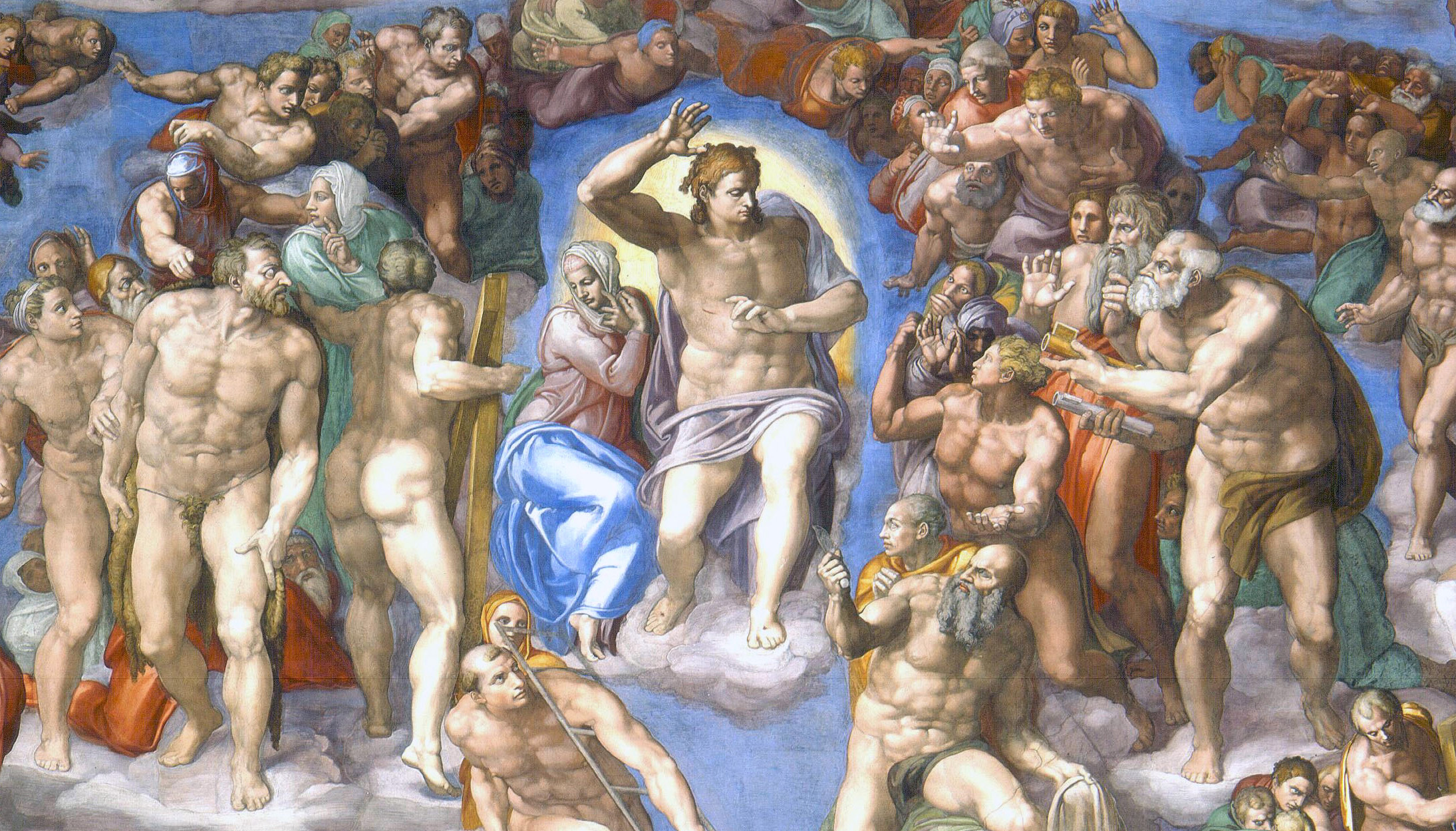
Christ is the fulcrum of this complex composition. A powerful, muscular figure, he steps forward in a twisting gesture that sets in motion the final sorting of souls (the damned on his left, and the blessed on his right). Nestled under his raised arm is the Virgin Mary. Michelangelo changed her pose from one of open-armed pleading on humanity’s behalf seen in a preparatory drawing, to one of acquiescence to Christ’s judgment. The time for intercession is over. Judgment has been passed.
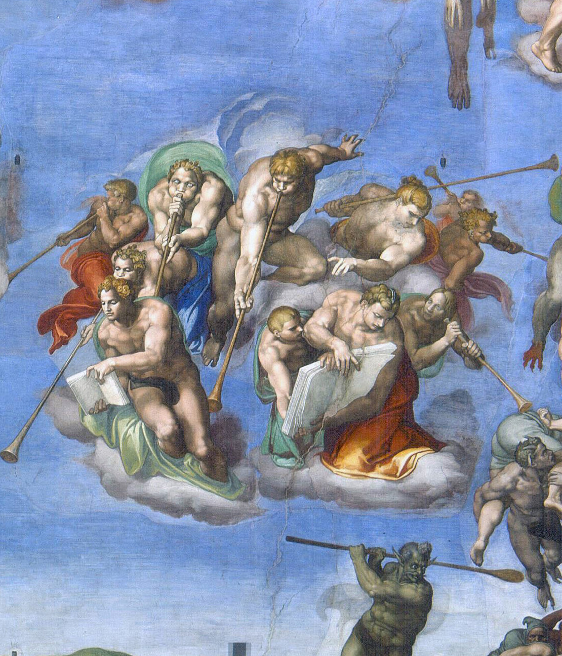
Directly below Christ a group of wingless angels (left), their cheeks puffed with effort, sound the trumpets that call the dead to rise, while two others hold open the books recording the deeds of the resurrected. The angel with the book of the damned emphatically angles its down to show the damned that their fate is justly based on their misdeeds.
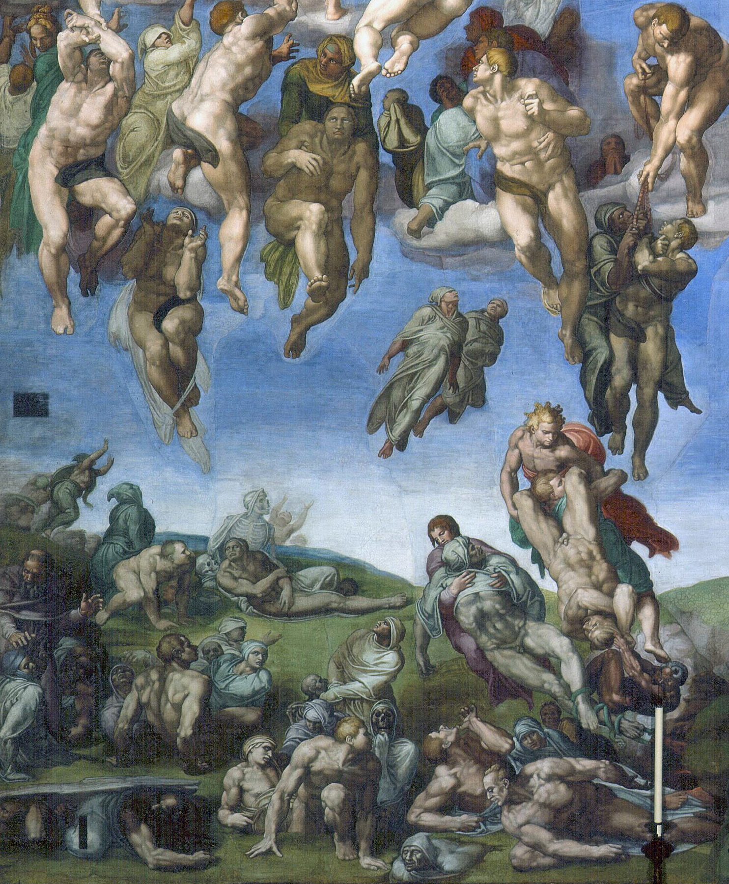
The elect (those going to heaven)
On the lower left of the composition (Christ’s right), the dead emerge from their graves, shedding their burial shrouds. Some rise up effortlessly, drawn by an invisible force, while others are assisted by herculean angels, one of whom lifts a pair of souls that cling to a strand of rosary beads. This detail reaffirms a doctrine contested by the Protestants: that prayer and good works, and not just faith and divine grace, play a role in determining one’s fate in the afterlife. Directly below, a risen body is caught in violent tug of war, pulled on one end by two angels and on the other by a horned demon who has escaped through a crevice in the central mound. This breach in the earth provides a glimpse of the fires of hell.
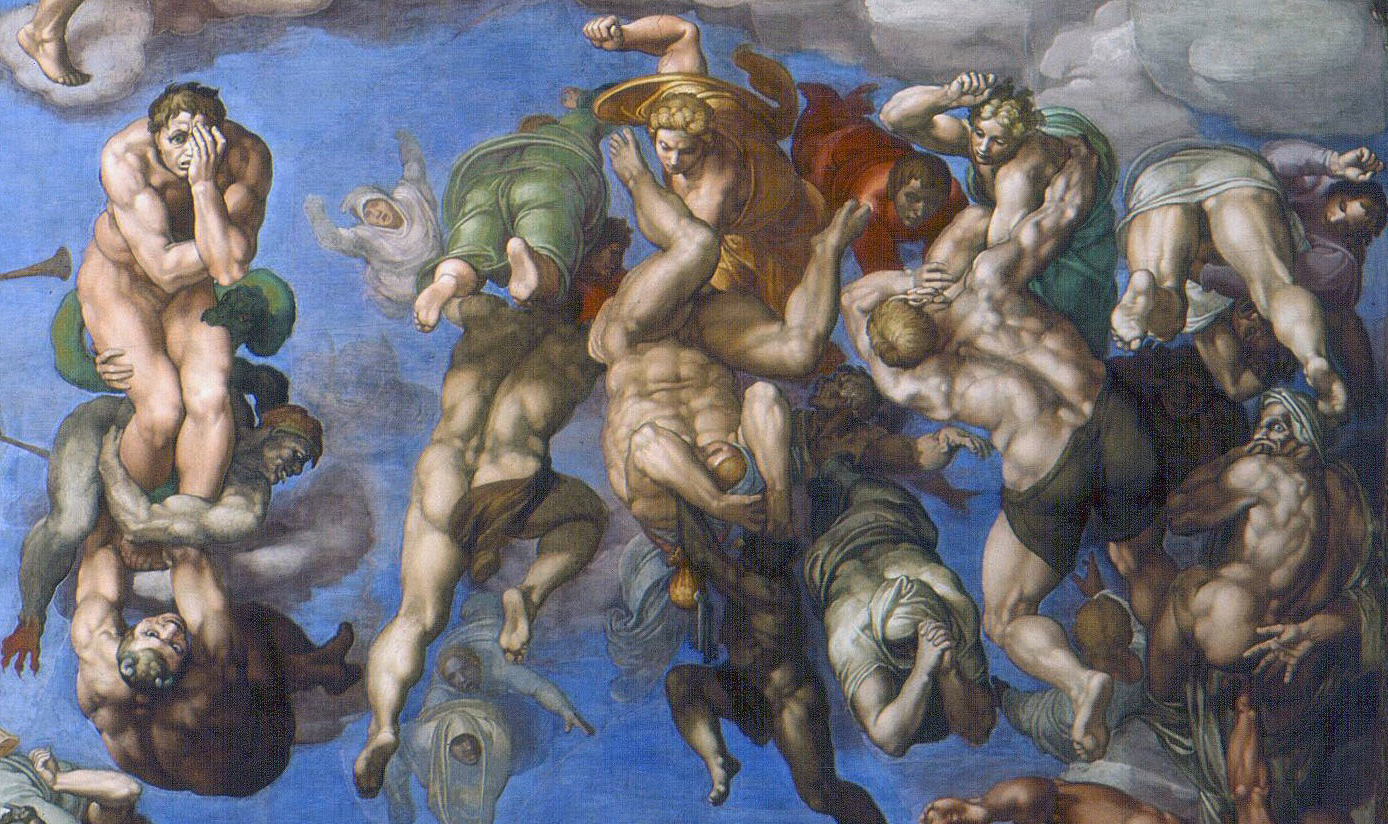
The damned (those going to hell)
On the right of the composition (Christ’s left), demons drag the damned to hell, while angels beat down those who struggle to escape their fate (image above). One soul is both pummeled by an angel and dragged by a demon, head first; a money bag and two keys dangles from his chest. His is the sin of avarice. Another soul—exemplifying the sin of pride—dares to fight back, arrogantly contesting divine judgment, while a third (at the far right) is pulled by his scrotum (his sin was lust). These sins were specifically singled out in sermons delivered to the papal court.
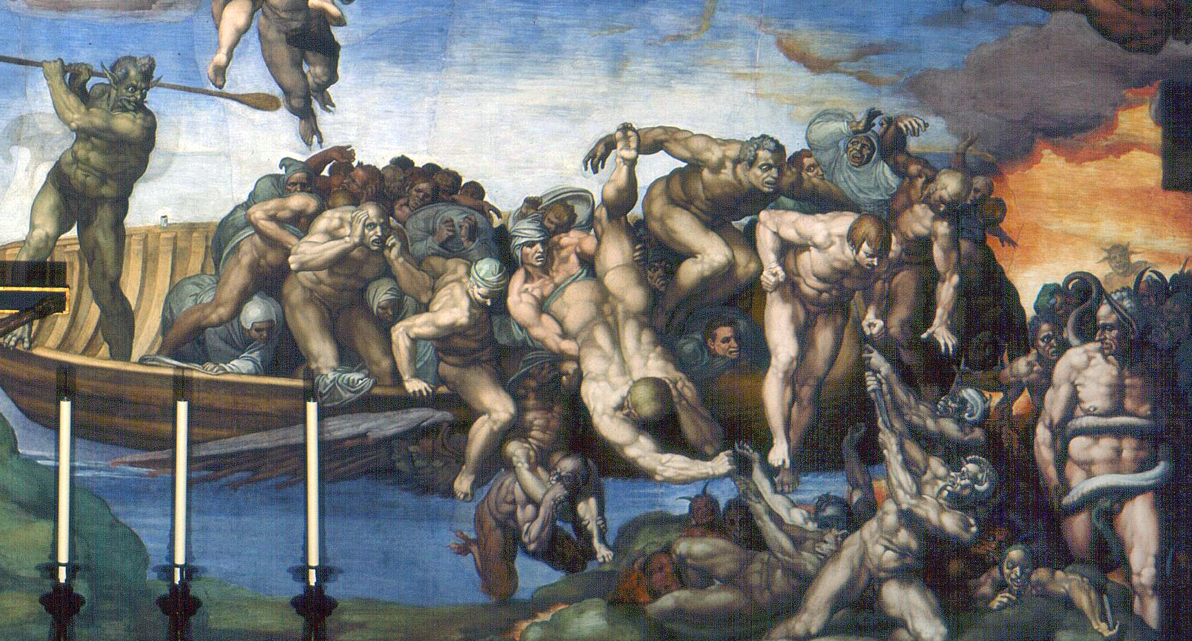
In the lower right corner, Charon—the ferryman from Greek mythology who transports souls to the underworld—swings his oar as he drives the damned onto hell’s shores (image above). In the lower right corner stands another mythological character, the ass-eared Minos, his own carnal sinfulness indicated by the snake that bites his genitals. He stands at the very edge of hell, judging the new-comers to determine their eternal punishment.
In the company of Christ
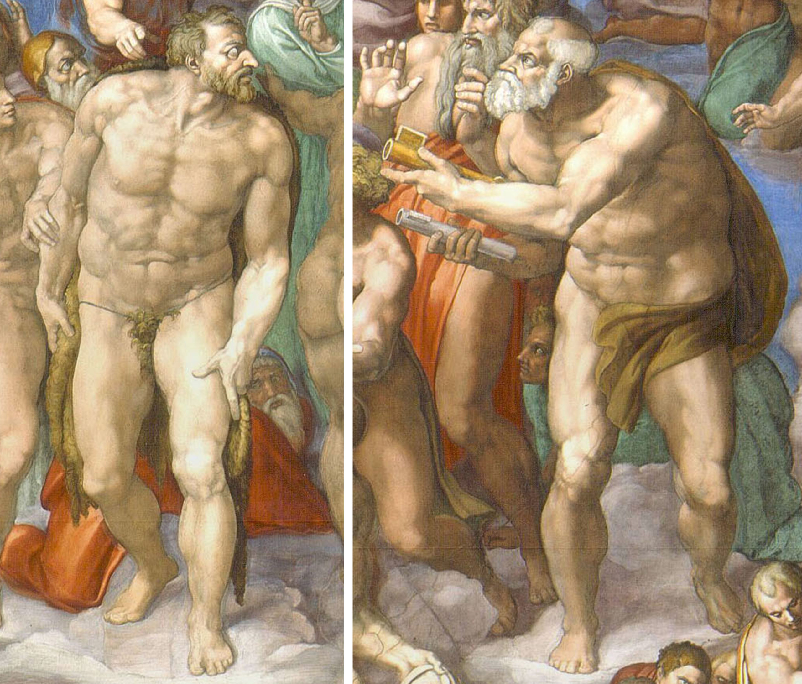
While such details were meant to provoke terror in the viewer, Michelangelo’s painting is primarily about the triumph of Christ. The realm of heaven dominates. The elect encircle Christ; they loom large in the foreground and extend far into the depth of the painting, dissolving the boundary of the picture plane. Some hold the instruments of their martyrdom: Andrew the X-shaped cross, Lawrence the gridiron, St. Sebastian a bundle of arrows, to name only a few.
Especially prominent are St. John Baptist and St. Peter who flank Christ to the left and right and share his massive proportions (above). John, the last prophet, is identifiable by the camel pelt that covers his groin and dangles behind his legs; and, Peter, the first pope, is identified by the keys he returns to Christ. His role as the keeper of the keys to the kingdom of heaven has ended. This gesture was a vivid reminder to the pope that his reign as Christ’s vicar was temporary—in the end, he too will to answer to Christ.
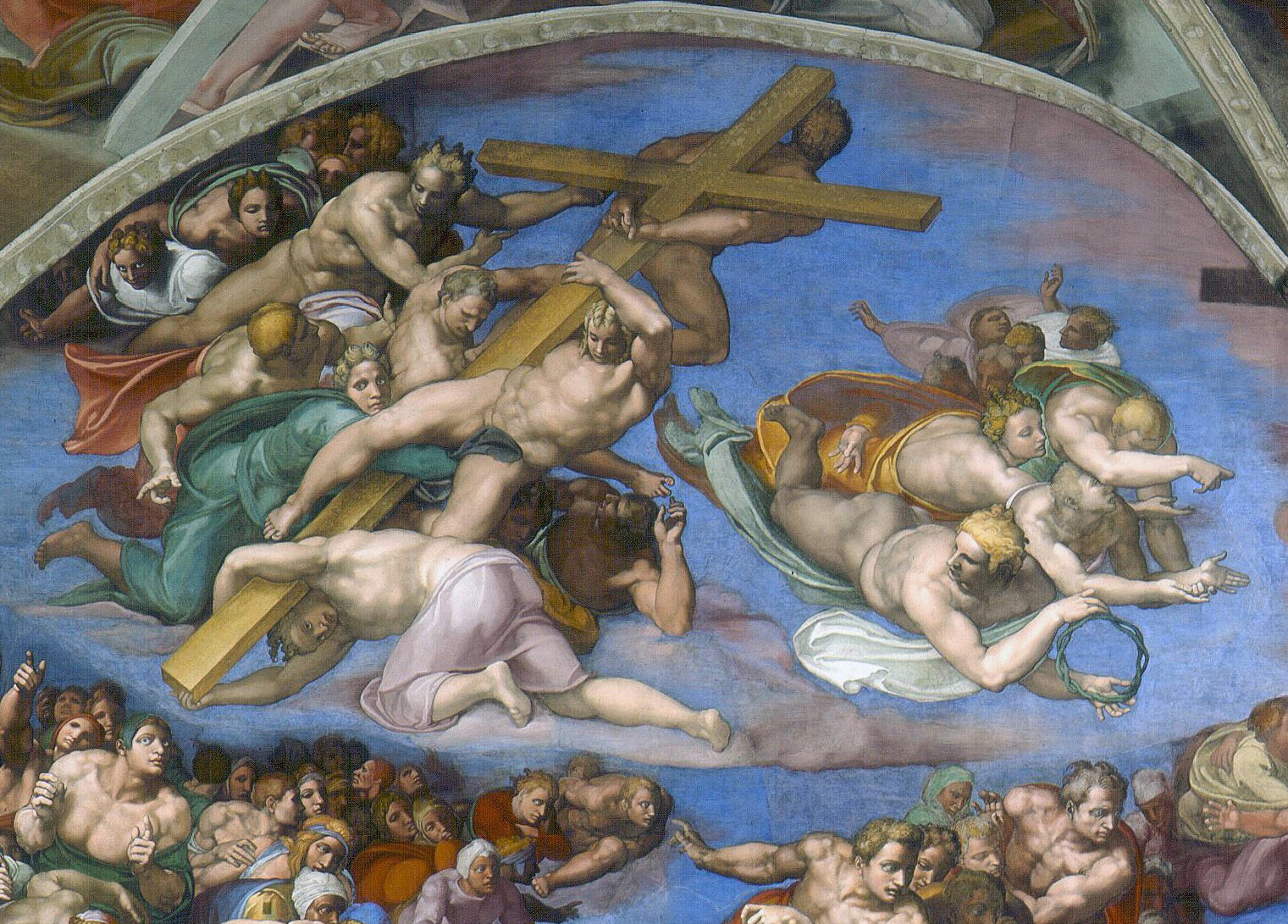
In the lunettes (semi-circular spaces) at the top right and left, angels display the instruments of Christ’s Passion, thus connecting this triumphal moment to Christ’s sacrificial death. This portion of the wall projects one foot forward, making it visible to the priest at the altar below as he commemorates Christ’s sacrifice in the liturgy of the Eucharist.
Critical response: masterpiece or scandal?
Shortly after its unveiling in 1541, the Roman agent of Cardinal Gonzaga of Mantua reported: “The work is of such beauty that your excellency can imagine that there is no lack of those who condemn it. . . . [T]o my mind it is a work unlike any other to be seen anywhere.” Many praised the work as a masterpiece. They saw Michelangelo’s distinct figural style, with its complex poses, extreme foreshortening, and powerful (some might say excessive) musculature, as worthy of both the subject matter and the location. The sheer physicality of these muscular nudes affirmed the Catholic doctrine of bodily resurrection (that on the day of judgment, the dead would rise in their bodies, not as incorporeal souls).
Others were scandalized—above all by the nudity—despite its theological accuracy, for the resurrected would enter heaven not clothed but nude, as created by God. Critics also objected to the contorted poses (some resulting in the indecorous presentation of buttocks), the breaks with pictorial tradition (the beardless Christ, the wingless angels), and the appearance of mythology (the figures of Charon and Minos) in a scene portraying sacred history. Critics saw these embellishments as distractions from the fresco’s spiritual message. They accused Michelangelo of caring more about showing off his creative abilities than portraying sacred truth with clarity and decorum. Religious art was the “book of the illiterate” and as such should be easy to understand.
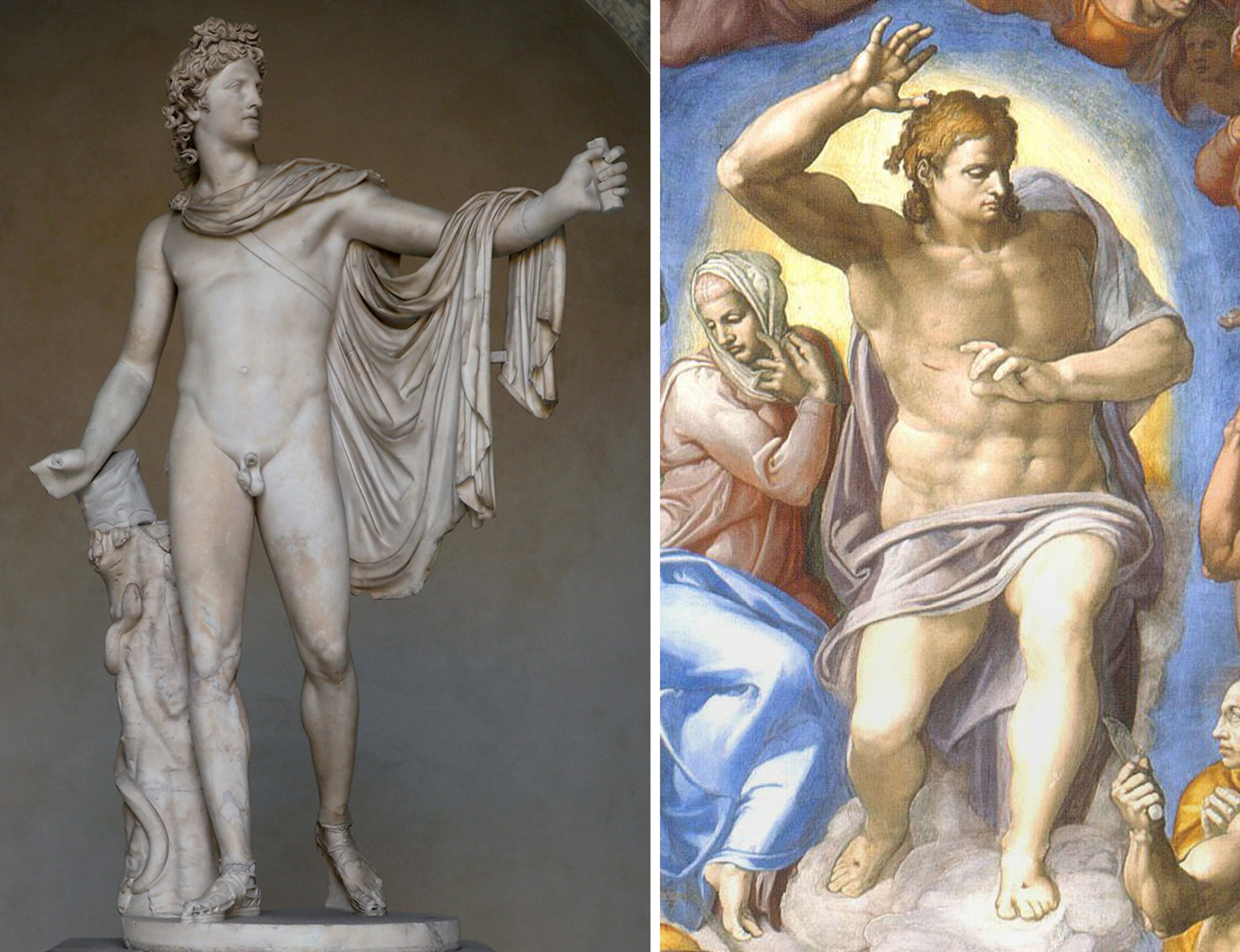
Michelangelo’s Last Judgment, however, was not painted for an unlearned, lay audience. To the contrary, it was designed for a very specific, elite and erudite audience. This audience would understand and appreciate his figural style and iconographic innovations. They would recognize, for example, that his inclusion of Charon and Minos was inspired by Dante’s Inferno, a text Michelangelo greatly admired. They would see in the youthful face of Christ his reference to the Apollo Belvedere, an ancient Greek Hellenistic sculpture in the papal collection lauded for its ideal beauty. Thus, Michelangelo glosses the identity of Christ as the “Sun of Righteousness” (Malachi 4:2).
A self-portrait
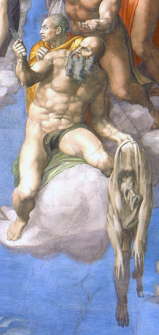
Even more poignant is Michelangelo’s insertion of himself into the fresco. His is the face on the flayed skin held by St. Bartholomew, an empty shell that hangs precariously between heaven and hell. To his learned audience, the flayed skin would bring to mind not only the circumstances of the saint’s martyrdom but also the flaying of Marsyas by Apollo. In his foolish arrogance, Marsyas challenged Apollo to a musical contest, believing his skill could surpass that of the god of music himself. His punishment for such hubris was to be flayed alive. That Michelangelo should identify with Marsyas is not surprising. His contemporaries had dubbed him the “divine” Michelangelo for his ability to rival God himself in giving form to the ideal body. Often he lamented his youthful pride, which had led him to focus on the beauty of art rather than the salvation of his soul. So, here, in a work done in his mid sixties, he acknowledges his sin and expresses his hope that Christ, unlike Apollo, will have mercy upon him and welcome him into the company of the elect.
An epic painting
Like Dante in his great epic poem, The Divine Comedy, Michelangelo sought to create an epic painting, worthy of the grandeur of the moment. He used metaphor and allusion to ornament his subject. His educated audience would delight in his visual and literary references.
Originally intended for a restricted audience, reproductive engravings of the fresco quickly spread it far and wide, placing it at the center of lively debates on the merits and abuses of religious art. While some hailed it as the pinnacle of artistic accomplishment, others deemed it the epitome of all that could go wrong with religious art and called for its destruction. In the end, a compromise was reached. Shortly after the artist’s death in 1564, Daniele Da Volterra was hired to cover bare buttocks and groins with bits of drapery and repaint Saint Catherine of Alexandria, originally portrayed unclothed, and St. Blaise, who hovered menacingly over her with his steel combs.
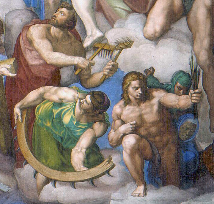
In contrast to its limited audience in the sixteenth century, now the Last Judgment is see by thousands of tourists daily. However, during papal conclaves it becomes once again a powerful reminder to the College of Cardinals of their place in the story of salvation, as they gather to elect Christ’s earthly vicar (the next Pope)—the person who will be responsible for shepherding the faithful into the community of the elect.
Caravaggio, Calling of Saint Matthew
A key figure in Counter-Reformation religious art, Caravaggio’s focus on realism and use of tenebrism engaged viewers in profound moments of faith.
Practicing Visual Analysis
Caravaggio’s Calling of Saint Matthew exemplifies the 17th century Baroque style with its dramatic presentation of Biblical subject matter. Unlike Renaissance paintings where Christ is often placed in the center of the composition at the vanishing point of linear perspective, Caravaggio used an asymmetrical composition. Christ is placed on the far right of the painting almost completely shrouded in darkness. The viewer follows the diagonal line of light streaming above Christ’s head toward Matthew. In a typical Renaissance painting, a natural light source is logically perceivable: a window, the sun, a candle, etc. Here, however, light does not relate to a natural source. The window above Christ’s extended arm does not illuminate the scene. Rather, the light comes from an unseen, ambiguous source. To further enhance the theatricality of the scene, Caravaggio employed an extreme form of chiaroscuro modeling: tenebroso. With dark shadows and bright highlights, the tenebroso lighting magnifies the drama of Matthew’s spiritual awakening. In a Renaissance painting, Christ is often the brightest figure in scene; however, here Christ seems to emerge from the shadows bringing light with him to illuminate the earthly sinner, Matthew. In terms of pictorial space, Caravaggio used tenebroso and overlapping of forms to suggest three-dimensional space on a two-dimensional canvas. He also condensed the picture plane by bringing the figures forward in pictorial space and into conversation with us, the viewer.
Caravaggio and Caravaggisti in 17th-century Europe
One of the most widely imitated artists
Michelangelo Merisi da Caravaggio was famously sensitive when it came to matters of artistic originality: he threatened both the painter Guido Reni and artist and biographer Giovanni Baglione for copying his style. Despite his best efforts to protect his singular style, however, Caravaggio became one of the most widely imitated artists in the history of Western art.
After his untimely death in 1610, many Italian and non-Italian artists alike came to be considered his “followers,” even though they had never met the artist or worked alongside him. Unlike the typical Renaissance master-follower relationship, these artists could claim no direct descent from the studio of Caravaggio (since he did not have one), and in some cases, they had not even seen his paintings first-hand. Some artists imitated Caravaggio for only a brief phase of their careers – Baglione, Carlo Saraceni, and Guercino, for example—while others remained committed to Caravaggio’s stylistic model for the duration of their lives.
Nevertheless, these painters, often labeled Caravaggisti, emulated aspects of Caravaggio’s style, technique, and choice of subjects and were responsible for the dissemination of Caravaggism across the European continent.
A distinctive style
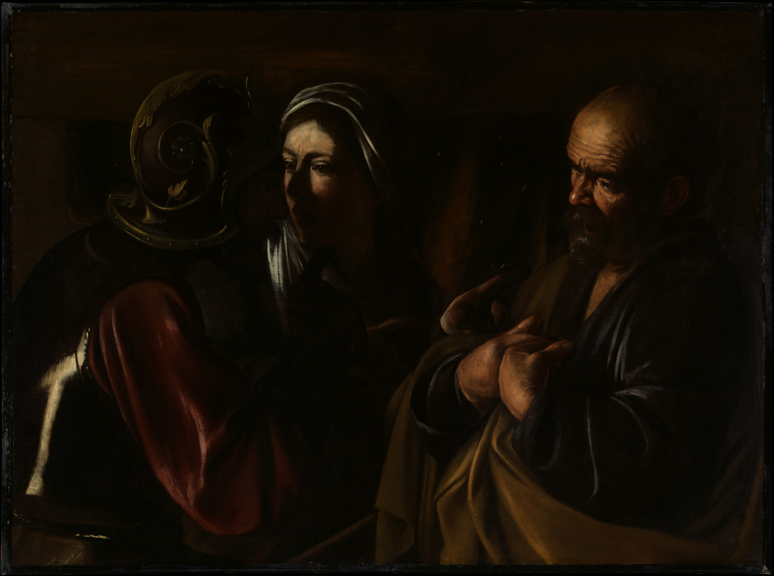
These followers, whether Italian, Spanish, French, or Netherlandish, were especially attracted to Caravaggio’s tenebrism—the use of dark shadows to obscure parts of the composition. Caravaggio’s employment of tenebrism and chiaroscuro, the strong contrast of light and dark, lends his paintings a dramatic effect that has been likened to a spotlit stage.
By combining this theatrical dynamism with careful observation of life, Caravaggio achieved a gritty naturalism in both genre and religious scenes. His subdued palette, half-length figures, and magnification of the picture-plane to create intimate, relatable compositions contributed to Caravaggio’s widespread appeal during the first three decades of the 17th century in Europe.
The unusual darkness and life-like realism of Caravaggio’s paintings accounted in part for his popularity. On the other hand, the types of subject matter and revision of traditional iconographies popularized by Caravaggio had a significant impact on the development of international Caravaggism.
New themes: Rogues and revelers
During his early years in Rome, Caravaggio worked as an assistant in the illustrious workshop of the Cavaliere d’Arpino, but he also completed some of his best-known easel paintings (independent, portable canvases) and sold them on the open market. These paintings included depictions of themes that were uncommon in Roman art at the time and became ubiquitous with the help of the Caravaggisti.
These followers were particularly interested in Caravaggio’s renderings of the seedy underbelly of Roman street-life in the form of The Cardsharps and The Fortune Teller, two of Caravaggio’s most copied paintings, or in the artist’s depiction of music-making as in the Musicians and The Lute Player. Italian artists like Bartolomeo Manfredi and Antiveduto Grammatica, French painters such as Valentin de Boulogne, Georges de La Tour, Nicolas Régnier, and Simon Vouet, and Dutchmen Hendrick Ter Brugghen and Gerrit van Honthorst all replicated these subjects or similar themes in obvious admiration of Caravaggio’s original paintings.
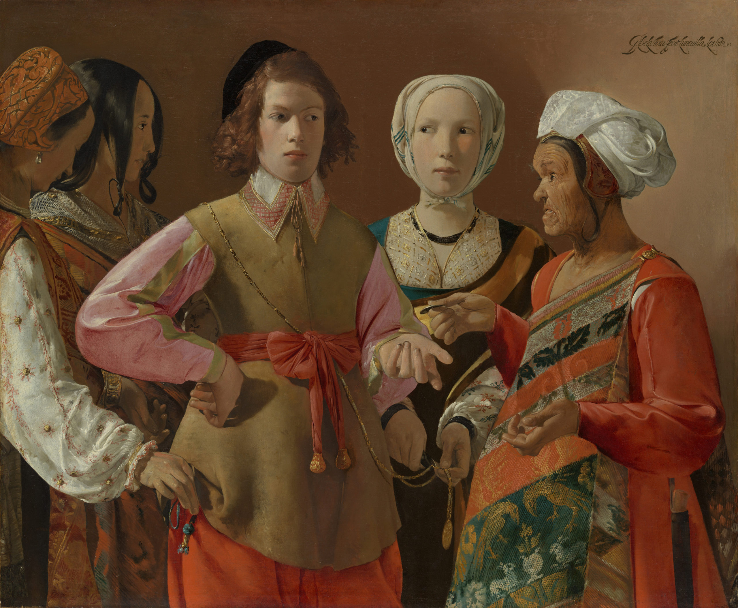
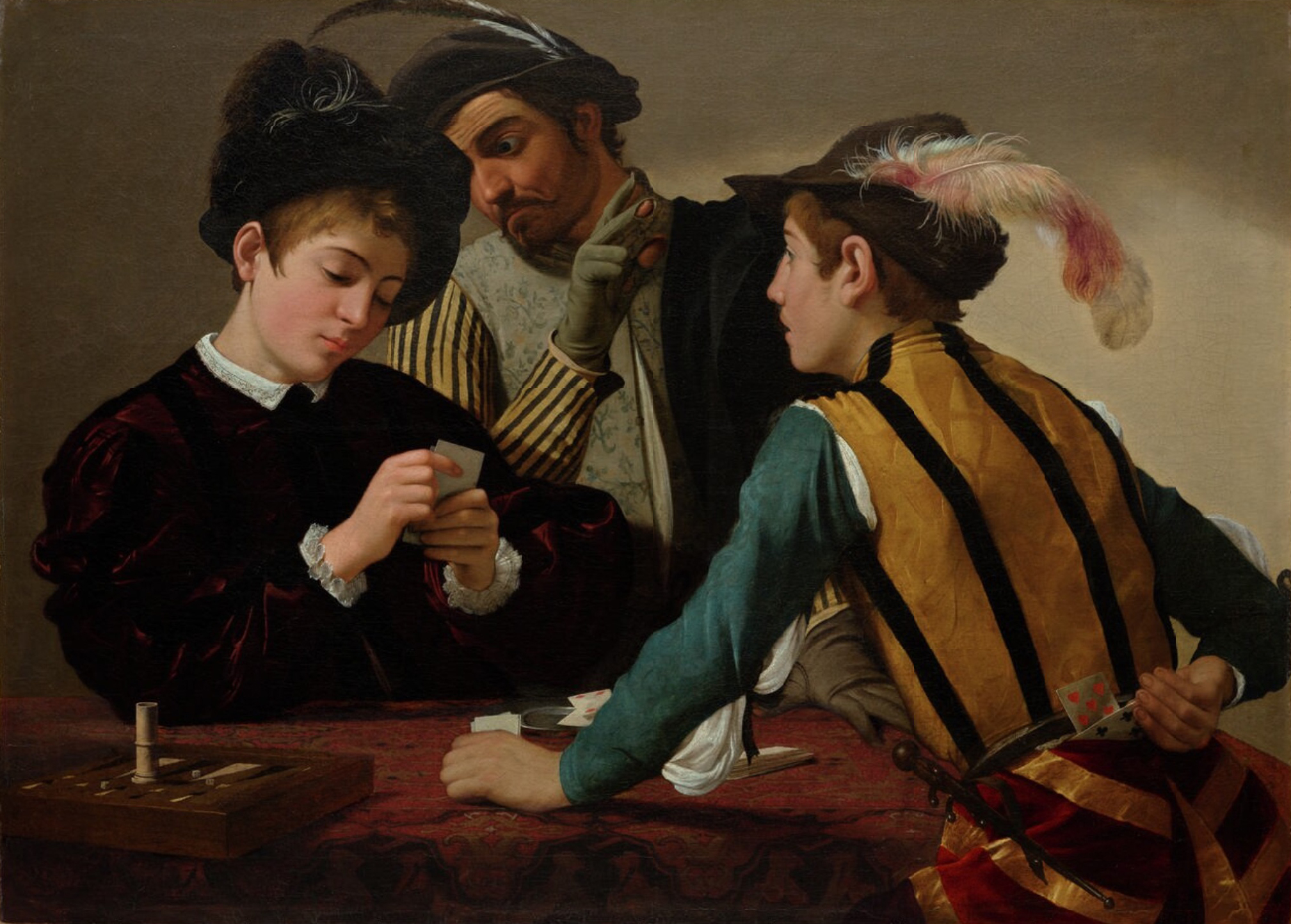
These followers were undoubtedly struck by Caravaggio’s ability to enliven such subjects with a dignity not necessarily befitting the lowly actions depicted. In The Cardsharps, for instance, a fresh-faced boy is tricked by two professional cheats. The viewer is privy to the deception—the figure at the far right of the composition exposes the stolen cards behind his back—and we are brought close to the ruse and the precariously balanced backgammon board, teetering on the edge of an ornate, brocade-covered table. In versions of the theme by Boulogne, Manfredi, or Nicholas Tournier, earthy scenes of revelry might replace cardplaying.
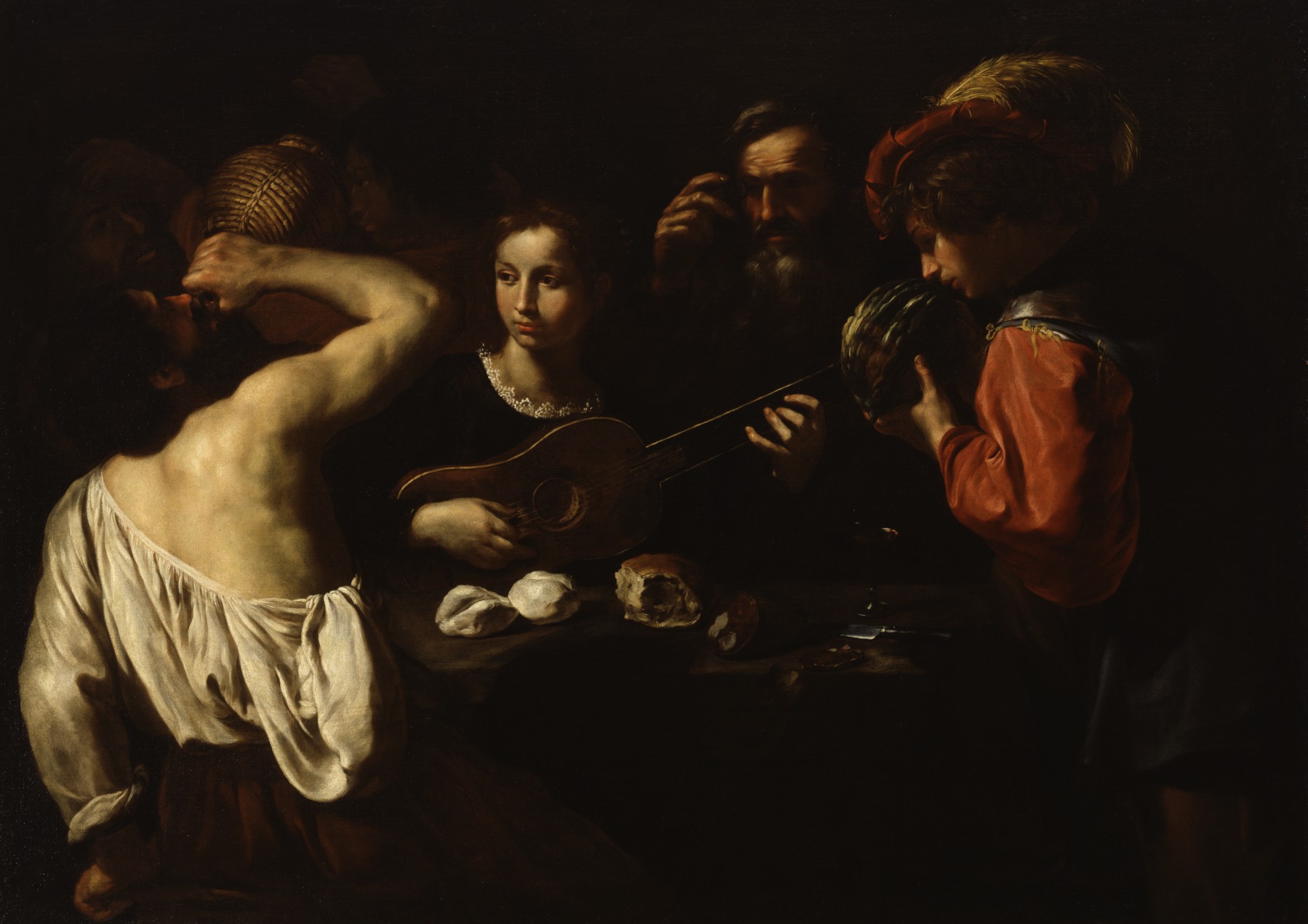
These sometimes-elaborate compositions do not seek to reproduce the quiet intimacy of Caravaggio’s paintings, but they succeed in transposing the artist’s tenebristic backgrounds and embolden the disenfranchised populations they depict. In Pietro Paolini’s rendering of drinkers and revelers in his Allegory of the Senses, he superimposes the dark, somber tonality of Caravaggio’s later religious paintings on the themes Caravaggio painted in his youth. The combination is striking: the levity of gambling or musical merriment is sobered by the reddish ground and stronger chiaroscuro common in the second half of Caravaggio’s career, when he had long since left such subjects behind.
Selective adoptions
Since followers of Caravaggio had no formal indoctrination by the master himself (unlike painters in the school of the Carracci, for instance), they were free to take from Caravaggio whatever aspects of the painter’s style and method they were most interested in. Painters like Cecco del Caravaggio, Orazio Gentileschi and his daughter, Artemisia Gentileschi, or Grammatica, who knew Caravaggio personally, did have the benefit of direct contact with the source of their inspiration, but their work retains a character all its own.
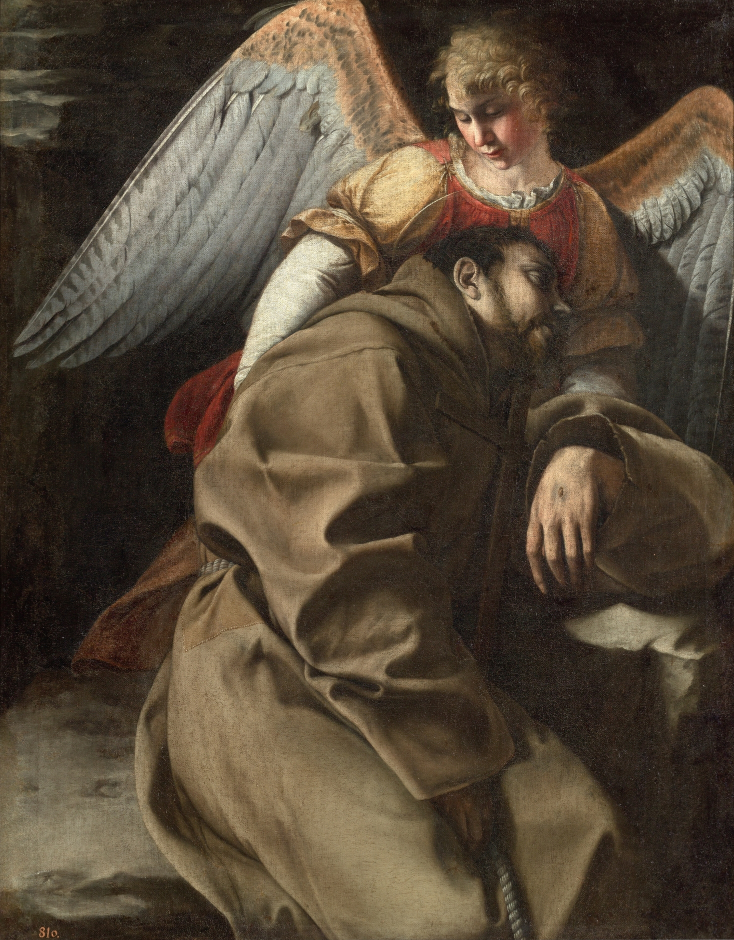
The Gentileschi—both father and daughter—produced more lyrical paintings than did Caravaggio. Incorporating the cold blues, yellows, and violets that were notably absent from Caravaggio’s palette, their paintings, particularly those of Orazio, often reflected local influences. Nevertheless—and crucial to the discussion of Caravaggism in Europe—their work reveals an absorption not only of Caravaggio’s tenebrism, but of his approach to religious iconography.
In his depictions of St. Francis in Ecstasy, Orazio favors the intimate saint-angel relationship first struck by Caravaggio in his Hartford St. Francis. In her gory Judith Beheading Holofernes, Artemisia Gentileschi further highlights the violent struggle of decapitation emphasized in Caravaggio’s painting of 1599. In both cases, the mixed horror and conviction apparent in Judith’s face humanize her violent yet selfless act, all while blood drips mercilessly into the viewer’s space.
A new kind of religious imagery
Other Caravaggisti were also influenced by Caravaggio’s humanizing depictions of devotional subjects. In their representations of the Doubting Thomas, for instance, Ter Brugghen, Honthorst, and Mattias Stomer reproduced the extraordinary half-length figures in semi-circular groupings and visceral depiction of Thomas’s finger in Christ’s side from Caravaggio’s c. 1602 painting for Benedetto Giustiniani. In fact, these Northern artists were likely responsible for the sudden surge in popularity of Doubting Thomas imagery in the Netherlandish city of Utrecht during the first half of the 17th century.
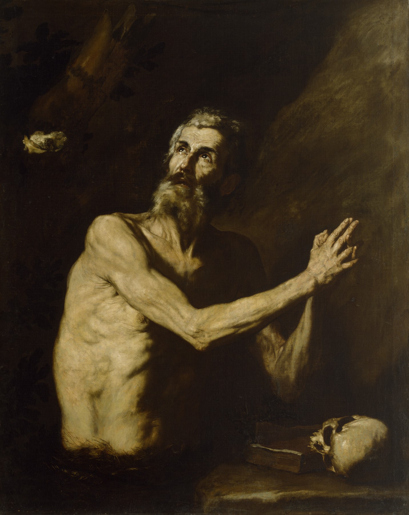
Similarly, Jusepe de Ribera is credited with the spread of the Caravaggesque style to Spain, where it in turn may have influenced the work of Diego Velázquez. Ribera’s paintings of half-length saints, such as the St. Jerome and Sts. Peter and Paul, and large-scale devotional paintings such as the Lamentation over the Dead Christ reflect his years spent in Rome and Naples, where the art of Caravaggio fostered Ribera’s tenebrism and intimate portrayal of hallowed religious subjects.
In 1612, two years after Caravaggio’s death, a young Ribera asked his Roman landlord for permission to cut a hole in his roof. Allowing natural light to illuminate models in Ribera’s studio, this makeshift skylight stands as unusual evidence of the lengths Caravaggisti might go to achieve the first-hand observation, dramatic lighting, and incisive realism that characterized this new approach to art.
This content was first developed for Oxford Art Online and appears courtesy of Oxford University Press.
Artemisia Gentileschi, Judith Slaying Holofernes
“Lord God, to whom all strength belongs, prosper what my hands are now to do for the greater glory of Jerusalem; for now is the time to recover your heritage and to further my plans to crush the enemies arrayed against us.” Judith’s prayer before beheading Holofernes (Judith 13:4-5)
The story of Judith
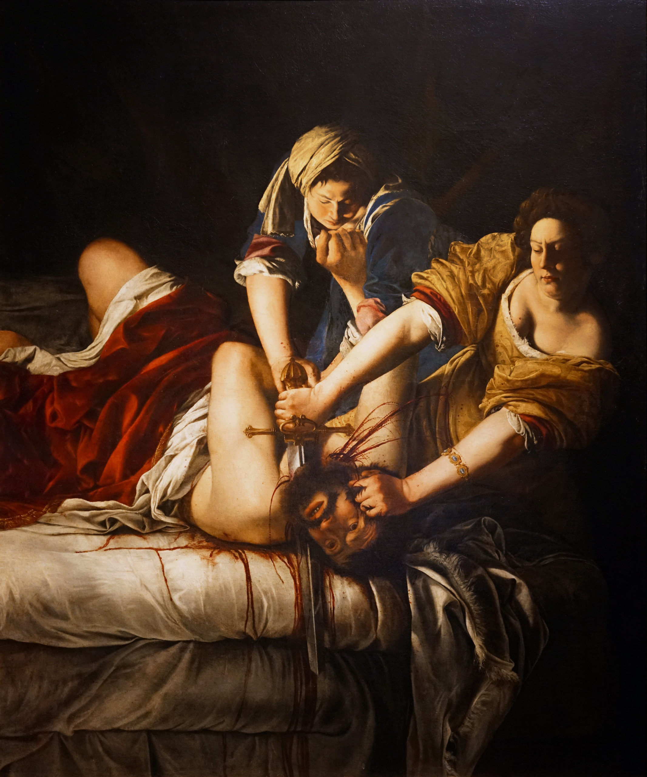
Rivulets of blood run down the white sheets, as Judith, a pious young widow from the Jewish city of Bethulia, beheads Holofernes, general of the Assyrian army that had besieged her city. Moved by the plight of her people and filled with trust in God, Judith took matters into her own hands. She coiffed her hair, donned her finest garments and entered the enemy camp under the pretense of bringing Holofernes information that would ensure his victory. Struck by her beauty, he invited her to dine, planning later to seduce her. As the biblical text recounts, “Holofernes was so enchanted with her that he drank far more wine than he had drunk on any other day in his life” (Judith 12:20). Judith saw her opportunity; with a prayer on her lips and a sword in her hand, she saved her people from destruction.
The story of Judith and Holofernes is recounted in the Book of Judith, a 2nd century text deemed apocryphal by the Jewish and Protestant traditions, but included in Catholic editions of the Bible. Like the story of David and Goliath, it was a popular subject of art in the Renaissance and Baroque periods.
Artemisia and Caravaggio
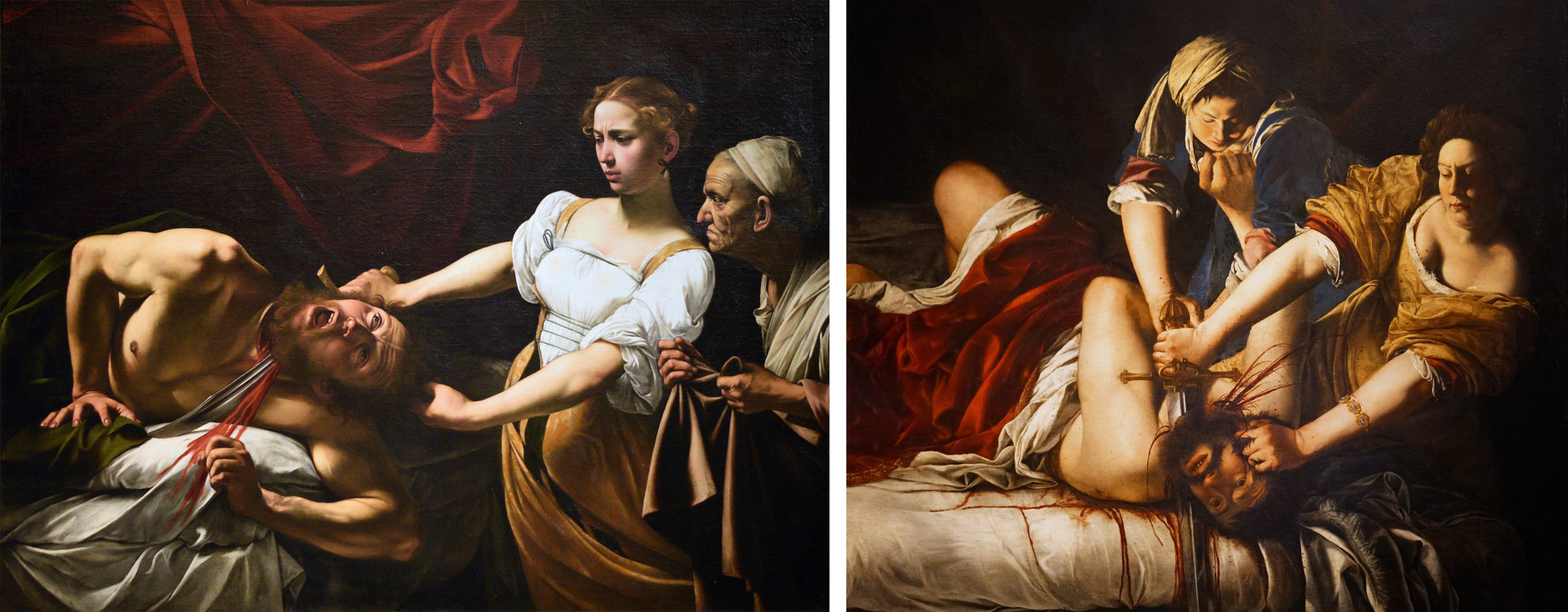
This particular painting, executed by Artemisia Gentileschi in Florence and now in the Uffizi, is one of the bloodiest and most vivid depictions of the scene, surpassing the version by Caravaggio, arch-realist of Baroque Rome, in its immediacy and shocking realism. Artemisia was certainly familiar with Caravaggio’s painting of the subject; her father Orazio, who was responsible for her artistic training, was Caravaggio’s friend and artistic follower. Caravaggio’s painting inspired, and perhaps even challenged, the young Artemisia.
A comparison between the two reveals not only her debt to the older artist, but also a series of pointed modifications that heighten the intensity of the physical struggle, the quantity of blood spilled, and the physical and psychological strength of Judith and her maidservant, Abra. In Artemisia’s painting, the bloody sheets are in the immediate foreground, close to the viewer’s space. Holofernes’s muscular body projects dynamically into the depicted space as bold areas of light and dark draw attention to his powerful limbs.
And, most importantly, whereas Caravaggio pairs his delicate Judith with a haggard attendant who merely looks on, her eyes wide with disbelief, Artemisia depicts two strong, young women working in unison, their sleeves rolled up, their gazes focused, their grips firm. Caravaggio’s Judith gracefully recoils from her gruesome task; Artemisia’s Judith does not flinch. Instead, she braces herself on the bed, as she presses Holofernes’s head down with one hand and pulls a large sword through his neck with the other. The creases at her wrists clearly show the physical strength required. Holofernes struggles in vain, the thrust of his arms countered by the more forceful movement of Abra, Judith’s accomplice in this grisly act.
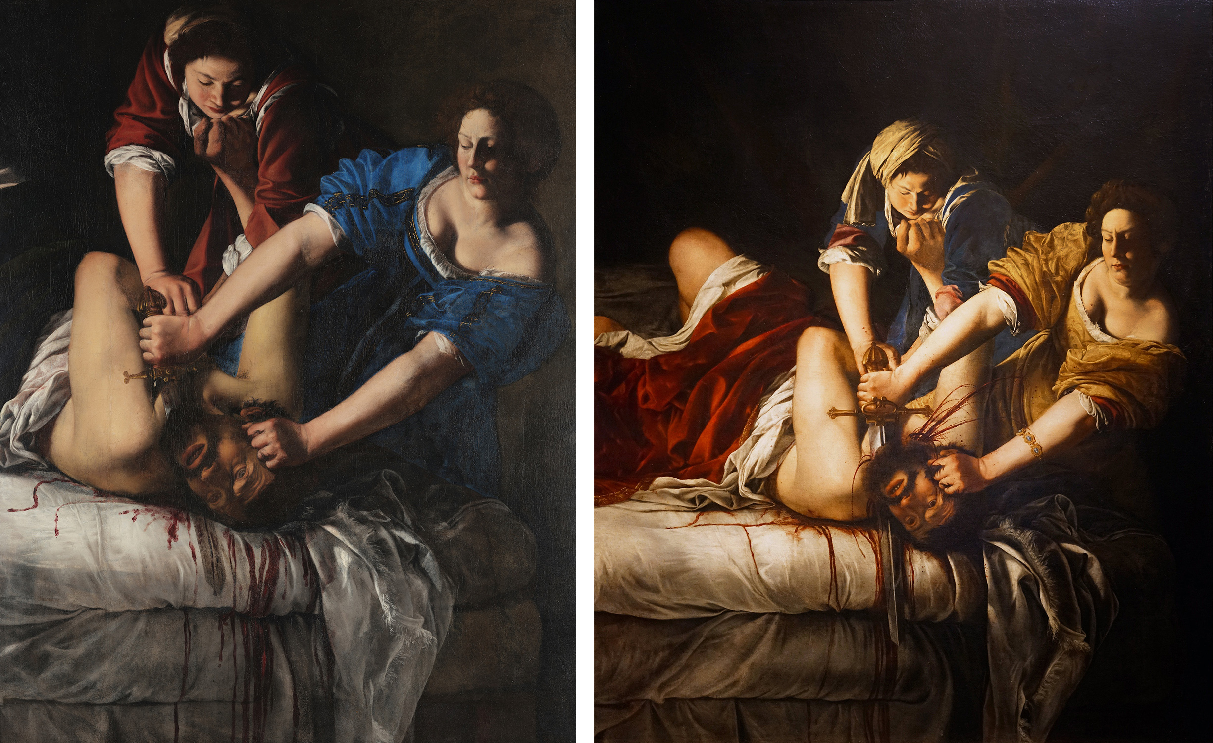
A composition perfected
The Uffizi Judith Slaying Holofernes is Artemisia’s second telling of this narrative. The first, executed in Rome and now in the Capodimonte Museum in Naples, introduced the dynamic composition centered on the thrust and counter thrust of extended limbs. Artemisia refined the composition in the second (Uffizi) version. Small but significant adjustments reveal her growth in technical skill, her awareness of the local Florentine taste for sumptuous fabrics, and her thoughtful consideration of the expressive potential of each detail. Awkward passages of anatomy and proportion (such as Holofernes’ head) have been corrected, the colors and textures of the fabrics are now richer (notice the red velvet draped over Holofernes and the golden damask of Artemisia’s Judith’s dress), and Judith’s hair is more elaborately curled, in keeping with the biblical text’s emphasis on her self-adornment.
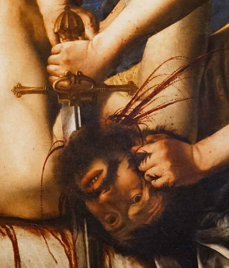
Most striking, however, is the portrayal of the blood. The Capodimonte version omits the blood that violently spurts from the neck of Holofernes. Like Caravaggio’s, the Uffizi painting places particular emphasis on this detail, and does so with even greater realism.
Framed by Judith’s arms, jets of blood now arc and descend in droplets that bespeckle her arms and dress. The pattern described by the spurting blood suggests Artemisia may have been familiar with her friend Galileo Galilei’s research on parabolic trajectories. Artemisia also modified the sword in the Uffizi version. The sword, here longer and held more vertically, prominently marks the painting’s central axis which extends from Abra’s arm to the blood that runs down the edge of the bed. This powerful visual axis reinforces the strength of the women and the violence of the deed. It is no accident that Judith’s sword-clenching fist is at the very center of the composition; imbued with divine strength, this widow’s hand is now the hand of God protecting the Israelites from their enemies.
Judith—Artemisia’s alter ego?
Artemisia’s unique portrayal of Judith and Abra has prompted scholars to argue that Artemisia identified with the protagonist of the story in a way her male counterparts did not. This association stems not only from their shared gender, but also from Artemisia’s own traumatic experience. Artemisia was raped at the age of 17 by the artist Agostino Tassi, a close friend of her father. When Tassi failed to marry her, as the social dictates of the time demanded, her father sought recourse in court. During the trial, Artemisia describes her struggle against Tassi and her attempt to attack him with a knife. She also recalls the sense of betrayal she felt when she realized her female chaperone had colluded with Tassi and arranged to leave the two alone.
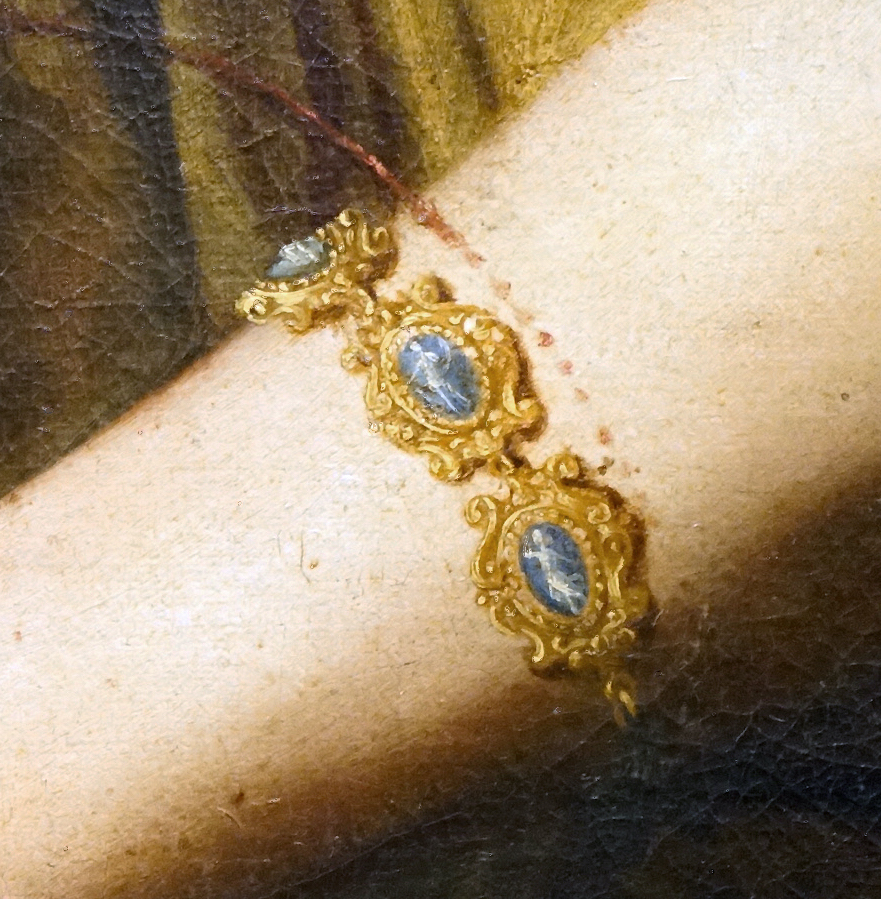
The first version of Judith Slaying Holofernes dates to this difficult period in the artist’s life. Especially significant is Artemisia’s portrayal of Abra as youthful, strong and fully engaged in the assisting Judith, in striking contrast to the chaperone who purposefully abandoned Artemisia in her hour of need. In the Uffizi painting Artemisia adds a small detail that supports her identification with Judith. One of the cameos on Judith’s bracelet appears to depict Artemis, the ancient goddess of both chastity and the hunt.
Judith—a symbol of the church militant
While the story of Judith may have held personal significance for Artemisia, it is important to note its broader cultural valence. The story of Judith was especially popular in the Baroque period, not only in the visual arts but also in literature, theater, and music. An example of the victory of virtue over vice, of God’s protection of his chosen people from their enemies, Judith was also seen as an Old Testament antetype of the Virgin Mary and, by extension, as a symbol of the Church. This association partly explains the increase in portrayals of Judith in late 16th through the 17th centuries, when the Catholic Church was engaged in conflicts with both the Protestants and the Ottoman Turks, whose eastern origins facilitated their identification with Holofernes. Artemisia and her contemporaries capitalized on this popularity, frequently portraying not only the moment of the beheading itself, but also the moment right after it, when Judith and her maidservant escape from the enemy camp. The dramatic potential of the story made it as ideal subject for the powerful theatricality of Baroque art.
Banished
The Uffizi Judith was likely either commissioned by or gifted to the Medici, Florence’s ruling family, the same family that commissioned Donatello’s famous bronze sculpture of Judith and Holofernes in the late 15th century.
Artemisia Gentileschi was clearly proud of the Uffizi Judith Slaying Holofernes, signing it in the lower right corner. In it she demonstrated her mastery of the language of Baroque realism, exploiting its emphasis on proximity to the picture plane, strong chiaroscuro, and realistic details to create an especially potent depiction of the story’s dramatic climax.
The bold immediacy of this finely-tuned composition succeeded all too well, for in the late 18th century, disgusted by the horror of the scene, the Medici duchess banished this painting to a dark corner of the Uffizi, where it remained until the late twentieth century. To this day, it strikes its viewers with both revulsion and awe at the skill of the artist who so convincingly transformed paint into blood.
Conclusion
17th century Italian Baroque art was profoundly shaped by the Counter-Reformation and the Catholic Church’s response to the Protestant Reformation. Artists, especially those serving the Church, were required to follow the new art-making rules set forth by the Council of Trent. In Italy and in other Catholic territories, art associated with the church now had to teach, to serve as positive propaganda, and to follow the rules of censorship. The emerging Baroque period introduced a style that was full of drama, theatricality, emotion, movement, and viewer engagement.
Citation and Licensing
The following sections were written by Chelsea Wright and licensed CC BY-NC-SA 4.0:
- Chapter Overview and Introduction
- Focus artwork and term list compiled by Chelsea Wright
- Introduction to Baroque Architecture
- Practicing Visual Analysis
- Conclusion
The following articles from Smarthistory licensed CC BY-NC-SA 4.0 were remixed and adapted for the chapter:
- Dr. Lauren Kilroy-Ewbank and Dr. Heather Graham, “Mannerism, an introduction,” in Smarthistory, September 1, 2020.
- Smarthistory, “El Greco,” in Smarthistory.
- Dr. Beth Harris and Dr. Steven Zucker, “El Greco, Adoration of the Shepherds,” in Smarthistory, November 25, 2015.
- Dr. Esperança Camara, “Baroque art, an introduction,” in Smarthistory, June 9, 2015.
- Dr. Beth Harris and Dr. Steven Zucker, “How to recognize Baroque art,” in Smarthistory, May 10, 2016.
- Smarthistory, “Francesco Borromini,” in Smarthistory.
- Dr. Beth Harris and Dr. Steven Zucker, “Francesco Borromini, San Carlo alle Quattro Fontane, Rome,” in Smarthistory, November 18, 2015.
- Smarthistory, “Gian Lorenzo Bernini,” in Smarthistory.
- Dr. Beth Harris and Dr. Steven Zucker, “Gian Lorenzo Bernini, Saint Peter’s Square,” in Smarthistory, November 18, 2015.
- Dr. Beth Harris and Dr. Steven Zucker, “Gian Lorenzo Bernini, Baldacchino, Saint Peter’s,” in Smarthistory, July 19, 2015.
- Dr. Esperança Camara, “Michelangelo, Last Judgment, Sistine Chapel,” in Smarthistory, November 28, 2015.
- Smarthistory, “Caravaggio,” in Smarthistory.
- Dr. Beth Harris and Dr. Steven Zucker, “Caravaggio, Calling of Saint Matthew,” in Smarthistory, November 18, 2015.
- Oxford University Press and Dr. Erin Benay, “Caravaggio and Caravaggisti in 17th-century Europe,” in Smarthistory, July 12, 2015.
- Dr. Esperança Camara, “Artemisia Gentileschi, Judith Slaying Holofernes,” in Smarthistory, July 19, 2015.



_-_National_Museum_of_Capodimonte.jpg)
_Kimbell_Art_Museum.jpg)