
Value
Introduction
Everything we see has value. Value is the degree of lightness to darkness. Without value, there would be no definitive edges or distinction between observed areas. Artists use value to make an image understandable.
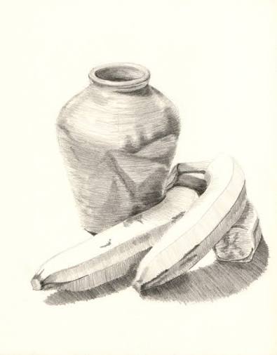
Tonal values provide vital information about light and how drawn objects occupy space, and shading is the subtle distribution of values by which three-dimensionality and degrees of light and dark are art suggested in a drawing. With value, forms can be made to advance or recede in pictorial space. A value pattern is the overall organization relationship of light, mid-tone, and dark values in a work of art. Value patterns provide structure in a drawing and typically fall into three categories of high-contrast, high-key, and low-key. We will expand on these concepts throughout this chapter, but to start consider the drawing above. Notice how the lightest value is the white of the page and the darkest value is a dark gray, but not quite black, in the shadows. Since this drawing does not contain what is referred to as a full range of value (white to black), it can be categorized as closer to a high key value pattern. High key value patterns contain mostly light to mid-tone values and very few to no dark values.
White under bright light is the lightest possible value, while black in shadow produces the darkest possible value. Values shift depending on their location in a composition. Value relationships occur when one value is compared to another to determine if it is lighter or darker.
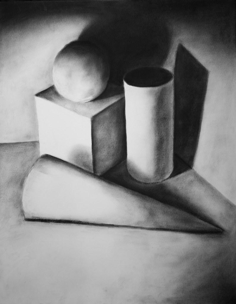
A value range is the difference between the lightest and darkest values in a work of art. For instance, if a drawing has white (the lightest value possible) and black (the darkest value possible), then it has a full range of values.
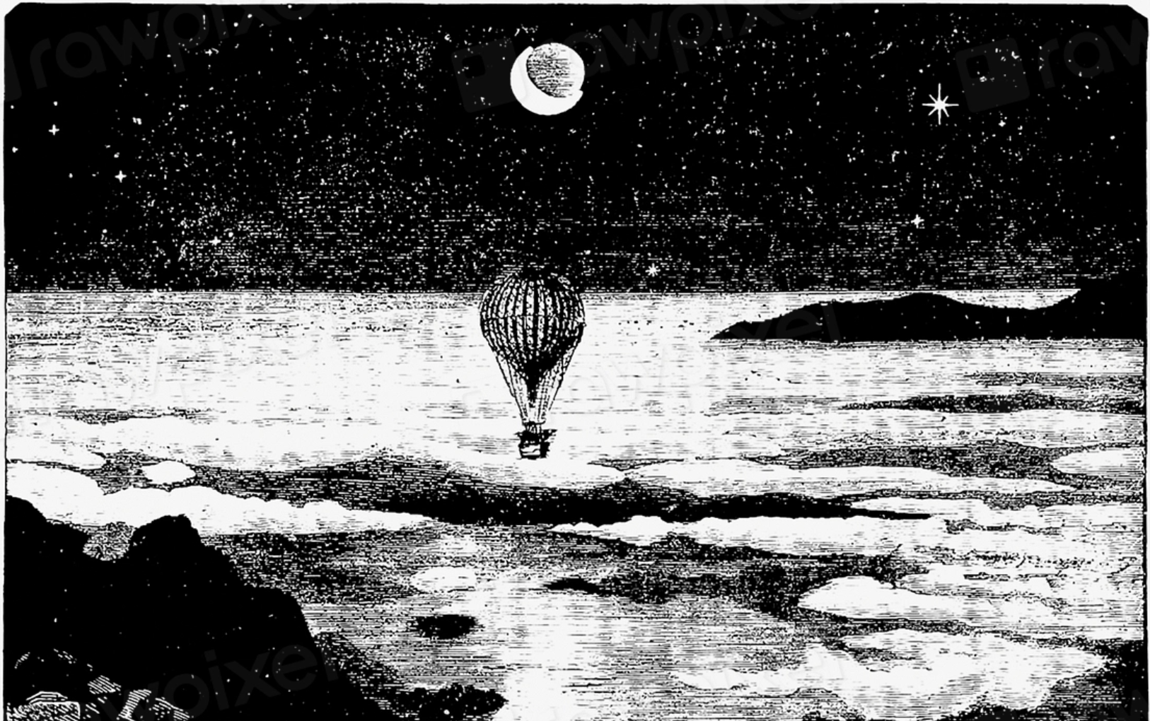
An essential ingredient for understanding value is intentionally applying contrast. Contrast means difference. In this chapter, we will specifically focus on value contrast, the difference between light and dark. Values with a significant difference between the lightest and darkest values, such as the image above, are referred to as high contrast drawings. For example, white and black. Whereas a narrow value range with very subtle differences between the lightest and darkest values is called a low contrast drawing. For example, a light gray and a medium gray.
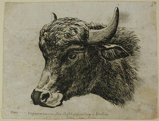
Source: Art Institute of Chicago. License: CC0 1.0.
In addition to providing definition, value also develops surface texture. With value, artists expand their visual vocabulary to include characteristics that cannot be described by line alone. Value permits artists to show textures from the smooth sheen of a shiny polished surface to the roughness of a jagged rock. These distinctions are manipulated by artists with drawn pressure, a variety of materials, and tiny to expansive areas of light and dark across a surface. With the push and pull of light and dark, an artist can create distinct value patterns that display a variety of surface textures.
Value contrast has dramatic power! Strong contrasts of light and dark can create focal points in a composition. Focal points direct the viewer’s attention and help subdue backgrounds to create expansive space.
Typical art materials used to create value drawings include graphite, charcoal, ink, and erasers.
Light Logic
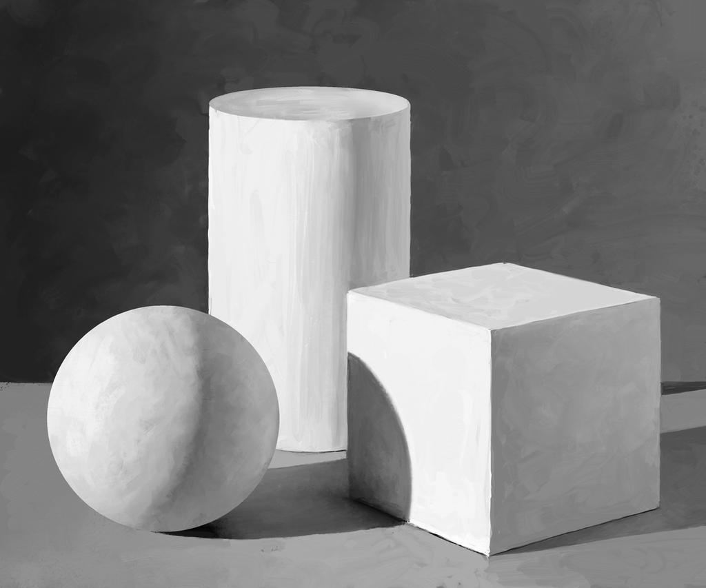
Before learning how to draw value, artists must first understand light logic. Light logic is the predictable behavior of light. Light is logical because it always travels in a straight line. The shape of a shadow is a direct response to a light source’s angle and intensity. As a result, an artist can harness the realistic portrayal of light by manipulating values in a drawing. The translation of light through value provides the key to drawing realistic portrayals of three-dimensional objects.
It is helpful to keep in mind that while light is logical, light and shadow change when light conditions change. As a result, many artists choose to create drawings with controlled lighting conditions. For example, building a still life inside with a single light source.

However, other artists may choose more challenging light and shadow conditions. For instance, an artist may use multiple light sources or, as shown in the photo above, go outside where the sun is the light source. As the sun moves throughout the day, shadows shift in response to its position. As a result, artists must also account for unexpected light interference from shifting clouds, fog, rain, etc.
Using Elements of Light to Define Form
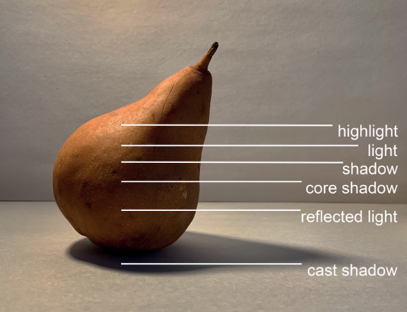
To portray light logic in drawings, artists include elements of light to define form. These elements include highlight, light, shadow, core shadow, reflected light, and cast shadow. Some artists will take on the challenge of translating color into value, as shown in the image above, while other artists opt to edit references to be black and white so they can focus on light logic and value. A black and white version of the reference is below.
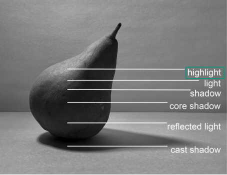
The highlight is located on the part of an object that is perpendicular to the light source. It is the lightest part of an illuminated object. The size and perceived value of the highlight is affected by the object’s proximity to the light source.
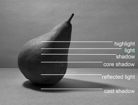
Light is the part of the object that faces the light source. Light is represented by values that are darker than the highlight but lighter than the other values.
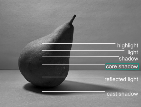
The core shadow is the darkest part of an object because it receives no illumination. The core shadow on a complex form will expand and contract as it follows the form’s intricate contours. The core shadow will get lighter as it moves towards the reflected light.
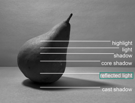
Reflected light is the area on an illuminated form where the light bounces off a neighboring surface to illuminate a portion of the object’s form shadow. Reflected light is not as strong as direct light.
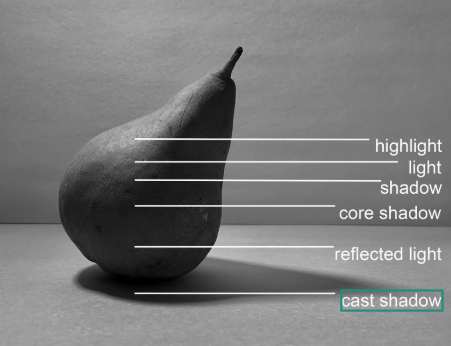
The cast shadow is dependent on the intensity and proximity of the light source. For instance, a hard light will produce a cast shadow with a sharp edge, whereas a soft light will produce a cast shadow with a softer or sometimes blurred edge. The further the cast shadow is from the object, the softer the edge of the shadow becomes. Subsequently, the cast shadow is darkest right underneath the object (also called the occlusion shadow) and gets lighter and lighter as it moves further away from the light source.
The images below show the same pear from above without annotations next to a light logic charcoal reduction drawing example. These images are shown side by side to provide a visual example of how a three-dimensional object, or black and white photo in this case, can be referenced in a drawing to show a full range of value from white to black.
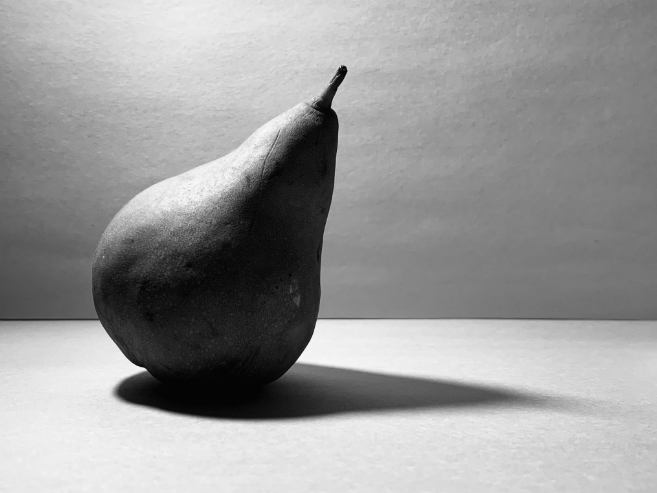
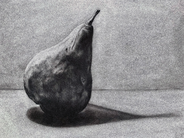
Pear with a Single Light Source Photo Reference and Charcoal Drawing of the Reference, Briana Miyoko Stanley, digital photo and charcoal on drawing paper, License: CC BY NC 4.0
Atmospheric Perspective
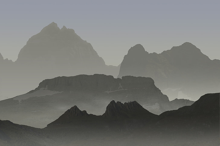
Drawing outside from direct observation is a particularly challenging experience because light and shadow consistently shift and change. As a result, capturing an accurate portrayal of value becomes difficult to achieve. When the reference changes, the artist needs to make moment-by-moment decisions about how the drawing changes as well.
A technique artists use to create a deep sense of space is atmospheric perspective. Atmospheric perspective is the method of creating an illusion of recession by manipulating contrast. The foreground contains the most detail and high contrast. The middle ground has a little less detail and a medium range of contrast. The background includes general shapes and low contrast. By moving from detailed to general and high to low contrast, the artist simulates spatial depth.
Value Methods
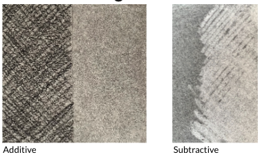
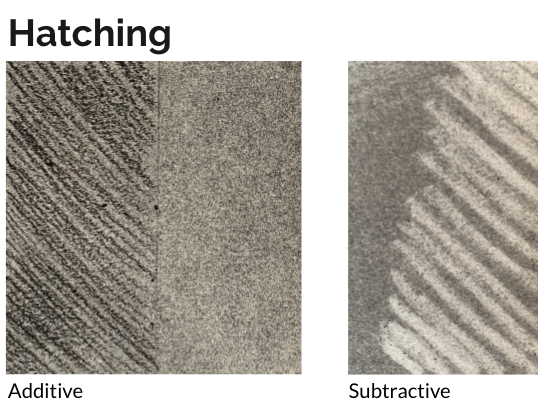
When drawing, values are created additively or subtractively. The additive process creates an image by adding particles of material (graphite, charcoal, etc.) to the substrate (drawing paper, canvas, etc.). The drawing’s tonal description is built up progressively by applying layers of value to the surface of the paper.
On the other hand, the subtractive process is achieved by removing particles of material (graphite, charcoal, etc.) from a substrate (drawing paper, canvas, etc.). In the subtractive process, an eraser is used as a drawing tool to create lighter values on a substrate.
These methods are exercised with a variety of drawing materials. You will practice some of these methods in the application section at the end of this chapter.
As you learn about and then apply value methods, avoid smudging the graphite, charcoal, etc., until your drawing is nearly complete. A good rule of thumb is to wait until your drawing is approximately 90% complete before using smudging tools and techniques to smooth out specific areas. I say specific areas because you want to avoid making everything uniform and smooth. Implied texture is beneficial in drawings, so only smudge surfaces that you want to look reflective, glossy, or polished.
While smudging a material such as charcoal will make it appear smoother, it will also push the material into the substrate. This makes it particularly difficult to erase or lighten if you need to adjust values, texture, etc., in your drawing. You also want to avoid surface textures that are too uniform. If all surfaces are smooth, the drawing will look flat and lifeless. For example, if you are trying to capture the implied texture of rough tree bark, you actually want to avoid smudging. Leaving a more raw finish will imply the rough texture you are trying to create.
Value Scales
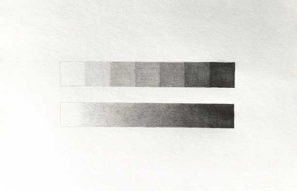
Value scales are a visual tool to show the sequence of values that progress incrementally from white to black. The standard value scale consists of nine values and progresses from white to black with seven shades of gray in between.
A step value scale is a progression in value from white to black that occurs in a series of equal increments.
A gradient value scale is a seamless progression in value from white to black.
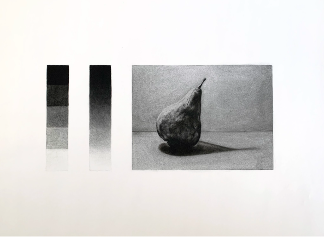
Value scales are excellent tools to keep on hand throughout the drawing process. You can use them as a visual reference to determine how light or dark objects are in a still life and directly compare them to your drawing.
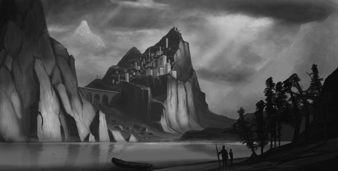
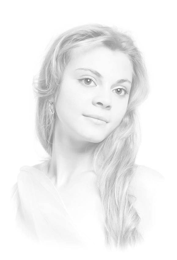
If values only span the range from mid-tones to black values, they are referred to as low key. Drawings with these values are often moody with dramatic tones. On the other hand, if values only span from mid-tones to white values, this is called high key. This value range in a drawing can make viewers feel more optimistic and upbeat.
Value Techniques
Arbitrary Value is a subjective or intuitive response to a subject, rather than observed values.
Hatching refers to closely spaced parallel lines that are added to a form to create value and texture.
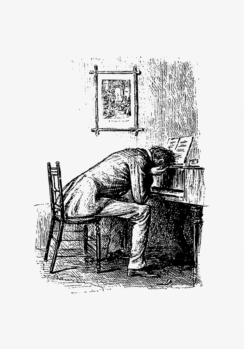
Cross-hatching is a technique used to create variations in value and texture that are achieved by placing multiple layers of parallel lines on top of each other. Each successive layer of hatched lines is placed at an angle to the preceding layer. The result is that each new layer’s lines cover openings left by the previous layer.
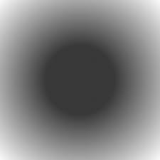
A gradient is a smooth and seamless shift in the appearance of value over a given distance.
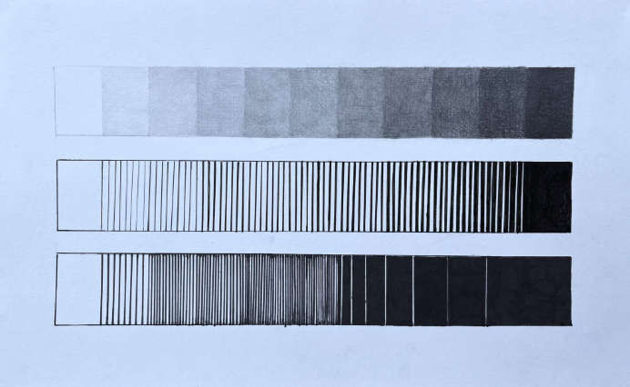
Grayscale is the range of gray tones between black and white.
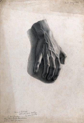
Source: Look and Learn, License: CC0 1.0
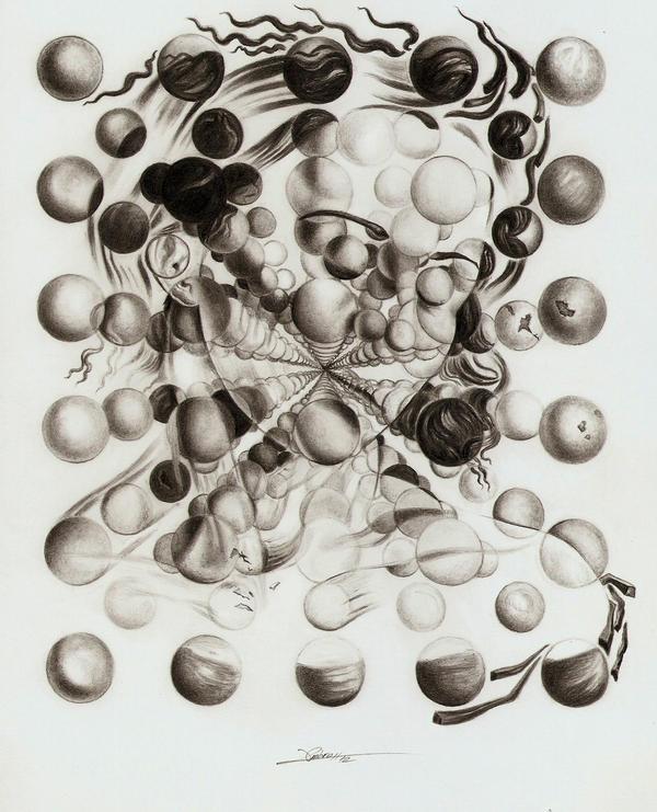
Tonal Drawing is created when there is a gradual increase or decrease from light to dark in one part of a drawing to another. There are no lines; only value contrast is used to create the imagery of the spheres and implied movement in the drawing example above.
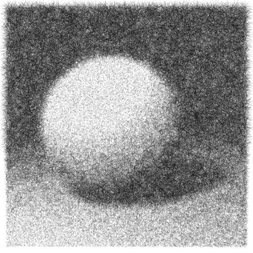
Scumbling is the value technique of using scribbles to imply changes in light to dark and implied form.

Simultaneous Contrast is the theory that one value can change how we perceive a different value when the two are placed side by side. For example, in the image above to the left, the center gray looks light in comparison to the black that surrounds it. However, the same gray value above to the right appears much darker surrounded by white.
Flickr, License: CC BY-NC-ND 2.0
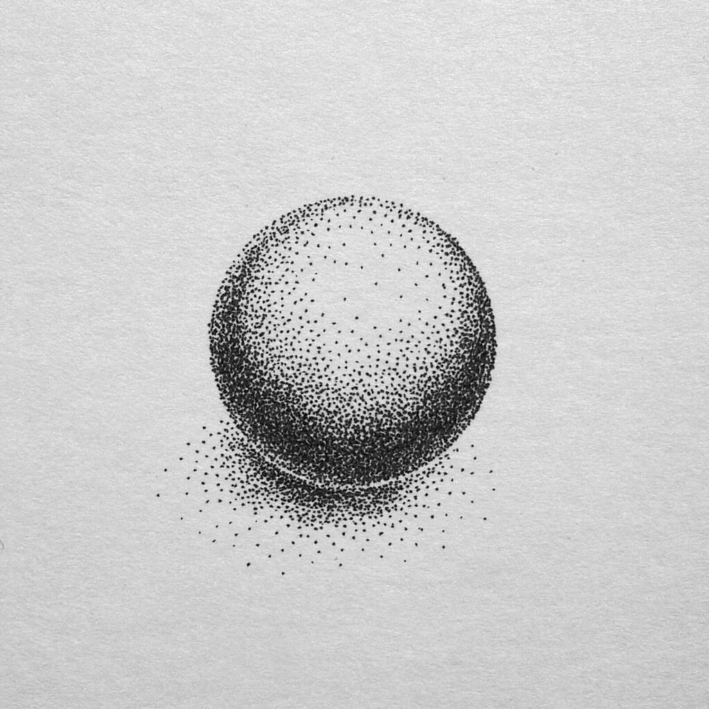
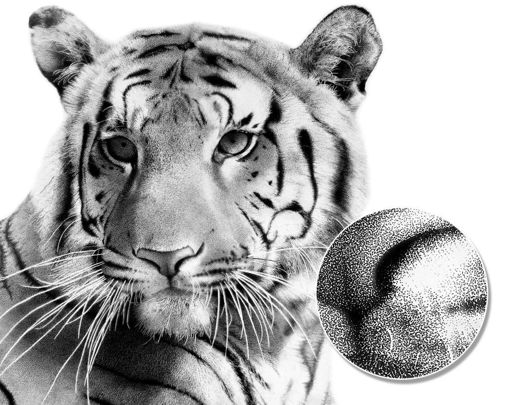
Stippling is the technique of using a drawing tool to make dots on a substrate. The farther apart the dots are, the lighter the perceived value; the closer together the dots are, the darker the perceived value. A detailed example of drawing with stippling is shown below. This technique is often seen in vintage comic books because they were printed with an inexpensive mechanical printing method called Ben-Day dots.
Master Artist: Leonardo da Vinci and Light Logic
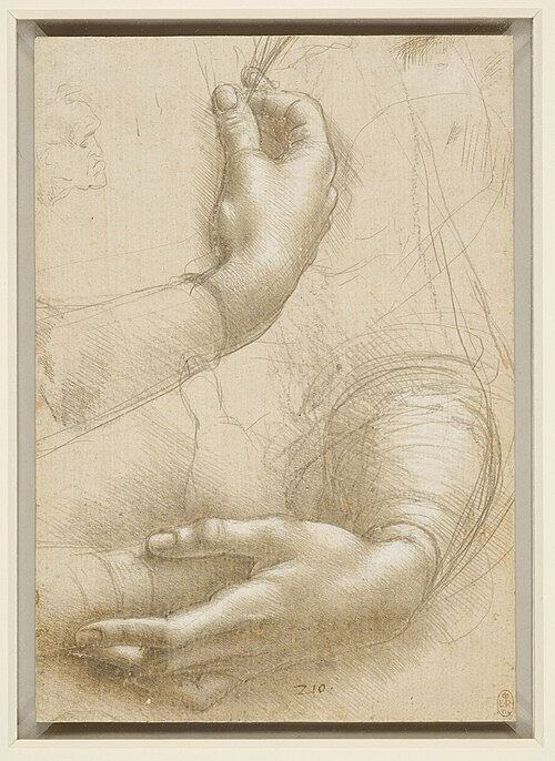
In art historical terms, light logic is often discussed using an Italian word: chiaroscuro (“chiaro” for light or bright and “scuro” for dark). Chiaroscuro is modeling in highlights and shadows. When you combine observational drawing with light logic, you sharpen your perceptual skills through observation, including the subtle play of light and shadow. The Italian Renaissance artist, Leonardo da Vinci, mastered the subtlety of light and shadow in his work. While he left behind a small number of completed artworks, da Vinci produced numerous sketches and studies, such as A Study of a Woman’s Hands (c. 1490). In this study, da Vinci considered the direction of the light source, the gradations of tonal value to create contrast, and how to logically cast shadows. Paying attention to the way light logically affects an object, he was able to create the illusion of three-dimensions on a two-dimensional surface. Art historians think A Study of a Woman’s Hands may have been used in preparation for a finished portrait. As a Renaissance artist, da Vinci was fascinated by techniques used to create the illusion of depth. Renaissance artists achieved this through chiaroscuro modeling, linear perspective, and atmospheric perspective — all techniques you are learning!
“Master Artist: Leonardo da Vinci and Light Logic.” Written by Chelsea Wright. License: CC BY
Licensing and Attributions
“Value.” Written by Briana Miyoko Stanley. License: CC BY
Value Activities
Value Scales Activity
Description
For this activity, you will practice creating a full range of values with charcoal by making two separate value scales. You will use a variety of materials and techniques, including vine charcoal, charcoal pencils, and erasers, to apply additive and reductive drawing techniques.
Activity Parameters
Duration
1-2 Hours
Size
7×11” (Two 2×9” value scales with a 1” border on all sides.)
Subject
Two value scales: one a step scale and the other a gradient scale
Applied Techniques
- Cross-Hatching – creating value with layers of parallel lines
- Reduction Drawing – remove charcoal to create light values
- Additive Drawing – add charcoal to create dark values
Materials
- Sketchbook or Spare Piece of Drawing Paper (minimum size = 8×10″)
- Tracing Paper – use as an apron to protect your drawing from smudges and the natural oils from your hand
- Charcoal Pencil (HB)
- Vine Charcoal (willow)
- Kneaded EraserWhite Rubber Eraser
- Mono Zero Round EraserPainter’s Tape
- Powder Puff – only need one
- Ruler
- Pencil Sharpener
Student Learning Outcomes
- Controlled value techniques, such as hatching, crosshatching, additive, and subtractive drawing in charcoal.
- Applied Value Chapter knowledge to show a full range of light to dark values as step and gradient scales.
Method
Preparatory Steps
- Use a ruler and HB graphite pencil to draw two 2×9” rectangles centered on a piece of paper.
- Leave room for a border (at least 1” on all sides) around the rectangles.
- Use the ruler and HB pencil to make nine sections in the top rectangle.
- Make each section 1” wide, 2” tall.
- Do not draw section lines in the gradient scale (bottom rectangle).
- Tape the exterior borders of both rectangles with painter’s tape.
- Remove the excess tackiness of the tape beforehand, so the tape can be removed without tearing the paper after the value scales are complete.
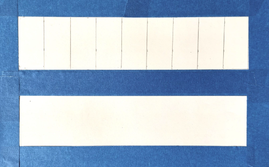
1 2 3 4 5 6 7 8 9
Gradient and 9-Step Value Scale Setup, Briana Miyoko Stanley, graphite on drawing paper, License: CC BY NC 4.0
- Tone the paper with vine charcoal and a powder puff.
- Leave the far-right section white, this will be known as Step 9.
- Use very light pressure when using the powder puff
- Aim to create an even medium grey.
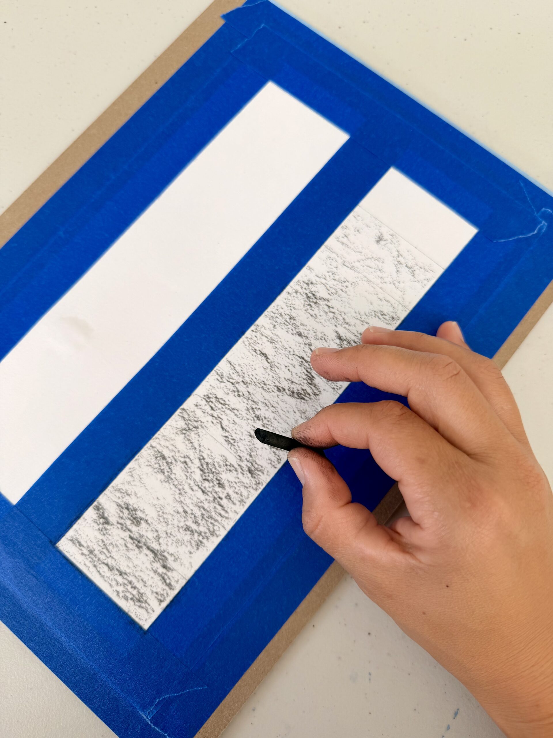
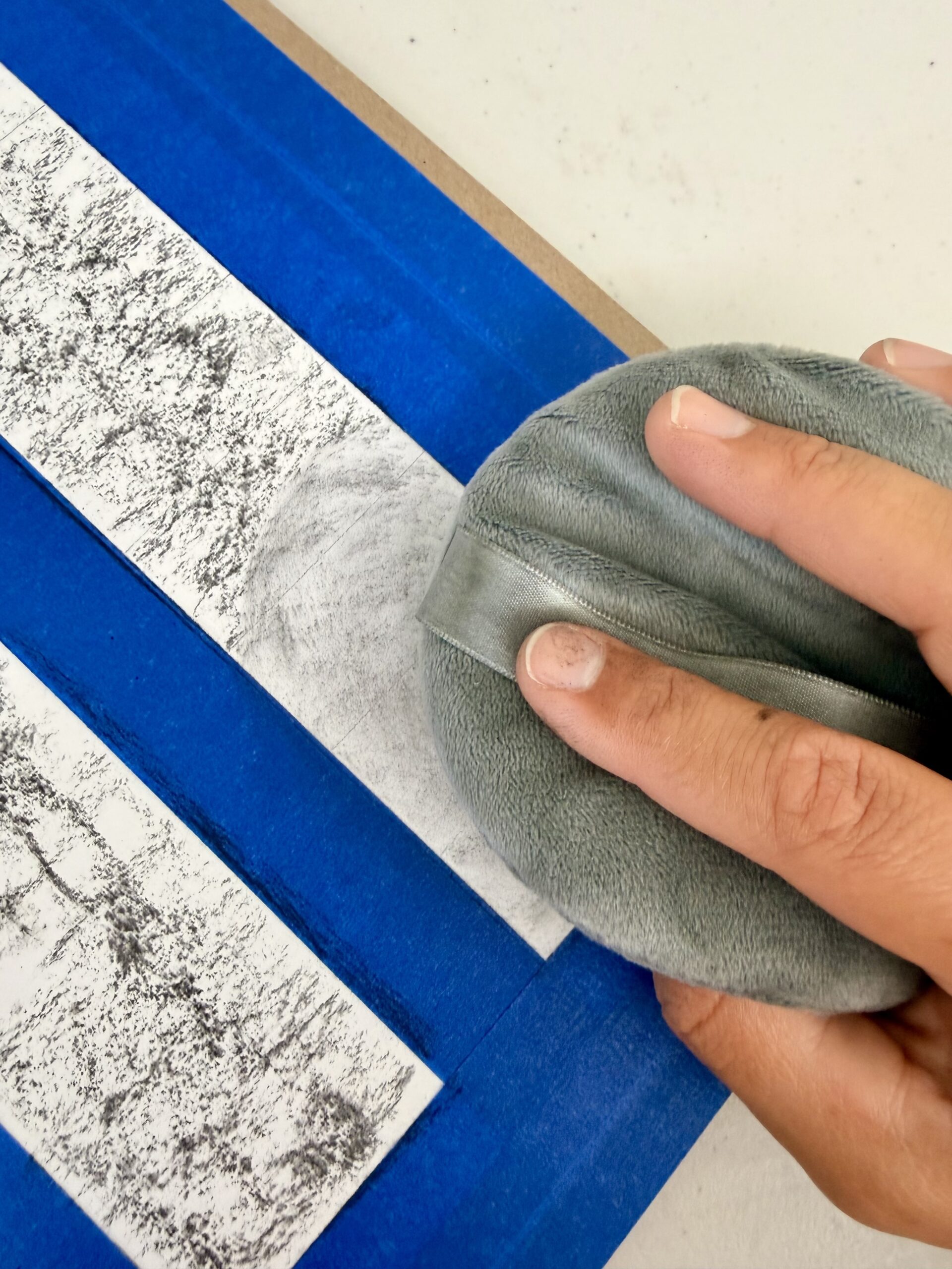
Using Vine Charcoal to Tone Paper (left) and Using a Powder Puff to Tone Paper (right), Briana Miyoko Stanley, vine charcoal on drawing paper, License: CC BY NC 4.0
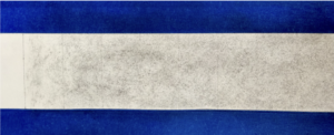
Toned Step Scale for Value Scales Activity, Briana Miyoko Stanley, vine charcoal on drawing paper, License: CC BY NC 4.0
Process
- Begin with the extremes on the step scale. Step 1 is your darkest dark and Step 9 is your lightest light.
- Use a kneaded eraser to remove unwanted charcoal dust from Section 9.
- Then, cover all of the sections with a paper apron, an extra piece of paper, except for Step 1.
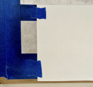
Paper Apron for Value Scales Activity, Briana Miyoko Stanley, vine charcoal on drawing paper, License: CC BY NC 4.0
- In Step 1, crosshatch with the charcoal pencils until you create a solid black. Start with a medium pencil and then add crosshatch layers with softer charcoal pencils, such as 4B and 6B.
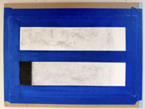
White and Black Steps on the Step Scale, Briana Miyoko Stanley, vine charcoal on drawing paper, License: CC BY NC 4.0
- Create medium gray in the middle, Step 5.
- Locate the middle step and cover its neighboring steps with paper aprons.
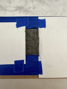
- Then, use additive and subtractive crosshatching techniques to create a medium gray. Aim to create a value 50% lighter than black and 50% darker than white.
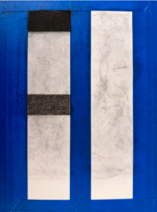
Toned Paper with Darkest Dark, Medium Gray, and Lightest Light for the Step Value Scale, Briana Miyoko Stanley, charcoal on drawing paper, License: CC BY NC 4.0
- Create Steps 3 & 7 with paper aprons, charcoal pencils, and erasers.
- Aim to make Step 3, a value 50% darker than Step 5 and 50% lighter than Step 1.
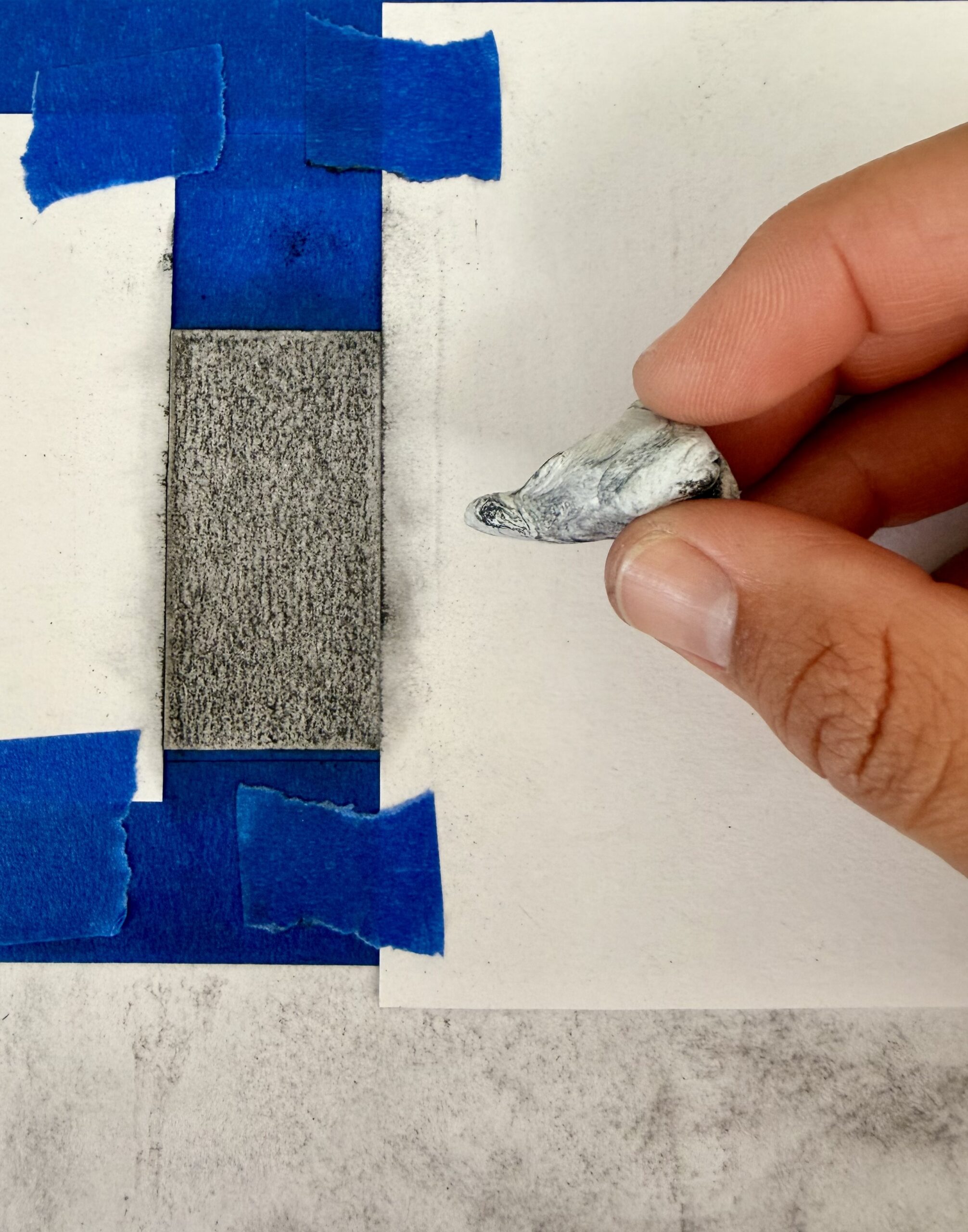
Paper Aprons for Step 7, Briana Miyoko Stanley, charcoal on drawing paper, License: CC BY NC 4.0
- Aim to make Step 7, a value 50% lighter than Step 5 and 50% darker than Step 9.
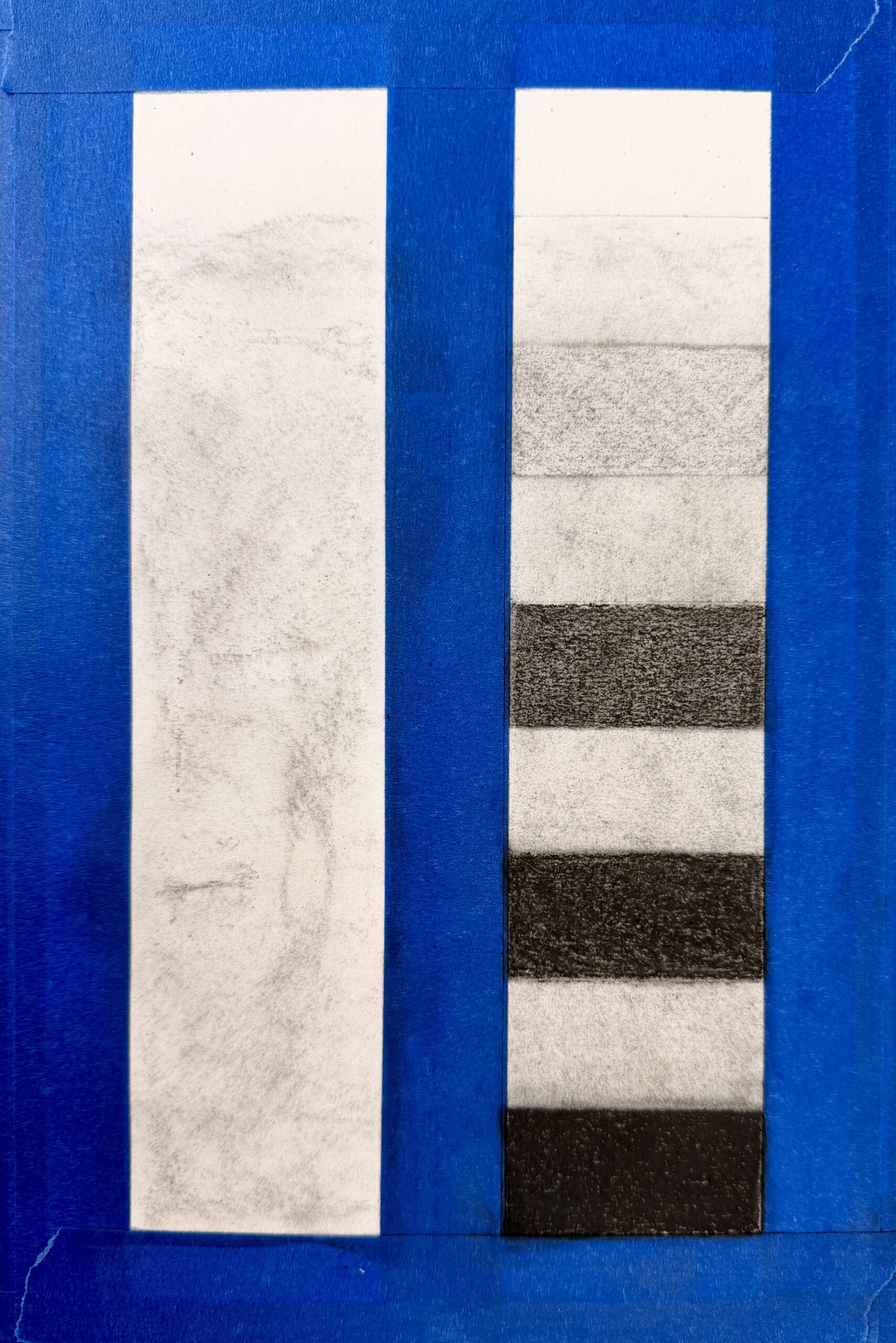
Value Steps 1,3, 5, 7, and 9 Example, Briana Miyoko Stanley, charcoal on drawing paper, License: CC BY NC 4.0
- Create the remaining steps
- Sections 2, 4, 6, & 8
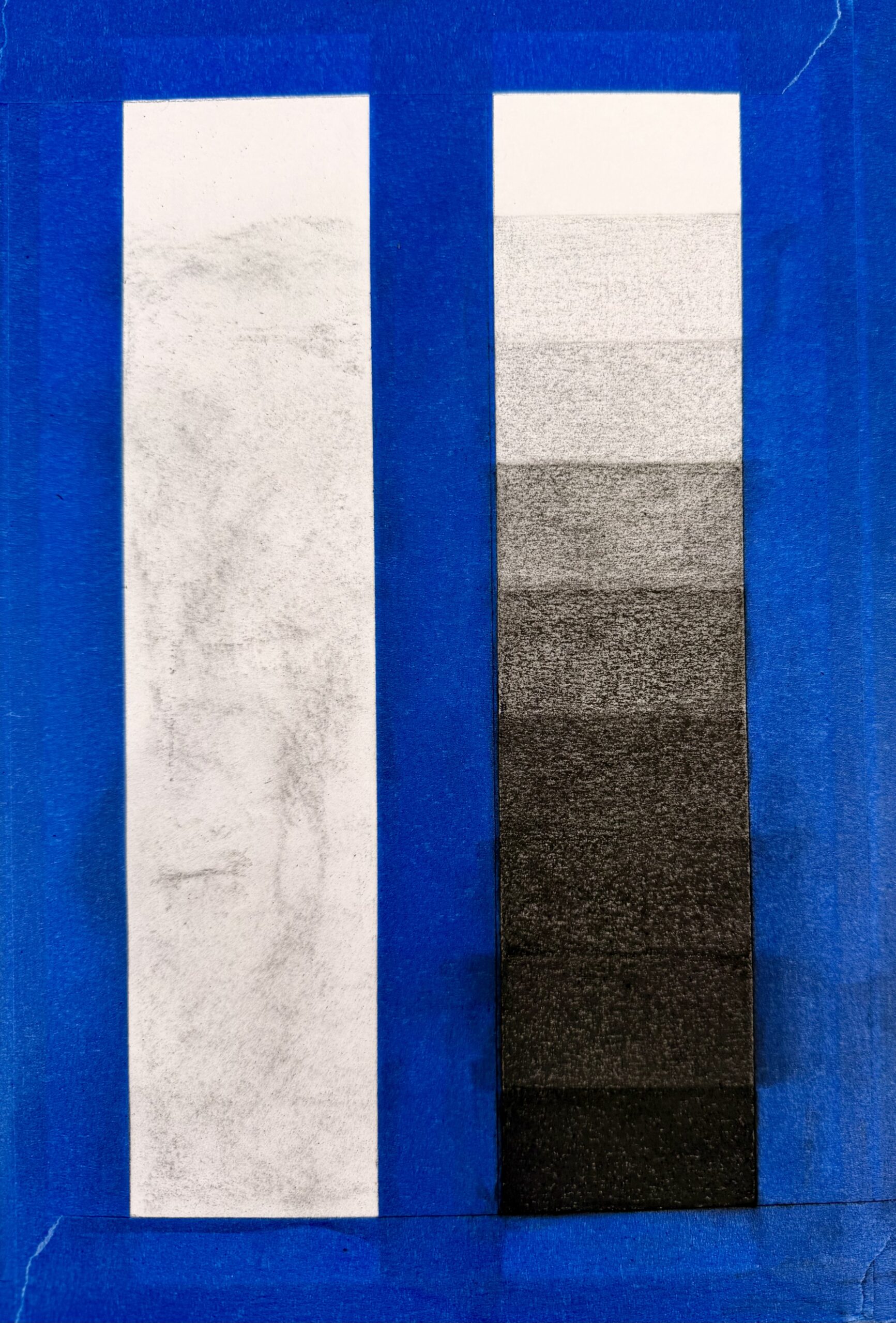
Initial Value Step Scale Example, Briana Miyoko Stanley, charcoal on drawing paper, License: CC BY NC 4.0
- Rebalance
- Finish the scale by evening out values where necessary. Identify if there are “jumps” between two tones and adjust as needed with additive and subtractive techniques.
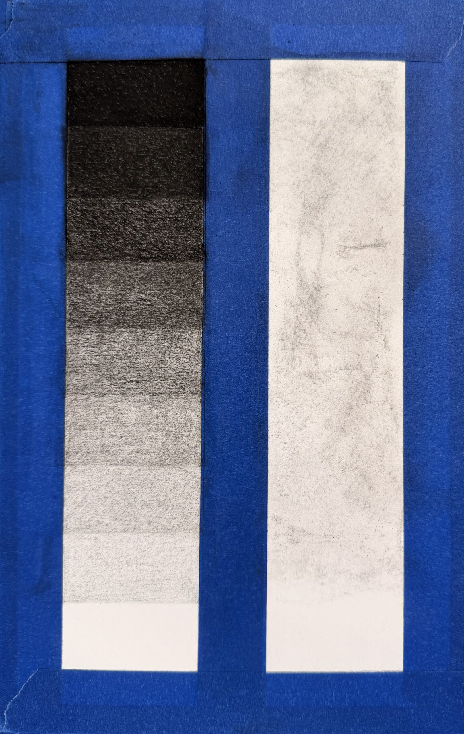
Revised Value Step Scale Example, Briana Miyoko Stanley, charcoal on drawing paper, License: CC BY NC 4.0
- Start the Gradient Scale
- Switch from working on the step scale to working on the gradient scale.
- The objective of the gradient scale is to create a seamless shift from the darkest to the lightest charcoal values. Parallel the values you created in the step scale, so the values align between the two scales.
- View the short gradient scale demonstration video to help apply additive and subtractive techniques to adjust the values and create smooth value transitions.
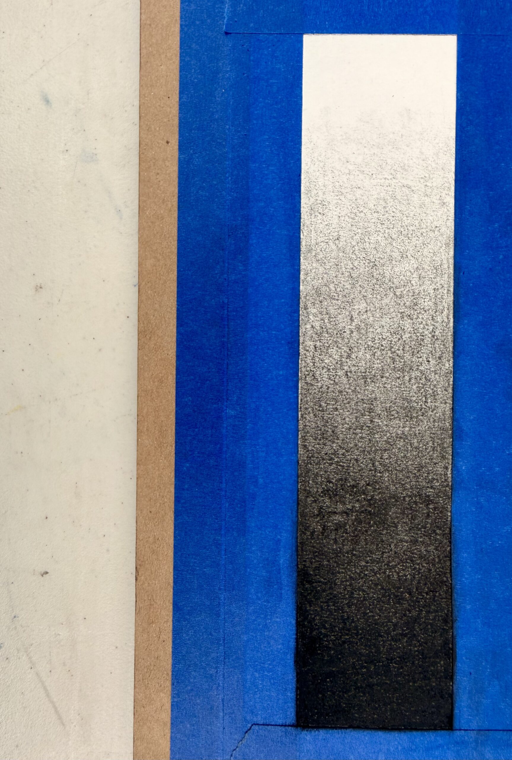
Gradient Scale Example, Briana Miyoko Stanley, charcoal on drawing paper, License: CC BY NC 4.0
- Remove Tape (optional)
- Use a hairdryer on low heat and speed to help loosen the tape. Avoid temperatures too hot or high speeds because these can damage the exercise.
- Lift the tape by carefully pulling it away or towards you. Do not lift the tape directly up or abruptly tug on it, since this will rip the paper.
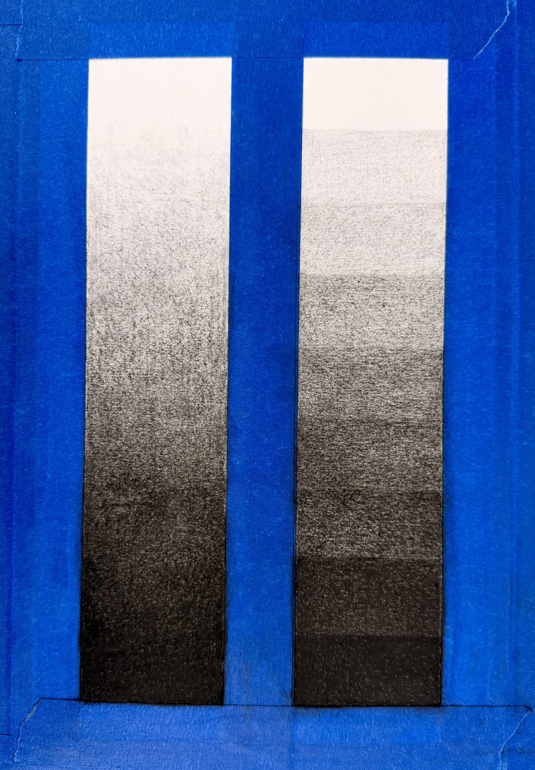
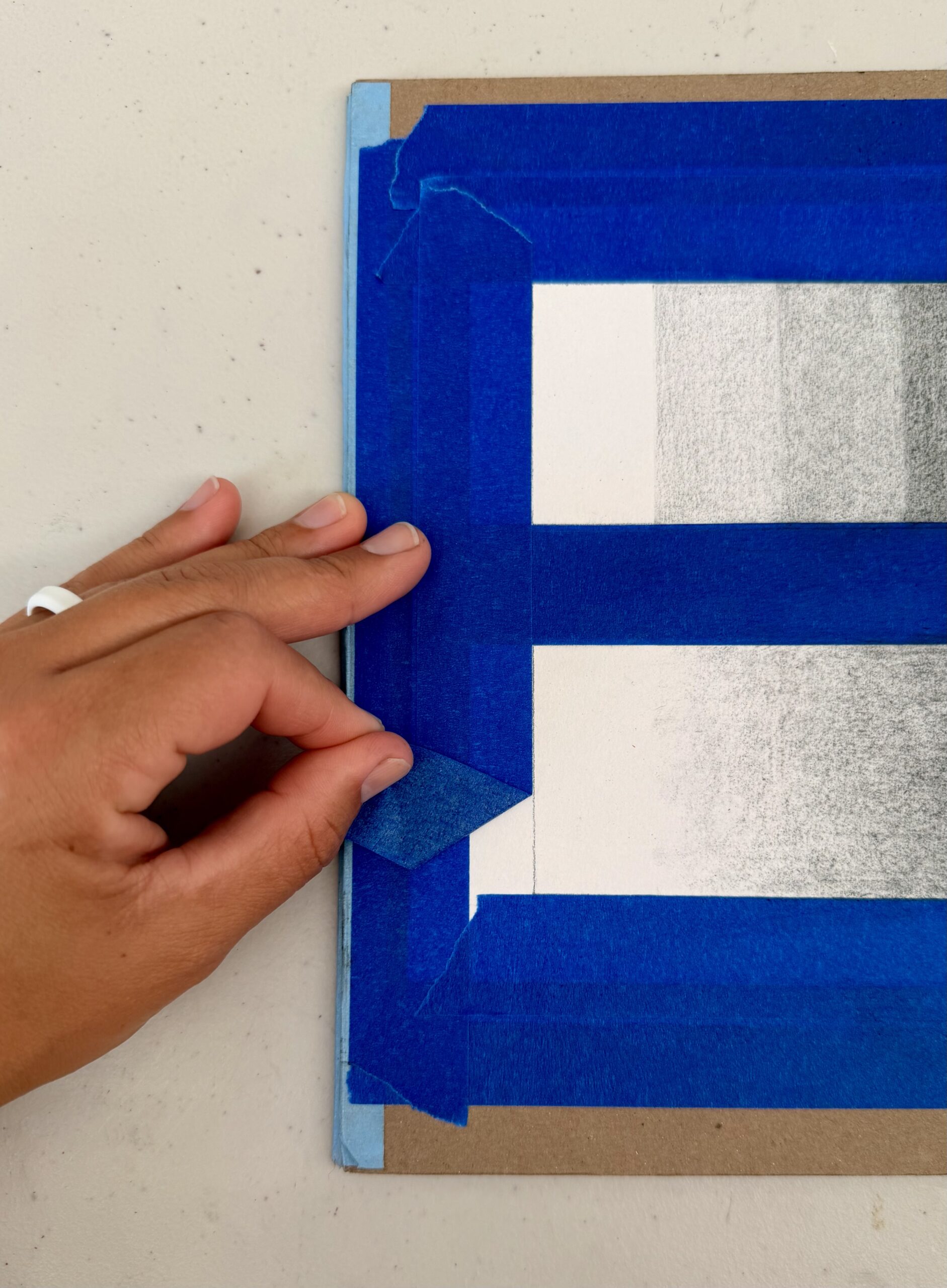
Tape Removal Example, Briana Miyoko Stanley, charcoal on drawing paper, License: CC BY NC 4.0
- Finishing Touches
- Confirm the values in both scales parallel to each other as the value moves from dark to light.
- Use an eraser to clean up the edges of the exercise.
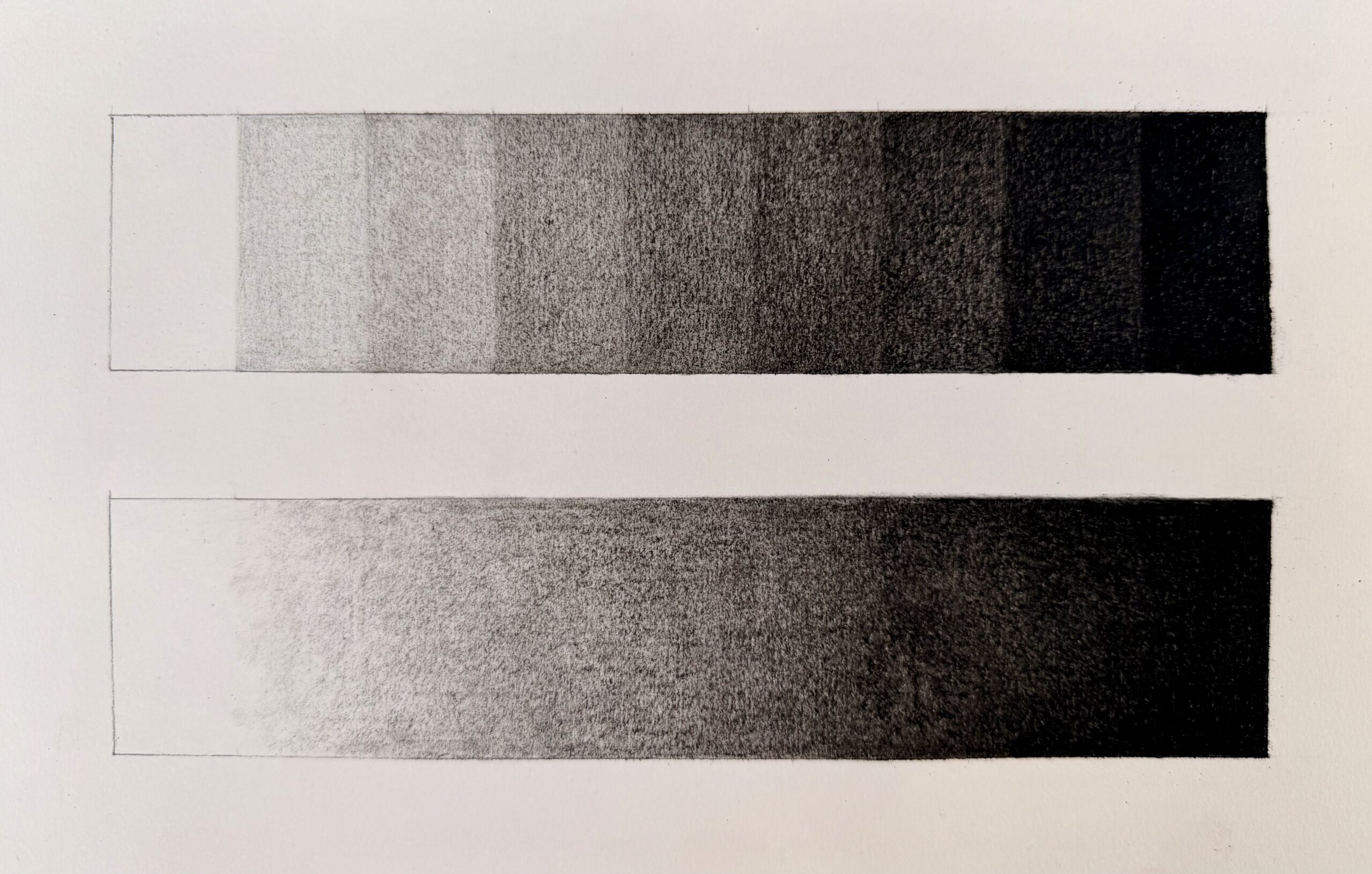
Completed Value Scales Activity, Briana Miyoko Stanley, charcoal on drawing paper, License: CC BY NC 4.0
Tips
- Always use a sharp pencil
- Use sandpaper to help smooth out the tips of freshly sharpened charcoal pencils
- Use a drawing apron (straight edge of tracing paper) to avoid smudging and help create crisp edges.
- A protective layer while drawing is used to keep the paper outside of the drawing’s image area clean and free of unwanted marks and smudges.
Result
The result will be two value scales – one a step scale showing distinct increments of light to dark value, and the other a gradient scale showing an even and seamless progression from light to dark. The two scales should mirror each other’s values.
Charcoal Reduction Activity
To develop your skills in creating value, we are going to dive into a rigorous drawing project. The project is titled the Charcoal Reduction Activity because the method you will use to complete the project is reductive drawing.
Reduction drawing is an art technique in which you remove material from a substrate. What that means for this project is that you will use vine charcoal (or charcoal powder) and a powder puff to cover a piece of drawing paper with an even layer of medium gray. The goal is to tone the paper an even gray with light pressure. You want the charcoal to sit on the surface rather than working it into the paper. If aggressive pressure is used, it will be difficult to adjust or remove the charcoal later on in the drawing process.
Description
This is a charcoal reduction still life activity. The activity combines many of the techniques we have been learning and requires you to accurately record visual information into a drawn form. However, this time we will be using and adapting these techniques to create a charcoal drawing.
Using charcoal requires working with reductive and additive techniques. It also incorporates light logic and tonal value. This will be a rewarding but also challenging and time-intensive assignment.
Project Parameters
Duration
20+ Hours
Size
18×24” (16×22” Image Size with 1” Border)
Reference
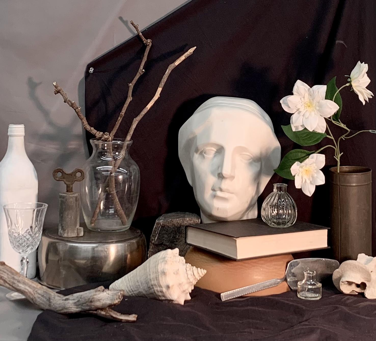
An achromatic still-life composed of a backdrop, objects (minimum of 4), light, and shadow
Applied Techniques
- Direct Observation – draw the still-life objects as they are seen
- Reduction Drawing – remove charcoal to create light values, also called subtractive drawing
- Additive Drawing – add charcoal to create dark values
Materials
- Drawing Board
- Drawing Paper (18×24”) – 1 piece
- Newsprint (18×24” – at least 1 piece
- 18” Tracing Paper Roll
- Pencil Sharpener
- Charcoal Pencils (HB, 2B, white, etc.)
- Vine Charcoal (willow)
- Erasers – Kneaded Eraser, White Rubber Eraser, & Mono Zero Round Eraser
- Drafting Brush
- 1” Painter’s Tape
- Ruler
- T-Square
- Powder Puff
- Sighting Tool/Skewer Stick
- Viewfinder
Student Learning Outcomes
- Use of charcoal to create a realistic tonal drawing of at least four still-life objects with a backdrop
- Accurate record of light, shadow, and texture
- Application of additive and reductive charcoal drawing techniques
Method
Still-Life Setup
Optional Step: Choose a theme (concept) to create a visually interesting still-life setup. Consider the backdrop, objects, and lighting conditions.
- Gather still-life objects of various sizes, textures, values, and limit to 1-2 colors.
- Building Materials
- Backdrop – paper or fabric
- Platform Items – boxes/additional items to act as supports to vary the height of objects in the still-life
- Object Categories – 1 of each (*however, you can add more objects)
- White Object
- Gray Object
- Black Object
- Glass OR Metallic Object
- Lighting:
- Spotlight – single light source to illuminate the setup; position it to create interesting highlights and shadows
- Building Materials
- Build the Still-Life Setup
- Place objects so that some overlap, showing clearly what is in front or behind another object to add a sense of space.
- Account for both negative and positive space.
- Form connections that lead the eye around the composition.
- Choose a focal point – I recommend a glass or metal object.
- Be willing to change out objects and add others in.
- Intentionally Light the Still-Life Setup
- Lighting in a still-life setup is critical and can enhance or ruin a composition.
- A single source of light, preferably coming from the side, creates a clear pattern of lights and darks that helps define forms and relationships between objects.
- During setup, try different light solutions; different light effects can dramatically change the feel of the same composition.
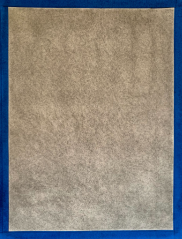
Preparatory Drawing Steps
- Tone the Paper
- Create a 1” border with painter’s tape on an 18×24” piece of drawing paper.
- Use vine charcoal (or charcoal powder), a powder puff, and a drafting brush to tone the 18×24” piece of drawing paper.
- Use light pressure
- Use the drafting brush to clean up charcoal dust
- Repeat until an even medium gray is achieved
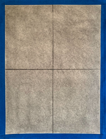
- Draw Crosshairs
- Get two pieces of 18×24” paper
- Fold one in half on the long side, and the other in half on the short side.
- Use these two folded pieces to draw crosshairs in vine charcoal.
- Get two pieces of 18×24” paper
Drawing Process
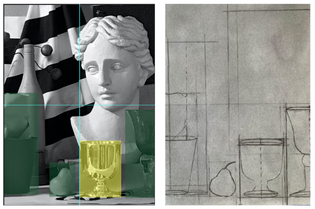
- Create a Proportion Box
- Look at the still life setup and locate an object you can see fully (not covered up by another item).
- Then, use the viewfinder to determine where the object will be in your drawing.
Sight and measure to determine the proportion of the object. After you have the proportion ratio from sighting and measuring and the location from the viewfinder, use the vine charcoal to indicate where the top, bottom, and sides of the proportion box will be. After the primary unit of measure is indicated with light marks, use one of the folded 18×24” paper guides to help create straight lines for the sides of the proportion box. Using the folded paper will keep any natural oils from your skin from coming into contact with the paper. It will also limit smudging and/or any alterations to the toned paper.
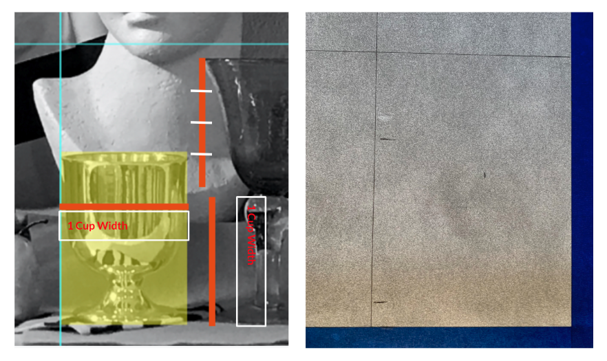
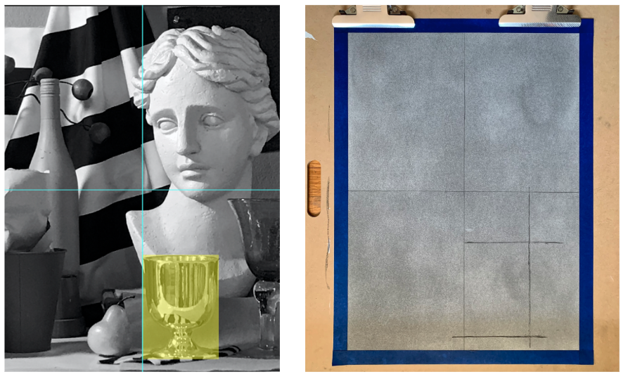
- Create foreground and middle ground proportion boxes
- Sight and measure to create the proportion boxes for objects in the foreground and middle ground
- Continue to avoid smudging or altering the toned paper.
- Continue to use vine charcoal for all of these steps.
- Sight and measure to create the proportion boxes for objects in the foreground and middle ground
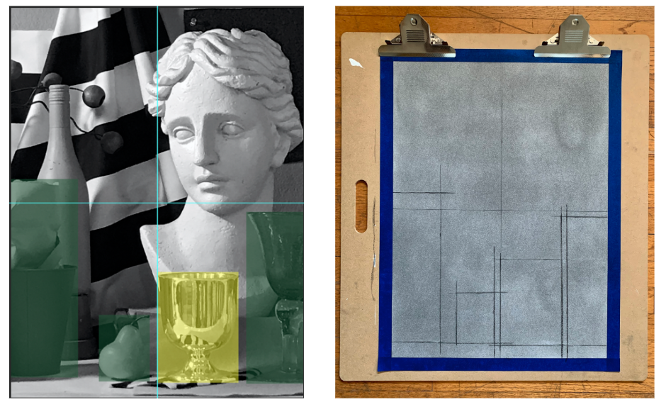
- Draw Centerlines for Symmetrical Objects
- To check for symmetry, draw a vertical line down the center of each symmetrical item in your drawing. (Use vine charcoal)
- The demo image shows dashed vine charcoal lines to indicate the center lines of symmetrical objects.
- To check for symmetry, draw a vertical line down the center of each symmetrical item in your drawing. (Use vine charcoal)
*Line of Symmetry – Any line splitting a shape into two equal parts.
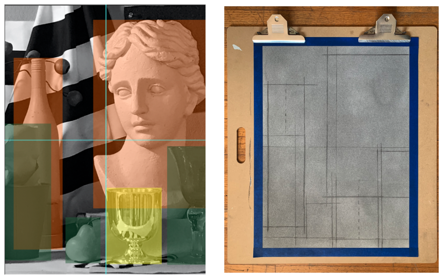
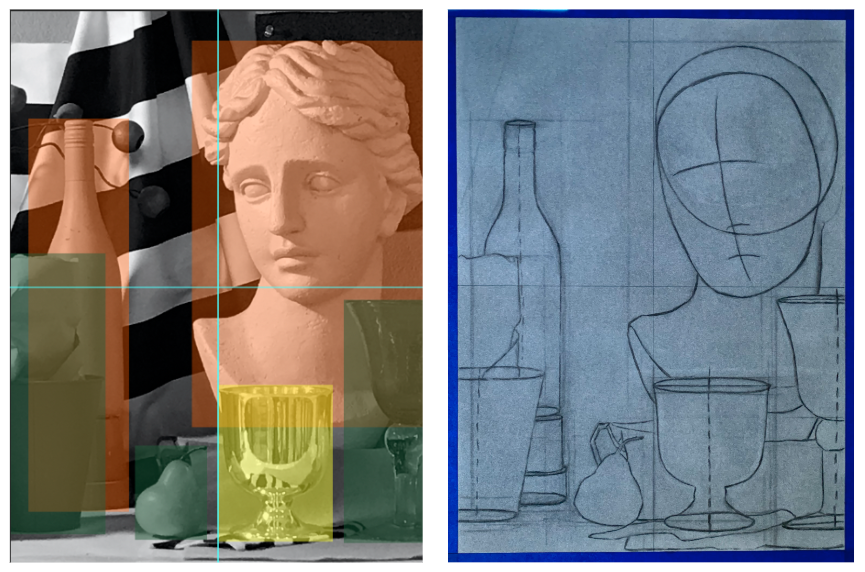
- Block in the Foreground and Middle Ground Objects
- Indicate the objects – lightly mark the general form of each object in vine charcoal with contour lines.
- Use vine charcoal to draw volumetric form rather than details.
- Start with the primary object and then use it as a guide to indicate the neighboring objects.
- Draw through the Objects = Act as if the objects are transparent
- Draw as if you can see through the objects to set up a believable structure for each component of the drawing. Think of this as the foundational blueprint for the drawing.
- To do this on symmetrical circular forms, such as the metal cup above, draw ellipses that travel from the front, curve to the back, and then curve back to the front. Crosshairs to mark the width and depth of the ellipses can provide additional assistance in making ellipses more accurate.
- These through lines, lines we imagine we can see through the objects, help us develop accurately drawn forms.
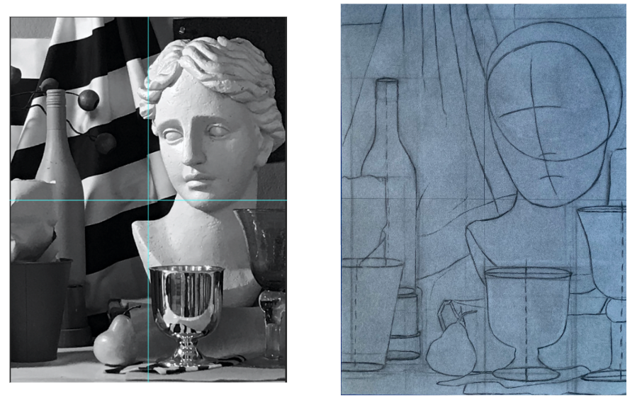
- Indicate objects in the background
- After the foreground and middle ground objects are simply indicated, use points of overlap to record the simple shapes of background objects.
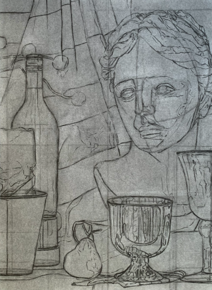
- Indicate Interior contour lines
- Use vine charcoal to draw all of the interior contour lines you observe.
- These include, but are not limited to, reflections, folds of fabric, paper creases, light and shadow mapping, etc.
- Use vine charcoal to draw all of the interior contour lines you observe.
*This is the last step for using purely vine charcoal. For the following steps, use charcoal pencils. Then, incorporate compressed charcoal for darker values.
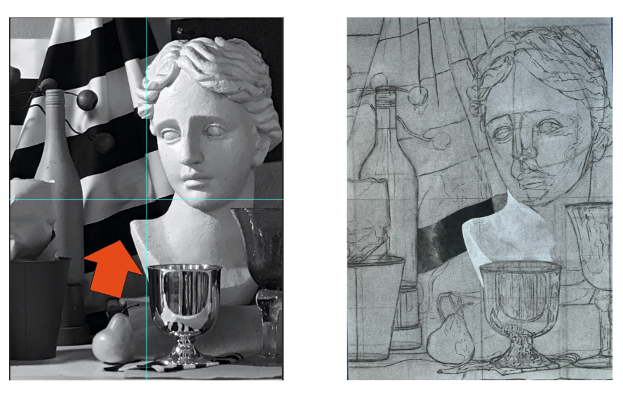
- First value range indication
- To start, close one eye, look at the still life, and identify an area where the darkest and lightest values in your composition are close together.
- These two values create the endpoints of the value range of your drawing (lightest & darkest possible values).
- For example, a white object illuminated by the light source will be the lightest value, and a black object in shadow will be the darkest.
- Create local values
- Local Value: value of an object or figure without light and shadow.
- By creating the local value of objects, viewers will be able to discern if an object is white, grey, or black in the drawing.
- To do this, use the kneaded eraser to make white objects lighter (do not erase completely), and the HB charcoal pencil to crosshatch and add value to darker objects (avoid going too dark).
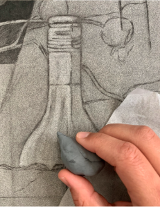
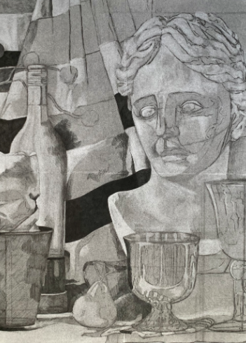
Kneaded Eraser Example (L) and Local Values Development (R), Briana Miyoko Stanley, charcoal and erasers on drawing paper, License: CC BY NC 4.0
- Establish the value pattern
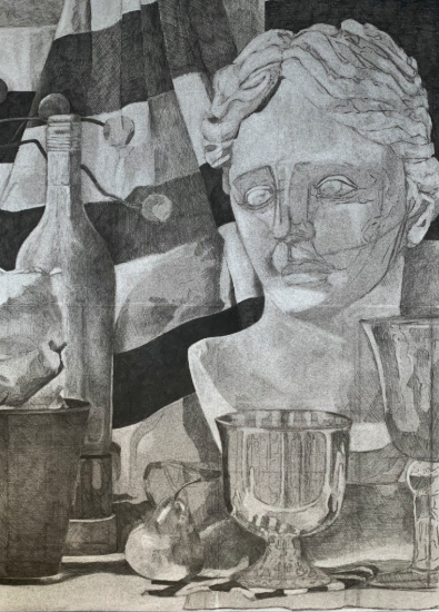
- After the local value of each object is generally in place, establish the value pattern.
- Value Pattern: is the overall organization relationship of light, mid-tone, and dark values in a work of art.
- Apply light logic (do not use white charcoal yet)
- To define the volume of each form, describe the effect of light on its surface.
- In order to determine the correct value of a form’s half-tone and core shadow, you must compare their value to the established darkest dark.
- Consequently, to determine the correct value of a form’s light half-tones and highlights, you need to compare their value to the established lightest lights.
- Refine forms & spatial relationships
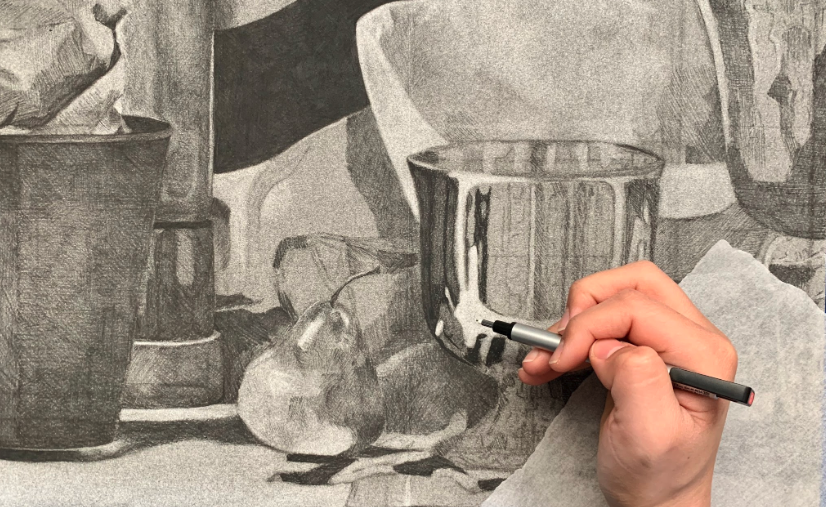
- Use the principles of atmospheric perspective to create spatial depth.
- Draw foreground objects with more detail, higher contrast, and a greater range of values.
- As objects move back in space, record fewer details and value changes.
- High details and contrast cause objects to advance, while objects with fewer details and limited value changes recede.
- Use the principles of atmospheric perspective to create spatial depth.
- Surface Texture
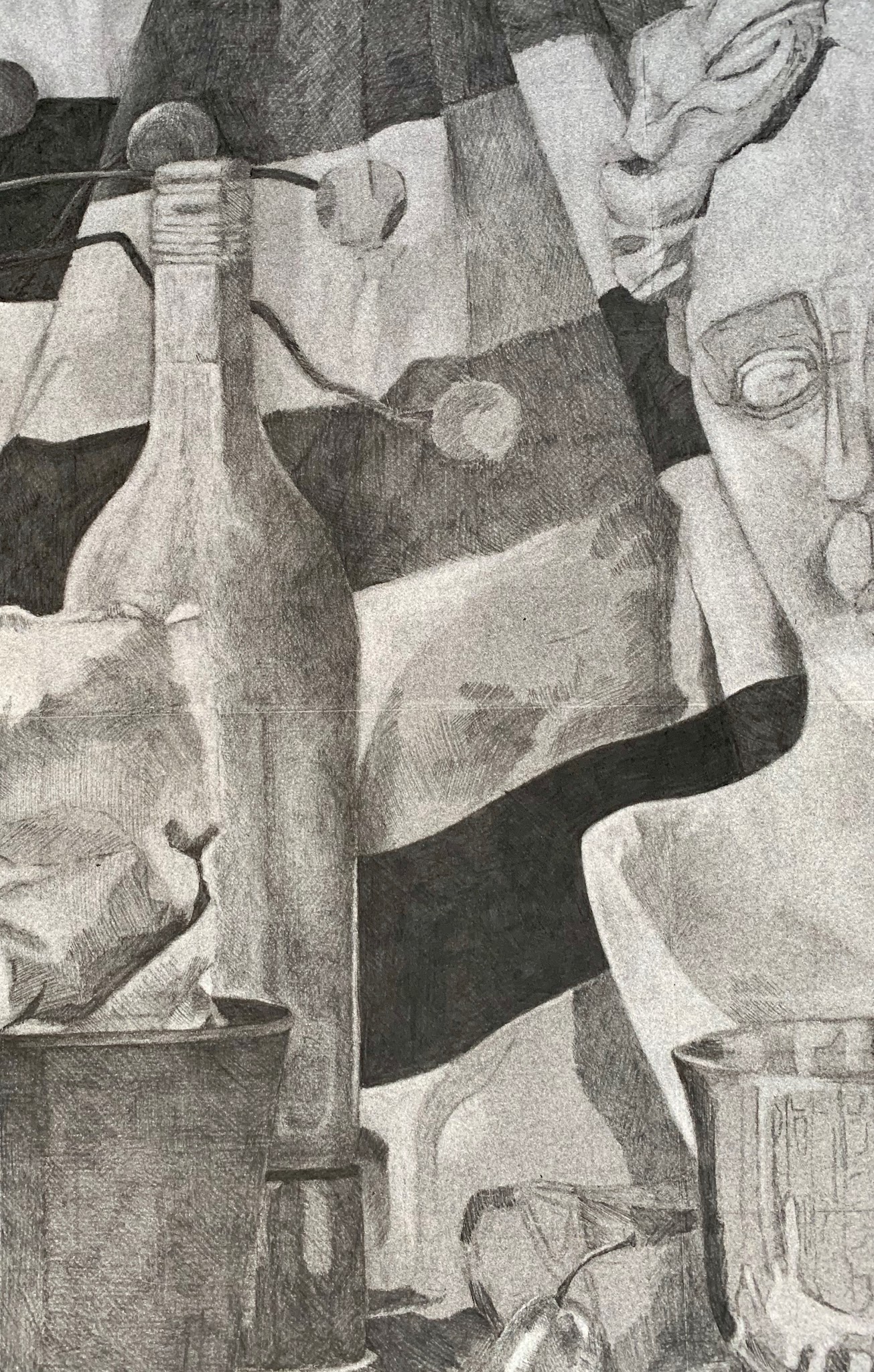
- For every object, consider not only its form and edge, but also its texture. Different materials have different surface textures.
- For example, if there is a shiny metal cup in your still life, it will require high contrast, sharp internal edges, complex value shifts, and a wide variety of gradations. Please refer to the “Tips” section at the end of this activity for further instruction.
- Whereas a matte finish object with a non-reflective surface located in the background of the composition would need to be rendered in soft edges and a more limited value range.
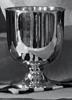
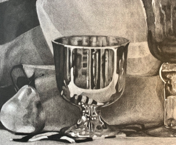
Metal Cup Digital Photo (L), and Metal Cup Charcoal Reduction Drawing Close-Up (R), Briana Miyoko Stanley, digital photo and charcoal on drawing paper, License: CC BY NC 4.0
- Simultaneous Contrast
- As value is distributed, certain value relationships can be deceiving because of simultaneous contrast
- A dark form can appear to be darker in value than it actually is if it is adjacent to a light form. Consequently, a light form can appear to be lighter in value than it actually is if it is adjacent to a dark form.
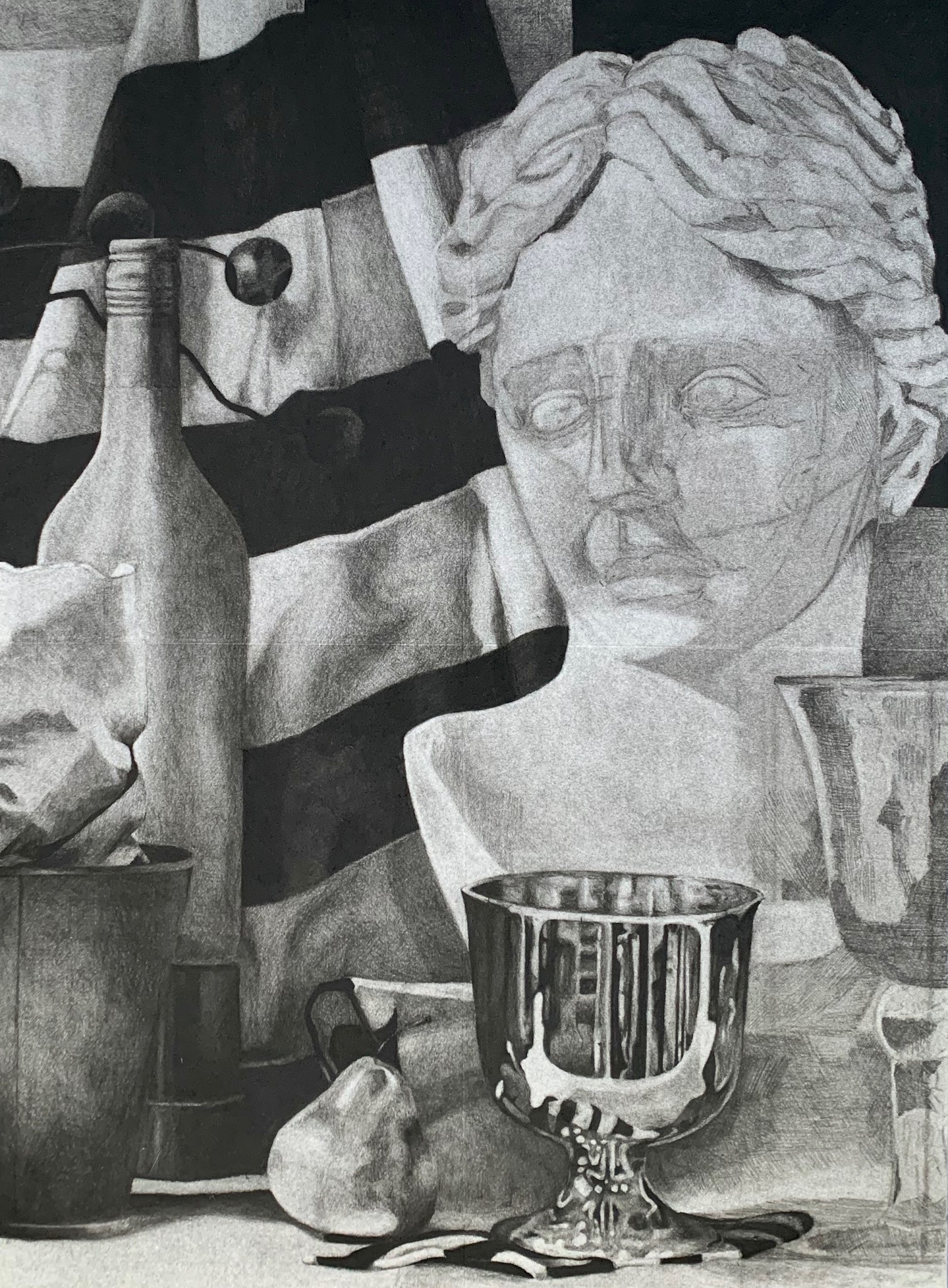
- Refinement & White Charcoal
- Once your drawing is nearly complete, you can strategically blend to create smoother gradients and transitions where appropriate. Do not overblend. Objects with a rough texture (rocks, twigs, etc.) should be drawn as such; objects with a smooth texture (fabric, glass, etc.) should be blended.
- After refining the drawing, use the white charcoal to emphasize highlights and heighten contrast.
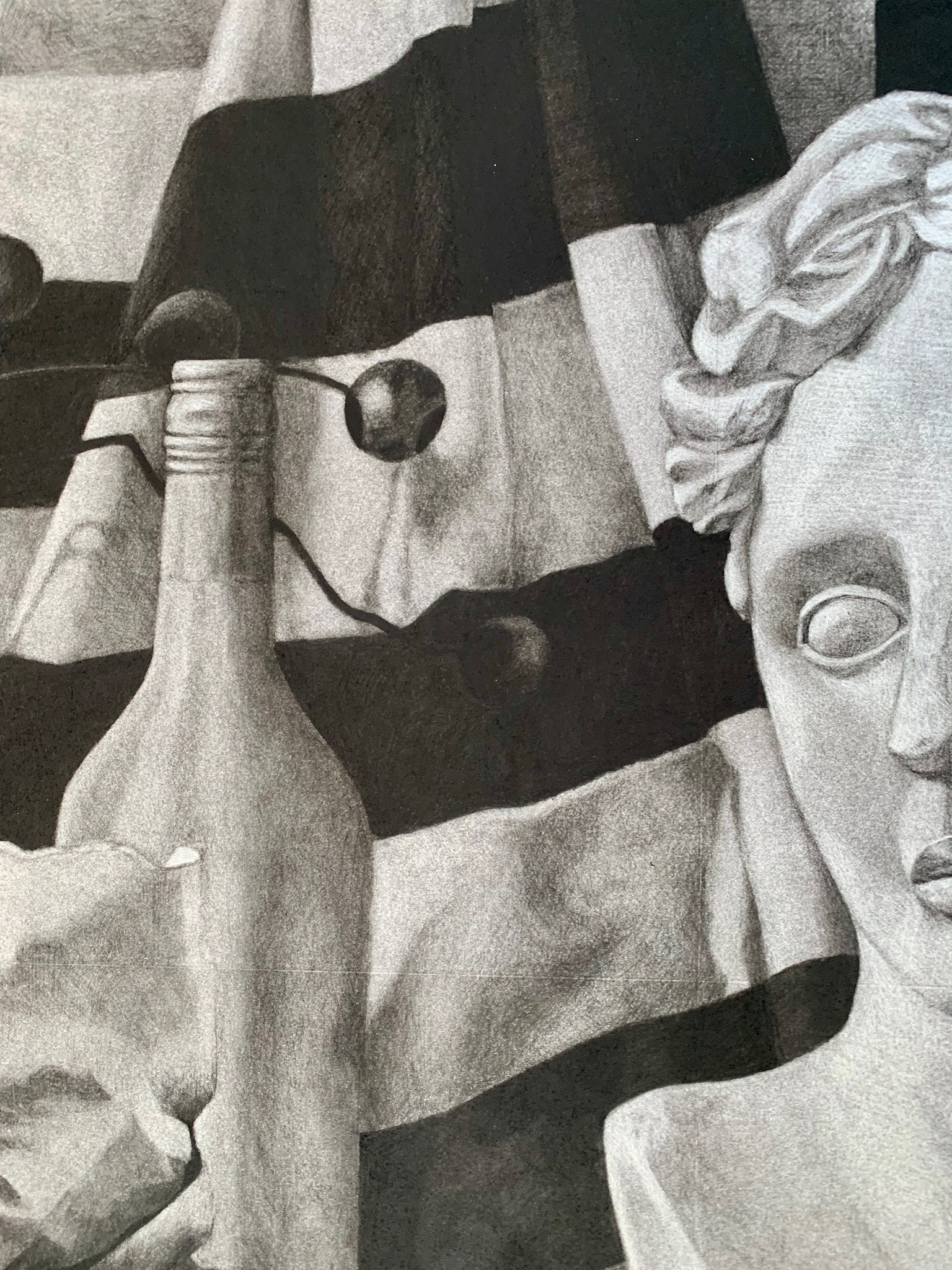
- Compositional adjustments
- Turn your drawing upside down. Step at least 6’ back from it.
- Ask yourself what catches your eye first, second, and so on. Was the first thing to catch your eye the focal point? Is the area with the closest value range in the background?
- Depending on the answers, your drawing may need adjustments before it’s complete.
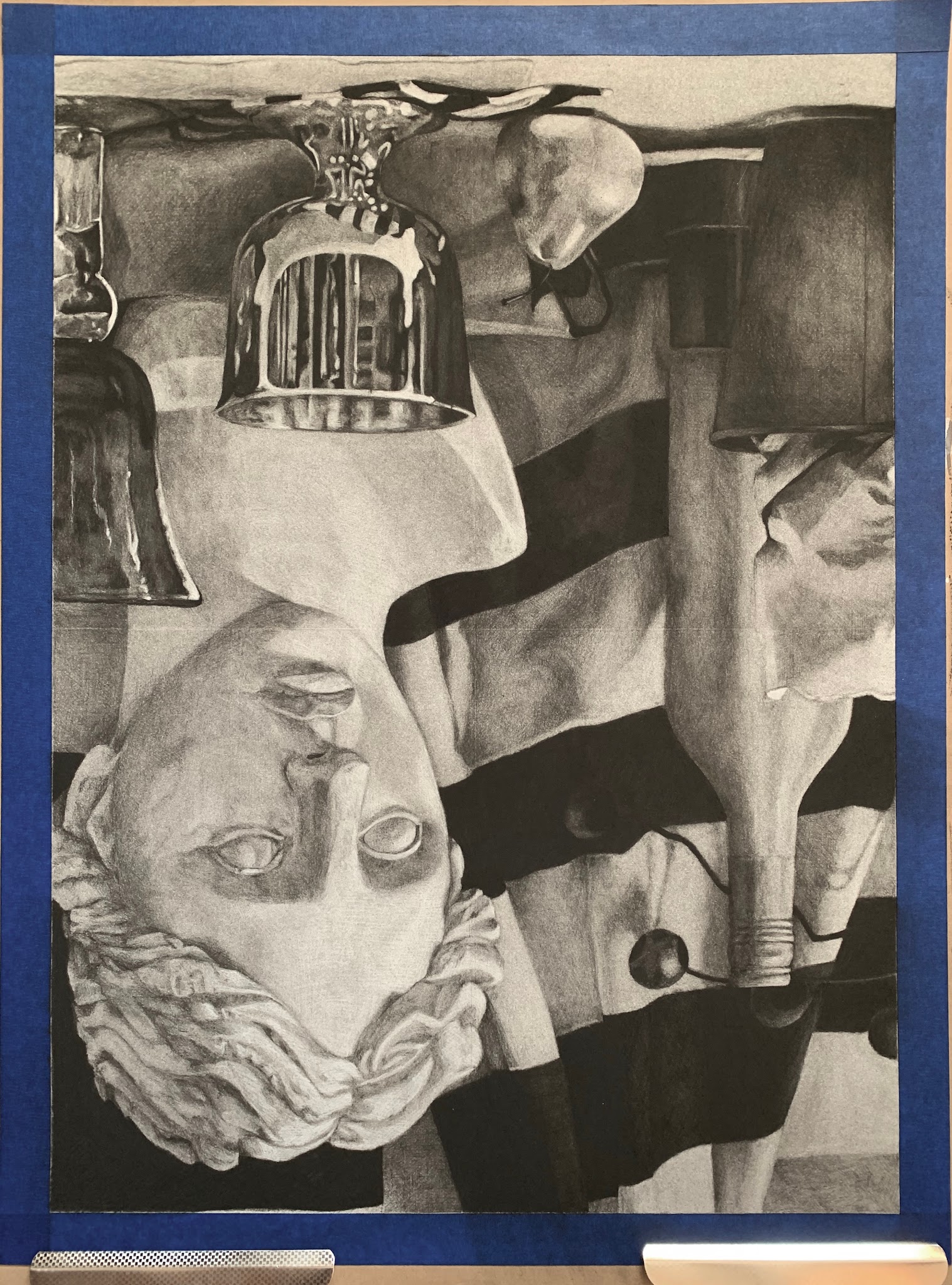
- Re-establish the compositional order
- Revising an object’s value, edge, level of detail, etc., will reaffirm its spatial relationship in the composition.
- To create a hierarchical structure, selectively adjust values and make modifications to edges and levels of detail to provide order to your composition.
- These adjustments should be based on compositional considerations rather than on direct observation. You should make adjustments that distinguish or diminish the visual prominence of certain areas, forms, or passages within the composition.
- (Optional) Tape Removal
- To remove the protective border, carefully lift the tape from the corner and gently pull it away from the edge of the paper.
- If the tape does not release easily from the drawing paper, use a hairdryer to heat the tape’s adhesive. If you choose this method, firmly hold the drawing, carefully lift up a corner of the tape, and, with the hot air from the hairdryer directed at the section of tape you want to remove, carefully and slowly remove the tape from the paper. Repeat this process until all of the tape is removed.
- The final step in the drawing is to use your eraser to clean up the border edges.
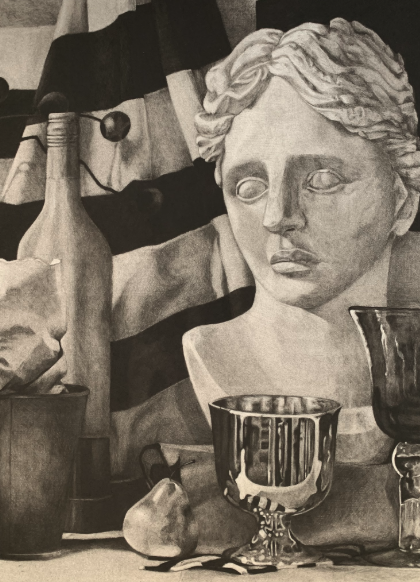
Completed Reductive Drawing Assignment Example, Briana Miyoko Stanley, charcoal on drawing paper, License: CC BY NC 4.0
Tips
- How to avoid smudging
- Use a sheet of tracing paper to rest your palm on while you draw. This will decrease the chance of smudging and also keep the natural oils of your hand from damaging the drawing.
- Change out the tracing paper regularly to cut down the transfer of charcoal dust and to keep from dirtying your drawing.
- Keep a wet towel or wipe nearby to clean off your hands and/or work surface. Charcoal tends to cling to surrounding surfaces.
- Work from general to specific and record the overall relationship of light and dark within the drawing.
- To add value (make an area darker), use the Charcoal Pencils to Crosshatch
- To indicate your value range, use the charcoal pencils and cross-hatching technique to gradually darken the base tone with even, light pressure. Make sure the cross-hatch lines are straight and close together. With each layer, the value development will become smoother and smoother.
- *Developing value with cross-hatching will take an immense amount of time and thereby patience, but it will also result in controlled and intentional values.
- To subtract value (make an area lighter), use the kneaded eraser
- After you have established the darkest value in a small area of your drawing, use your eraser to adjust, through subtraction, the lightest value. Continue to cross-hatch and erase the charcoal dust from the surface of the paper until you have achieved the appropriate light value.
- How to draw metallic objects
- Like every other object, lit with a single light source, the metal cup has a light side and a shadow side. However, because its texture is smooth and shiny, objects that are next to it are reflected on its surface. Though this makes describing the form more challenging, your approach to drawing it should not change.
- Just as you would with any other object, you must work from general to specific to indicate the object’s surface details, like reflections, after the basic volumetric form is established.
- Keep in mind that reflections in metallic objects tend to have curved and more defined edges.
- How to draw glass objects
- Like other reflective objects (metal, high-gloss ceramic, etc.) glass is challenging to draw because it has its own local value, but it also shows a record of its surroundings.
- Reflected forms will stretch or constrict depending on the glass’s shape and surface area.
- Draw what you see, not what you think the glass or reflections should look like.
- Record what is reflected on the surface of the glass and observed through the glass. The clearer and more transparent the glass, the more material there is to record. Make sure to work from general to specific to avoid becoming overwhelmed or too intimidated by this challenging object.
- Typically, an object seen through glass will be lighter in value with a softer edge.
- Objects seen through glass will not perfectly match up with objects outside of the glass.
- Like other reflective objects (metal, high-gloss ceramic, etc.) glass is challenging to draw because it has its own local value, but it also shows a record of its surroundings.
Result
The result of the activity is a detailed and accurate charcoal reduction drawing of a still life. The drawing will demonstrate the development of your light logic knowledge and improved technical skills.
Licensing and Attributions
“Value Activities.” Written by Briana Miyoko Stanley. License: CC BY