
Color
An introduction to color theory applied to drawing projects.
Introduction
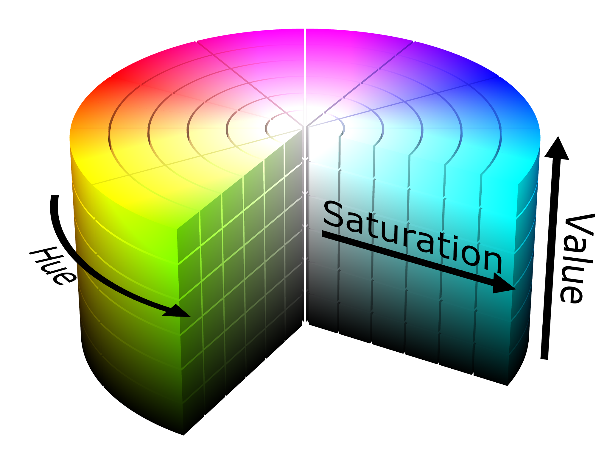
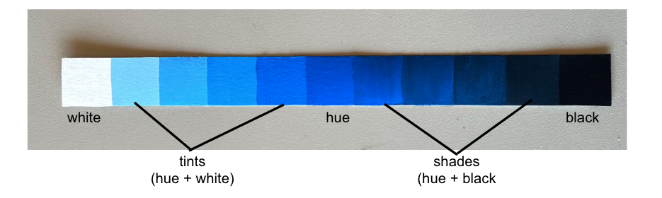
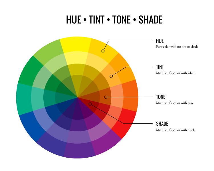
Color theory studies guidelines, principles, and ideas about color attributes – hue, value, and saturation. Hue refers to pure color. Value is the degree of lightness or darkness of a color. And saturation is the luminosity, intensity, and/or vibrancy of a color.
Color & Light
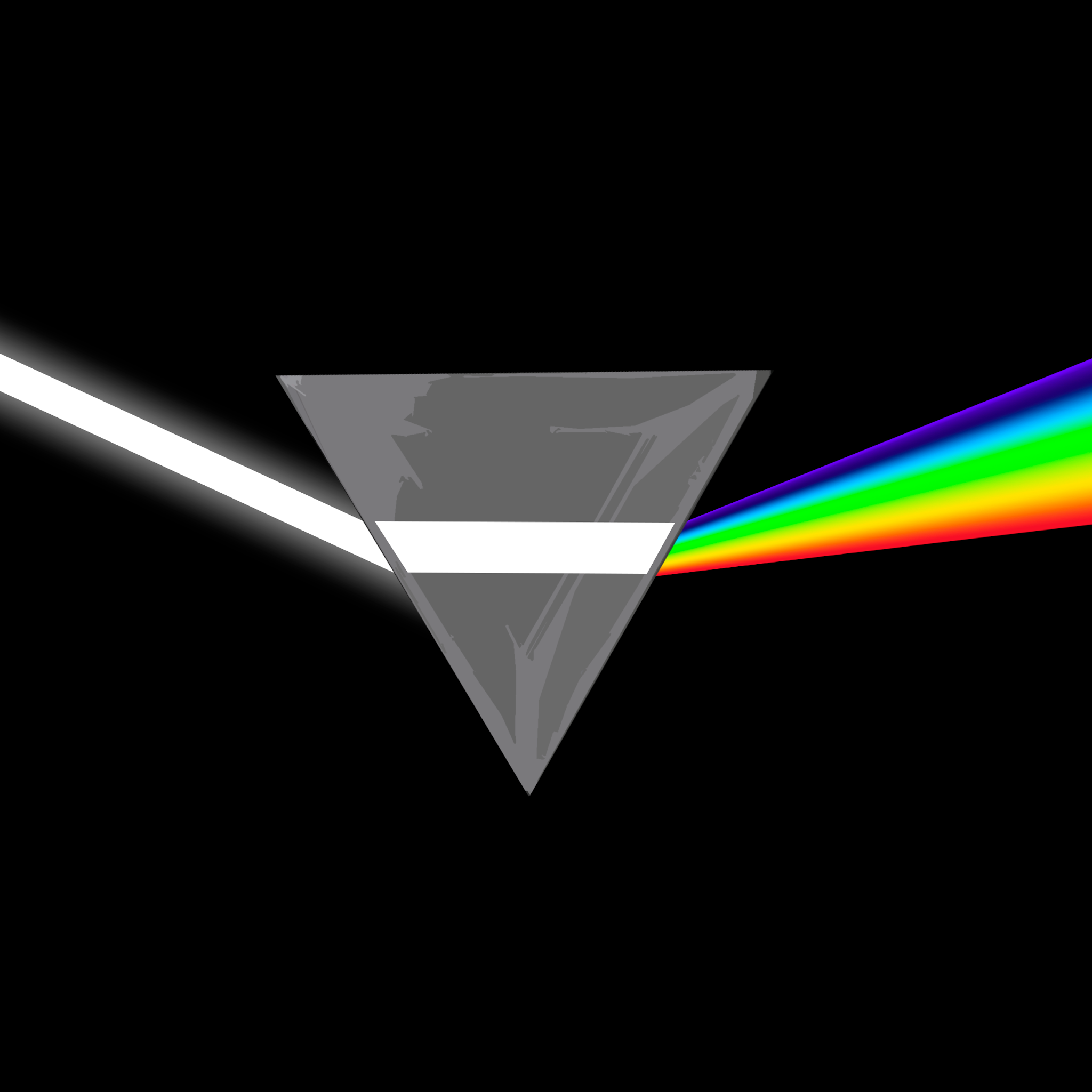
Color originates from light. Without light, there is no color. Depending on the wavelength of the light and the quality of an object’s surface, rays of light will be entirely or partially absorbed by the surface, rendering a perception of a specific hue.
Color Relativity
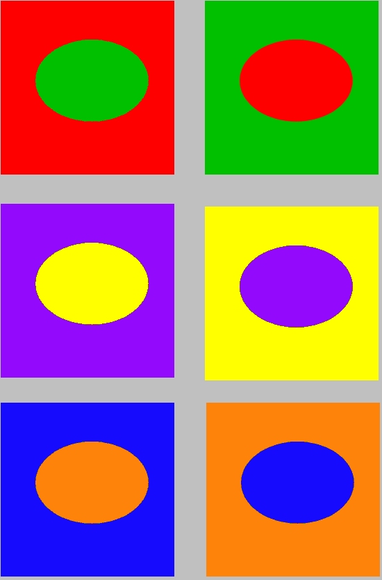
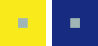
Color is the most complex and relative element of art. The color a person perceives is called color perception, and it is highly dependent on their surroundings. For instance, if red is placed in the middle of a blue square, the red will look lighter in value. However, if the same red is placed in the middle of a yellow square, the red will look darker. This is due to color relativity. Typically, a color appears darker when an adjacent color is lighter, and a color appears lighter when next to a darker color.
Color Theorists
Color theorists are scientists and artists who study color. Notable color theorists who will be referred to throughout this chapter are Sir Isaac Newton, Johann Wolfgang von Goethe, Johannes Itten, and Josef Albers. These color theorists searched for a system to explain relationships among colors and provide guidelines and principles for understanding color.
Sir Isaac Newton
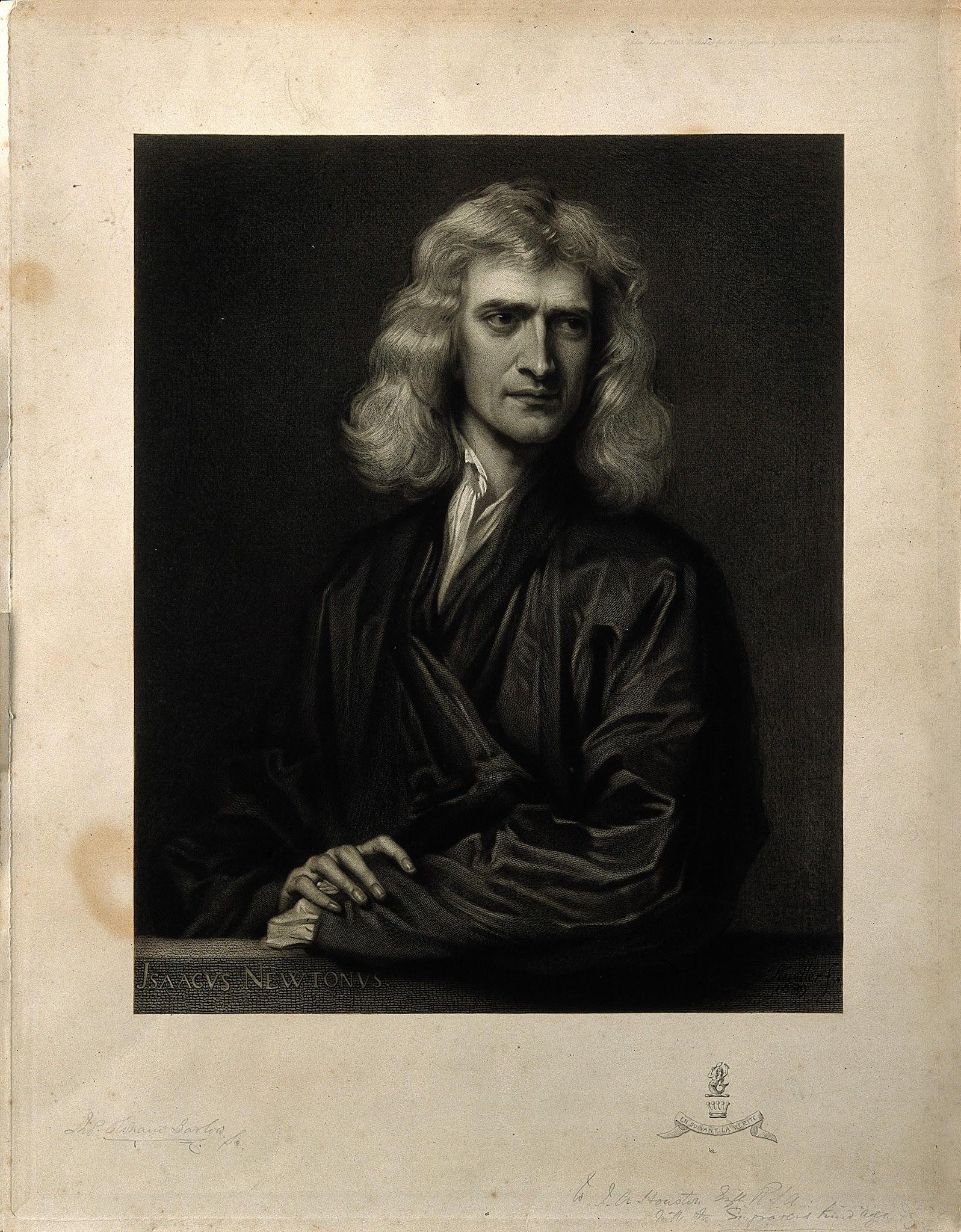
In the 18th century, Sir Isaac Newton conducted scientific experiments with prisms that led him to discover that white light can be split into a spectrum of colors. He was the first person to place hues in a circular formation, a format that is still used today!
Johann Wolfgang von Goethe
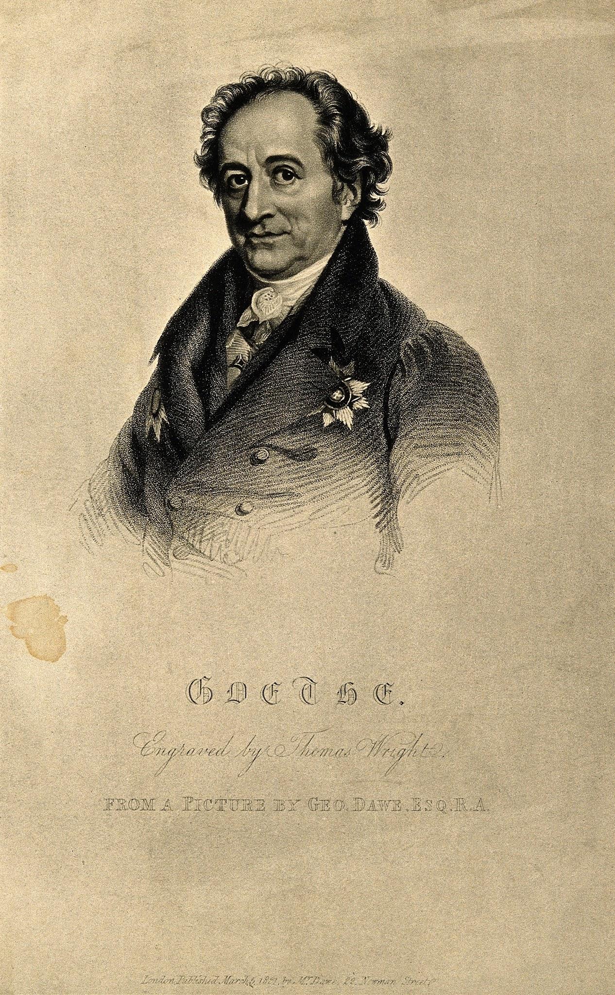
Johann Wolfgang von Goethe went against Newton’s theories. Instead of approaching color theory as a science, Goethe focused on the psychological effects of color. He believed color was a function of the eye and not the sole property of light.
Johannes Itten
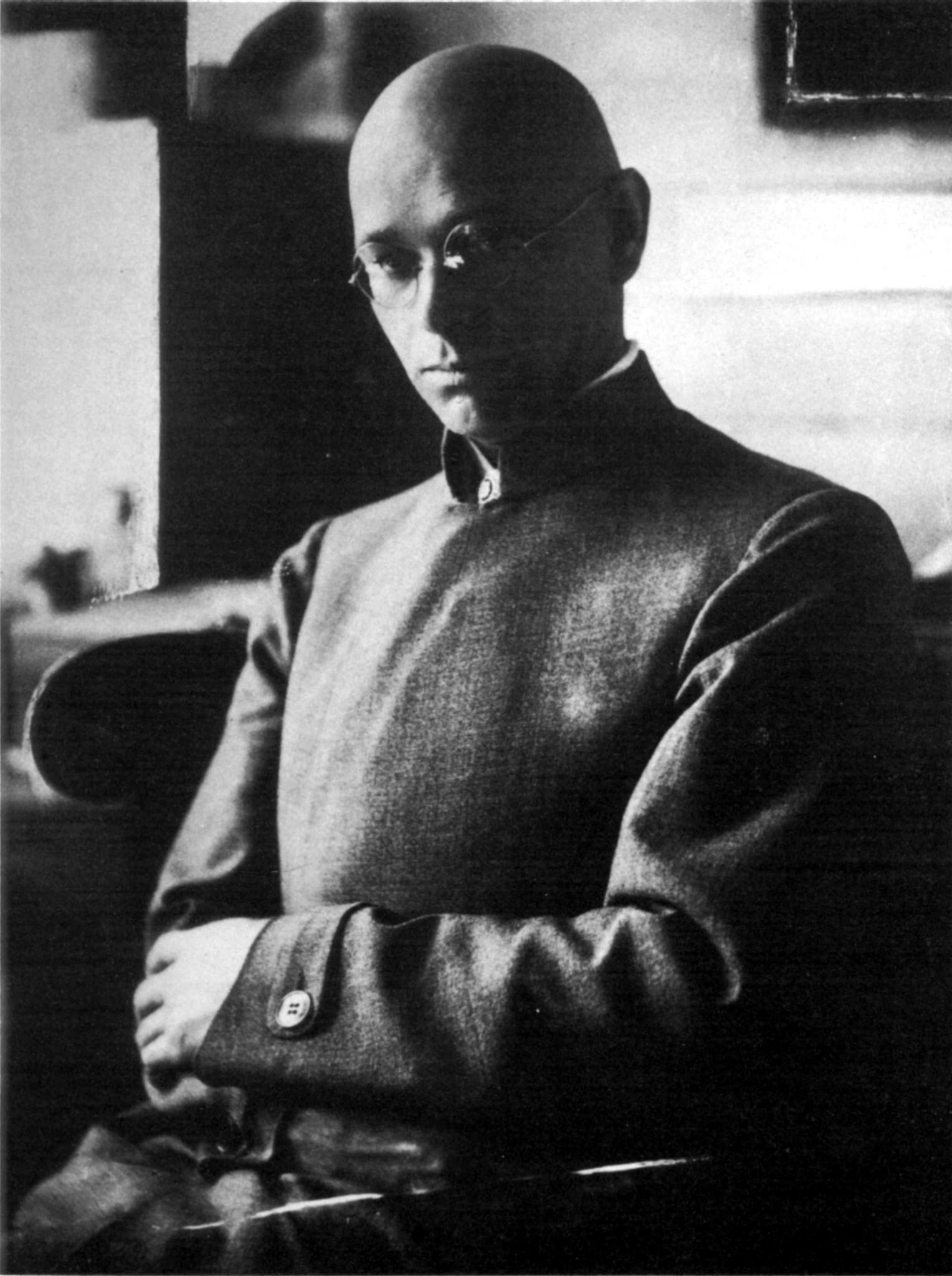
Johannes Itten is one of the most influential color theorists. Itten started an art school in Vienna and later taught with fellow artists such as Josef Albers, Wassily Kandinsky, and Paul Klee at the Bauhaus School in Weimar, Germany.

Itten also created the most commonly used twelve-hue model color wheel that divides colors into three categories based on the three primary colors – red, yellow, and blue. This chapter will follow his color contrast system of hue, value, warm/cool, complementary contrast, simultaneous contrast, saturation, and extension, which are all defined later in the chapter.
Josef Albers
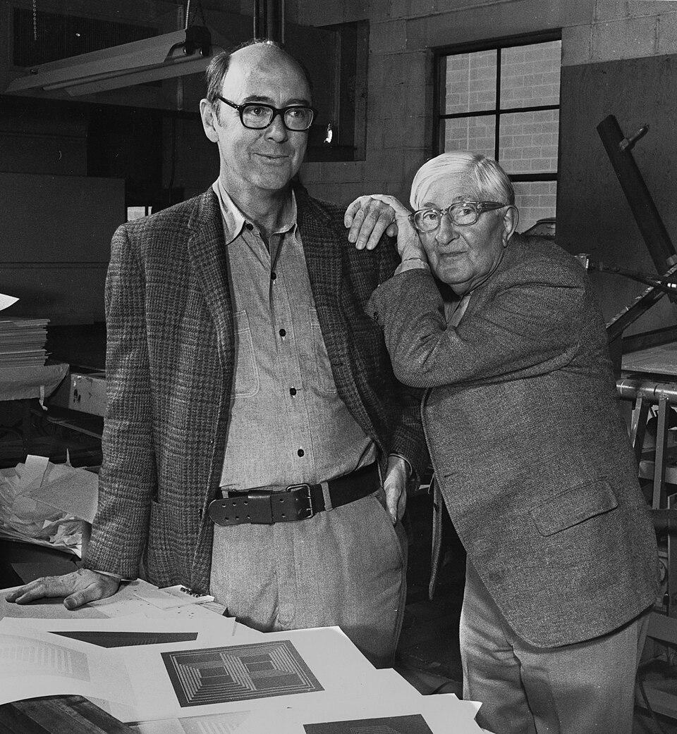
Josef Albers was a German-American artist and colleague of Johannes Itten. He devoted his teaching and art career to the study of color relativity. Alber’s book Interaction of Color (1963) is still one of the most influential books about color theory today.
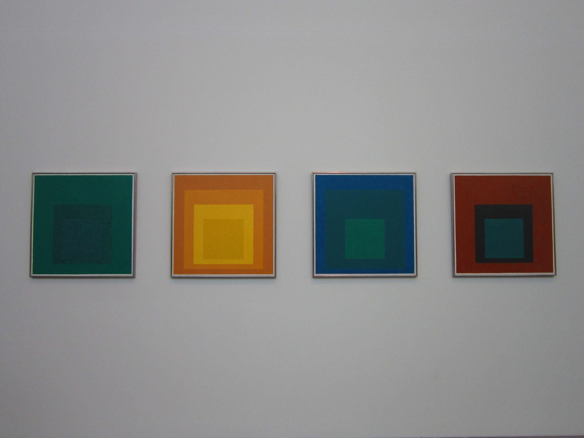
Josef Albers was one of the foremost art professors of the 20th century, and is best known for his painted series of iconic square colors, known as Homage to the Square. Visual examples of Homage to a Square paintings are shown above.
Perception
Local, Optical, & Arbitrary Color
In art, color is typically portrayed as local color, optical color, and subjective color.
Local color, also known as objective color, is the color that is seen in normal daylight. Local color is typically associated with the natural appearance of things. It is the objective color of the subject in an ambient setting without extra light and shadow.
Optical color, also known as perceived color, depicts color seen under various light conditions. It shows light logic (light and shadow).
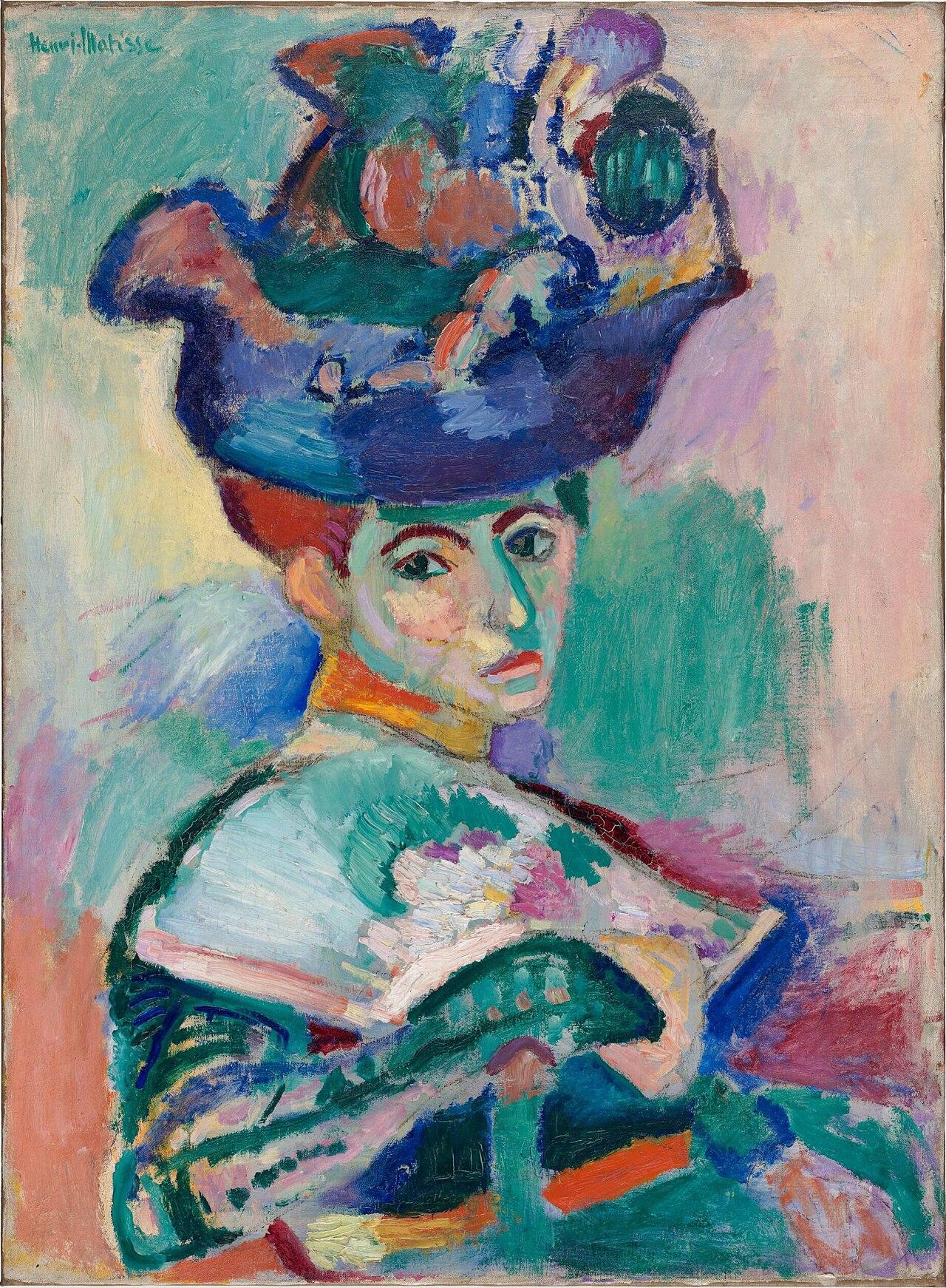
Subjective color, also known as arbitrary color, is when the chosen color does not depict the natural appearance of something. Instead, an artist picks colors for design, aesthetic, symbolic, psychological, or emotional reasons, as seen in the Matisse below.
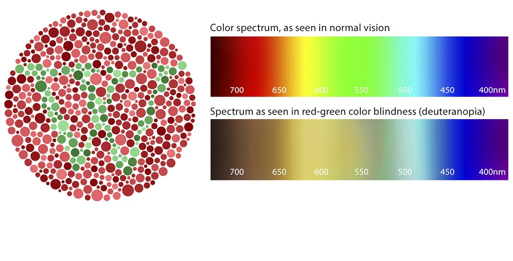
Color Blindness
Color blindness is also known as “Color Vision Deficiency.” It means seeing colors differently from most people. Color is relative to every person, but for people with color blindness, the perceived changes in color are more extreme. Often, color blindness makes it hard to tell the difference between certain colors.
Color Schemes
Color schemes are collections of harmonious colors selected from the 12-part color wheel. These collections range from similar to highly contrasting combinations. These groupings are helpful organizational tools for creating drawings with heightened visual interest, implied spatial depth, and realistic portrayals of light and shadow. The following section explores these collections and the terms that define them.
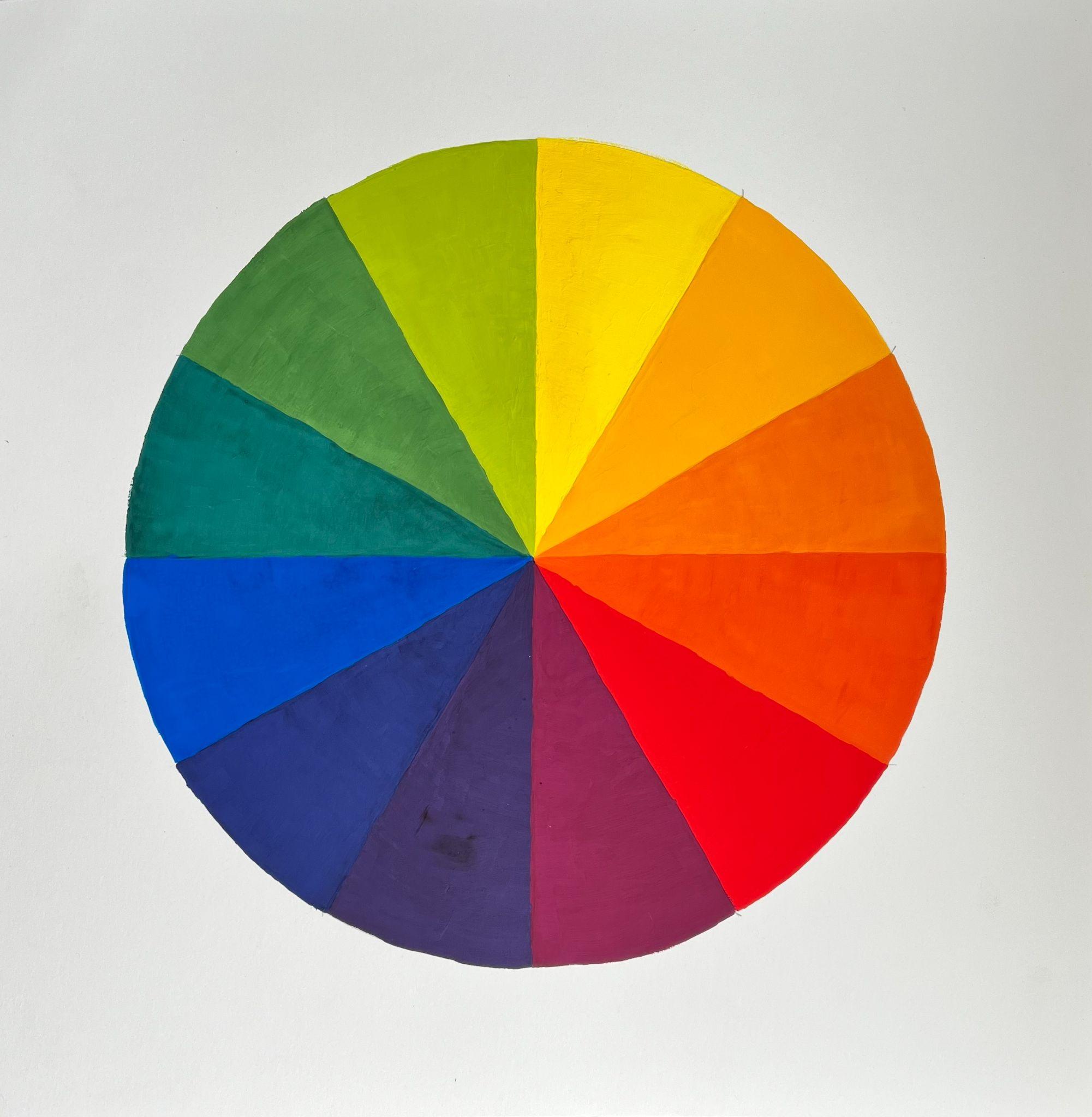
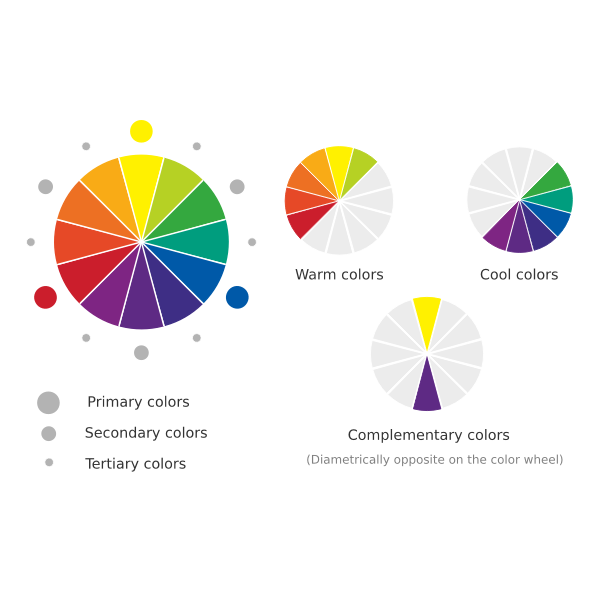
The 12-Part Color Wheel is an organizational tool that places hues in a circle to show the relationships between the primary (yellow, red, blue), secondary (orange, violet, green), and tertiary colors (yellow-orange, red-orange, red-violet, blue-violet, blue-green, yellow-green).
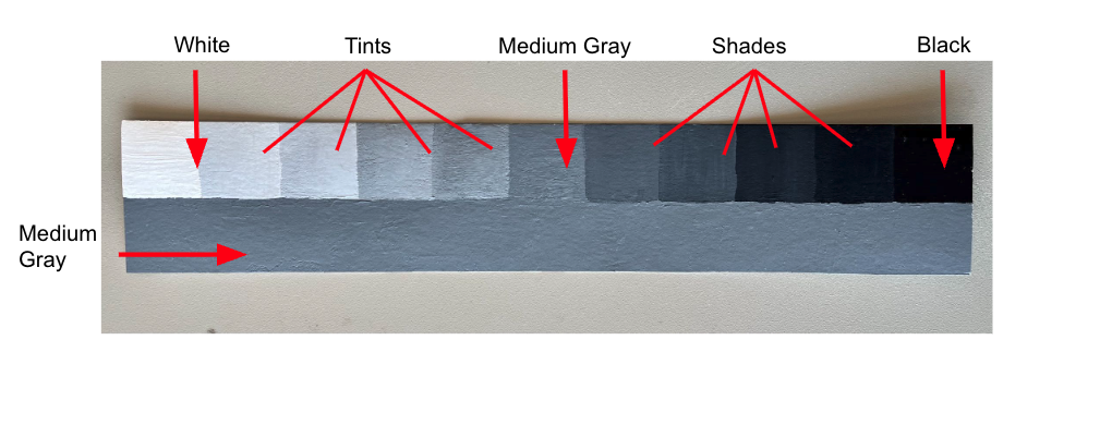
Before we start to define the color schemes that derive from the 12-part color wheel, it’s important to note that achromatic is a term that means “without color.” Many drawings do not include a color, and as a result, they can be referred to as having an achromatic color scheme. This means the artist only used a range of white to gray to black without hue or saturation.
A monochromatic color scheme consists of one color’s value and saturation range.
An analogous color scheme has three neighboring hues on the color wheel. An extended analogous color scheme has four.
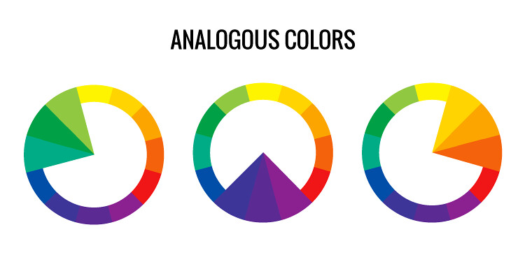
Analogous Scheme Examples. Source: Lacie Lynnae via Flickr, License: CC BY NC ND 2.0
Cool Colors range from green to red-violet on the color wheel; they are typically associated with water and peaceful or serene connotations.
Warm Colors range from yellow-green to red on the color wheel; they are typically associated with fire and energetic or active connotations.
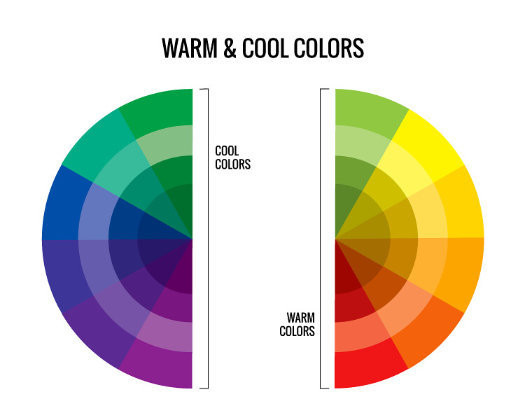
Complementary Colors (also called complementary pairs) are high contrast colors that are placed on opposite sides of the color wheel from one another; they are made up of one warm color and one cool color.
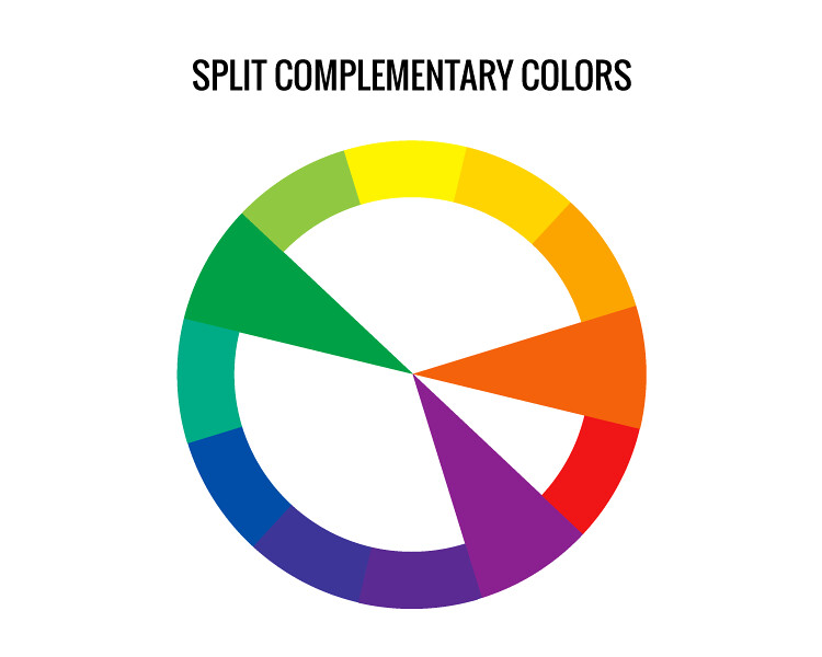
Split-Complements are three-color combinations that use one color and the two colors adjacent to its complementary pair color.
A Triadic Color Scheme is made up of three colors equally spaced on a 12-part color wheel.
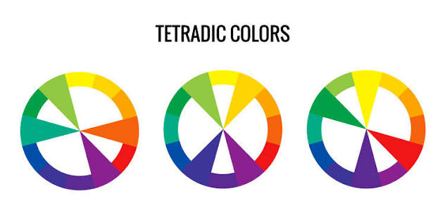
Tetradic Colors: four colors composed of two complementary pairs equally spaced on the color wheel
Johannes Itten’s Theory of Color Contrasts
The color theorist Johannes Itten created seven color contrasts to define color differences. These differences are important to the field of color theory and art as a whole because they provide visual guidelines for viewers and helpful theories for artists to apply throughout their work across all media. Three of the color contrasts are the same as the color attributes. These terms are reviewed below because Itten’s color contrasts build on one another in order of complexity with hue as the simplest to extension as the most complex.
- Hue is a pure, unadulterated color. It is the color as it is perceived on the color wheel. Hue contrast refers to different colors in their pure form.
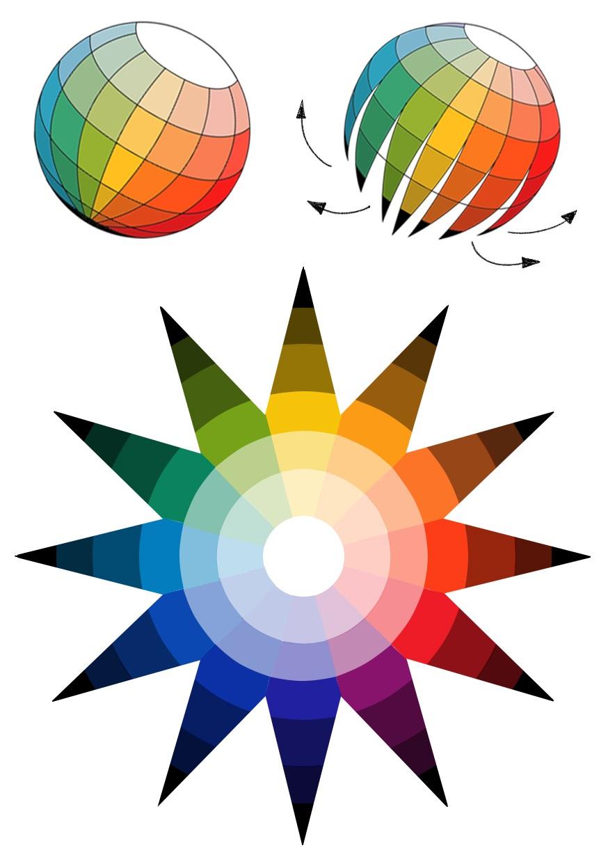
- Value is the degree of lightness or darkness of a color. All colors have values. Value is the proportion of light and dark in color, and it is necessary for a good composition. Without value contrast, differences between visual elements could not be seen.
- Temperature is how warm or cool a color is perceived.
- Complementary contrast includes opposing colors on the color wheel. For example, red and green. These colors neutralize each other when mixed but visually vibrate when placed side-by-side.
- Simultaneous Contrast is the optical phenomenon of one color changing due to the visual effect of a neighboring color. This phenomenon occurs when the eye viewing a color requires the complementary color and will produce this if the color is not present.
- Saturation is the degree of color intensity or vibrancy
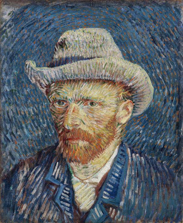
- Extension is the contrast between two color areas of different sizes. By changing the proportion and extent of colors in a composition, you can change the entire composition and what it evokes. If color proportions are balanced in a composition, they create color harmony. However, if color proportions are unbalanced, as shown in the Van Gogh Self Portrait with Grey Felt Hat painting below,, they express varying degrees of emotion, light, and/or subjective color in a composition. If a color scheme is in extension contrast, three color effects can occur in the composition: color expressing light, color expressing mood, and color expressing color. If harmonious proportions of hues are used, the effects of extension are neutralized. The contrast of extension is advanced and requires an understanding of all the Color Contrasts. As a result, taking a color theory class is highly recommended to build your knowledge to eventually activate this color contrast technique.
Color Psychology
Color quietly plays a significant role in how the world is perceived. It can affect a person’s mood, alter sleep schedules, and even change how food tastes.
Color psychology connects colors with emotions and behavior. Artists often use these connections to design an artwork’s visual and conceptual potential. While color psychology can play a vital role, its tenets are considered guidelines rather than rules. In addition, the connection between emotion and color often changes depending on the culture and context. For instance, in Western culture, white symbolizes purity, whereas in Japan and Africa, white represents death
Master Artist: Hilma af Klint and Color
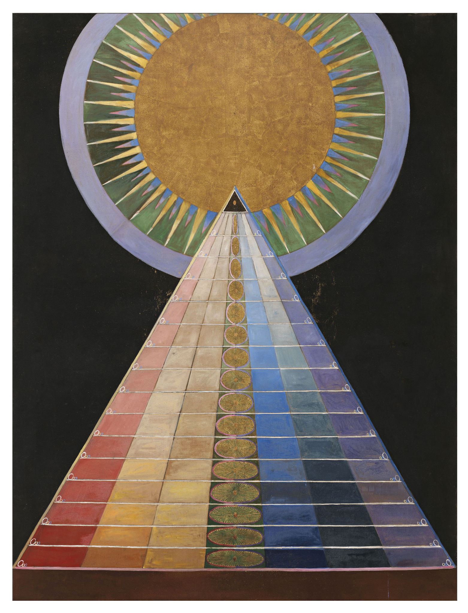
In the early 20th century, Swedish artist Hilma af Klint created fully abstract works of art several years before the famous names of Wassily Kandinsky and Piet Mondrian. Like other early 20th century abstract artists, af Klint had an interest in the occult, Theosophy, and the spiritual possibilities of art. Abstract art, or art free from identifiable subject matter, became a way to explore the invisible realities unseen by the human eye. Abstract artists turned to the formal elements like line, shape, and color to express spiritual concepts. Group X, No. 1, Altarpiece (Altarbild) is part of a series af Klint made between 1906-1915 while practicing as a spirit medium. In Group X, No. 1, Altarpiece (Altarbild), af Klint used structured geometric forms primarily of a large triangle intersecting a large circle. The triangle is evenly divided into seven sections featuring prismatic colors across the visible spectrum. In this clearly organized composition, af Klint consciously considered the relationship between shape and color. For af Klint, she developed systems of color with complex symbolic meanings informed by a variety of sources. Using Hilma af Klint’s own writings, her color systems are recently beginning to be decoded by art historians.
“Master Artist: Hilma af Klint and Color.” Written by Chelsea Wright. License: CC BY
Color Application
Color Mixing
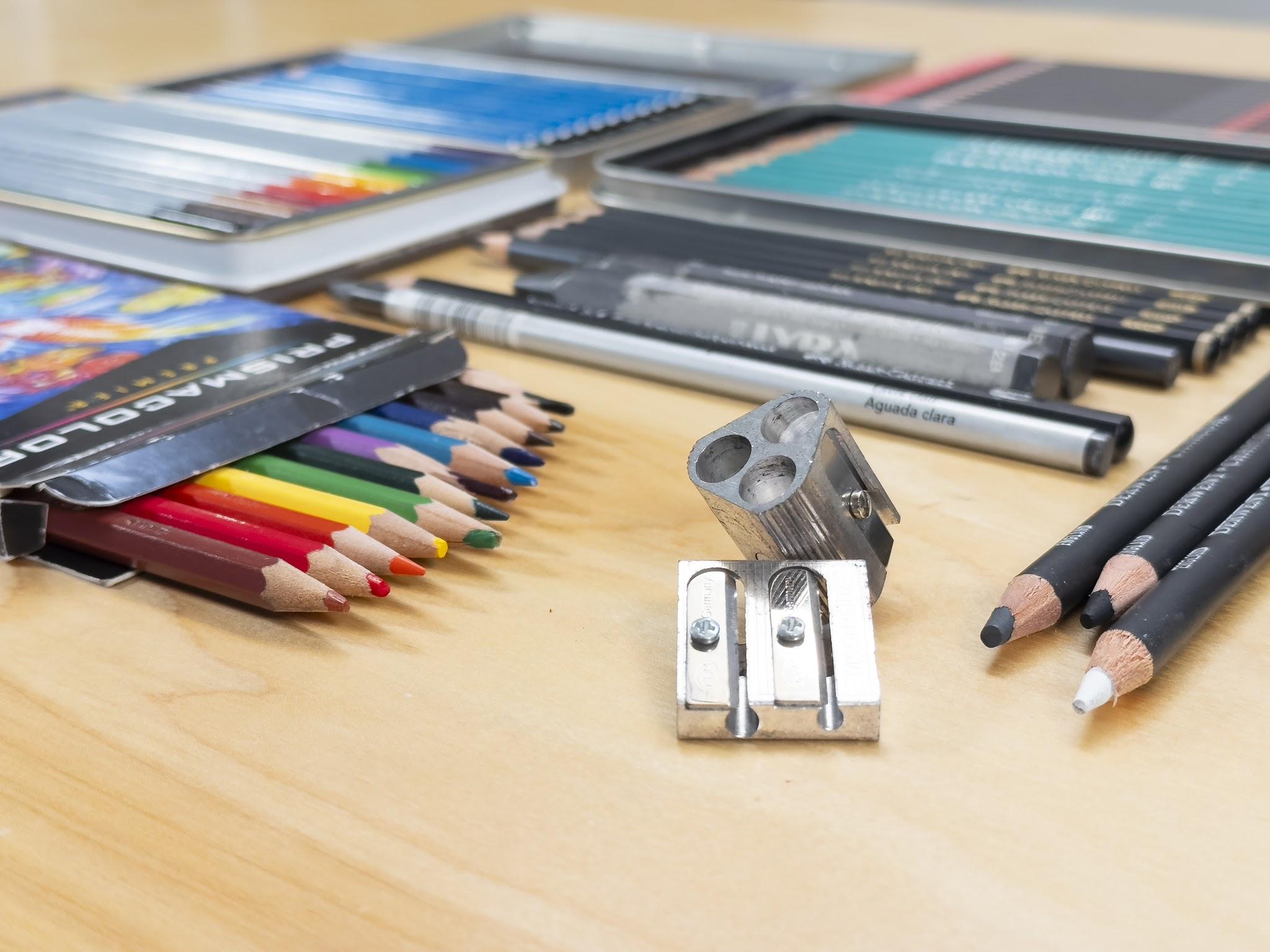
Artists who use paint pigments use the primary color system, RYB (red, yellow, blue). Pigments are physically mixed to create new colors. The color mixing process changes depending on the material. For instance, wet media such as paint, dyes, and inks can be mixed on a palette or directly on canvas, paper, etc. Whereas, dry media such as pastels and colored pencils must be mixed with drawing techniques such as hatching, cross-hatching, blending, and/or stippling directly on the drawing ground.
Drawing Techniques for Color
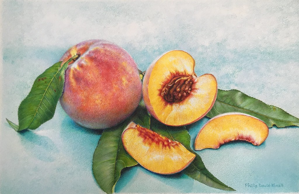
To use color in a drawing, an artist must be mindful of color’s attributes – hue, value, and saturation. For instance, if an artist decides to use colored pencils, the color is already in the tool. Even with one pencil, the artist can still control the level of value and saturation. If more pigment is applied, the darker and more saturated a color becomes. And if two colored pencils are used, then there is the option to mix them to desaturate the color and likely create a darker value. Dry color media can also be mixed with layers to achieve optical mixing. Various drawing techniques in different colors are shown in the image below.
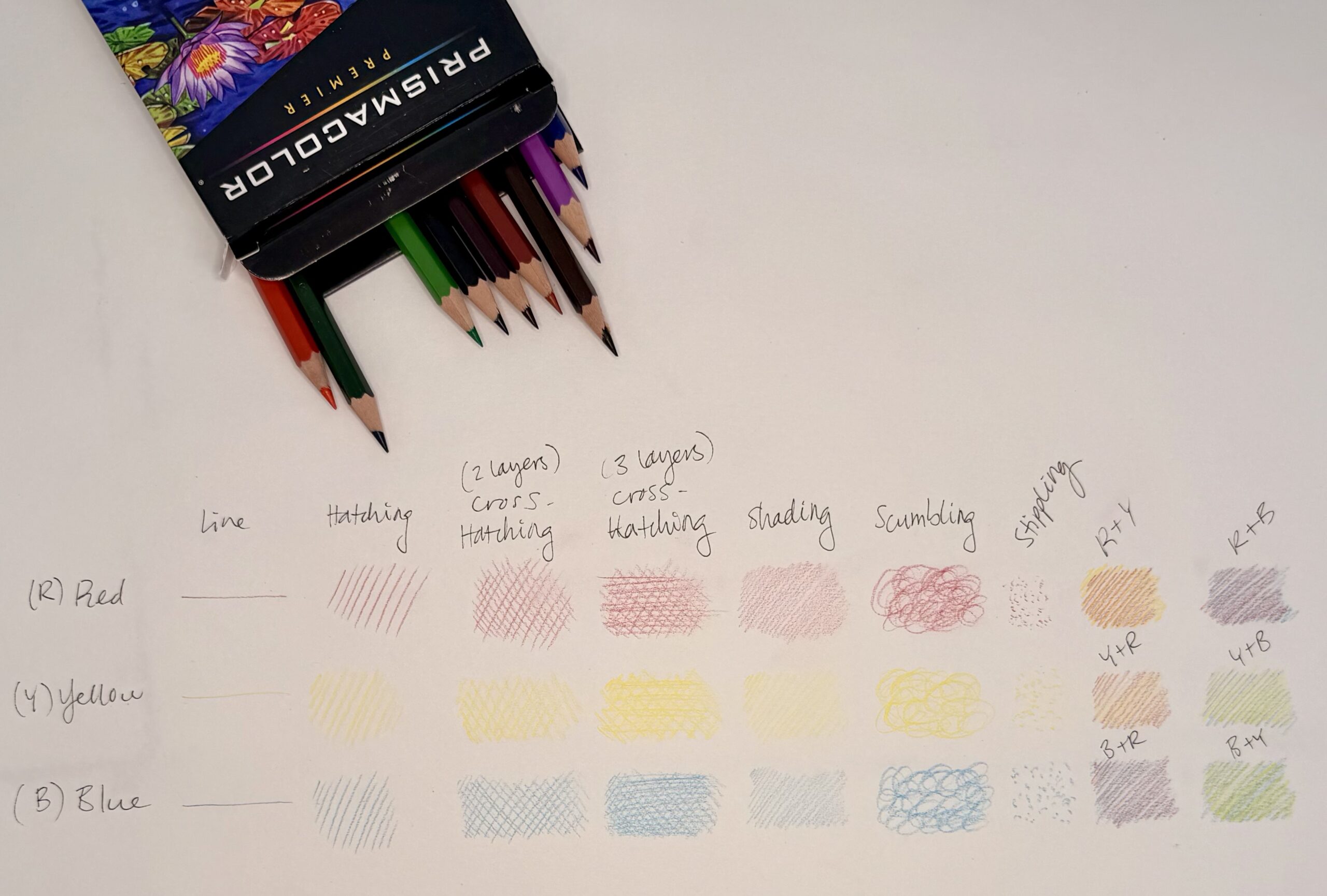
Col-Erase Prismacolor Pencil Technique Examples, Briana Miyoko Stanley, digital photo, License: CC BY NC 4.0
Conclusion
Color theory is a rich and complex field that greatly impacts not only every artist, but every person. The attributes of color include hue, value, and saturation. These attributes influence and characterize every visual phenomenon we perceive no matter the media that’s used to create it.
Licensing and Attributions
“Color.” Written by Briana Miyoko Stanley. License: CC BY
Color Activity
Spot Color Activity
Description
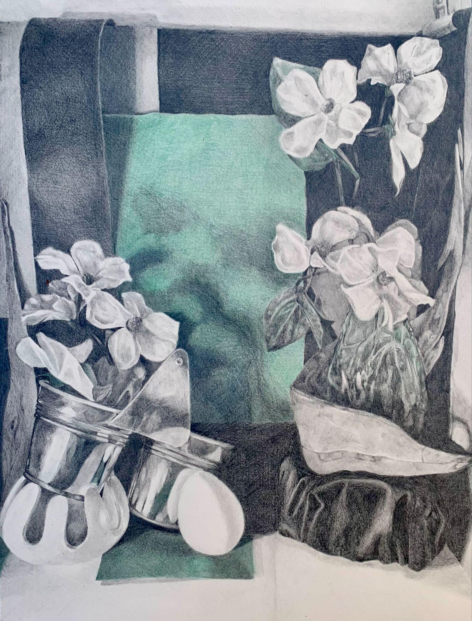
The Spot Color Activity is a limited palette still-life drawing. Spot color means using limited color to draw greater visual weight to a certain area of the composition. Use graphite and colored pencils to create the spot color drawing. In this assignment, the primary object or focal point will be rendered in color. Draw from direct observation to capture correct proportions, light logic, and color. Here you are using skills and concepts from the chapters on proportion and light logic. (Depending on the composition, a color that matches or corresponds with the primary object can be used in other areas of the still life as well.) The result will be a drawing rendered in black, gray, and white with spots of color. These spots of color will be one to two colors shown in various values and saturation to display light, shadow, and color temperature.
To create the drawing, build a themed still-life reference with white, gray, black, and chromatic (blue, yellow, orange, etc.) objects. For the theme, think of the still-life setup as a stage. Is the stage set as a tragedy, political satire, comedy, etc.? Artwork created with an intentional theme, also known as a concept, often becomes more successful because you, as the artist, are more invested in the outcome, there is a unifying idea, and an ultimate message conveyed to the viewer.
Choose objects with a variety of sizes and textures. Implement the theme with choices for the background, props, and light. Consider highlights, shadows, and the placement of objects to set an emotive intent – dark and moody, light and buoyant.
After the still-life reference is built, choose the project’s perspective. Is there a dominating view looking down on the scene, straight at it, from below? Consider the perspective as cinematic potential, like a still from a movie. The angle the shot is captured in guides the viewer’s experience.
Project Parameters
Duration
12-18 Hours
Size
14×16” Paper Size (12×16” Minimum Image Size with 1” Border)
Subject
A still-life composed of a backdrop, objects (minimum of 5), light, and shadow.
Technique
Direct Observation – draw the still-life object as it is seen
Materials
- Drawing Board
- One sheet of 14×18” (minimum) drawing paper
- Tracing Paper (14×18” minimum)
- Pencil Sharpener
- Graphite Pencils – HB & 2B
- Prismacolor Pencils (or
- Kneaded Eraser
- White Rubber Eraser
- Mono Zero Round Eraser
- Drafting Brush
- 1” Blue Painter’s Tape
- 36” Ruler
- Sighting Tool/Skewer Stick
- Viewfinder
Student Learning Outcomes (SLOs)
Use graphite and colored pencils to create a direct observation drawing of a themed still-life setup with accurate proportions, believable perspective, a full range of value, atmospheric perspective, light logic, implied texture, and spot color.
Method
Still-Life Setup Method
- Choose a theme (concept) to create a visually interesting still-life setup. Consider the backdrop, objects, and lighting conditions.
- Gather still-life materials that enhance the theme and vary in size, texture, value, and 1-2 colors.
- Building Materials
- Backdrop – paper or fabric
- Platform Items – boxes/additional items to act as supports to vary the height of objects in the still-life
- Object Categories – 1 of each (*however, you can add more objects)
- Chromatic Object – choose items with your group’s color & match one of your Prismacolor pencils
- Light Object – white, cream, etc.
- Dark Object – black, gray, etc.
- Glass or Metallic Object
- Organic Object – shell, dry plants/bark, pumpkin, artificial plants, etc.
- Lighting:
- Spotlight – single light source to illuminate the setup; position it to create interesting highlights and shadows
- Building Materials
- Build the Still-Life Setup
- Arrange the objects to represent the project’s theme
- Try to place objects so that some overlap, showing clearly what is in front or behind another object to add a sense of space.
- Account for both negative and positive space.
- Form connections that lead the eye around the composition.
- Be willing to change out objects and add others in.
- Arrange the objects to represent the project’s theme
- Intentionally Light the Still-Life Setup
- Lighting in a still-life setup is critical and can enhance or ruin a composition.
- A single source of light, preferably coming from the side, creates a clear pattern of lights and darks that helps define forms and relationships between objects.
- During setup, try a variety of lighting solutions, because different light effects can dramatically change the feel of the same composition.
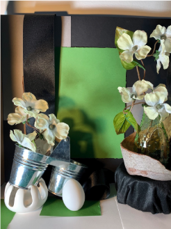
Still-Life Tips
- When picking objects for the still-life setup, consider if they are more important for their shape, texture, or pattern.
- Patterns can be lively and colorful, but they tend to obscure shapes. Don’t include more than 1-2 patterned objects in the same still-life setup.
Drawing Process
- Paper Preparations
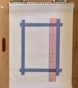
- Get one sheet of 14×18” tracing paper. Use an HB pencil and ruler to draw a 12×16” rectangle in the center.
- Once the tracing paper is prepared, clip it to a drawing board.
*Adding a piece of drawing paper below the tracing paper will improve the drawing visibility.
- Draw Proportion Boxes
- Refer back to the Observation Drawing Chapter for this technique
- Sight and measure to create proportion boxes on the prepared tracing paper. Use a viewfinder to help place proportion boxes in the correct location.
- Use a Prismacolor pencil to create the first proportion box. Use an object in the foreground.
- Use the viewfinder and crosshairs as guides to find the approximate location of the object on the tracing paper. Then, sight and measure to determine the object’s tallest, lowest, leftmost, and rightmost points to create an accurate proportion box.
- Use the same Prismacolor pencil to create proportion boxes for the remaining objects. Consider grouping objects when appropriate.
*Use the height and width of the first proportion box to find the proportions of the other objects in the still life. Remember to observe points of overlap to determine where one form intersects with another, and make sure to measure negative space between forms as well.
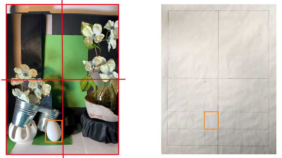
- Composition Drawing
- Use a different Prismacolor pencil to create the composition drawing. The composition drawing is the indication of forms. Carve away and block in the general forms of each object.
- Continually sight and measure to depict accurate proportions and spatial relationships. Use points of overlap and neighboring objects to create accurate objects.
- Once the construction drawing is complete, modify the contour lines, record shadow edges, and the finer details of the still-life.
- Double-check everything, including ellipses.
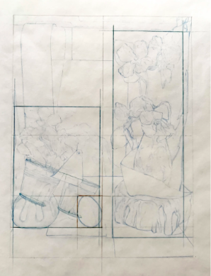
- Drawing Transfer
- After the composition drawing is modified, turn it over and trace the back of the tracing paper with a 2B graphite pencil. Do not transfer proportion boxes or any searching lines. These are not needed in the final drawing.
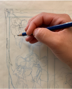
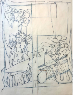
Spot Color Still Life Composition Drawing Development on Tracing Paper, Briana Miyoko Stanley, soft graphite on the back of tracing paper, License: CC BY NC 4.0
- Once the back of the composition drawing is traced, turn it over.
- Prepare a sheet of drawing paper.
- Get one sheet of 14×18” drawing paper & draw a 12×16” rectangle in the center with a ruler and HB graphite pencil.
- Use painter’s tape to protect the border. *Remove as much tackiness as possible before adding the tape to the drawing paper.
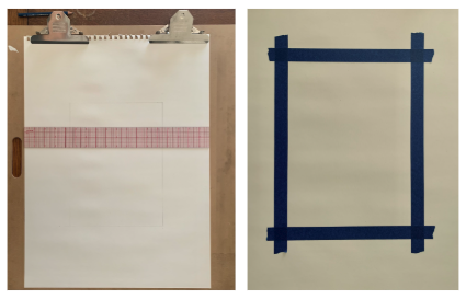
- Place the tracing paper right side up on the prepared sheet of drawing paper. This means the Prismacolor pencil side will be facing up, and the 2B graphite side should be facing down. Make sure the image is facing the right direction and that it is centered on the prepared drawing paper.
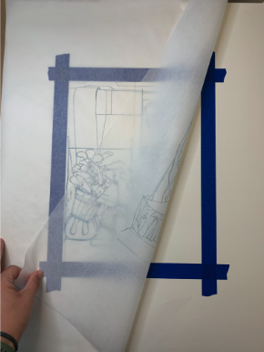
- Use a new Prismacolor pencil to transfer the construction drawing to the drawing paper. Do not press hard. If you do, the pencil will create an indented groove on your drawing paper that will leave a white outline around the shapes in your drawing when you begin to distribute value.
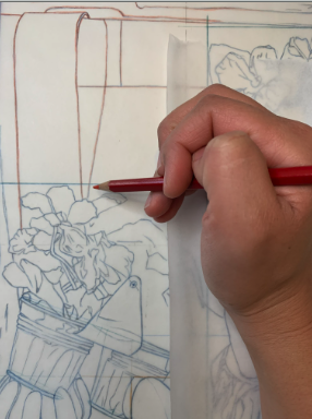
- After a small area of the construction drawing has been traced, hold the tracing paper firmly in place with one hand so that it does not move, and lift a corner of the tracing paper to make sure the drawing is transferring cleanly and lightly.
- The transferred lines should be very light because a dark outline will prevent you from creating subtle shifts in value within and between value shapes. If the transferred drawing is too dark, use a kneadable eraser to lighten it. The goal is to have lines that are barely visible.
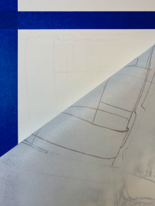
- Continue using the Prismacolor pencil to trace the composition drawing. Remember to only record the needed components of each object. Do not trace the crosshairs or proportion box lines.
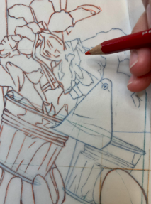
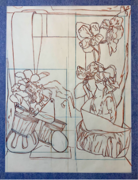
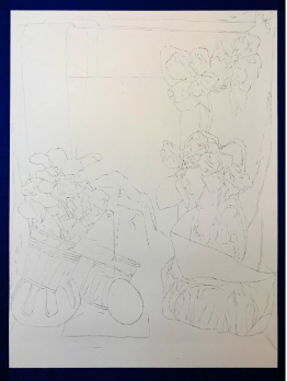
Spot Color Still Life Graphite Transfer Completion Example, Briana Miyoko Stanley, soft graphite transferred onto drawing paper from the back of tracing paper, License: CC BY NC 4.0
- Local Values
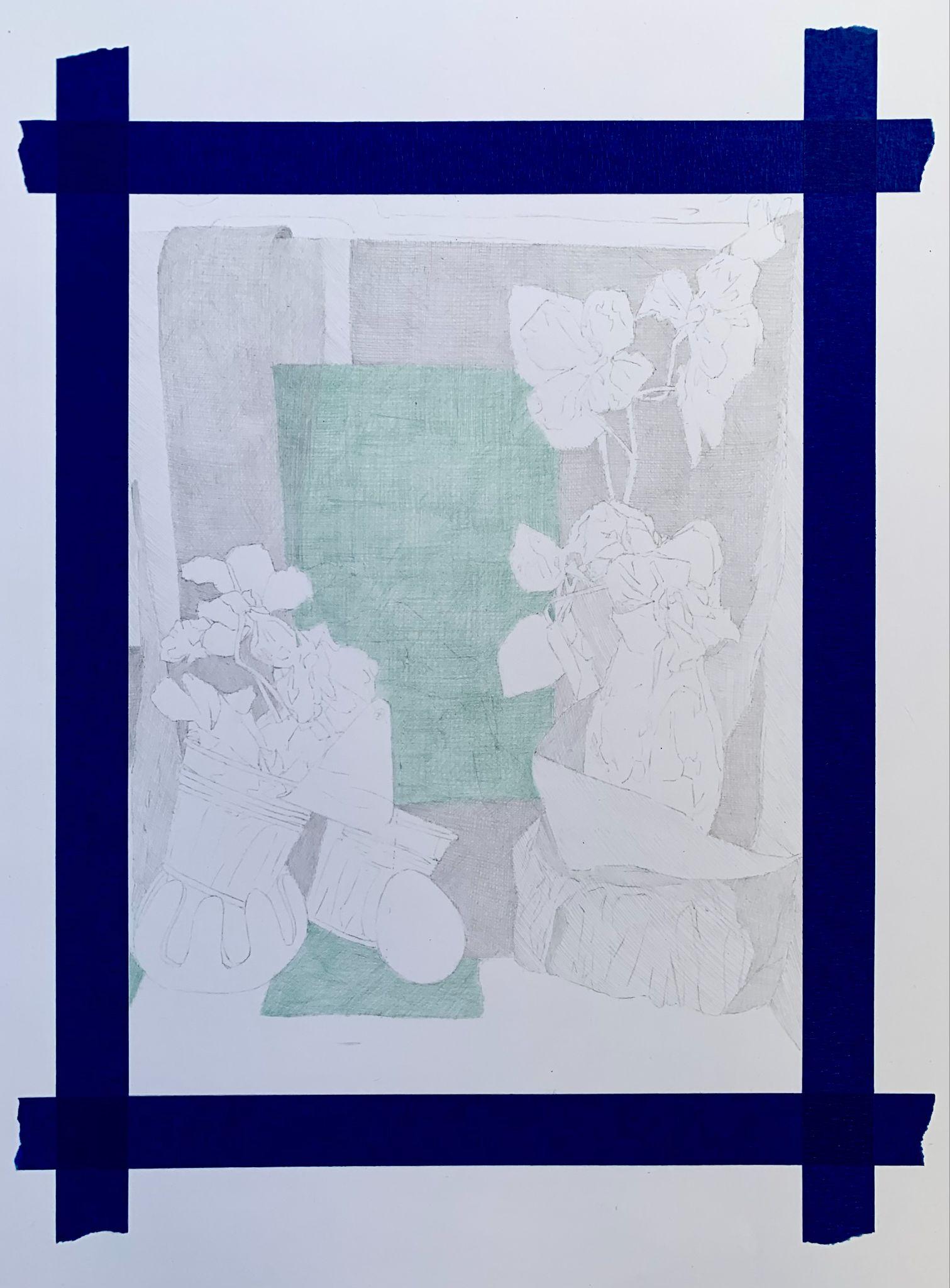
- Before developing the value pattern, establish the local value of each object in the still-life with HB graphite and Prismacolor pencil(s). Use extremely light layers to avoid unwanted texture.
- This drawing relies on additive drawing techniques. Preserve the white of the paper for the lightest value objects at this stage. Only distribute value in areas that are not white forms in direct light.
- To establish local value, cross-hatch with light and even pressure to build value. Place light layer upon light layer of graphite pencil hatch lines to establish the medium gray that represents the value of the shapes of light on the backdrop fabric.
- In the drawing, build the value or color of each object as it is observed in natural light. For instance, if an object is white, leave it the white of the page. If an object is grey, cross-hatch with graphite to achieve a grey. If an object is black, cross-hatch to add value until it is a dark grey (reserve the darkest darks for black objects in shadow). If an object is a color, use the corresponding Prismacolor to cross-hatch and build the color.
- In addition to establishing the local value of objects in HB pencil, light layers of Prismacolor hatch lines should also be placed on shapes representing spot color areas.
- For both HB graphite and Prismacolor pencils, follow the contours of the objects when distributing value.
- Use gradients instead of outlines. Remember that when a volumetric form turns away, it receives less light.
- Value & Color Development
- Use the HB graphite and Prismacolor pencil(s) to block in the value pattern of the drawing. Establish the value pattern of everything except the metal and glass objects.
- A value pattern records the overall relationship between light and dark.
- Indicate the simplest shapes of value and color throughout the picture plane. Work from general to specific. Separate the light and shadow sides of objects and leave the white areas the white of the paper. Indicate dark halftones on objects and cast shadows.
- At this stage, do not develop objects all the way to completion. This is the blocking in step of the value pattern so that visual relationships can be determined.
- Cast shadows have soft gradations and are not outlined. Shadows are darkest near the object. A cast shadow is a gradient that gets lighter as it moves away from the object. Its edge gets fuzzier along the perimeter.
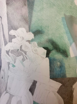
- The reflected light is located in the dark half-tone. When working with spot color, keep in mind that reflected light may not only include light value, but it can often include reflected color as well. Reflected light cannot be as light as actual light or highlights.
- For the metal and glass objects, add color and value where you see them and omit them where you can’t see them.
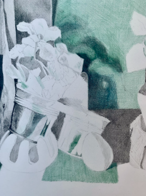
- Pay attention and record where the glass shows refraction, where the volumetric glass object curves, and where the thickness of the glass is visible.
- Objects behind glass will have a different value than unobscured objects. Record soft to hard edges observed in reflective surfaces.
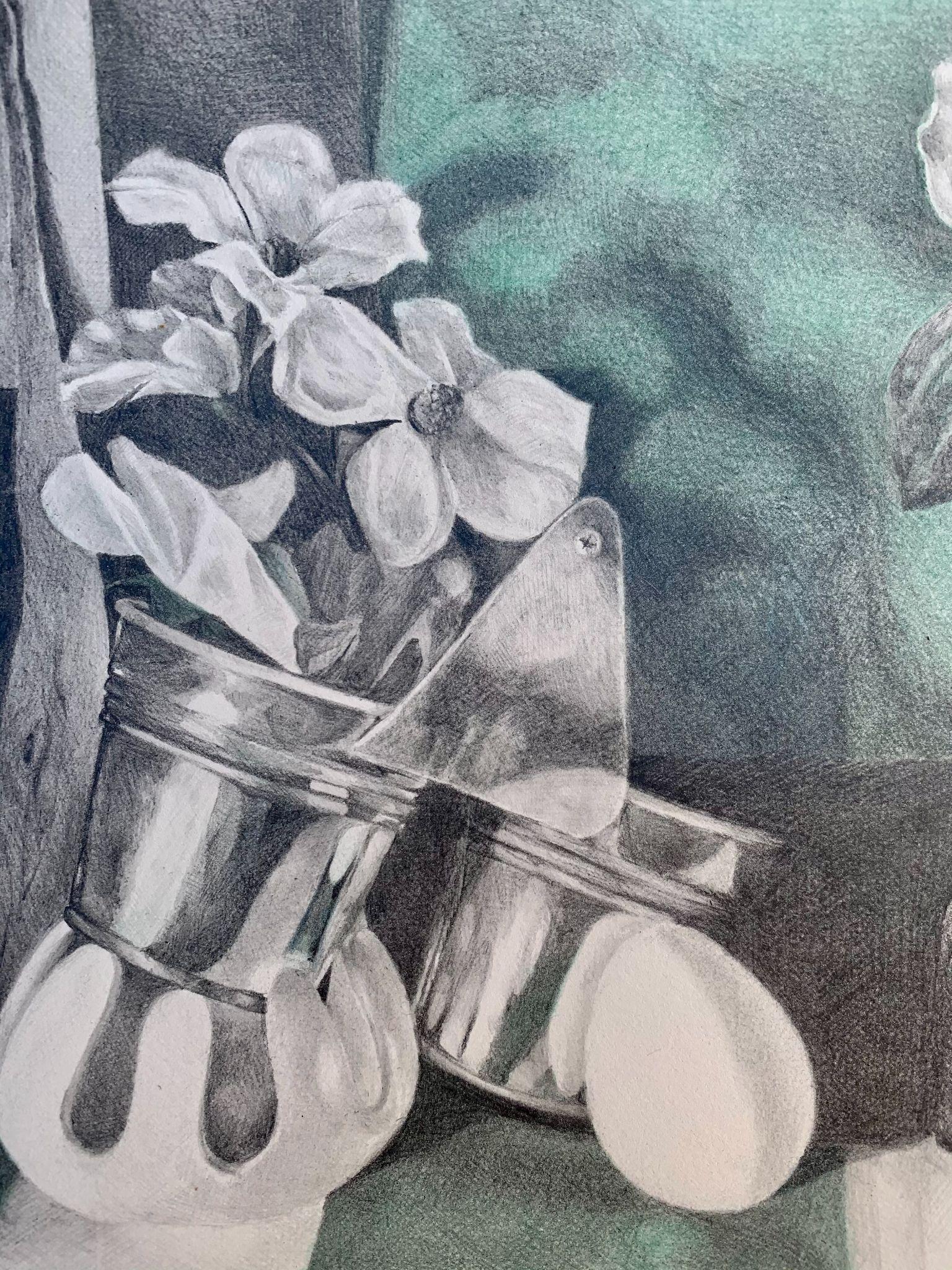
- Open shapes use lost and found edges. They add to the illusion of space and volume. Closed shapes flatten forms.
- Finishing Touches
- Use the HB graphite, 2B graphite, and Prismacolor pencil(s) to finish the value pattern of the drawing. Record the overall relationship of light and dark within the composition.
- Keep in mind that a difference in value describes objects, not lines. Also, remember to build the value gradually to avoid unwanted texture. The HB pencil will disburse lighter values in a cooler tone, while the 2B pencil will disburse darker values in a warmer tone.
- Use atmospheric perspective to determine spatial relationships. Lighter forms project, and darker forms recede. Higher contrast and sharper details come forward, while low contrast and fuzzy edges move back in space.
- Value describes characteristics that cannot be described by a line alone. Do not fill in an object, instead describe it.
- Reductive Drawing – When applicable, consider using the kneadable eraser and/or Mono Zero eraser to soften, refine, or even reductively draw. Though this drawing primarily relies on additive techniques, reductive drawing methods will improve the range of contrast and edge comparison.
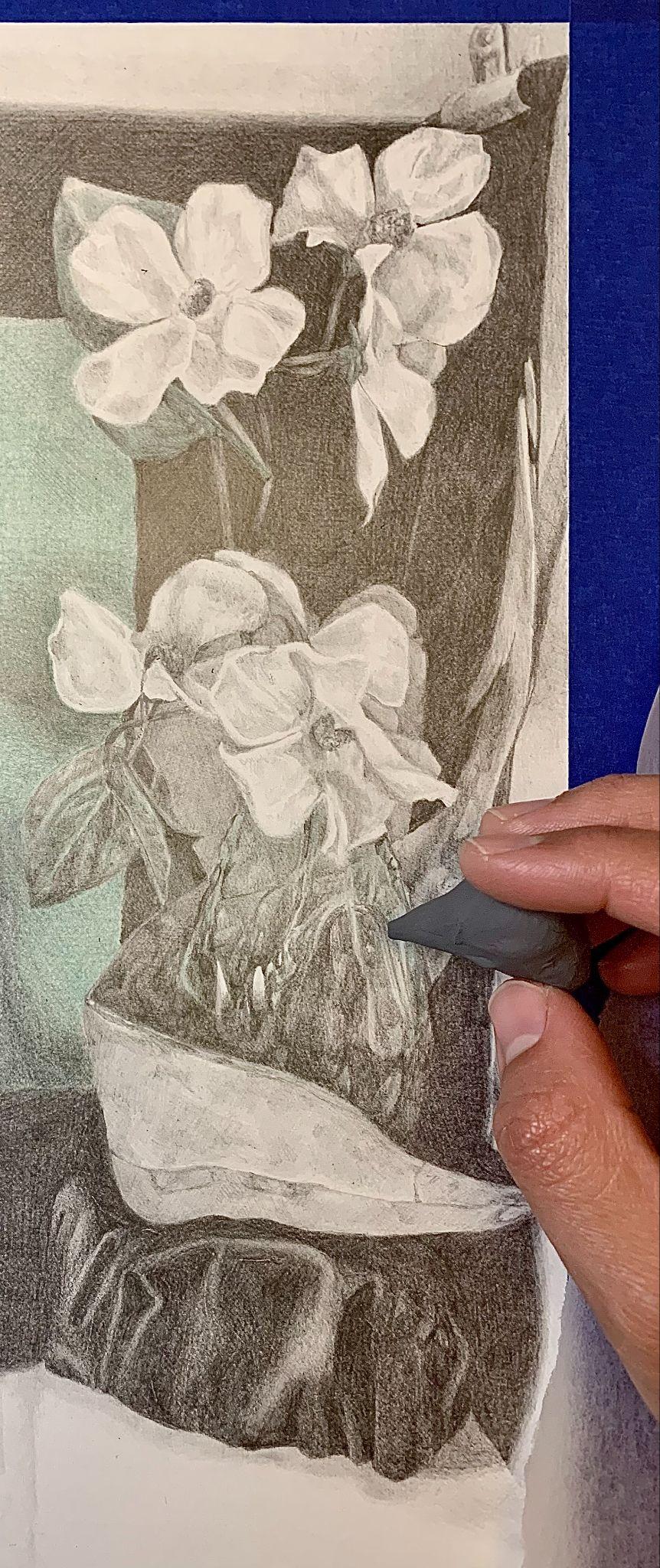
- Upside Down Test
- Flip the drawing upside down and assess what it needs. Step at least 6’ back, and ask what stands out first, second, and so on. Was the first thing the focal point? Is the area with the closest value range in the background?
- Depending on the answers, the drawing may need adjustments before it is complete.
- Re-Establish Compositional Order
- Revising an object’s value, edge, level of detail, etc., will reaffirm its spatial relationship in the composition.
- To create a hierarchical structure, selectively adjust values and make modifications to edges and levels of detail to provide order to your composition.
- These adjustments should be based on compositional considerations rather than on direct observation. Make adjustments that distinguish or diminish the visual prominence of certain areas, forms, or passages within the composition.
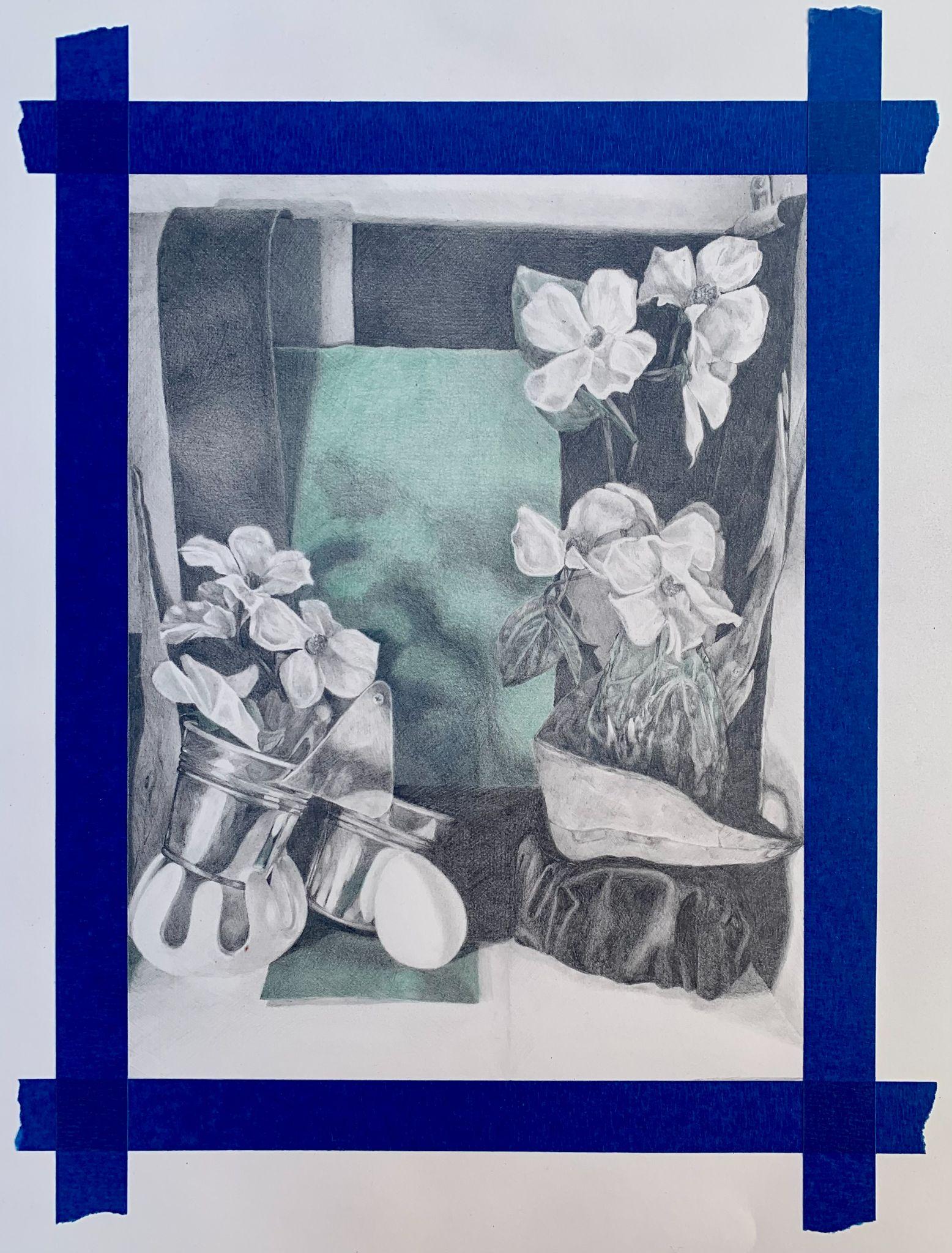
- Optional Step – Tape Removal
- To remove the protective border, carefully lift the tape from the corner and gently pull it away from the edge of the paper.
- If the tape does not release easily from the drawing paper, use a hairdryer to heat the tape’s adhesive. Firmly but gently, hold the drawing, carefully lift up a corner of the tape and with the hot air from the hairdryer directed at the section of tape you want to remove, carefully and slowly remove the tape from the paper. Repeat this process until all of the tape is removed.
- The final step in the drawing is to use your eraser to clean up its edges.
Drawing Tips
- When using color, alternate between Prismacolor and HB graphite pencil to build shadow.
- Develop all parts of the drawing at the same time. This will unify the drawing. Avoid creating a drawing composed of beautiful segments and details. This drawing assignment is all about relationships. Pay attention to edges and transitions from light to dark.
- Layer and build value. Avoid applying too much value or pressing too hard too quickly. Layering with light, even cross-hatching, avoids distracting texture or shine.
Result
The result will be a direct-observation drawing created with graphite and Col-Erase Prismacolor pencil that displays a scene with believable space, texture, light, and color.
Licensing and Attributions
“Color Activity.” Written by Briana Miyoko Stanley. License: CC BY