
Elements of Art & Principles of Design
Introduction
Every lower-division Studio Art and Art History course begins with an overview of the elements of art and principles of design. The terminology is the essential language we use when we speak about art formally. In this context, “formally” refers to the discussion of an artwork’s elements and principles, rather than its subject matter, iconography, or historical context.
Once you can comfortably use these terms to discuss existing artworks, they will begin to frame your own creative process. There is no doubt that you are already using these concepts in your practice. However, you can become more intentional with their use when they become part of your vocabulary and conscious thought.
If we consider art as a visual language, then the elements of art are the letters of the alphabet, while the principles of art are the words and sentences composed together to create meaning. In this chapter, the term composition will be used frequently. Composition refers to how the elements and principles are used together; it refers to the whole of the artwork, i.e., the result of the combination of different parts.
Elements of Art
Line
A line is defined as a point moving in space. This definition is wildly abstract. So, instead of focusing on that, let’s discuss the types of lines that you will practice in your development as an artist.
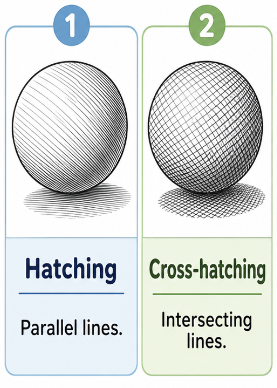
Hatch lines are closely spaced parallel lines, added to a form to create value and texture.
Crosshatching is shown in the image above and is used in techniques such as drawing and printmaking to create variations in value and texture. These variations in value and texture are achieved by placing multiple layers of parallel lines on top of each other.
Contour lines define the edges of a shape or form.
Actual lines vs. Implied lines: Actual lines are objectively present in an image. Implied lines are those that can be followed by the viewer’s eye, even though they are not explicitly drawn on the page. An artist creates an implied line by arranging the composition in a way that connects one or more parts together. A common way to create an implied line is through a figure looking towards something, also known as a line of sight. However, a figure can also point towards something to create an implied line.
Classic lines, also known as “straight lines,” move vertically, horizontally, or diagonally across the composition to provide a sense of structure. Vertical and horizontal lines create a sense of stability, while diagonal lines give the viewer the sense that the image is moving or unstable.
Expressive lines are the curvy and organic lines that can make a work feel dynamic and add emotional expression to the composition.
Shape
Shape is an element consisting only of height and width; it is flat or two-dimensional (2D). Shapes can be defined by contour lines or simply by a change in color or value.
Geometric shapes are taught in geometry class: circles, squares, triangles, etc. They have a sense of symmetry and clear structure.
Organic shapes are the other shapes that are not geometric; they are more free-form and irregular, such as trees and clouds. The human form is an organic shape that is often broken up into smaller, geometric shapes to create ease in the drawing process. Organic shapes occur naturally in the world and lack the formal, symmetrical structure of geometric shapes.
Form
Form is best defined as a shape with depth, or an illusion of depth in 2D works. Forms can also be classified, like shapes, as organic or geometric.
Space
Space, sometimes referred to as ground or negative space, generally refers to the area surrounding components or objects in an artwork.
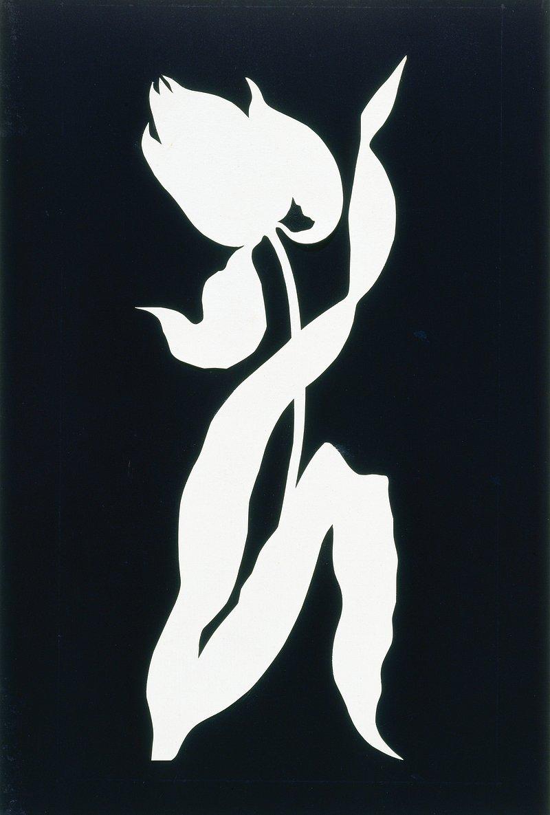
Positive space is the subject or figure of an artwork, while negative space is the ground, background, or environment that surrounds the subject. Positive and negative space are compositional elements of art, also known as figure-ground.
In the work above, the white area of the composition is positive space, also referred to as the subject. The positive space is in the shape of a tulip’s flower, stem, and leaves; notice how the white is consistent without any breaks or interruptions. This occurs because the artwork follows the positive and negative technique, in which, when a positive space overlaps a positive space, they combine into one seamless shape. In the image above, the negative space is represented in black, also known as the ground.
Pictorial space is the term used to describe the three-dimensional (3D) depth in a two-dimensional (2D) work. It is created through various illusions that appear to stretch back into space beyond the picture plane of a 2D work. If you think of a 2D artwork as a view out of a window, the picture plane is the glass of the window.
Linear perspective is a technique invented by the Ancient Romans and rediscovered during the Italian Renaissance that creates an illusion of 3D space on a 2D surface through the use of lines. You’ll learn more about linear perspective in the Perspective Chapter.
Atmospheric/aerial perspective is another technique artists use to create an illusion of 3D space on a 2D surface. This technique involves the artist making objects in the distance appear further away. Some ways to achieve this effect include portraying subjects with less detail, lower contrast, softer edges, and cooler colors as they move back in space. This is discussed further in the discussion of Color below.
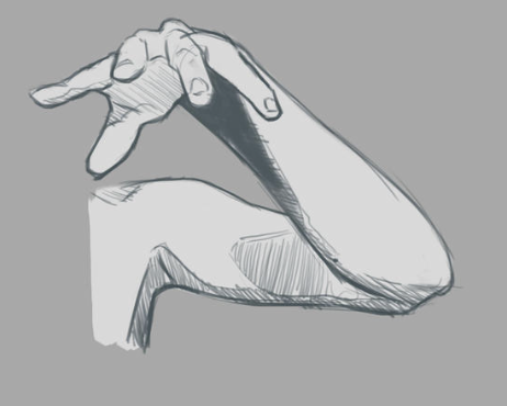
Foreshortening uses perspective to contract an object to make it appear as if it recedes in space. This concept is best understood with a visual example, so refer to the image below. Notice how the middle finger is positioned in a way that blocks its own full view? It’s collapsed to give the illusion of receding into space / advancing towards the viewer.
Color
Color is another element with a rather abstract definition: the quality of an object that light reflects. Following this abstract definition, we can move on to discuss its technical importance to image-making by discussing the following color terms. Understanding the following concepts can help an artist move beyond the replication of reality into more expressive uses of color.
Saturation is the level of intensity or brightness of color.
Hue refers to colors, such as red, blue, and yellow, at their full saturation.
Tint is a hue mixed with white.
Tone is a hue mixed with gray.
Shade is a hue mixed with black.
Primary colors are the three basic colors, from which all other colors are made. They are red, yellow, and blue.
Secondary colors are made when two primary colors are mixed together. They are orange, green, and violet.
Tertiary colors are created when a primary and a secondary color are mixed together. An example is red-violet.
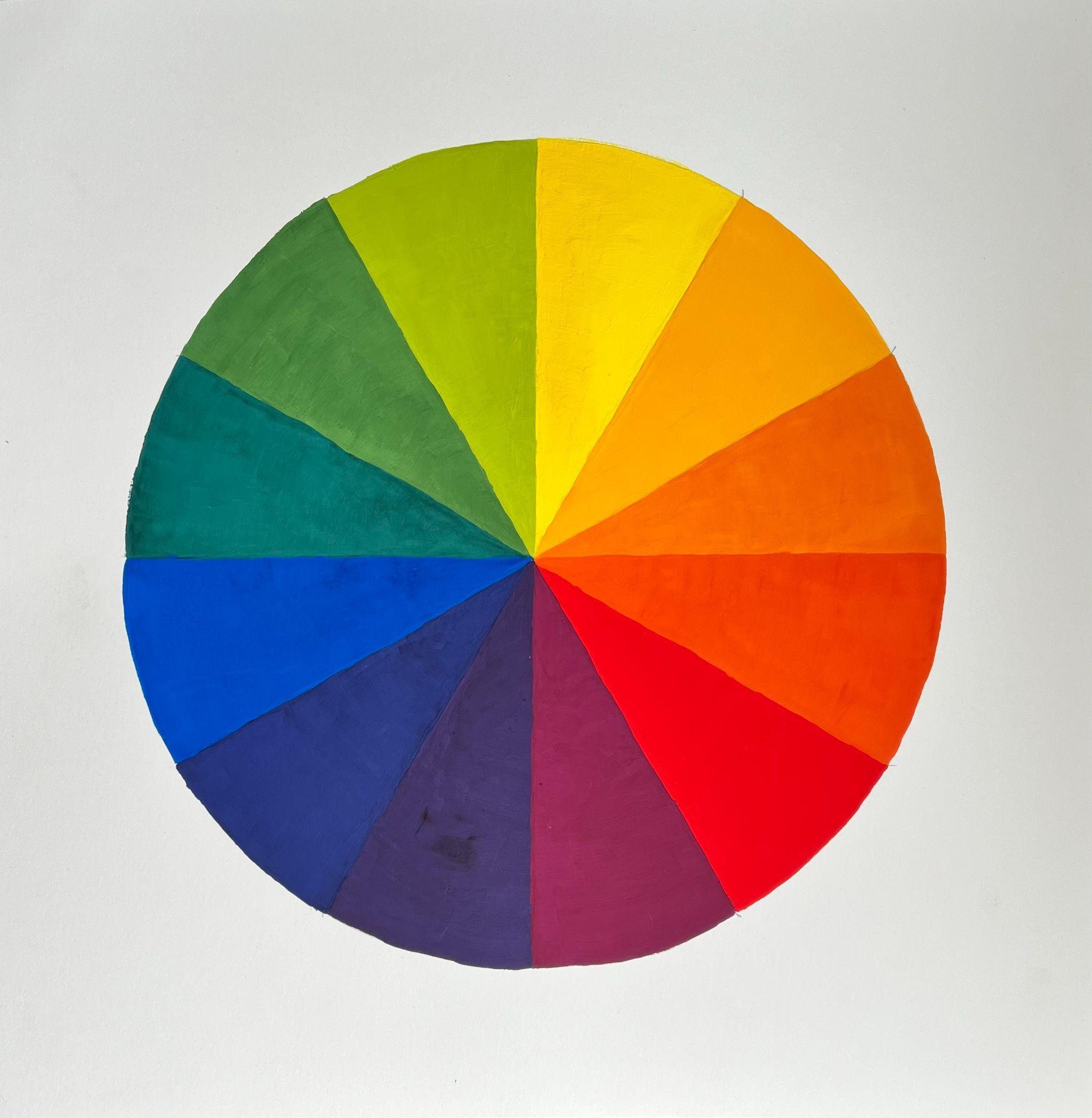
Complementary colors are colors across the color wheel from each other. When placed next to one another, they create high contrast. When combined, they create browns or grays.
Analogous colors are next to each other on the color wheel. Typically, this scheme will include three neighboring colors such as red, red-violet, and violet.
Warm colors are shown on the right half of the color wheel above. They include yellow, yellow-orange, orange, red-orange, red, and red-violet. An easy way to remember these colors is to think of a fire or a hot piece of metal.
Cool colors are shown on the left half of the color wheel above. They include violet, blue-violet, blue, blue-green, green, and yellow-green. An easy way to remember these colors is to think of water.
Artists use warm and cool colors for various compositional and expressive effects in their works. For example, using warm colors in the foreground and cool colors in the background creates an illusion of depth in a 2D work. This happens because of the way the viewer’s eye processes color; our brains know that views at a distance (when outside) often have a layer of atmosphere between our eyes and the distant object, making it appear more cool. This is part of a technique called atmospheric perspective, in which artists make distant objects cooler and less detailed to create an illusion of 3D depth on a 2D surface.
Value
This is the lightness or darkness of a color. Value helps present how objects occupy space in a drawing, appearing to advance towards or recede from the viewer.
High-value contrast is the extreme difference between the lightest and darkest values used in a drawing, ex: a black and white drawing.
Low-value contrast drawings feature a smaller difference between the lightest and darkest values used, ex: light gray and medium gray.
In the Value Chapter of this textbook, you’ll learn how to understand the predictable nature of light to manipulate value and create realistic shadows in your drawings.
Texture
Texture is a quality that can be physically felt or implied.
Actual texture or real texture are terms for a texture you can physically feel.
Implied texture is created through visual illusion.
Master Artist: Albrecht Dürer and Implied Texture
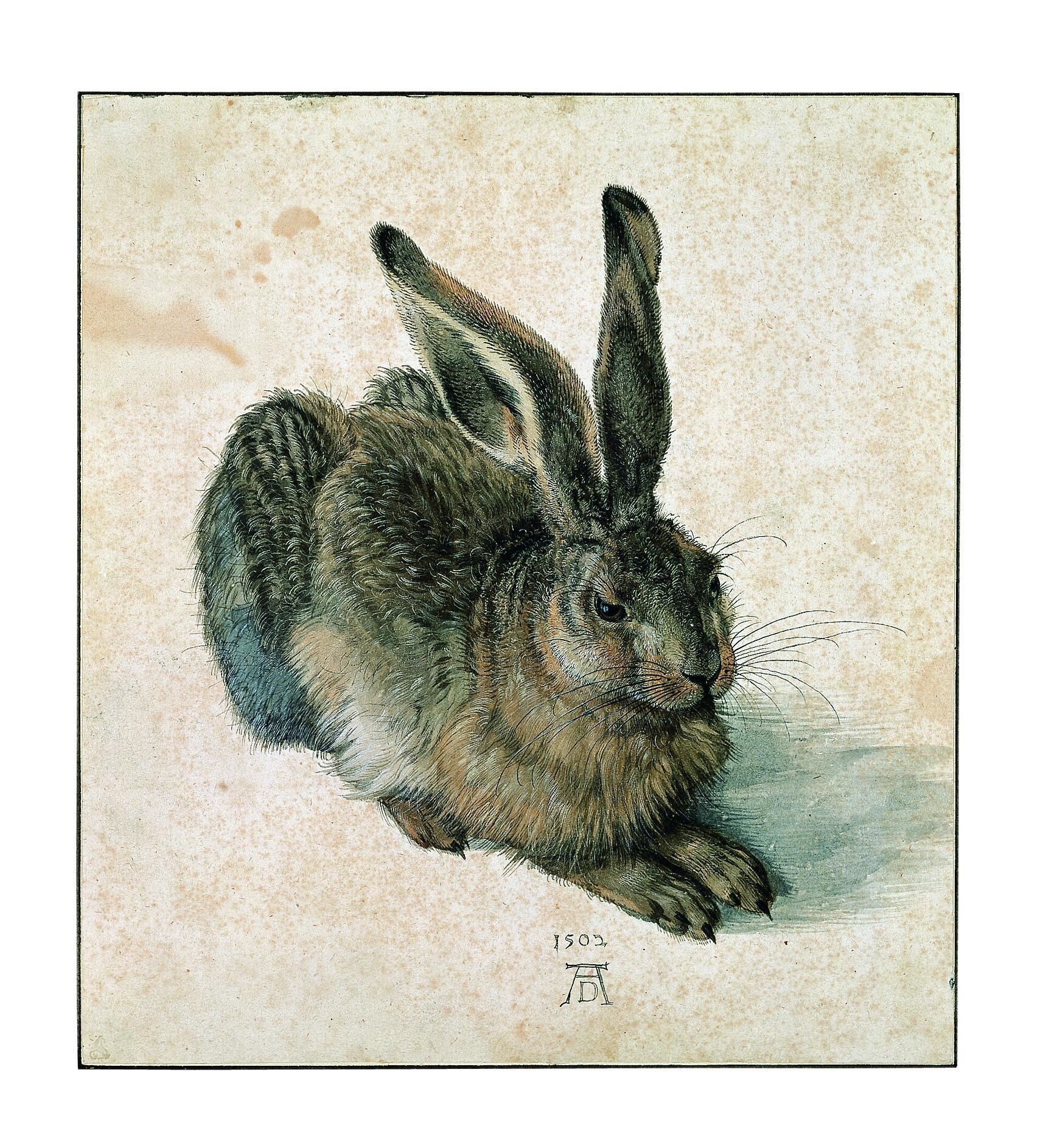
With drawings, artists tend to focus on implied texture rather than actual texture. A notable example from Art History of an artist who clearly mastered this skill is Albrecht Dürer. In his artwork below of a rabbit, one can distinguish many different textures. The rabbit appears to have glossy, wet eyes. Its coat has areas of rougher, longer hair on its body and shorter, more velvety-looking fuzz on its ears.
Although famous for his prints made from woodcuts and engravings, Albrecht Dürer succeeded in many different media. His painstaking attention to detail and objective drawing skill translate from printmaking to watercolor and gouache (as below) and even to oil painting.
“Master Artist: Texture.” Written by Elaine Wilson. License: CC BY
Principles of Design
The principles of design govern how the formal elements are arranged in a composition and how they are used together to create visual effects.
Pattern
Pattern is the repetition of an image multiple times throughout an artwork.
Nigerian artist Njideka Akunyili Crosby uses pattern to great effect in her work. Her work is not visually included in this text for copyright reasons, but you are encouraged to click on the link and explore it. She uses uniform patterns, which consist of symmetrical, repeated imagery, across many of her compositions. Crosby’s works also make use of geometric patterns, which feature repeated geometric shapes.
However, what makes her work so unique is that Crosby creates a sense of pattern through her specific technique of photomontage. The images she sources: magazines, album covers, and family photographs, are used to decorate surfaces in her artworks such as carpets, clothing, bedspreads, and wallpaper.[1] This imagery is transformed into a pattern through her placement techniques. The unique forms are made to look like a pattern from afar through their similar scale and color palette.
These combinations create pattern variety throughout each of Crosby’s works. Pattern variety is a form of contrast and keeps the image from being too uniform.
Emphasis
Emphasis refers to the region of the artwork that the viewer’s eye is most drawn to. Artists can create emphasis by employing the various elements and principles in visually striking ways.
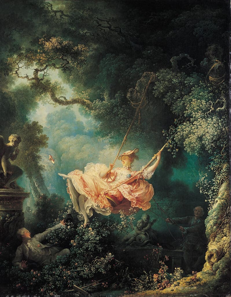
An example of emphasis in a work can be seen below in Fragonard’s Rococo painting, The Swing. The viewer’s eye is immediately directed towards the woman on the swing because the lighting in the forest highlights her brightly colored dress and she is placed in the center of the composition.
Contrast
Put simply, contrast refers to difference. You can create a difference between any of the formal elements, for example:
Texture contrast: smooth vs. textured
Shape contrast: rectilinear vs. curvilinear
Color contrast: light vs. dark
Harmony
Harmony creates artworks that are peaceful or have some visually pleasing effect.
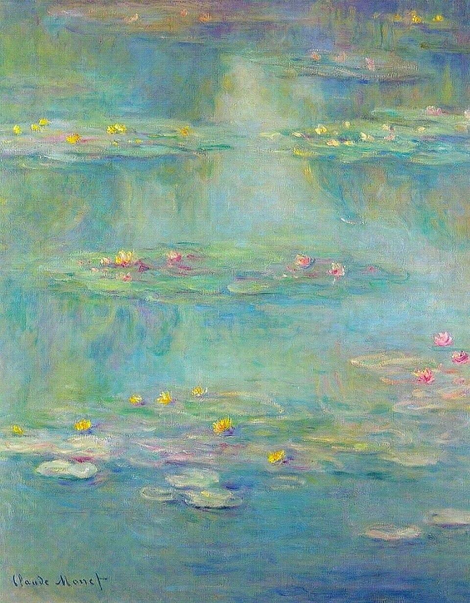
A common way to create harmony is through color harmony, as in the work below, which uses analogous colors in its color palette.
Variety
Variety is used to break up monotony; it involves the use of different elements to create visual interest.
Chuck Close’s 1997 Self-Portrait appears naturalistic at a glance, yet if you look closely, you can see the great variety of shapes and colors he uses to create an extra level of intrigue in the work. Close uses the grid method to break down his reference photograph into manageable sections to work from when transferring the image to the large canvas. In this example, instead of working in the Photorealism style he’s famous for, he creates the overall image from seemingly abstract puzzle pieces that, when viewed up close, appear visually unrelated to one another, but when viewed from a distance, knit together to create a recognizable portrait.
Unity
Unity is a concept that can be expressed in many different ways, but generally, it refers to when there are visual links throughout a composition. A lack of unity may leave an artwork feeling random or confusing.
For example, see the Delacroix below.
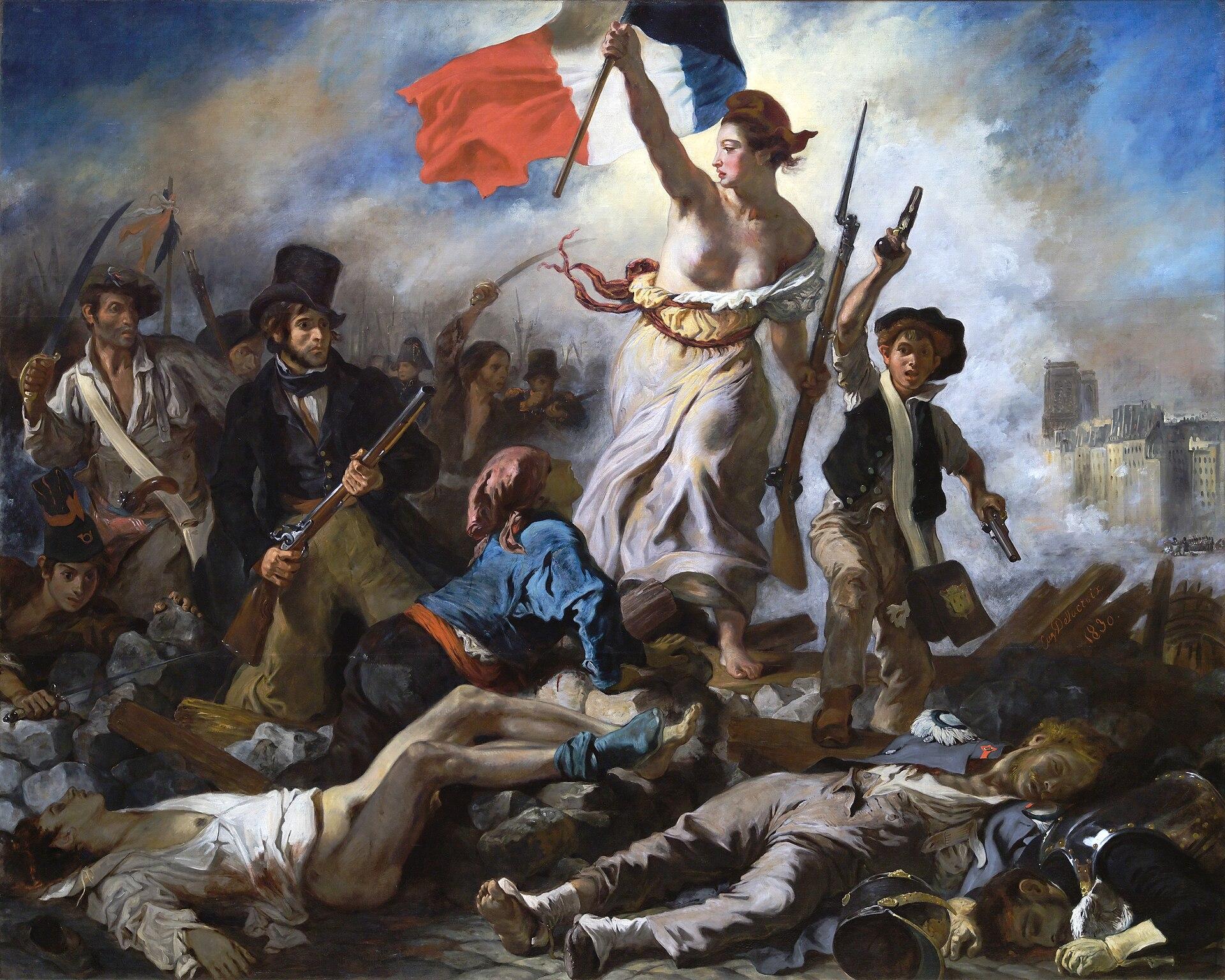
Delacroix creates unity throughout the above composition through color. He repeats the colors of the French flag (blue, white, and red) throughout the composition. This unity helps draw the viewer’s eye around and also unifies the image around the central theme of the work: patriotism.
Balance
There are many ways to create balance (or imbalance) in a composition. Balance is concerned with the placement of visual weight across an artwork. Visual weight is made up of a mixture of elements and principles, and is best explained with a visual example, as shown below.
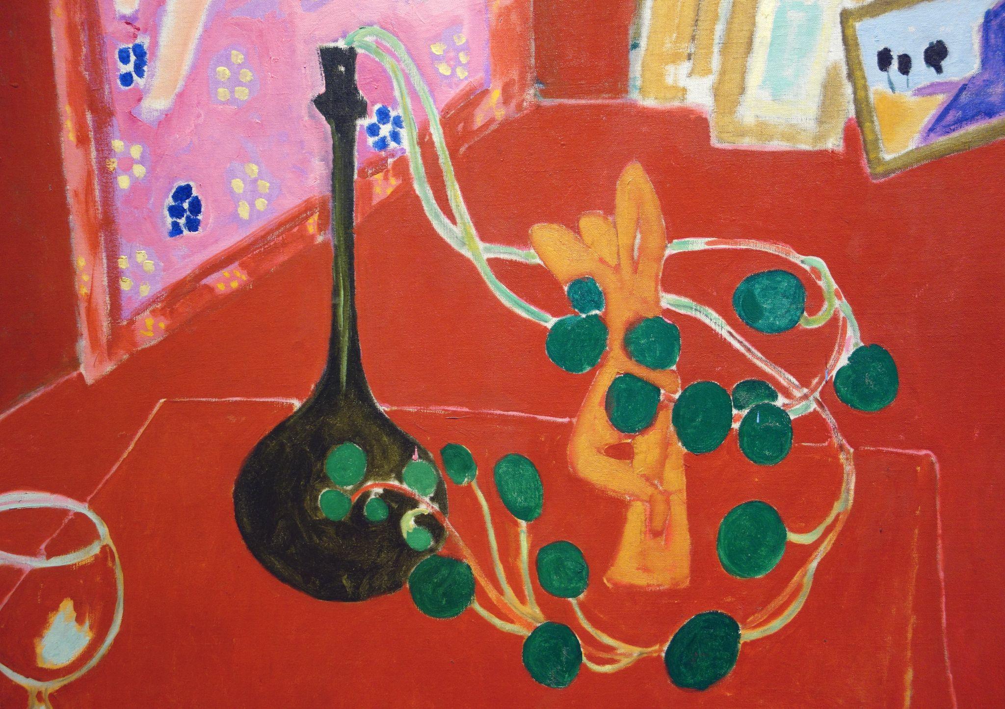
Matisse’s work, The Red Studio, is not symmetrical, yet it has a sense of balance because the artist has placed the visual weight intentionally. There is a vase on the left side of the composition, which feels heavy in visual weight due to its dark color and rounded bottom, yet its tapered top and height result in less visual weight towards the top of the composition. To balance out this weight on the right of the composition, there are several rounded shapes of medium green that flow towards the lower right side. Matisse uses color, scale, and placement to create a sense of balanced visual weight. Neither side of the composition feels significantly heavier or lighter than the other. Rather than placing two of the same vases side by side to create perfect symmetry, this is more complex and therefore more visually interesting.
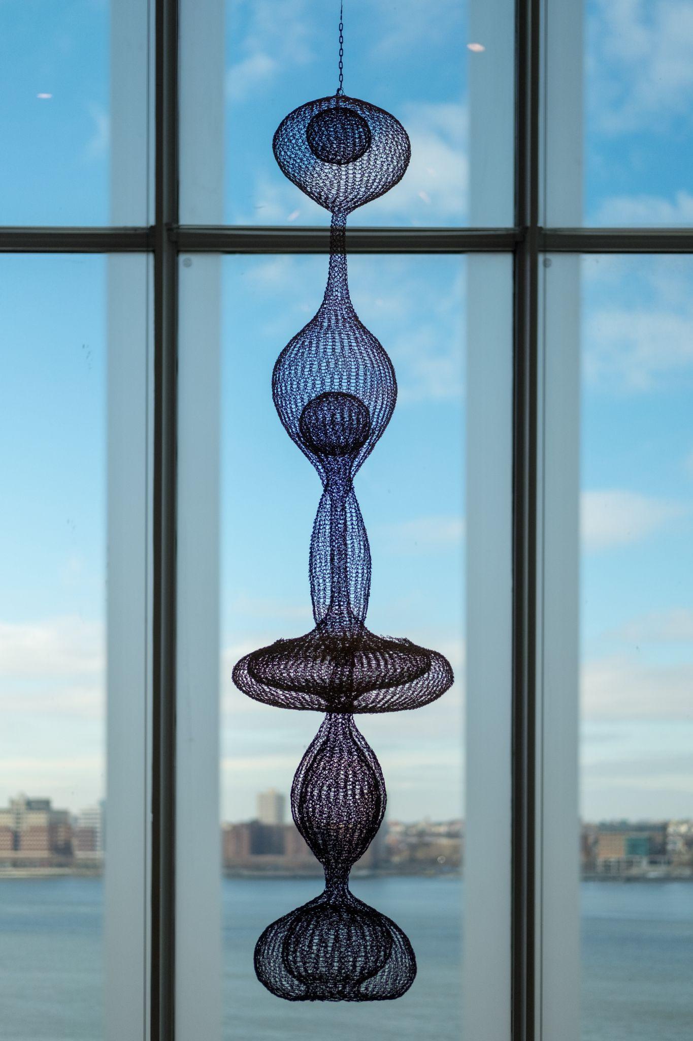
Symmetry may come to mind when considering how to balance an image. Bilateral symmetry mirrors two halves of an image, as seen below in the work of Ruth Asawa.
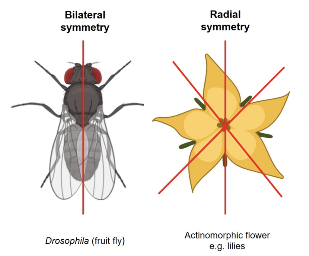
Another type of balance is radial symmetry. This happens when an artwork is balanced in orientation towards a central point, as seen in the diagram below.
On the other hand, an artist can deliberately make their composition asymmetrical. This would involve a deliberate imbalance to perhaps create a sense of uneasiness or to imply movement.
Some artists subscribe to a composition organizational principle known as The Rule of Thirds. To apply the Rule of Thirds to balance one’s artwork, one would imagine a grid of 9 boxes over the artwork, as seen below:
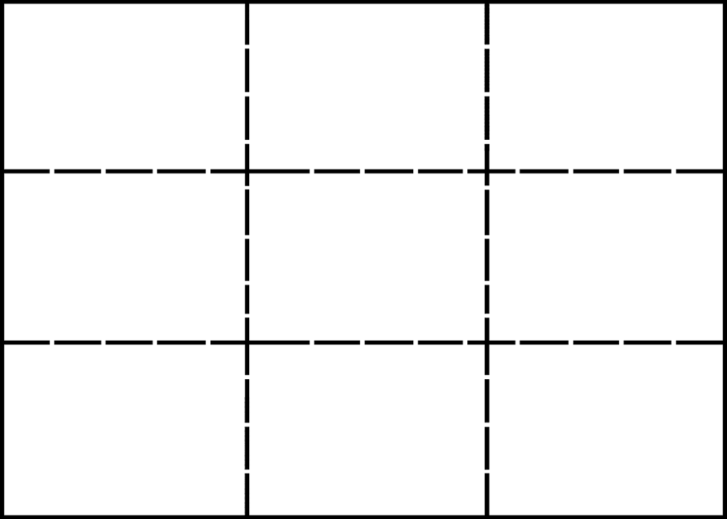
The artist would then place areas of emphasis over grid intersections. This approach creates opportunities for more dynamic compositions when compared to placing a focal point in the center of a composition.
The Golden Ratio is another way to organize and create balance in a composition; it’s a method based on mathematical calculations. Essentially, it consists of arranging one’s composition based on the spiral shown below:
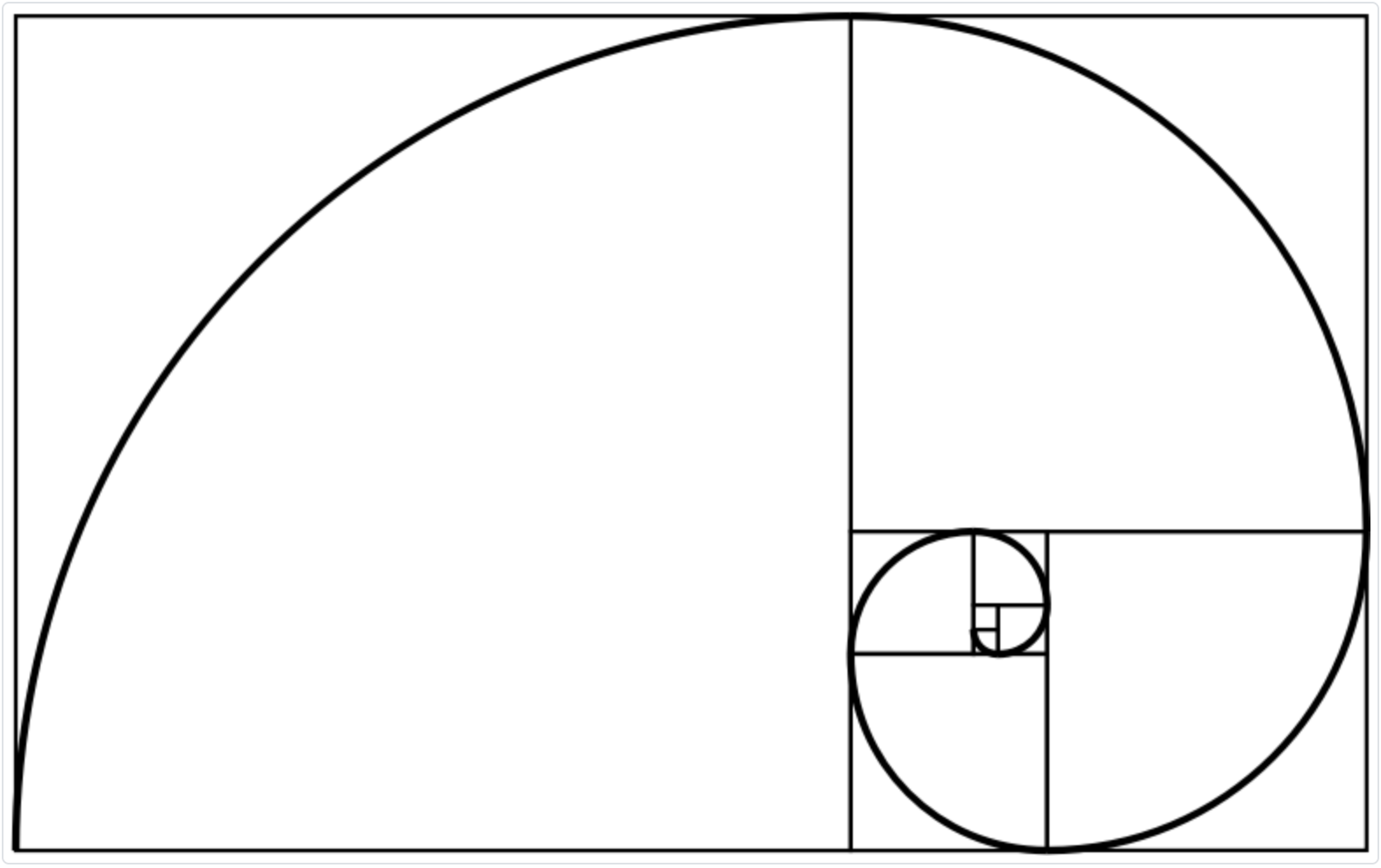
One’s subject would be placed in the center of the spiral, then the spiraling tail would ideally line up with other important areas in the composition. The spiral would draw the viewer’s eye outwards via an implied line across the composition.
Movement
Your drawing will not move (unless you’re interested in pursuing kinetic art), but you can imply a sense of movement with how you organize your composition.
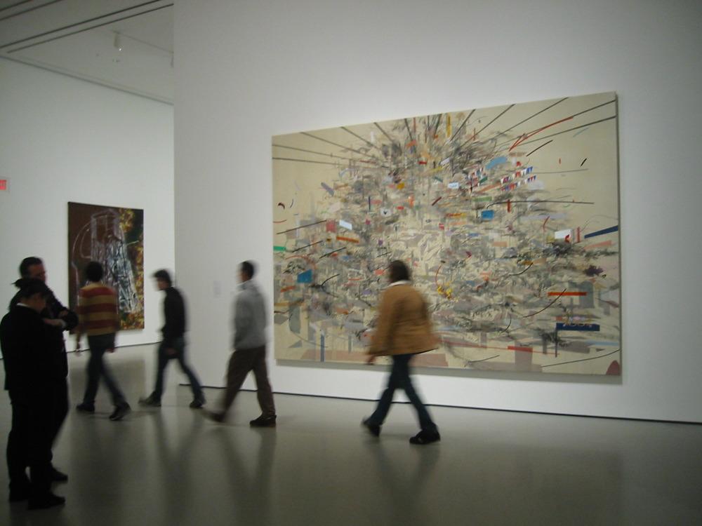
Ethiopian American artist Julie Mehretu is famous for her incredibly dynamic 2D artworks. In the artwork below, Julie Mehretu uses radiating and swirling lines to create a sense of spinning and turning in her composition.
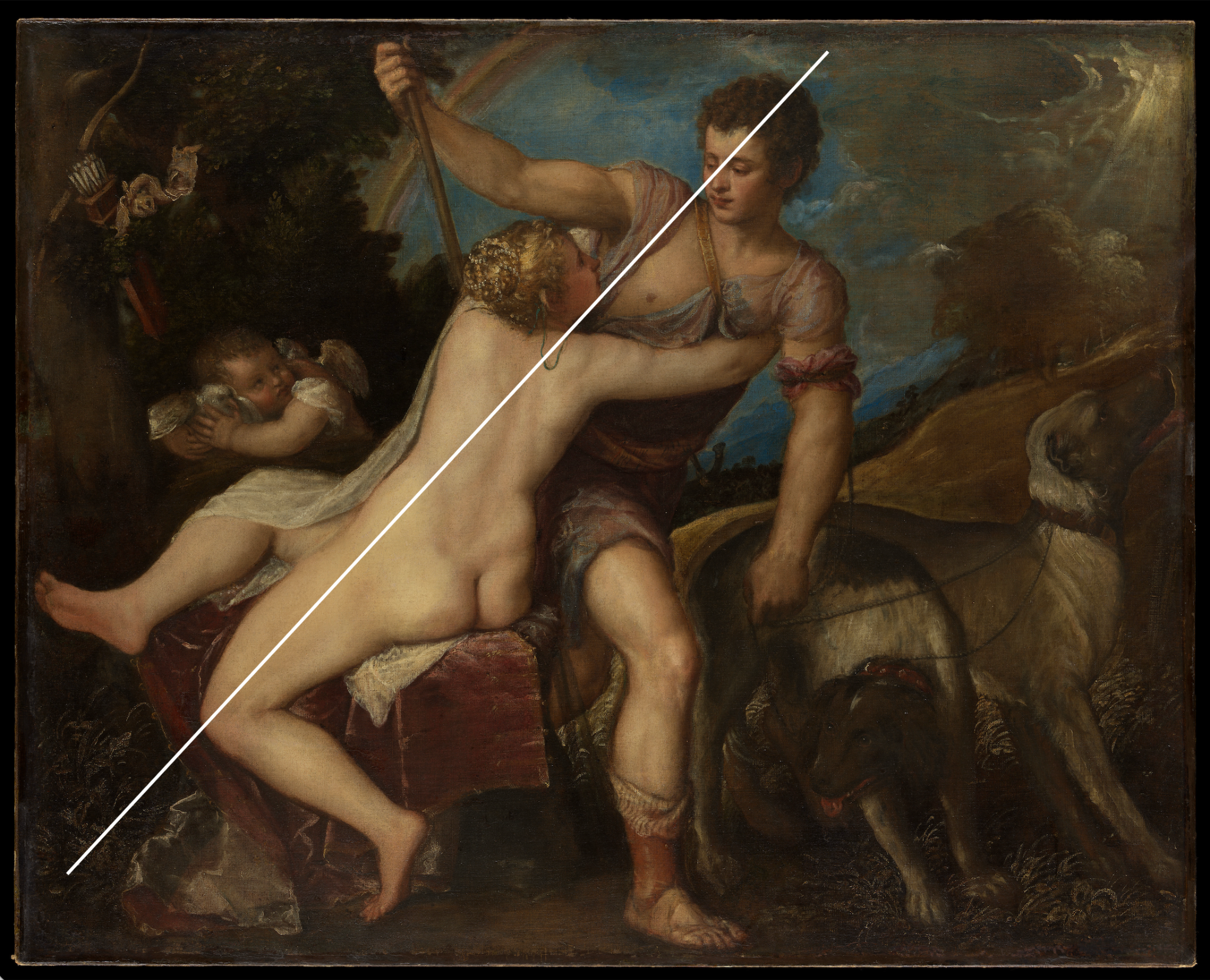
Another common way to create a sense of movement is with a diagonal axis line. In his painting Venus and Adonis (see below), Titian uses a diagonal axis line to create a sense of compositional imbalance and imply movement. The result is akin to a film still; the viewer expects Adonis to run off any moment, and for Venus to fall backwards as he moves away.
Proportion & Scale
These concepts both relate to size, yet in different ways. Proportion refers to the size difference of parts in relation to a whole. A common example of proportion is the comparison of the size of a body part to the size of the whole body. Another example of a proportion relationship would be the size of a part of the artwork in comparison to the size of the entire composition.
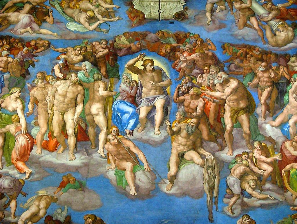
In the artwork below, Michelangelo was extremely deliberate with how he proportioned the human form. He worked during the High Renaissance, when Greco-Roman beauty ideals were in fashion, so he greatly exaggerated the proportions of his forms. The bodies are extremely muscular to an unachievable degree. Some Art Historians consider this artwork, specifically, to be a part of the Mannerist art style period because of the extreme distortion of human proportion, which goes beyond typical Renaissance body ideals.
Scale refers to the size relationship between two distinct forms.
The above artwork has a great example of a common use of scale, to create an illusion of space in an artwork through the diminution of scale. As the composition recedes into space, the human forms diminish in scale (get smaller). The forms that are meant to appear closest to the viewer are the largest in scale.
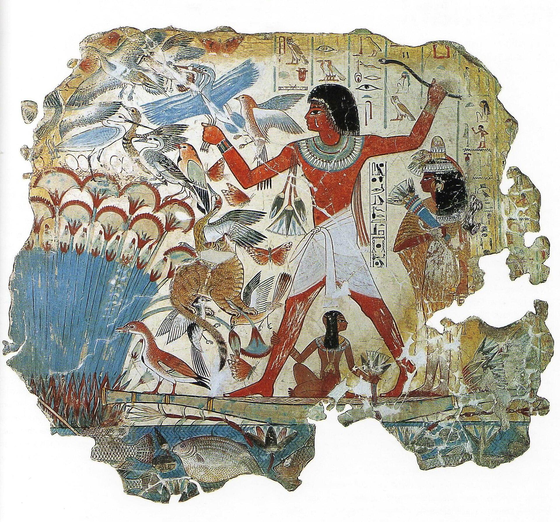
Another common use of scale that can be seen as far back as Ancient Egypt is to show importance with hierarchy of scale. This occurs when the most important person is depicted with the largest scale, as in the image below.
Conclusion
Elements and principles are the essential building blocks of art. They are the vital ingredients to create visual content and organize visually pleasing, enticing, or even surprising compositions. As mentioned at the start of this chapter, the elements are the letters, the principles are the words, and the composition is the sentence of the visual language. Together, they tell visual stories ranging from realistic to abstract, created by artists from the ancient past to the present day.
Licensing and Attributions
“Elements of Art & Principles of Design.” Written by Elaine Wilson. License: CC BY
Elements & Principles Activity
Title: Clutter Drawing
Description
This project is an opportunity to display your understanding of the elements and principles of art and your current drawing experience. There are two steps to this exercise. The first is to construct a still life, and the second is to use your supplies to draw the still life as accurately as possible.
Project Parameters
Duration
2 Hours
Size
8.5×11” Paper Size
Subject
A still-life composed of a variety of objects (at least ten)
Technique
Direct Observation – draw the still-life object as it is seen
Materials
- 8.5×11” Printer or Drawing Paper
- Pencils – Graphite and Prismacolor Col-Erase Colored Pencils
- Erasers – kneaded, rubber, and mono zero
- Objects – choose at least ten items of different sizes and textures
Goals
The goal of this project is to apply the elements and principles of art in an observation drawing.
Objectives
- Create a complex and full still life – lots of objects and clutter
- Observe the referenced still life more than the drawing. Avoid drawing from memory or what you think the objects should look like. Instead, draw what you see!
- Use descriptive, confident lines, value, and colors to record detail and attempt to show light, shadow, and implied surface texture.
- Keep the drawing in pristine condition – clean and neat
Method
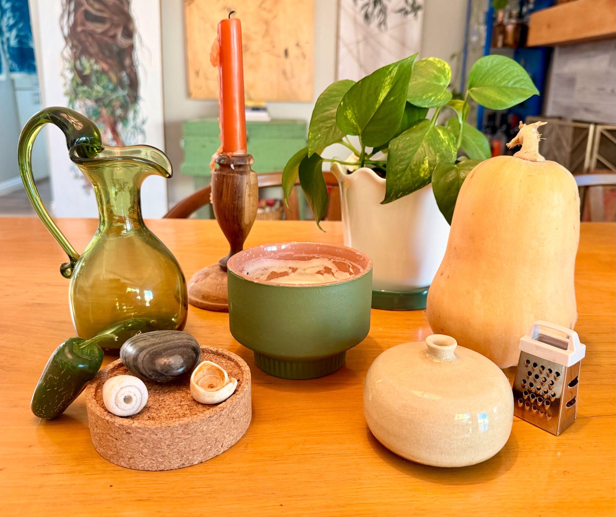
Still-Life Setup
- Find at least ten three-dimensional objects with different surface textures, heights, widths, etc.
- Avoid objects with complex patterns, text, etc.
- Include a lot of objects (at least ten)
- Arrange the objects so they sit at different heights and overlap.
Drawing Process
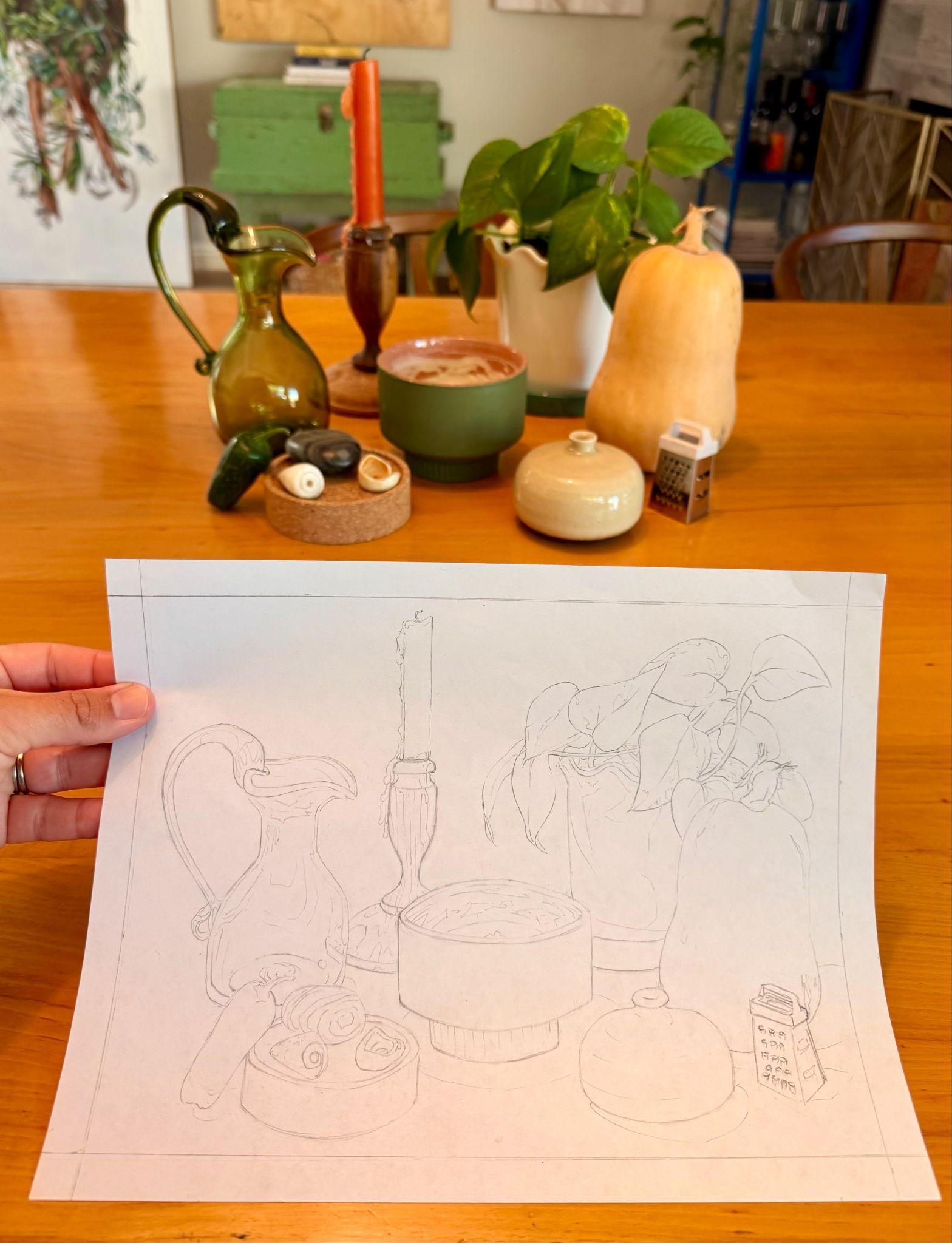
- Prepare to draw by using a ruler and pencil to measure and draw a .5” border on all sides of the paper.
- Then, use pencils to draw the still life to the best of your ability from observation.
- Avoid drawing too small; instead, aim to fill the page with the drawing.
- Do not use a photo reference when drawing. Instead, look at the physical objects and attempt to translate the three-dimensional forms into a two-dimensional drawing.
Tips
- Don’t despair if you do not have any drawing experience; if this is you, even better that you are here to learn. If you have previous experience, this is your chance to show off what you can do.
- The best way to create an accurate drawing is to continually look at the reference
- Only draw from direct observation; do not use a photo reference
- Draw lightly and use your eraser as needed to clean up and revise throughout the drawing process
- Think of this assignment as a great opportunity to draw what you are interested in by designing your still life with your interest in mind.
Result
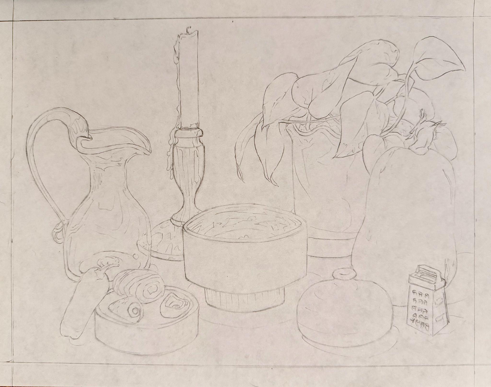
The result will be your first attempt to create a direct-observation drawing. Be patient with yourself and use this drawing as an opportunity to record your current drawing ability. Then, refer to it throughout the semester to determine how much you improve.
———————–
Licensing and Attributions
“Elements & Principles Activity.” Written by Briana Miyoko Stanley. License: CC BY
- Studio Museum in Harlem, “Njideka Akunyili Crosby, Nwantinti, 2012,” accessed June 25, 2026, https://www.studiomuseum.org/artworks/nwantinti. ↵