2 Chapter 2: Describing Data Using Frequency Distributions and Graphs
Statistics is more than just numbers—it is a way of telling stories about people, communities, and systems. When used thoughtfully, statistics can uncover patterns of inequality, highlight voices that are often silenced, and guide us toward solutions that promote fairness. For example, frequency tables and graphs do more than summarize data; they can reveal who has access to education, who is disproportionately impacted by the criminal justice system, or how resources are distributed across neighborhoods. In this way, statistics becomes a tool for advocacy, not just analysis.
Approaching statistics from a social justice perspective means asking questions about power, representation, and equity. Whose experiences are being measured? Who is left out of the dataset? How might the way we collect, organize, and present data either reinforce stereotypes or challenge them? By connecting statistical methods to real-world issues—such as racial profiling, housing inequality, and disparities in health care—we see how numbers are never neutral. They are deeply tied to human lives, and how we analyze them can influence policy, practice, and progress.
Before we can understand our analyses, we must first understand our data. The first step in doing this is using tables, charts, graphs, plots, and other visual tools to see what our data look like. This section examines graphical methods for displaying various results. We’ll learn some general lessons about how to graph data that fall into a number of categories. A later section will consider how to graph numerical data from a frequency distribution.
Frequency Tables
All of the graphical methods shown in this section are derived from frequency tables. Table 2.1 shows a frequency table for the results of a study on community members’ of color experiences with racial profiling; it shows the frequencies of the various response categories. It also shows the relative frequencies, which are the proportion of responses in each category. For example, the relative frequency for “never experienced racial profiling” of .17 = 85/500.
Table 2.1. Frequency table for reported experiences with racial profiling.
| Racial Profiling Exper. |
Frequency |
Relative Frequency |
|---|---|---|
|
Never |
85 |
.17 |
|
Occasionally |
60 |
.12 |
|
Frequently |
355 |
.71 |
|
Total |
500 |
1.00 |
Understanding and Creating Frequency Distributions
Frequency distributions are fundamental tools in statistics for organizing and summarizing data. They help researchers transform raw numbers into meaningful patterns and make statistical interpretation easier. This is particularly important in social justice research, where we analyze patterns in data to uncover inequities in education, housing, criminal justice, and other areas. This section will walk through how to create and interpret different types of frequency distributions, using real-world examples that can support data-informed advocacy and awareness. The data is hypothetical but it when using real-word data, the process is the same.
From Raw Data to Ranked Order
Raw data is the unprocessed list of values as they were collected. For example, let’s look at how many times 27 juvenile offenders were arrested.
In raw form, this might be listed as follows: 2, 1, 3, 2, 4, 1, 2, 3, 1, 2, 3, 1, 2, 4, 3, 1, 2, 3, 2, 1, 5, 5, 5, 2, 2, 6, 6.
While this shows the data, it’s not easy to analyze. A ranked frequency distribution organizes this data from highest to lowest to help visualize extremes.
Simple Frequency Distribution
To make the data easier to interpret, we count how often each number of arrests appears. This is a simple frequency distribution. Start by identifying all unique values (e.g., 1 arrest through 6 arrests).
Simple Frequency Table: Juvenile Arrest n=27
| Number of Arrests | Frequency |
|---|---|
| 1 | 6 |
| 2 | 9 |
| 3 | 5 |
| 4 | 2 |
| 5 | 3 |
| 6 | 2 |
In the table above, we see that 9 juveniles were arrested twice, while only 2 were arrested six times. This table gives us a quick sense of how arrest frequencies are distributed among the sample.
Grouped Frequency Distribution
Sometimes we want to simplify further by grouping values into intervals. This is especially useful when we have a wide range of data. In our case, we can group arrests into three intervals: 1–2, 3–4, and 5–6. We then total the number of offenders whose arrest count falls into each group.
Grouped Frequency Table: Juvenile Arrests
| Arrest Interval | Frequency |
| 1–2 | 15 |
| 3–4 | 7 |
| 5–6 | 5 |
|---|
This grouped table summarizes the same data in broader categories. Now, we can say that most juveniles (15) had between 1 and 2 arrests, while only 5 had 5 or more. Grouping helps when data has variability or when we want a quick snapshot of broader patterns.
Why This Matters in Social Justice Research
Understanding how to organize data into frequency distributions is essential for social justice statistics. For instance, frequency tables can be used to show how often different racial or socioeconomic groups experience arrests, access education, or face housing instability. Creating these tables allows advocates and researchers to identify patterns of inequality and communicate them clearly to policymakers or the public.
Creating a Grouped Frequency Distribution
Grouped frequency distributions help summarize large datasets by organizing scores into intervals, making it easier to identify patterns and trends. In this section, we’ll walk through how to construct a grouped frequency table and explain the components such as apparent limits, real limits, midpoints, relative frequency, cumulative frequency, and cumulative relative frequency. We’ll also show how to convert relative frequencies into percentages for easier interpretation.
Step 1: Decide on Intervals
Start by determining the range of your dataset, which is the highest value minus the lowest value. Then choose how many intervals you want. Divide the range by the number of intervals to get the width of each class interval. For example, if your data ranges from 0 to 49 and you want 10 intervals, each interval will cover 5 units (e.g., 0–4, 5–9, …, 45–49). Generally, we want to make intervals easy to understand by making them siz 5 or 10, depending on the range of the data. So, intervals that go from 1-5, 6-10, 11-15 etc. make it easy to organize and understand your data.
Step 2: Apparent Limits
Apparent limits are the values that define the range of each interval as it appears in a table. For example, the interval 10–14 means values from 10 to 14 are included in that group.
Step 3: Real Limits
Real limits are the boundaries that account for the continuity of data. For interval 10–14, the real limits are 9.5–14.5, meaning it includes any value from 9.5 up to but not including 14.5. Real limits are defined as .5 below the lowest apparent limit and .5 above the highest apparent limit in each category.
Step 4: Midpoints
The midpoint of each interval is the average of the lower and upper apparent limits. For example, the midpoint of 10–14 is (10 + 14) / 2 = 12.
Step 5: Frequency and Relative Frequency
Frequency (f) is the count of values that fall within each interval. Relative frequency is calculated by dividing each frequency by the total number of data points (n). This gives a proportion of the total for each interval.
Step 6: Cumulative Frequency and Cumulative Relative Frequency
Cumulative frequency (CF) is the total number of values that fall below the upper real limit of each interval. Cumulative relative frequency (CRF) is the cumulative frequency divided by the total number of scores. This tells us the proportion of data below a given point.
Step 7: Converting Relative Frequencies to Percents
To convert a relative frequency to a percentage, multiply the value by 100. For example, a relative frequency of 0.125 becomes 12.5%. For example, in the table below, the relative frequency for those who missed 0-4 school abscences is .083. To change that into a percent, it becomes 8.3%. Relative frequency columns add up to 1.0 and when converted to percents, adds up to 100%.
Grouped Frequency Table Example: School Absences
| Apparent Limits | Real Limits | Midpoint | F | Rel f | Cum f | Cum Rel f |
|---|---|---|---|---|---|---|
| 0–4 | −0.5–4.5 | 2 | 4 | .083 | 4 | .083 |
| 5–9 | 4.5–9.5 | 7 | 8 | .167 | 12 | .250 |
| 10–14 | 9.5–14.5 | 12 | 3 | .063 | 15 | .313 |
| 15–19 | 14.5–19.5 | 17 | 3 | .063 | 18 | .376 |
| 20–24 | 19.5–24.5 | 22 | 6 | .125 | 24 | .501 |
| 25–29 | 24.5–29.5 | 27 | 4 | .083 | 28 | .584 |
| 30–34 | 29.5–34.5 | 32 | 6 | .125 | 34 | .709 |
| 35–39 | 34.5–39.5 | 37 | 3 | .063 | 37 | .772 |
| 40–44 | 39.5–44.5 | 42 | 4 | .083 | 41 | .855 |
| 45–49 | 44.5–49.5 | 47 | 7 | .146 | 48 | 1.000 |
Pie Charts
The pie chart in Figure 2.1 shows the results of the amount of racial profiling experienced. In a pie chart, each category is represented by a slice of the pie. The area of the slice is proportional to the percentage of responses in the category. This is simply the relative frequency multiplied by 100. Figure 2.1. Pie chart of racial profiling experienced illustrating frequencies of previous racial profiling: 71% of participants reported frequently being racially profiled.
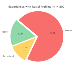
Pie charts are effective for displaying the relative frequencies of a small number of categories. They are not recommended, however, when you have a large number of categories. Pie charts can also be confusing when they are used to compare the outcomes of two different surveys or experiments. In an influential book on the use of graphs, Edward Tufte asserted, “The only worse design than a pie chart is several of them.”¹
Here is another important point about pie charts. If they are based on a small number of observations, it can be misleading to label the pie slices with percentages. For example, if just 5 people had been interviewed about the amount of racial profiling experienced being never, and 3 participants reported frequently, it would be misleading to display a pie chart slice showing .60. With so few people interviewed, such a large percentage of racially profiled users might easily have occurred since chance can cause large errors with small samples. In this case, it is better to alert the user of the pie chart to the actual numbers involved. The slices should therefore be labeled with the actual frequencies observed (e.g., 3) instead of with percentages.
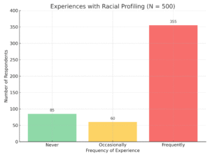
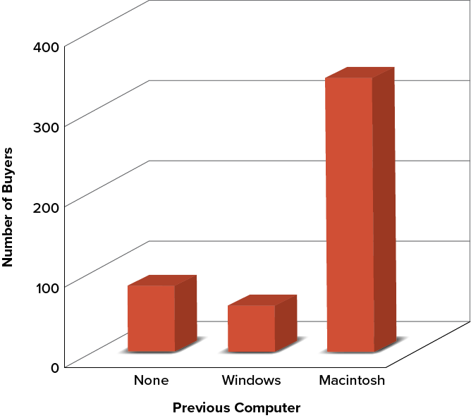
Bar Charts
Bar charts can also be used to represent frequencies of different categories. A bar chart of the amount of racial profiling experienced shown in Figure 2.2. Participants experience (never, occasionally, frequently) is shown on the x-axis and the frequencies (Number of Respondents) are shown on the y-axis. Typically, the y-axis shows the number of observations in each category rather than the percentage of observations in each category as is typical in pie charts.
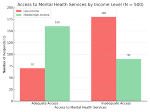
Comparing Distributions
Often we need to compare the results of different surveys, or of different conditions within the same overall survey. In this case, we are comparing the “distributions” of responses between the surveys or conditions. Bar charts are often excellent for illustrating differences between two distributions. Figure 2.3 A community organization surveyed 500 individuals to examine disparities in access to mental health services based on household income. Respondents were asked whether they had adequate access or inadequate access to mental health services. The results were categorized by income level.
Some Graphical Mistakes to Avoid
Don’t get fancy! People sometimes add features to graphs that don’t help to convey their information. For example, three-dimensional bar charts such as the one shown in Figure 2.4 are usually not as effective as their two-dimensional counterparts.
Figure 2.4. Charts like this are less effective. (“Mac Bar Chart 3D” by Judy Schmitt is licenced under CC BY-NC-SA 4.0.)
Here is another way that fanciness can lead to trouble. Instead of plain bars, it is tempting to substitute meaningful images. For example, Figure 2.5 presents the iMac data using pictures of computers. The heights of the pictures accurately represent the number of buyers, yet Figure 2.5 is misleading because the viewer’s attention will be captured by areas. The areas can exaggerate the size differences between the groups. In terms of percentages, the ratio of previous Macintosh owners to previous Windows owners is about 6 to 1. But the ratio of the two areas in Figure 2.5 is about 35 to 1. A biased person wishing to hide the fact that many Windows owners purchased iMacs would be tempted to use Figure 2.5.
Figure 2.5. . (“Mac Bar Chart Lie Factor” by Judy Schmitt is licensed under CC BY-NC-SA 4.0. “Apple iMac G3 (1998)” by albaco/Flickr is licensed under CC BY-NC-SA 2.0; image was brightened and background was removed.)
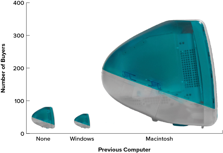
Edward Tufte coined the term lie factor to refer to the ratio of the size of the effect shown in a graph to the size of the effect shown in the data. He suggests that lie factors greater than 1.05 or less than 0.95 produce unacceptable distortion.
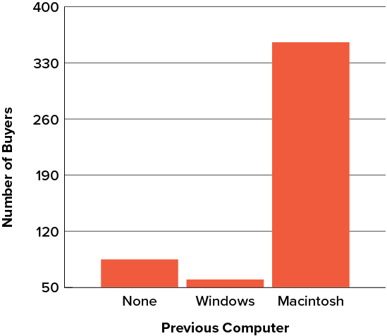
Another distortion in bar charts results from setting the baseline to a value other than zero. The baseline is the bottom of the y-axis, representing the least number of cases that could have occurred in a category. Normally, but not always, this number should be zero. Figure 2.6 shows the iMac data with a baseline of 50. Once again, the differences in areas suggests a different story than the true differences in percentages. The number of Windows-switchers seems minuscule compared to its true value of 12%.
Figure 2.6. A redrawing of Figure 2.2 with a baseline of 50. (“Mac Bar Chart Baseline 50” by Judy Schmitt is licensed under CC BY-NC-SA 4.0.)
Summary
Pie charts and bar charts can both be effective methods of portraying data. Bar charts are better when there are more than just a few categories and for comparing two or more distributions. Be careful to avoid creating misleading graphs.
Graphing Quantitative Variables
As discussed in the section on variables in Chapter 1, quantitative variables are variables measured on a numeric scale. Height, weight, response time, subjective rating of pain, temperature, and score on an exam are all examples of quantitative variables. Quantitative variables are distinguished from qualitative variables (sometimes called categorical variables or nominal variables), such as favorite color, religion, city of birth, and favorite sport, in which there is no ordering or measuring involved.
There are many types of graphs that can be used to portray distributions of quantitative variables. The upcoming sections cover the following types of graphs: (1) stem-and-leaf displays, (2) histograms, (3) frequency polygons, (4) box plots, (5) bar charts, (6) line graphs, (7) dot plots, and (8) scatter plots (discussed in Chapter 12). Some graph types, such as stem-and-leaf displays, are best-suited for small to moderate amounts of data, whereas others, such as histograms, are best-suited for large amounts of data. Graph types such as box plots are good at depicting differences between distributions. Scatter plots are used to show the relationship between two variables.
Stem-and-Leaf Displays
A stem-and-leaf display is a graphical method of displaying data. It is particularly useful when your data are not too numerous. In this section, we will explain how to construct and interpret this kind of graph.
As usual, we will start with an example. Consider Figure 2.8, which shows the number of touchdown passes (TD passes) thrown by each of the 31 teams in the National Football League during the 2000 season.
Figure 2.8. Number of touchdown passes. (“Touchdown Passes Raw Data” by Judy Schmitt is licensed under CC BY-NC-SA 4.0.)
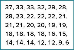
A stem-and-leaf display of the data is shown in Figure 2.9. The left portion of Figure 2.9 contains the stems. They are the numbers 3, 2, 1, and 0, arranged as a column to the left of the bars. Think of these numbers as 10s digits. A stem of 3, for example, can be used to represent the 10s digit in any of the numbers from 30 to 39. The numbers to the right of the bar are leaves, and they represent the 1s digits. Every leaf in the graph therefore stands for the result of adding the leaf to 10 times its stem.
Figure 2.9. Stem-and-leaf display of the number of touchdown passes. (“Touchdown Passes Stem and Leaf” by Judy Schmitt is licensed under CC BY-NC-SA 4.0.)
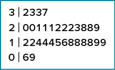
To make this clear, let us examine Figure 2.9 more closely. In the top row, the four leaves to the right of stem 3 are 2, 3, 3, and 7. Combined with the stem, these leaves represent the numbers 32, 33, 33, and 37, which are the numbers of TD passes for the first four teams in Figure 2.8. The next row has a stem of 2 and 12 leaves. Together, they represent 12 data points, namely, two occurrences of 20 TD passes, three occurrences of 21 TD passes, three occurrences of 22 TD passes, one occurrence of 23 TD passes, two occurrences of 28 TD passes, and one occurrence of 29 TD passes. We leave it to you to figure out what the third row represents. The fourth row has a stem of 0 and two leaves. It stands for the last two entries in Figure 2.8, namely 9 TD passes and 6 TD passes. (The latter two numbers may be thought of as 09 and 06.)
One purpose of a stem-and-leaf display is to clarify the shape of the distribution. You can see many facts about TD passes more easily in Figure 2.9 than in Figure 2.8. For example, by looking at the stems and the shape of the plot, you can tell that most of the teams had between 10 and 29 passing TDs, with a few having more and a few having less. The precise numbers of TD passes can be determined by examining the leaves.
Histograms
A histogram is a graphical method for displaying the shape of a distribution. It is particularly useful when there are a large number of observations. We begin with an example consisting of the scores of 642 students on a psychology test. The test consists of 197 items, each graded as “correct” or “incorrect.” The students’ scores ranged from 46 to 167.
The first step is to create a frequency table. Unfortunately, a simple frequency table would be too big, containing over 100 rows. To simplify the table, we group scores together as shown in Table 2.2.
Table 2.2. Grouped frequency distribution of psychology test scores.
|
Interval’s Lower Limit |
Interval’s Upper Limit |
Class Frequency |
|---|---|---|
|
39.5 |
49.5 |
3 |
|
49.5 |
59.5 |
10 |
|
59.5 |
69.5 |
53 |
|
69.5 |
79.5 |
107 |
|
79.5 |
89.5 |
147 |
|
89.5 |
99.5 |
130 |
|
99.5 |
109.5 |
78 |
|
109.5 |
119.5 |
59 |
|
119.5 |
129.5 |
36 |
|
129.5 |
139.5 |
11 |
|
139.5 |
149.5 |
6 |
|
149.5 |
159.5 |
1 |
|
159.5 |
169.5 |
1 |
To create this table, the range of scores was broken into intervals, called class intervals. The first interval is from 39.5 to 49.5, the second from 49.5 to 59.5, etc. Next, the number of scores falling into each interval was counted to obtain the class frequencies. There are 3 scores in the first interval, 10 in the second, etc.
Class intervals of width 10 provide enough detail about the distribution to be revealing without making the graph too “choppy.” More information on choosing the widths of class intervals is presented later in this section. Placing the limits of the class intervals midway between two numbers (e.g., 49.5) ensures that every score will fall in an interval rather than on the boundary between intervals.
In a histogram, the class frequencies are represented by bars. The height of each bar corresponds to its class frequency. A histogram of these data is shown in Figure 2.15.
Figure 2.15. Histogram of scores on a psychology test. (“Psychology Test Scores Histogram” by Judy Schmitt is licensed under CC BY-NC-SA 4.0.)
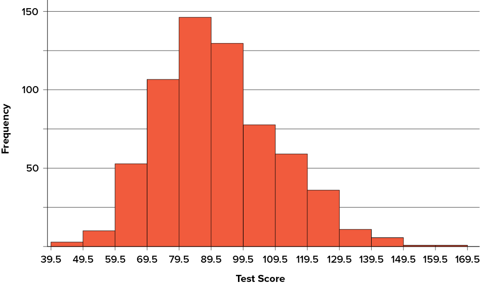
The histogram makes it plain that most of the scores are in the middle of the distribution, with fewer scores in the extremes. You can also see that the distribution is not symmetric: the scores extend farther to the right than they do to the left. The distribution is therefore said to be skewed. (We’ll have more to say about shapes of distributions in Chapter 3.)
In our example, the observations are whole numbers. Histograms can also be used when the scores are measured on a more continuous scale such as the length of time (in milliseconds) required to perform a task. In this case, there is no need to worry about fence sitters since they are improbable. (It would be quite a coincidence for a task to require exactly 7 seconds, measured to the nearest thousandth of a second.) We are therefore free to choose whole numbers as boundaries for our class intervals, for example, 4000, 5000, etc. The class frequency is then the number of observations that are greater than or equal to the lower bound, and strictly less than the upper bound. For example, one interval might hold times from 4000 to 4999 milliseconds. Using whole numbers as boundaries avoids a cluttered appearance, and is the practice of many computer programs that create histograms. Note also that some computer programs label the middle of each interval rather than the end points.
Histograms can be based on relative frequencies instead of actual frequencies. Histograms based on relative frequencies show the proportion of scores in each interval rather than the number of scores. In this case, the y-axis runs from 0 to 1 (or somewhere in between if there are no extreme proportions). You can change a histogram based on frequencies to one based on relative frequencies by (a) dividing each class frequency by the total number of observations, and then (b) plotting the quotients on the y-axis (labeled as proportion).
There is more to be said about the widths of the class intervals, sometimes called bin widths. Your choice of bin width determines the number of class intervals. This decision, along with the choice of starting point for the first interval, affects the shape of the histogram. The best advice is to experiment with different choices of width, and to choose a histogram according to how well it communicates the shape of the distribution.
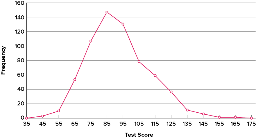
Frequency Polygons
Frequency polygons are a graphical device for understanding the shapes of distributions. They serve the same purpose as histograms, but are especially helpful for comparing sets of data. Frequency polygons are also a good choice for displaying cumulative frequency distributions.
To create a frequency polygon, start just as for histograms, by choosing a class interval. Then draw an x-axis representing the values of the scores in your data. Mark the middle of each class interval with a tick mark, and label it with the middle value represented by the class. Draw the y-axis to indicate the frequency of each class. Place a point in the middle of each class interval at the height corresponding to its frequency. Finally, connect the points. You should include one class interval below the lowest value in your data and one above the highest value. The graph will then touch the x-axis on both sides.
The frequency distribution of 642 psychology test scores, shown in Table 2.3, was used to create the frequency polygon shown in Figure 2.16.
Table 2.3. Frequency distribution of psychology test scores.
|
Lower Limit |
Upper Limit |
Count |
Cumulative Count |
|---|---|---|---|
|
29.5 |
39.5 |
0 |
0 |
|
39.5 |
49.5 |
3 |
3 |
|
49.5 |
59.5 |
10 |
13 |
|
59.5 |
69.5 |
53 |
66 |
|
69.5 |
79.5 |
107 |
173 |
|
79.5 |
89.5 |
147 |
320 |
|
89.5 |
99.5 |
130 |
450 |
|
99.5 |
109.5 |
78 |
528 |
|
109.5 |
119.5 |
59 |
587 |
|
119.5 |
129.5 |
36 |
623 |
|
129.5 |
139.5 |
11 |
634 |
|
139.5 |
149.5 |
6 |
640 |
|
149.5 |
159.5 |
1 |
641 |
|
159.5 |
169.5 |
1 |
642 |
|
169.5 |
170.5 |
0 |
642 |
The first label on the x-axis is 35. This represents an interval extending from 29.5 to 39.5. Since the lowest test score is 46, this interval has a frequency of 0. The point labeled 45 represents the interval from 39.5 to 49.5. There are three scores in this interval. There are 147 scores in the interval that surrounds 85.
You can easily discern the shape of the distribution from Figure 2.16. Most of the scores are between 65 and 115. It is clear that the distribution is not symmetric inasmuch as good scores (to the right) trail off more gradually than poor scores (to the left). In the terminology of Chapter 3 (where we will study shapes of distributions more systematically), the distribution is skewed.
Figure 2.16. Frequency polygon for the psychology test scores. (“Psychology Test Scores Frequency Polygon” by Judy Schmitt is licensed under CC BY-NC-SA 4.0.)
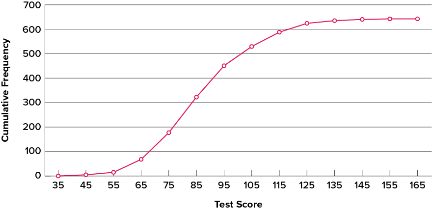
A cumulative frequency polygon for the same test scores is shown in Figure 2.17. The graph is the same as before except that the y value for each point is the number of students in the corresponding class interval plus all numbers in lower intervals. For example, there are no scores in the interval labeled “35,” three in the interval “45,” and 10 in the interval “55.” Therefore, the y value corresponding to “55” is 13. Since 642 students took the test, the cumulative frequency for the last interval is 642.
Figure 2.17. Cumulative frequency polygon for the psychology test scores. (“Psychology Test Scores Cumulative Frequency Polygon” by Judy Schmitt is licensed under CC BY-NC-SA 4.0.)
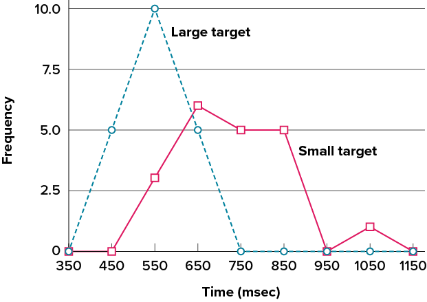
Frequency polygons are useful for comparing distributions. This is achieved by overlaying the frequency polygons drawn for different datasets. Figure 2.18 provides an example. The data come from a task in which the goal is to move a computer cursor to a target on the screen as fast as possible. On 20 of the trials, the target was a small rectangle; on the other 20, the target was a large rectangle. Time to reach the target was recorded on each trial. The two distributions (one for each target) are plotted together in Figure 2.18. The figure shows that, although there is some overlap in times, it generally took longer to move the cursor to the small target than to the large one.
Figure 2.18. Overlaid frequency polygons for the cursor task. (“Cursor Task Frequency Polygons” by Judy Schmitt is licensed under CC BY-NC-SA 4.0.)
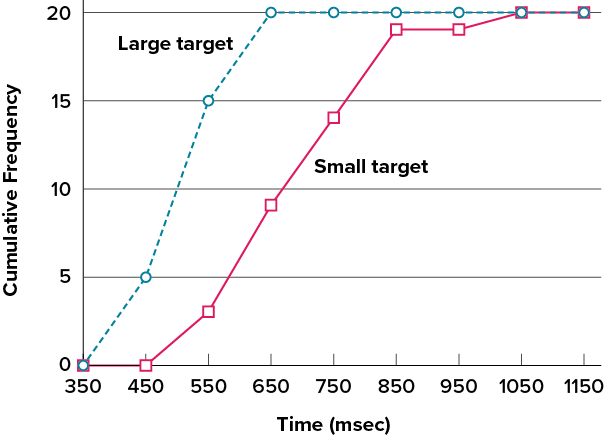
It is also possible to plot two cumulative frequency distributions in the same graph. This is illustrated in Figure 2.19 using the same data from the cursor task. The difference in distributions for the two targets is again evident.
Figure 2.19. Overlaid cumulative frequency polygons for the cursor task. (“Cursor Task Cumulative Frequency Polygons” by Judy Schmitt is licensed under CC BY-NC-SA 4.0.)
Bar Charts
In the section on qualitative variables, we saw how bar charts could be used to illustrate the frequencies of different categories. For example, as we saw earlier in this chapter, the bar chart shown in Figure 2.2 shows how many purchasers of iMac computers were previous Macintosh users, previous Windows users, and new computer purchasers.
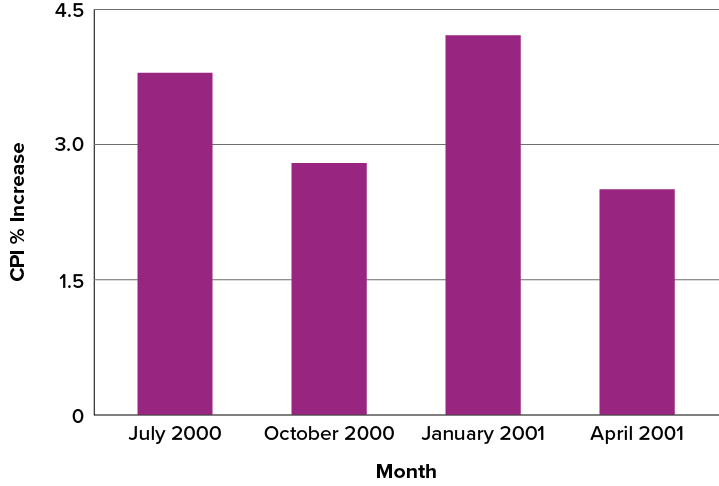
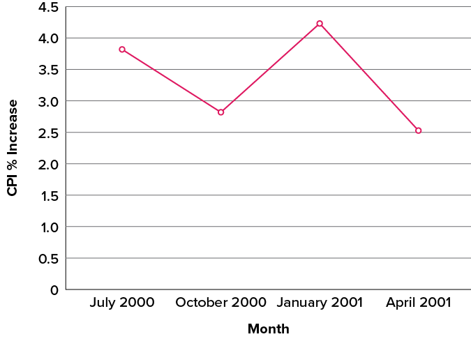
Bar charts are particularly effective for showing change over time. Figure 2.27, for example, shows the percent increase in the Consumer Price Index (CPI) over four three-month periods. The fluctuation in inflation is apparent in the graph.
Figure 2.27. Percent change in the CPI over time. Each bar represents percent increase for the three months ending at the date indicated. (“Percent Change in CPI” by Judy Schmitt is licensed under CC BY-NC-SA 4.0.)
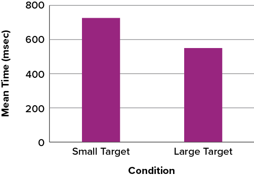
Bar charts are often used to compare the means of different experimental conditions. Figure 2.28 shows the mean time it took one person to move the cursor to either a small target or a large target. On average, more time was required for small targets than for large ones.
Figure 2.28. Bar chart showing the means for the two conditions. (“Means of Two Conditions” by Judy Schmitt is licensed under CC BY-NC-SA 4.0.)
Line Graphs
A line graph is a bar graph with the tops of the bars represented by points joined by lines (the rest of the bar is suppressed). For example, Figure 2.27, which was presented in the section on bar charts, shows changes in the Consumer Price Index (CPI) over time. A line graph of these same data is shown in Figure 2.30. Although the figures are similar, the line graph emphasizes the change from period to period.
Figure 2.30. A line graph of the percent change in the CPI over time. Each point represents percent increase for the three months ending at the date indicated. (“Percent Change in CPI Line Graph” by Judy Schmitt is licensed under CC BY-NC-SA 4.0.)
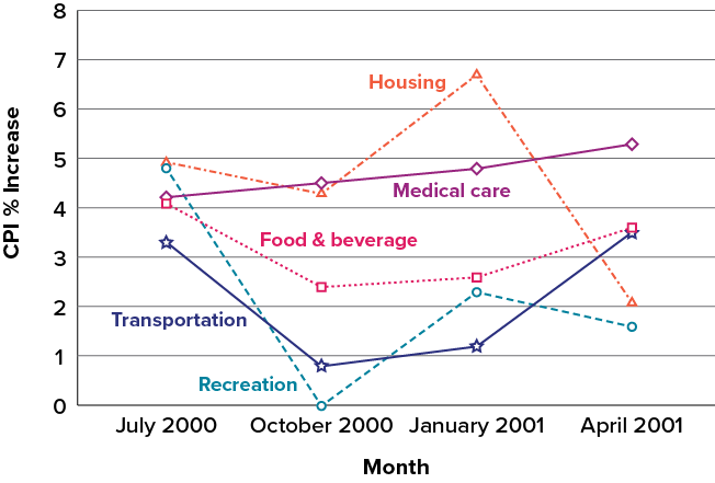
Line graphs are appropriate only when both the x– and y-axes display ordered (rather than qualitative) variables. Although bar charts can also be used in this situation, line graphs are generally better at comparing changes over time. Figure 2.31, for example, shows percent increases and decreases in five components of the CPI. The figure makes it easy to see that medical costs had a steadier progression than the other components. Although you could create an analogous bar chart, its interpretation would not be as easy.
Figure 2.31. A line graph of the percent change in five components of the CPI over time. (“Percent Change in CPI x5 Line Graph” by Judy Schmitt is licensed under CC BY-NC-SA 4.0.)
The Shape of Distribution (SKEWED DISTRIBUTIONS)
Finally, it is useful to present discussion on how we describe the shapes of distributions, which we will revisit in Chapter 3 to learn how different shapes affect our numerical descriptors of data and distributions.
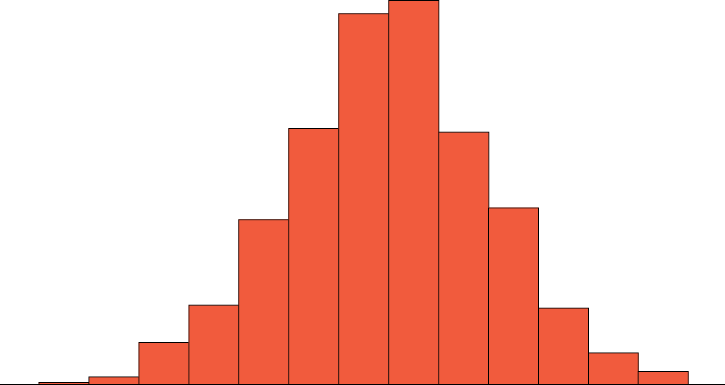
The primary characteristic we are concerned about when assessing the shape of a distribution is whether the distribution is symmetrical or skewed. A symmetrical distribution, as the name suggests, can be cut down the center to form two mirror images. Although in practice we will never get a perfectly symmetrical distribution, we would like our data to be as close to symmetrical as possible for reasons we delve into in Chapter 3. Many types of distributions are symmetrical, but by far the most common and pertinent distribution at this point is the normal distribution, shown in Figure 2.32. Notice that although the symmetry is not perfect (for instance, the bar just to the right of the center is taller than the one just to the left), the two sides are roughly the same shape. The normal distribution has a single peak, known as the center, and two tails that extend out equally, forming what is known as a bell shape or, as we will soon note, a normal curve.
Figure 2.32. A symmetrical distribution. (“Symmetrical Distribution” by Judy Schmitt is licensed under CC BY-NC-SA 4.0.)
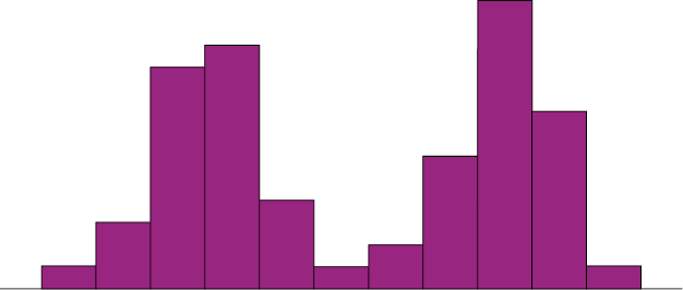
Symmetrical distributions can also have multiple peaks. Figure 2.33 shows a bimodal distribution, named for the two peaks that lie roughly symmetrically on either side of the center point. As we will see in Chapter 3, this is not a particularly desirable characteristic of our data, and, worse, this is a relatively difficult characteristic to detect numerically. Thus, it is important to visualize your data before moving ahead with any formal analyses.
Figure 2.33. A bimodal distribution. (“Bimodal Distribution” by Judy Schmitt is licensed under CC BY-NC-SA 4.0.)
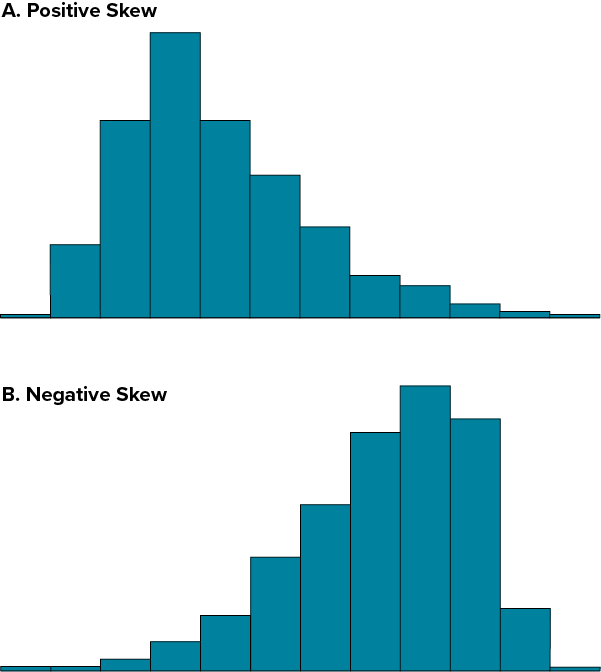
Distributions that are not symmetrical also come in many forms, more than can be described here. The most common asymmetry to be encountered is referred to as skew, in which one of the two tails of the distribution is disproportionately longer than the other. This property can affect the value of the averages we use in our analyses and make them an inaccurate representation of our data, which causes many problems.
Skew can either be positive or negative (also known as right or left, respectively), based on which tail is longer. It is very easy to get the two confused at first; many students want to describe the skew by where the bulk of the data (larger portion of the histogram, known as the body) is placed, but the correct determination is based on which tail is longer. You can think of the tail as an arrow; whichever direction the arrow is pointing is the direction of the skew. Figure 2.34 shows positive (right) and negative (left) skew, respectively.
Figure 2.34. Positively skewed (A) and negatively skewed (B) distributions. (“Skewed Distributions” by Judy Schmitt is licensed under CC BY-NC-SA 4.0.)
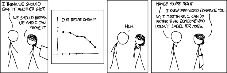
“Convincing” by Randall Munroe/xkcd.com is licensed under CC BY-NC 2.5.)